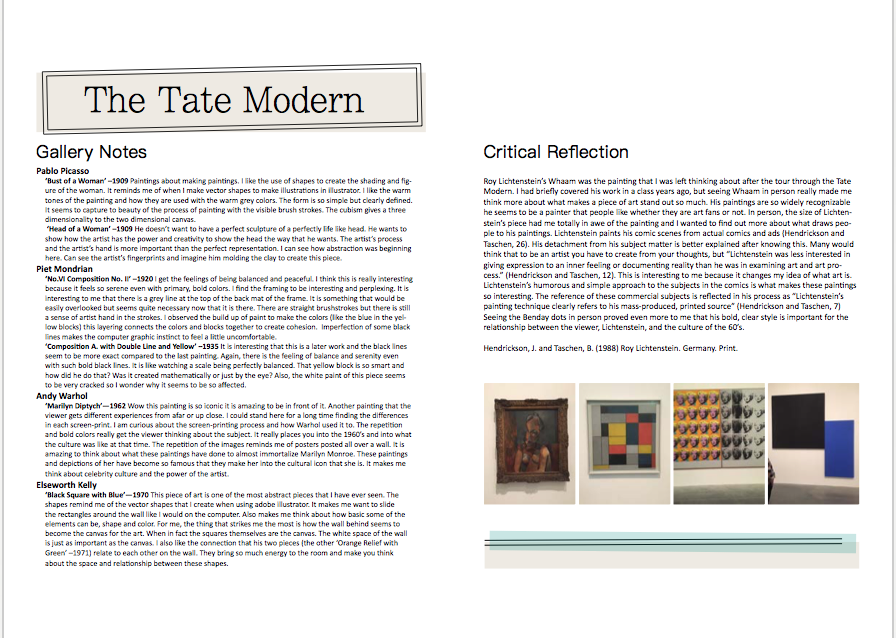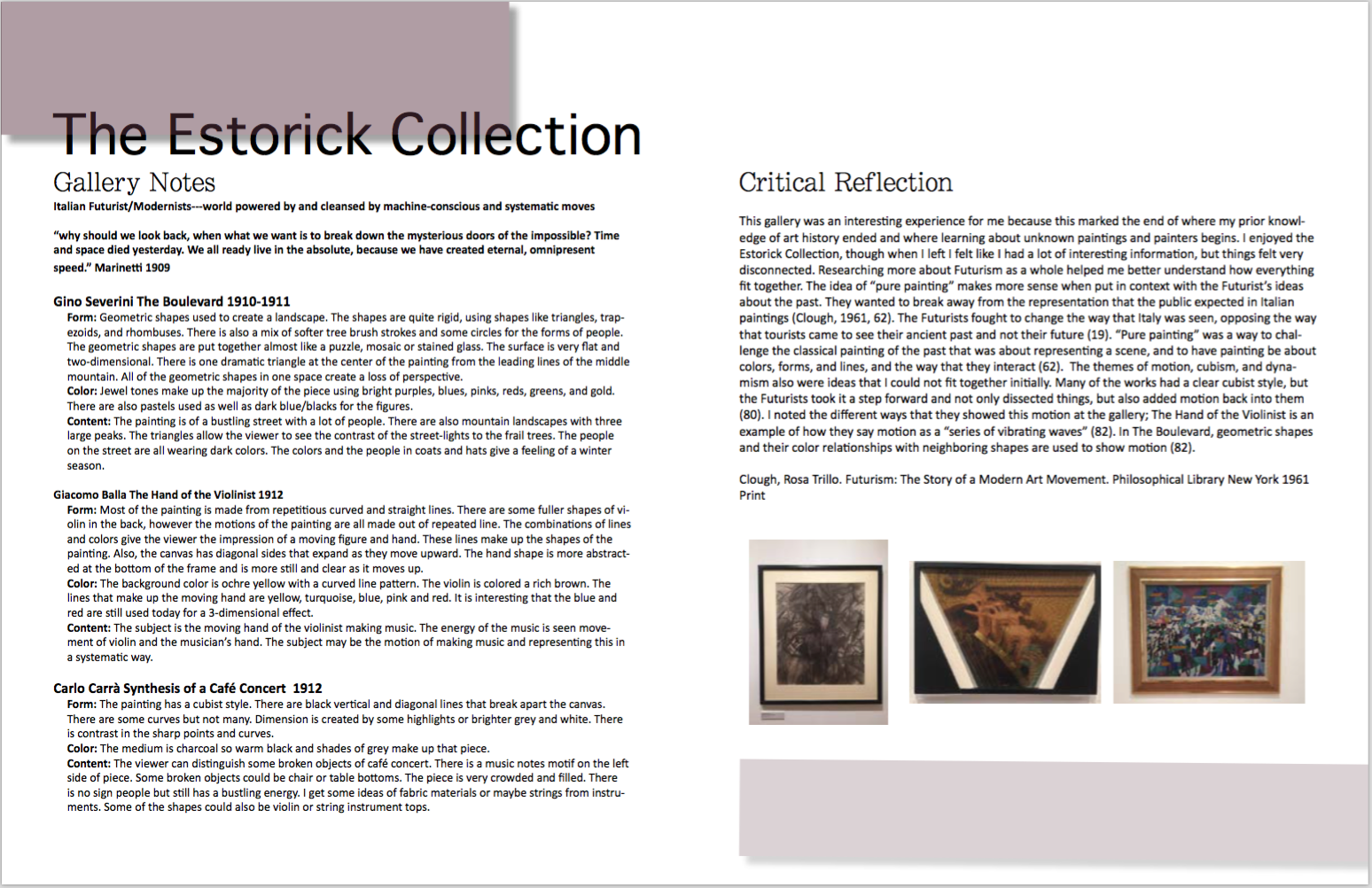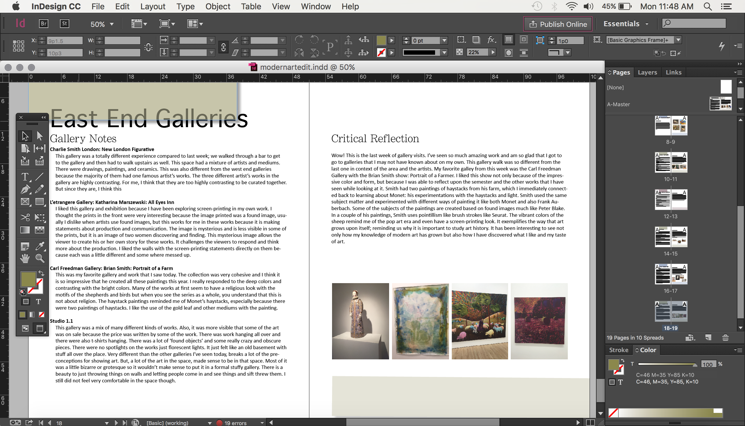
I realized, while I was organizing some of my work, that I had shared the cover of my journal for my modern art class, but never shared the rest of the work that I did on it. It was a pretty large project with weeks’ worth of notes and responses. Not only did it have a lot of text, I also had to make sure that the design shared the mood of the cover that I liked so much. This turned out to be a difficult thing to match when there is a lot of information that needs to fit into the page. This project was one that I would open and change a few thing and thought that I liked it and would open it again and hate it. Even when I returned from London, I opened it again and changed a bunch of the design elements. Right now I am pretty happy with the pages because I think I captured the “floating” feeling of the cover, but this is me and I will probably make more changes once I get some feedback on the layout.
I really wanted a minimalist look and everyone is right when they say that designing simple is complicated. Here are some of the pages from the journal before and after me redesigning them.