

Recently, I shared the first steps of my Pop Art painting for Advanced Drawing I. In that post, I explained the purpose of the project. In this update, I will show progress and dive deeper into the process of creating it.


I started with a reference photo that had a strong and consistent light source. In my sketch, I experimented with color and line, placing complementary colors next to each other and overlapping analogous colors to create interesting effects.

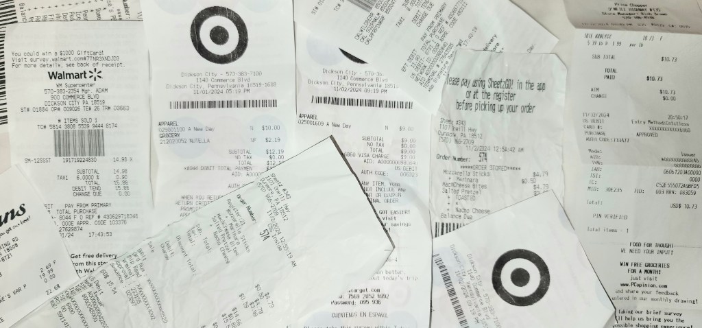
The first step for the canvas was to cover it with receipts. Using matte medium as an adhesive, I arranged receipts collected from friends and family across the surface. Once that layer was complete, I sketched the egg carton in chalk and began applying paint. As I’ve been studying Wayne Thiebaud, I’ve focused on paying close attention to light and shadow shapes. These elements are essential for creating the illusion of form and for experimenting with color. In this photo, you can see that as I painted, I continued layering receipts on top, building depth and texture.
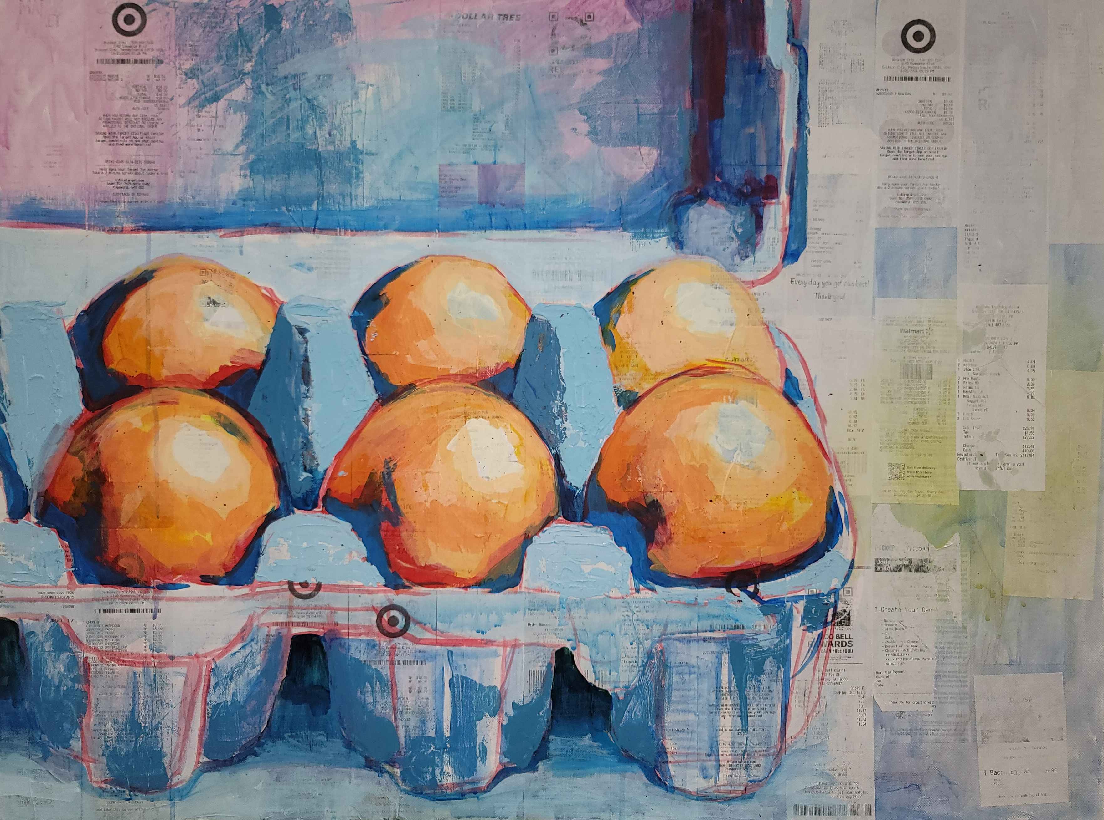
Here’s the most recent version of the painting. The colors have become bolder, with higher contrast. Since the earlier version, I covered the entire canvas again with receipts, nearly obscuring the previous painting and leaving only small gaps or glimpses of it visible. To redefine the egg carton, I used red paint to re-outline the shapes and then continued painting. On this layer, I started experimenting with texture, aiming to capture the rugged feel of the egg carton. To achieve this, I mixed acrylic paint with gel medium and calcium carbonate, creating a thick, impasto-like paint that I applied with a palette knife.
This piece is still a work in progress. I’m continuing to develop these ideas, focusing on enhancing light and shadow while experimenting with color, much like the Pop Artists I’ve been studying.
Thanks for reading. ~McKenna