

At the MET, I briefly saw a 20th century advertisement for a Venetian Jeweler. I was very intrigued to see the coloring and decorative nature of this poster compared to contemporary posters, which from what I’ve seen are amazing but show less detail than older posters do. 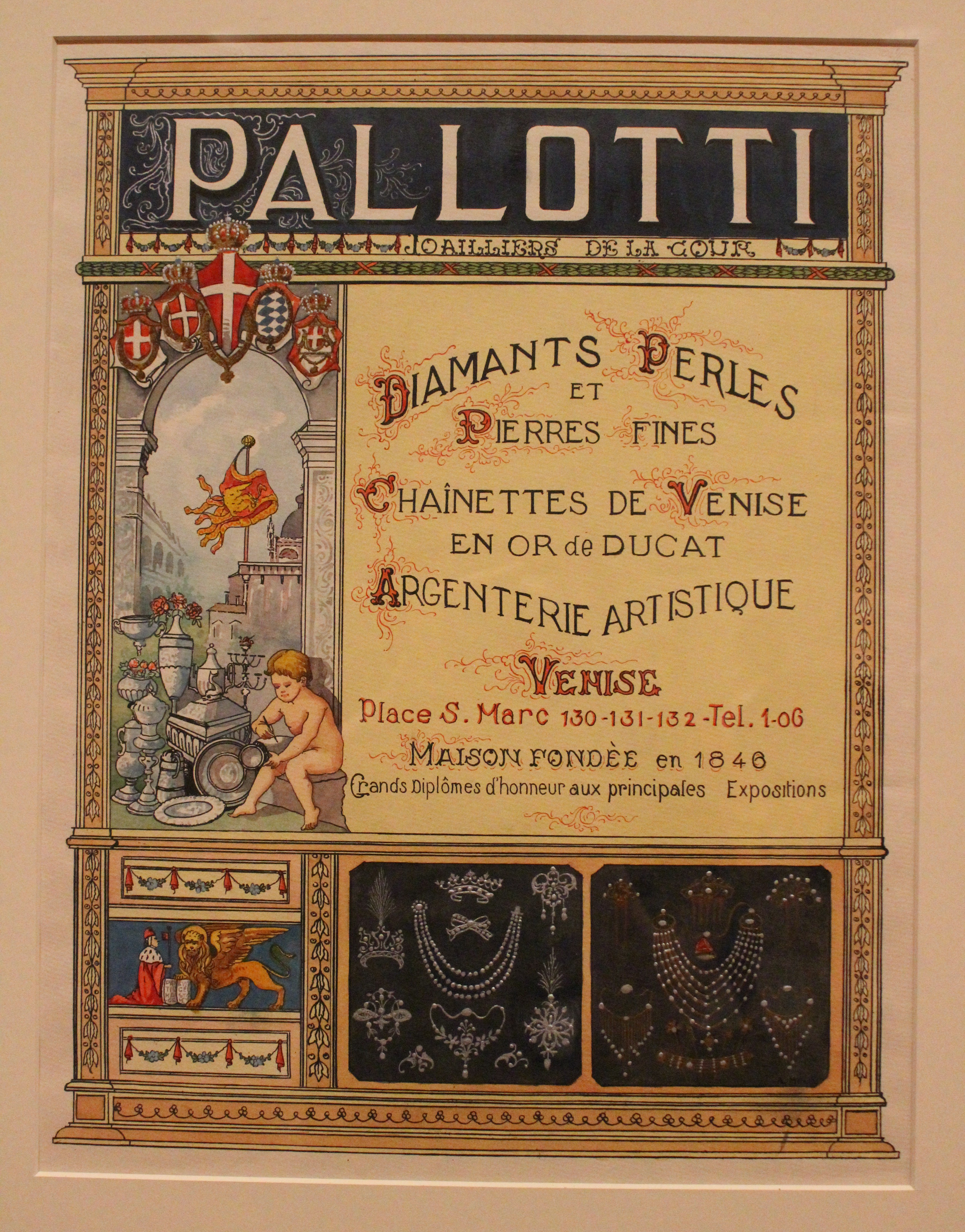

I enjoy the precise details that are included in this poster. Everything is colorful, and the colors work with each other. Additionally, the typography is beautiful.
I looked up a modern day jeweler’s poster and one example I found was this:


Image from Dora
This is a more specific type of poster, focusing on just men’s wedding rings from Dora but you can see the difference. A majority of the posters we have now are a lot more simple and to the point. They capture our attention by being easy to understand. Plus, the technology we have now allows us to create interesting and unique designs that are more difficult to capture through hand drawing.
Personally, I prefer the older version of advertisement, especially from the 19th and 20th century. They have a more personal touch, especially because many of them are handmade and show extensive details. Today there are some posters that are like this, being handmade and personal, but more often than not they are digitally made to be created in large qualities and quickly distributed to get the idea and products across.