

Infographics have been used for centuries to make complex information more accessible. Today, infographics blend data to tell stories quickly and clearly. Weather explaining social issue, breaking down scientific data, or guiding viewers though timelines, infographics help people absorb information at a glance. They do this by combining text images, and layout in a purposeful, visually engaging way.
I actually was tasked with creating an infographic for two different classes. One was for my Intro to Graphic design class, and the other for my Motion Graphics class.
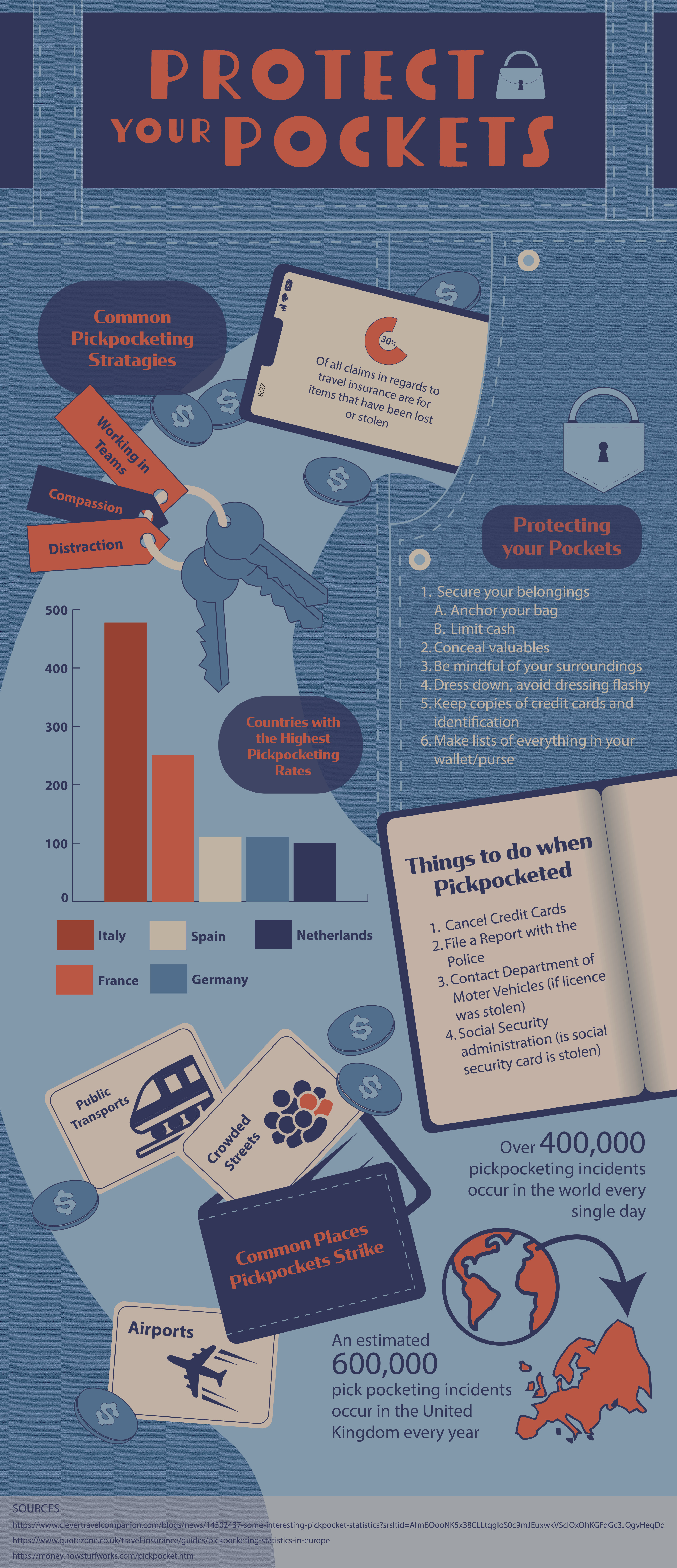
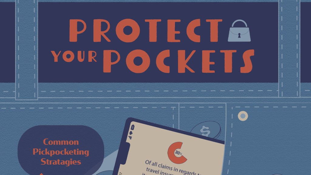
For my Intro to Graphic Design infographic I was actually inspired to chose to make the topic about pickpocketing by one of my roommates. We had been talking about places that we wished to travel to, and she brought up concern for being targeted and having stuff stolen from her while traveling. So I decided to make an infographic target towards people who were traveling. To start, I wanted the information and items to look as if they were falling out of a pocket. And I added an organic curved shape to reinforce that movement and draw the eye through the graphic. Formatting and arranging the information was the most challenging aspect of this project for me. I had difficulty trying to find a balance between all of the components of the design. But with a lot of experimentation I eventually landed on a layout that I was satisfied with. For a finishing touch I added some coins around the graphic to fill in the more awkward spaces between the bits on information. But I matched their colors to the background so they would’t distract the viewer too much.

For my Motion Graphics Infographic I chose to make the topic about chess. This was actually a discarded brainstormed option from my Intro to Graphic Design class. But I’m glad I got to explore it in motion graphics because I think it was a better topic for an infographic more reliant on animation. I stuck with a classic black and white color scheme to stay true to the topic of chess, and purposefully chose to arrange the grid of the chess board at an angle to make the composition more dynamic. I was heavily inspired by the look online chess and thought that having chess pieces moving on and off the screen would be a fun way to pay homage to the game. I also liked the idea of the pieces interacting with the text, and used them to help me map out the process of bring the information on and off screen. If I were to do it again I think I would allow a bit more time for each fact to rest on the screen so that people would have more time to read. But otherwise I’m very happy with how it came out!
Overall I really enjoyed this experience, and I’m happy with the end product of both projects. I especially appreciated the experience of looking at the same problem (needing to display information to an onlooker in an easily digestible way) from different perspectives. For my Intro to Graphic design infographic I was more focused on layout and balance, using color and contrast to call attention to different parts of the graphic to help guide the audience. But with my Motion Graphics infographic I was more focused on figuring out ways to use motion to bring and divert attention to the different bit of information I included. I’ll definitely consider both perspectives in future projects, but I challenge you guys to think back on projects and consider how you might approach them differently if they were assigned in different classes.
Thanks for reading!
Emma <3