


For the final project for my web design class we had to make some professional social media accounts. Instagram, Behance and LinkedIn. I already had a linkedin, so that was easy. Then for Instagram and behance I had to create my own brand image. The first, and for me the hardest, thing to do was make a choice on a color scheme. This literally took me days. I have a hard time thinking of good color schemes from the top of my head. So I took to my pintrest and my instagram saved posts.
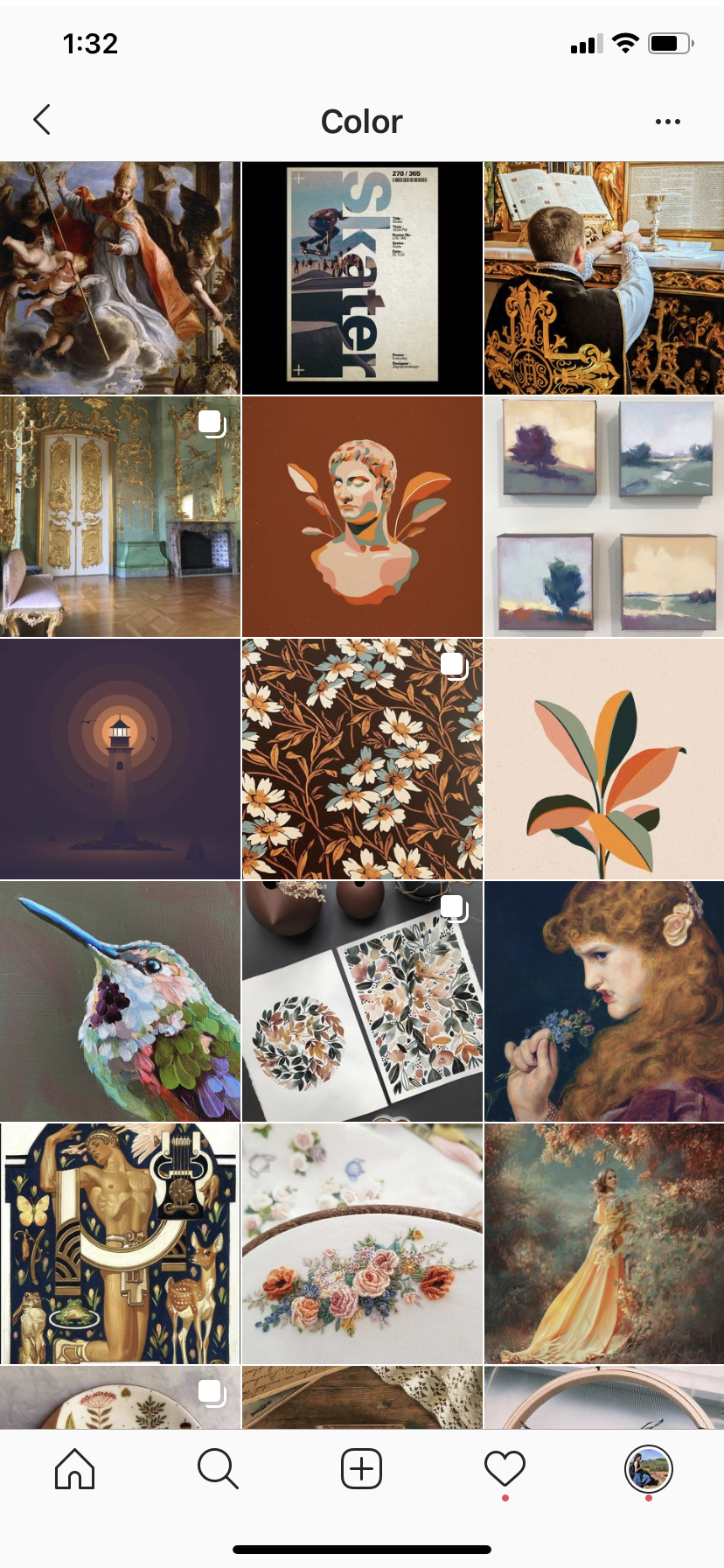
These are just some of the best color schemes, I just love them. But, the one I chose isn’t exactly like any of these. I went for a two toned bluish-gray, with the golden accent. From there it was a lot easier, I just made a layout, chose a nice big block font, added a repeated element of a frame, and stuck on my logo. I wanted there to be a flow and recognizable pattern to follow and to make it all cohesive. I did the light, dark, light for the background colors, and moved the layout every new post to keep the eyes moving. The set up for each post is a thumbnail in the frame on the first page, then scroll over for a closer look at each piece.
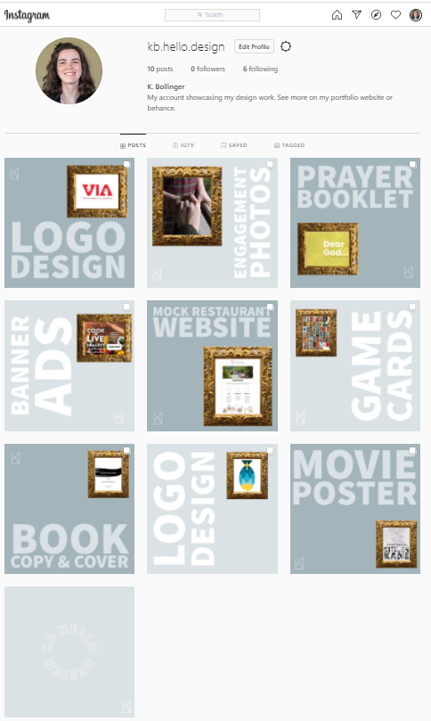
Overall, I am quite pleased with how the look came out, I wanted it to look serious, but interesting and I do think I achieved that. Everyone can check out my insta @kb.hello.design as well as my portfolio site: https://bollingerk.myportfolio.com