


“I think, therefore I am.”
These are the words spoken famous philosopher and mathematician, René Descartes. For Descartes, this means simply as it appears: an individual can know that they exist, by the mere fact that they think.
As a young philosophy student, Descartes’ idea is one that I was first introduced to in my very first philosophy class. Although there certainly are some interesting and problematic consequences of Cartesian dualism, this statement is a mantra that has drawn me. The phrase has taken on more meaning then Descartes’s explanation of mind and body, and has become a reminder that I am what I think I am. Yes, I “am” because I think…. as Descartes intended. However, I am also all of the things that I think of myself. What I believe, what I do, what I say about myself all shape the limits and extents to who I can be. If I think I am a good artist, I will continue to grow… but if I believe I will never be a good artist, well… I’ve placed a limit on myself.
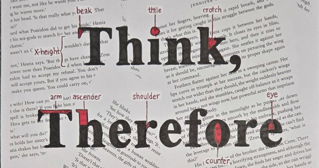
Because I have thought so much about this phrase of Descartes, it has made its way into a lot of my art. For my Introduction to Typography class, I have just finished my very first piece: The Anatomy of Type.
For this project, we were tasked to create a typographic image, by hand, with a phrase or word. We were to use a well-known typeface, and to label at least 15 different parts of a character/typographic term. I knew, almost immediately, that I wanted to choose this quote of Descartes.
For the design, I knew I wanted a more studious design. For me, there are a lot of different ways I find myself informed on philosophy. Of course, lived experience is the foundation from which my beliefs spring. I am well aware that I have biases that influence what ethical theories I adopt, how I understand metaphysics, or even how I understand the philosophy of art itself. However, I find that the experiences, thoughts, and ponderings of others are just as important in maintaining my philosophical viewpoint of the world. Part of what informs me on these outside ideas, is books. I have thoroughly enjoyed books like Oscar Wilde’s “The Picture of Dorian Gray,” and J. R. R. Tolkien’s “The Lord of the Rings,” for their outlooks on life. Wilde’s novel is perhaps a bit more on the nose about what kind of life a person should lead, but Tolkien’s stories also reflect a unique view of brotherhood that comes from a direct consequence of serving in World War I. Even now, “White Nights” by Fyodor Dostoevsky is on my TBR, for the very same reason. I digress. My point is: books, no matter how old or new, philosophical or fun, have given me a window into other people’s philosophies.
Because books are so important to that core of philosophy, at least to me, I wanted to include them in my design. I ended up deciding that I wanted to have pages of a book as the background behind my type.
Once I had my idea, after many thumbnail sketches, I started putting together some supplies and working out some mockups. I went with Times New Roman for my typeface, as I felt that it mimicked the feel of a book and academic papers. I looked at a lot of different ways of arranging the type, but ultimately settled on a one-word-per-line design. I also tried to balance my typographic terms so that they were not all on one line. Next, I bought a book that I ripped apart from the Dollar Store, and I made some scans of some scattered pages. I would have preferred to do the typography directly on top of the book pages themselves, but with this being my very first typography assignment, I was nervous to try something so bold. Furthermore, I had to consider legibility. The book pages, in my opinion, were so dark in color that my typography would blend in. Furthermore, the type on the book pages itself was too matchy-matchy with my typography. If I could scan in my pages, then I could lighten them up in Photoshop and improve legibility.


As you can see from the mockups, I did play around with the tone of the pages. As much as I wanted legibility, I really would have preferred to use the actual pages, or at least a darker toned page, just for the aesthetic of old books. However, I do think I lost too much legibility, so I ended up going with the second mockup, which has the lighter background.
Even though I did lose some of the old-timey aesthetic I had wanted, I did score in the application of the typography. Because this project had to be done by hand, I had to print out my scan of just the books pages, print out an image of the typography, and trace. (I checked with our professor to make sure this was okay, and it was). Because I got to use a single sheet of paper as opposed to the scattered stack of book pages, it fortunately worked really well on the lightbox. I traced my typography very easily, without the hassle of tracing paper. I spent a good amount of time in the art building, vibing to my playlist, just tracing letters.
From there, all I had left was to fill in the letters. I used a fine liner to work through the black, and then a red sharpie for the anatomical parts of the drawing. I did run into one more problem: my anatomical terms were hard to read on the scanned pages. Truthfully, this was something I had worried about the entire time, but had been praying that I was overthinking. In the end, I decided to use a white pen to essentially white out the background behind each anatomical term. I was a little nervous that this would look awful, but I actually don’t think it is too noticeable, and even when you can see the boxes of white, I think it does not distract from the overall piece.

Overall, I am pretty happy with how this project came together. For my first time working with typography seriously, I don’t think it is a half-bad attempt. If I were to do this project again, I would want to try to find a way to incorporate the book pages as they are, instead of the scans I used here. I would also buy a book that is more on theme for the project. At the time, I was looking for a cheap way to achieve the look I wanted. However, I feel that the design would have been more effective if the background had philosophical musings, rather than the love story of some ancient Greek Gods. (At least, that’s what it looked like to me; I haven’t actually read this book before).
So there you have it… I Think, Therefore I Am.
What do you think? How do you incorporate your own beliefs, ideas, philosophies into your art? I would love to hear about it!
Until next time!
-Rebecca Prowse