Why La Croix is out, but Polar is in
I’m a big fan of seltzer water. In fact, I think I can wholeheartedly assert that because of the unending thirst for seltzer that my roommate and I both share, GIANT expanded the amount of seltzer they carry over the course of the pandemic. The La Croix section is always fully stocked now… phew. However, I realized something as I was pounding can after can of the sweet sparkly liquid… La Croix’s branding and design is absolutely horrendous. For what is often considered the most elite brand of seltzer, you would think they would choose a more chic, minimalist approach. This week I thought it would be fun to rank the designs of my favorite brands in order of worst-to-best.
4. La Croix

La Croix is easily the best seltzer out there by a large margin. Nothing hits quite like the velvety smooth carbonation that imbues the flavor to create an experience that has ascended above the simple pleasures of humanity. However, their design is lacking in so many ways… ah it could be the perfect beverage otherwise. The typographical choices for the design are supremely tacky (although I must admit, it is somewhat charming). The color choices for the cans are strong, however the logo typography does little to harmonize with the rest of the text on the can. Overall, the typography is really what holds this design back. Fun fact, La Croix is owned by Faygo, the same company that is famous for their association with Juggalos.
3. Bubly
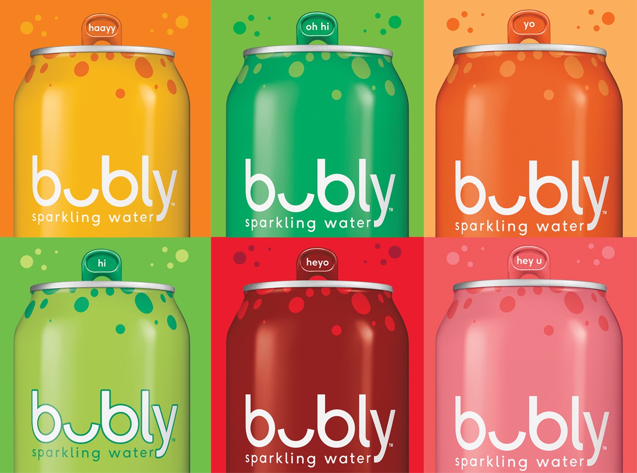
Bubly is ok. Mediocre at best, but manages to capture a more soda-like flavor than its competitors. However, it lacks any specific distinguashable seltzer-like qualities. It excels in flavor but not in the texture of its carbonation. The design thrives in it’s minimalism and creative logo that looks like a face, however it’s color schemes are unmemorable and it’s visual aesthetic is not discernible from a distance. Unlike other brands, it is less recognizable, and therefore likely to be less iconic. This is my own personal gripe, but the highly minimalist logo screams corporate design to me… something that I find exceptionally boring. This is no surprise, as the brand is a direct subsidiary of Pepsi (as if any of these brands don’t have a menacing parent company controlling them).
2. Spindrift
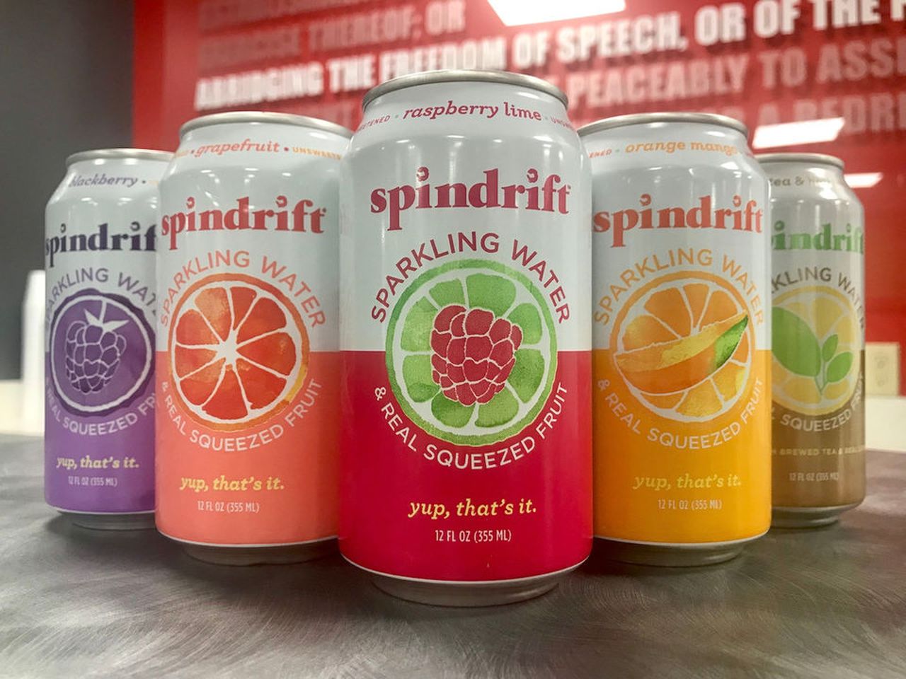
Spindrift is going to be your best choice if you’re looking to make a change in your seltzer game. It is made from actual squeezed fruit, and by extension, is somewhat pulpy in its liquid qualities. Unique for sure, but expensive, making it an “occasion” seltzer for me. Their design is as strong as their flavor. It is bold and recognizable, and has a strong useage of cohesive typography. The lowercase logo is fun and gives the design a relaxing energy which is coupled by the wash-like quality of the illustration colors. The watercolor elements of the design compliment the light nature of the drink and the strong and flat use of color outside of the illustration makes it pop even more.
1. Polar
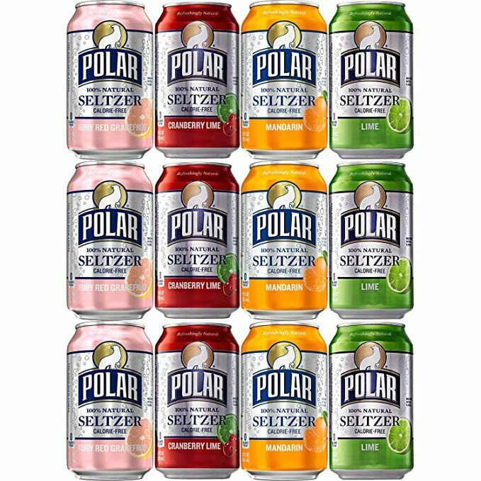
Polar is the king of fizz. It combines the wonderful flavor of La Croix with it’s own unique bite on the gulp. However, the only reason why it’s not my favorite is that I’m not always looking for that carbonated stiffness. Let’s talk about the design, though. Not only are the cans extremely recognizable in both their brand and flavor, but the polar logo itself stands as an absolute testament to the strength of simplicity in design. It is with good reason that the typography curves upwards, it gives a more hill-like effect for the polar bear to stand on. The use of shapes is incredibly strong and the circle that surrounds acts as an element of nature, as though the circle represents the sun rising or setting behind the bear. The typography is tasteful and simple, and overall, this design works to create a proper expectation for what you are about to enjoy.