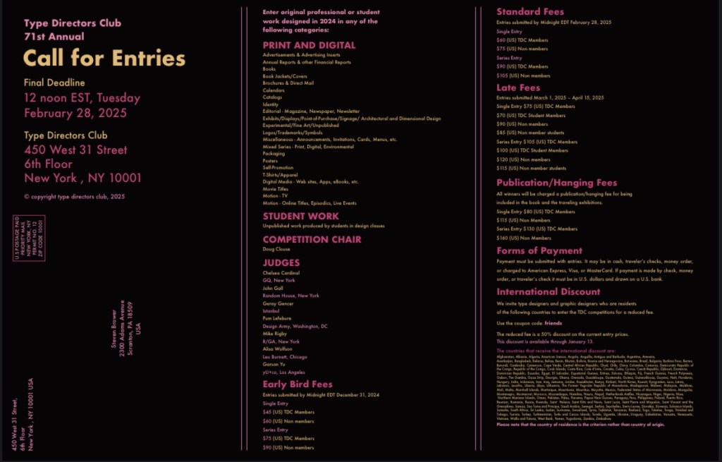
I had gotten a chance in my Digital Conceptual Design class to create a design for a call to action mailer and thought it would be fun to share here because I really liked how it came out. This call for action was for the Type Directors Club [editor’s note: TDC is “a global community united by the shared belief that type drives culture and culture drives type.”] which I thought was so cool to imagine myself actually designing for them because designers from all over the world see work for TDC. I will admit that I was a bit intimidated by this project at first because when it comes to printing and measurements I can be a bit technically challenged and tend to overthink it, so I decided to go with a simple fold and mailing design in order to focus on the design aspect of the project.
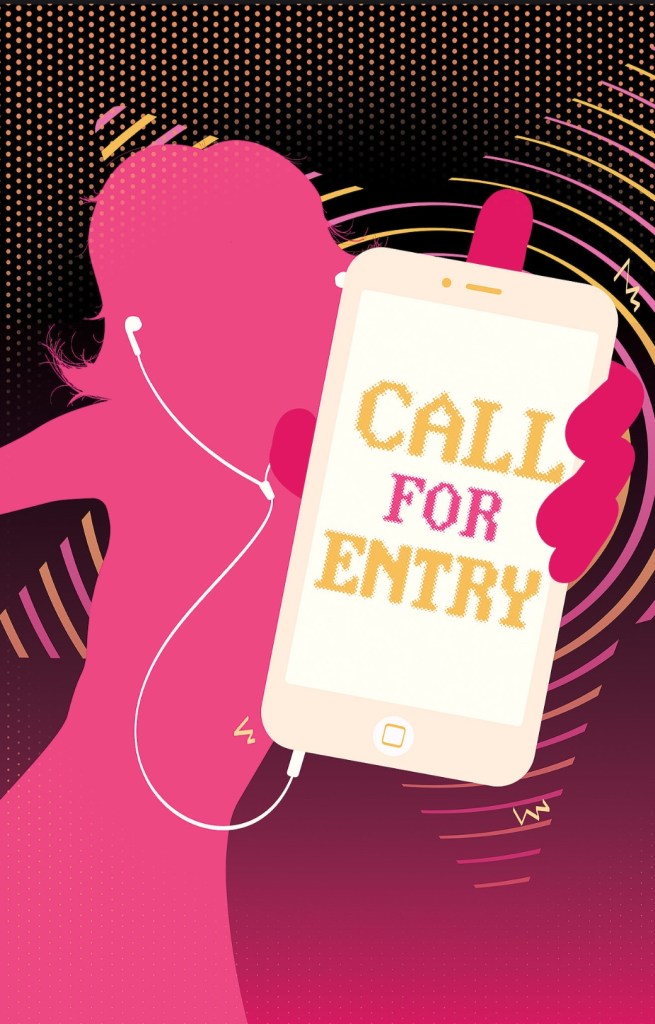
I like to go for a specific vibe when designing something, so I made a moodboard and decided I wanted to try and emulate a 2000’s frutiger metro style, similar to the old iPod commercials that apple came out with. I also choose Futura as my main font because it is one of my absolute favorites, and think it was fitting for this project. I also had found another really cool font online that looked pixelated, and really wanted to use it for the entire mailer but it was not letting me export the file with it on InDesign because of copyright issues. I decided to just use it for the front cover so that it appeared to be on the phone screen. I started off with my illustration on the back of the mailer which can serve as a poster to be displayed after someone would read up on the information. It took an embarrassingly long amount of time for me to finish the poster side because I wanted to get the figures hair and pose perfect, and decided to do each stroke of hair individually. I really love how this mailer came out and think I was able to capture the style I was going for in a nice and clean way, and would love to hear any feedback anyone might have! 🙂