Howdy!
Recently, I’ve spent a lot of time scrolling through Instagram and looking at art from some of my favorite art accounts. I would look at my pieces, look at theirs, look at mine, and then look at theirs again. I started noticing a trend that the art pieces I really enjoyed all had amazing color theory and a nice harmony and contrast. Motivated by looking at art that I enjoyed, I quickly sketched up a piece and worked on it for about an hour and a half.
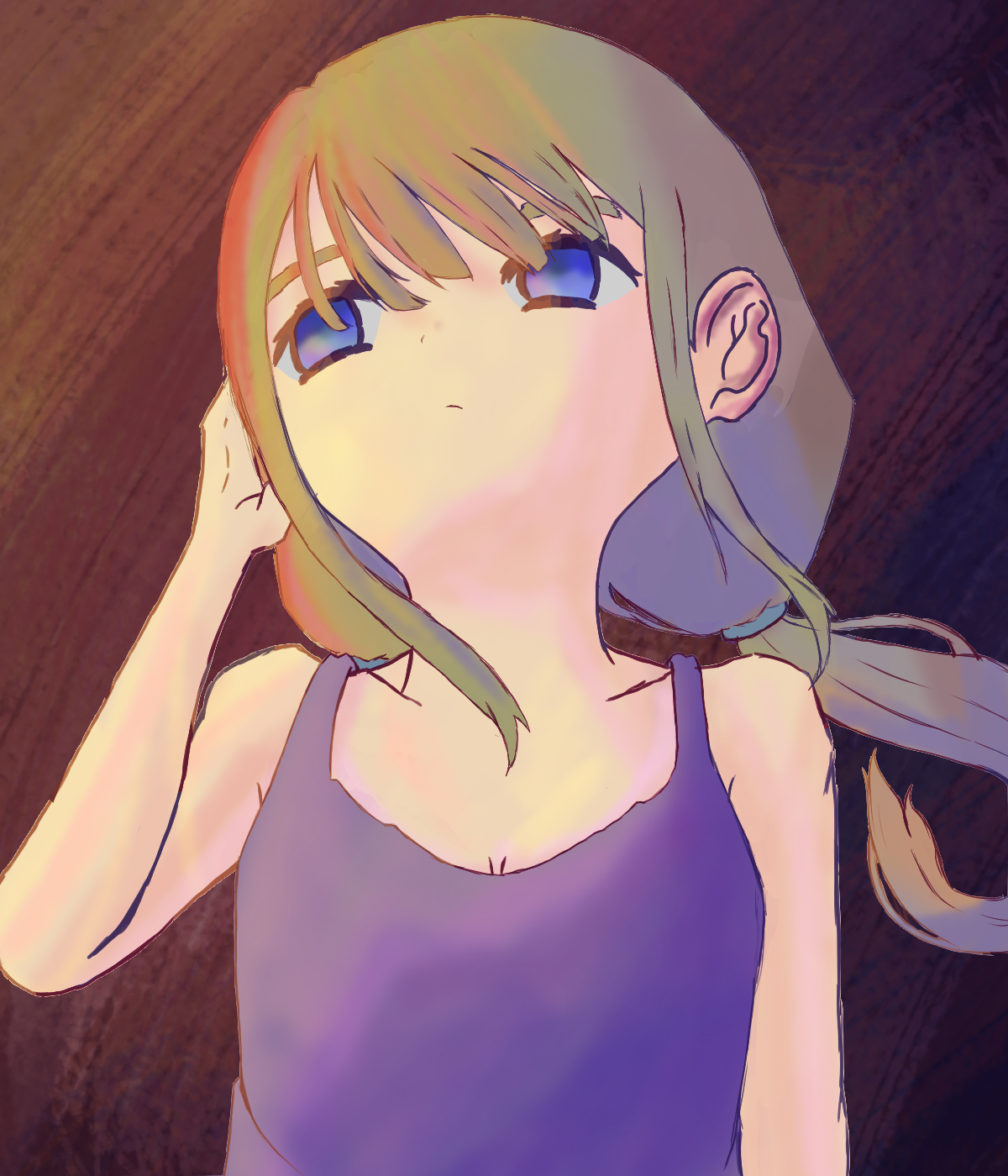
My main goal when working on this piece was establishing a clear light source and then figuring out how the light would hit the body. I stuck to using three colors for the lighting: red, orange, and yellow. These are the most “sun-like” colors I can think of. To contrast them, I kept the shading colors to using blues and purples. For both the shadows and lights, I stuck to using an overlay layer and I think all together, everything works nicely.
Happy with how this piece turned out, I started going through some of my older works to look for something I could improve.
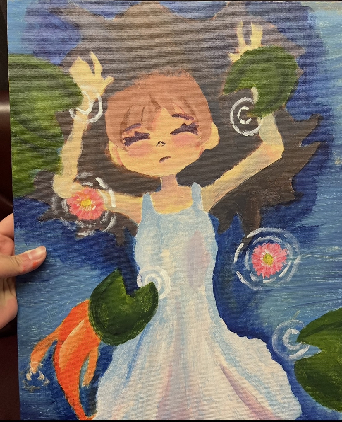
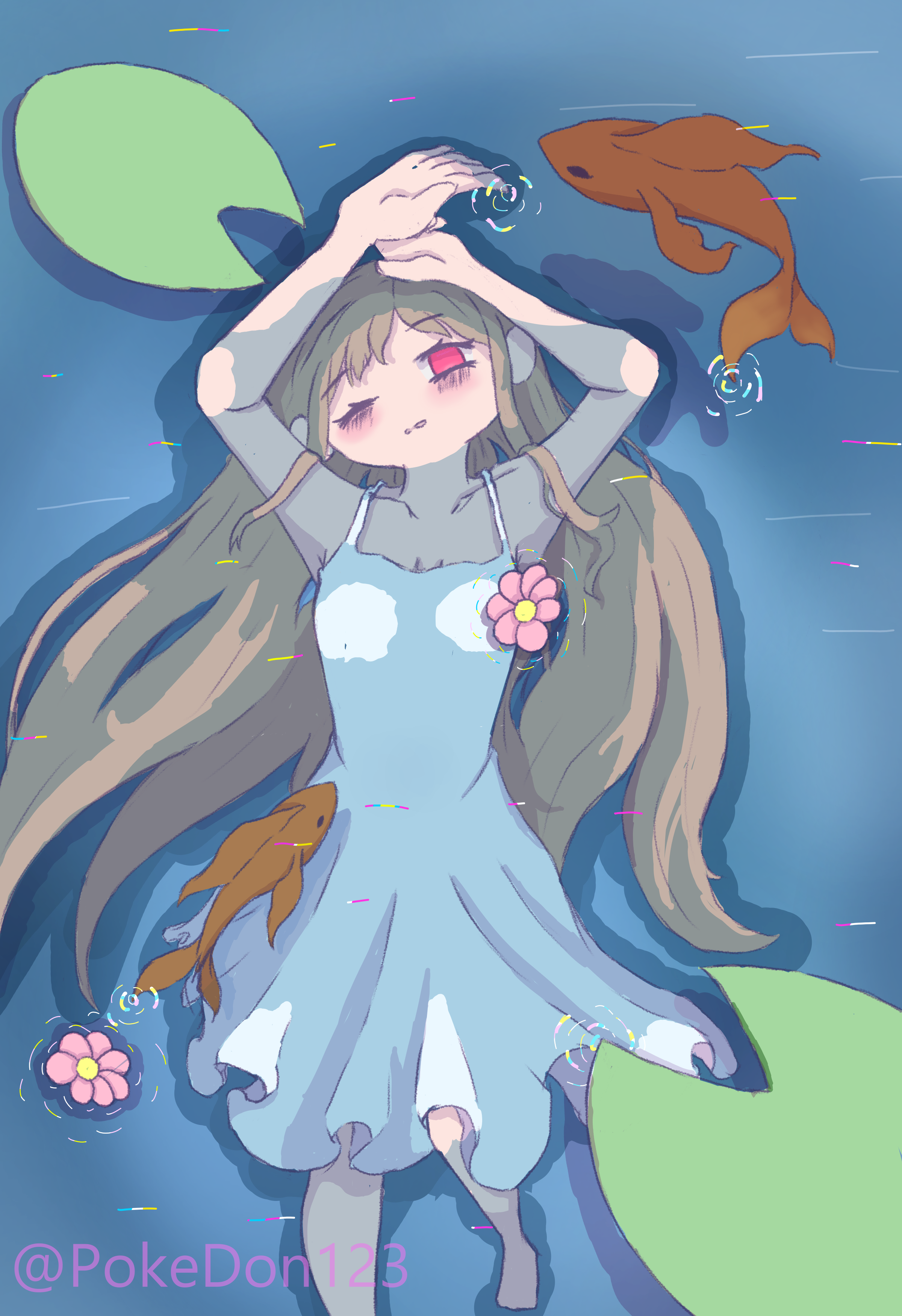
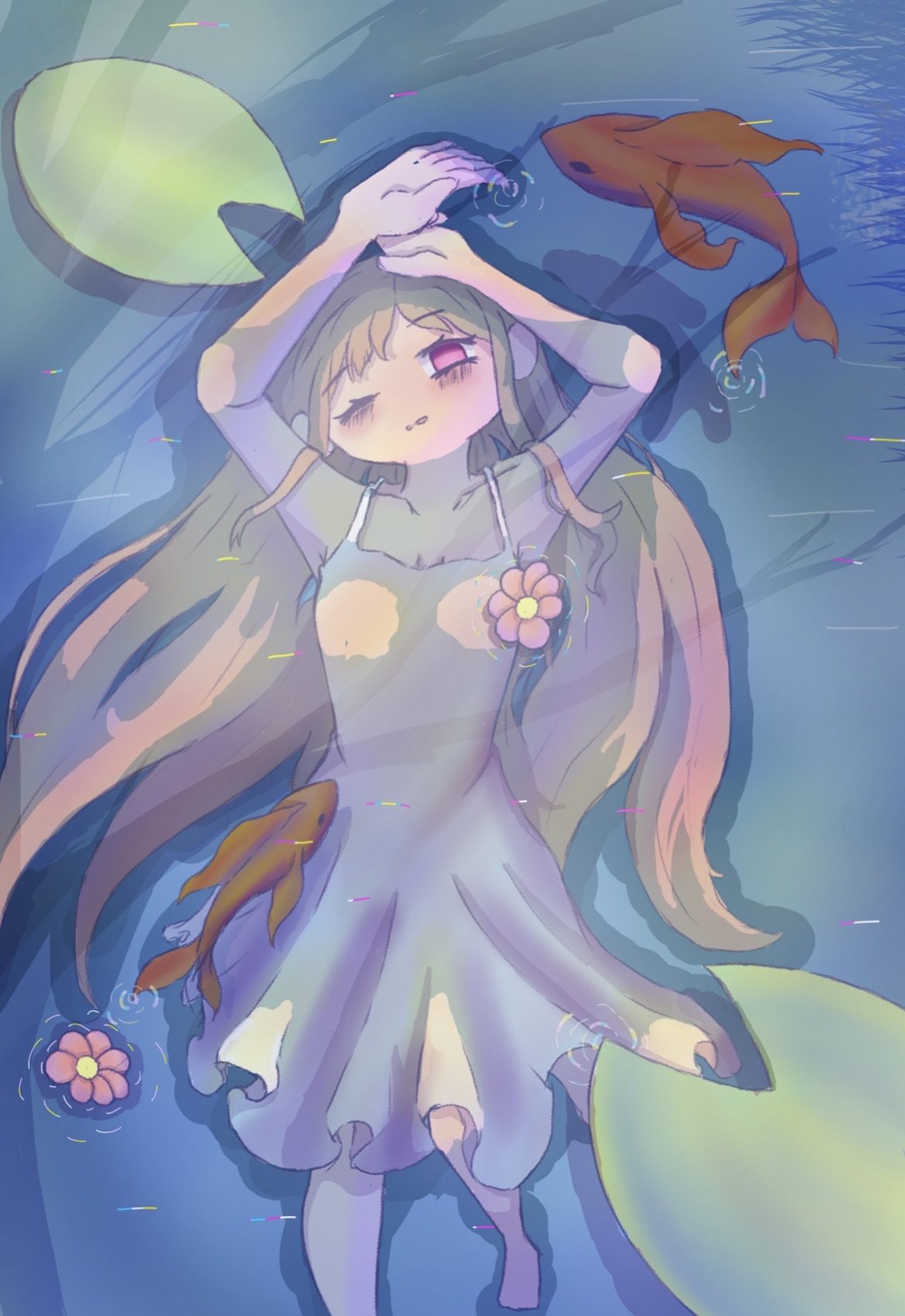
When going through past works, I found this redraw I did of when I painted Ophelia from Hamlet.
The painting on the left I did in March 2025 after reading Hamlet. The redraw in the middle was done December 2025, and the one on the right was done March 2026. I never expected to actually finish the middle one and had been content with it for awhile. I simply saw that I could make improvements on it, so that is what I did. Like the previous drawing I used yellow, red, orange, blue, and purple for lights and shadows. I also added the shadow of a tree and some grass because I wanted to give the drawing more depth and to try and make it feel more real.
I’m glad I decided to finish this piece as it has easily become my favorite thing I’ve done and it motivates me to want to make more pieces like it. (Especially ones where it will involve water in some way.)
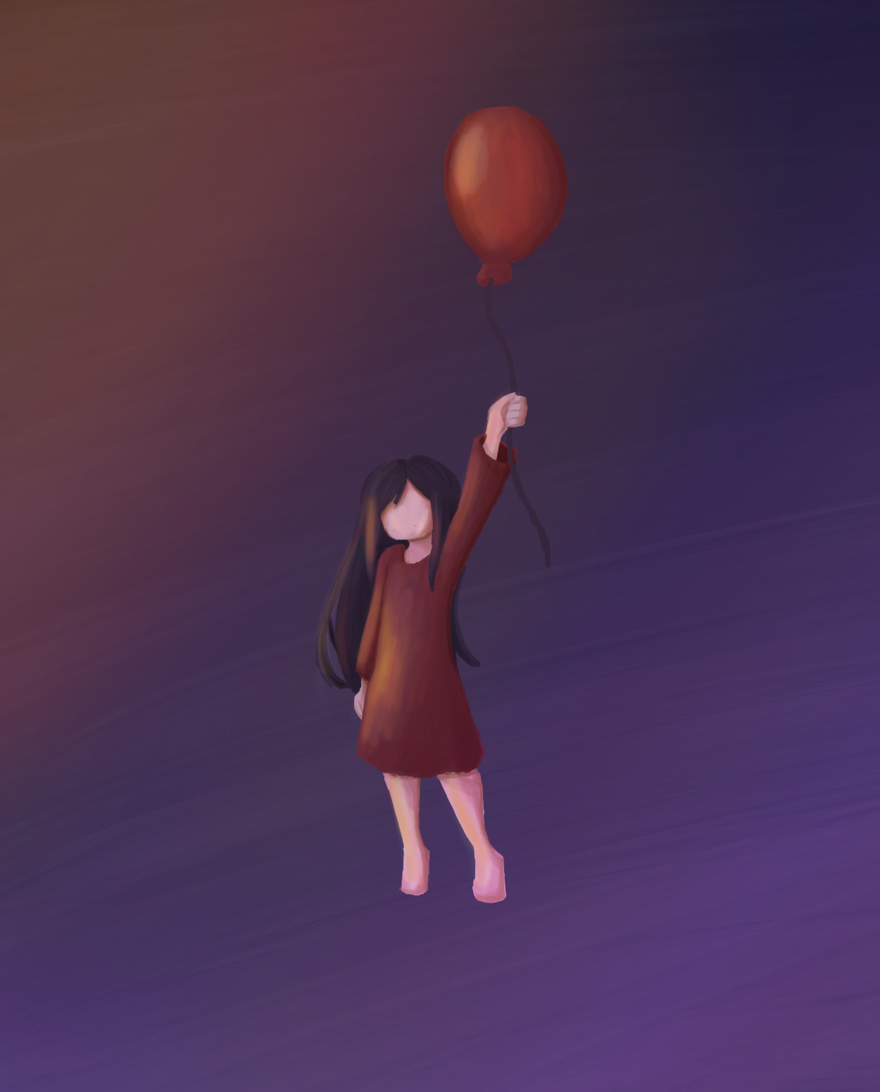
For this next piece, I wanted to create contrast using the red of the shirt and balloon, and the purple and blue of the sky. I once again thought about lighting and how a setting sun might cast light on something in the sky.
I’ve always enjoyed color theory and for many of my older works, it’s something that I didn’t give much thought and did subconsciously. Moving forward, however, I’m going to give it a more conscious thought so I can make my works even better.
Thanks for reading and be sure to look out for my next post!