A fundamental aspect of being a graphic designer is being able to understand the foundational law of visual perception, otherwise known as the ability to discern a relationship between a figure and its ground. The eyes and mind are trained to separate an object (figure) from its surroundings (ground). As designers we need to become aware of how the eyes and brain organize shapes on a surface that allows them to give them meaning. If we can learn to harness this concept, it will make our pieces stronger and more effective in communication.
So the aim for this project was to create an image were all of the elements incorporated serve as both the figure and the ground.
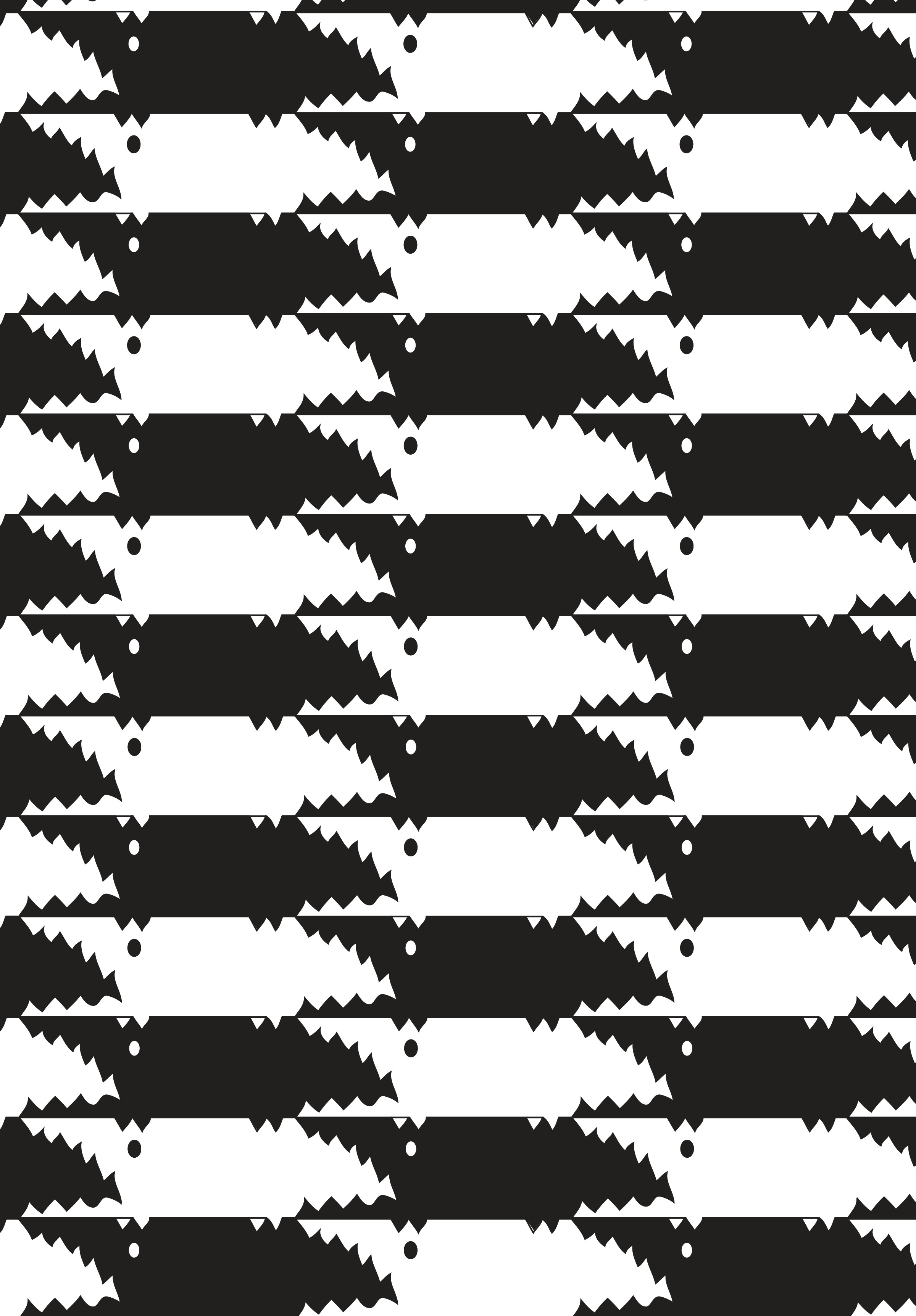
Theres a few ways to go about this task, but my favorites were to create a tessellation, or to create a single image that allowed for the onlooker to switch their perspectives between figure and ground.
To start a tessellation is the calculated juxtaposition of shapes that create a pattern. These shapes should be able to fit together without any space between them, and demonstrate the reversal of figure and ground throughout the pattern.
I used this method as a practice, to experiment and play around with creating an effective figure ground reversal. I came up with two patterns, one involving fish, and the other alligators.

The tessellation were so fun to create and were a great way to prep my brain for the making of my actual assignment. To be honest this assignment was quite the challenge for me, I went through to two different ideas before I came to my final. The first concept was creating an umbrella with a city lining the edge. But I felt that the components didn’t quite solidly serve as both figure and ground. So then I tried an Orca with an ocean silhouette that ran along its belly. But after asking some of my peers to give me feedback on it, I found that It was a bit difficult to read the orca shape effectively.
But luckily third time was the charm, and for my final attempt I created a figure ground reversal consisting of three chess pieces and two opponents staring down each other. This image I found was so much more effective at having the audience transition between the figures of the two men, and the chess pieces than my last attempts.


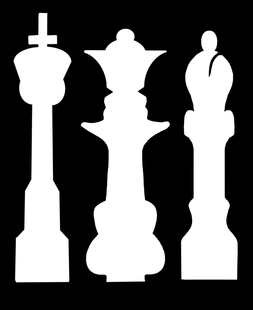
Overall, it was challenging, but I’m really happy with how my end project ended up looking. Although I didn’t end up presenting them in class, I ended up using and learning from the other two attempts I made, which made my final all the more effective. They served as a reminder that it’s ok to make mistakes or not quite hit the mark while going through your creative process! Just keep creating!
Thank you for reading!
Emma 🙂