Lately I’ve been pretty interested in layout and type design, especially after getting accepted to work with Vellichor Literary as a magazine designer. While contemplating what to create for my next blog post, I thought it would be fun to challenge myself to make my own typeface. In this post I’ll walk through my process of making my own typeface in two days.
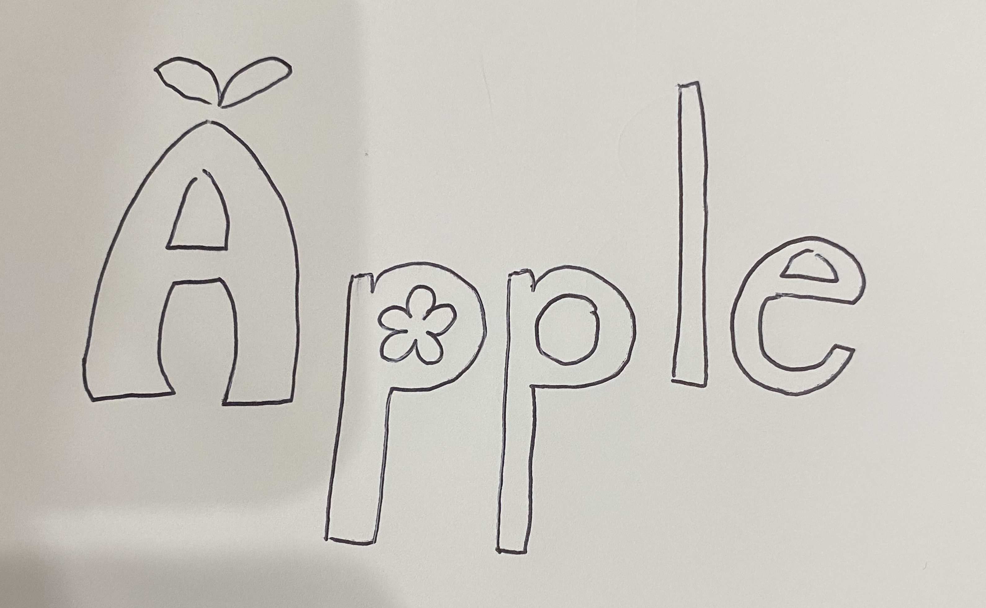
I started by sketching what I would want my typeface to look like. I knew I wanted it to have a garden theme and I wanted to lean into natural yet geometric elements. After my sketch, I figured out what assets I would need before I went into Illustrator. I started by grabbing a free plant svg from Google Icons that I can pull apart and use as my main elements. My uppercase type sketches looked exactly like Hobo Std Medium, so I knew I had a good starting point. I wanted my lowercase type to be clean yet rounded, and I knew searching fonts for hours to find the perfect one wouldn’t be beneficial, so I chose to use Century Gothic to heavily edit. It’s a pretty standard design rule to not alter type, but when you make your own typeface, you make your own rules.
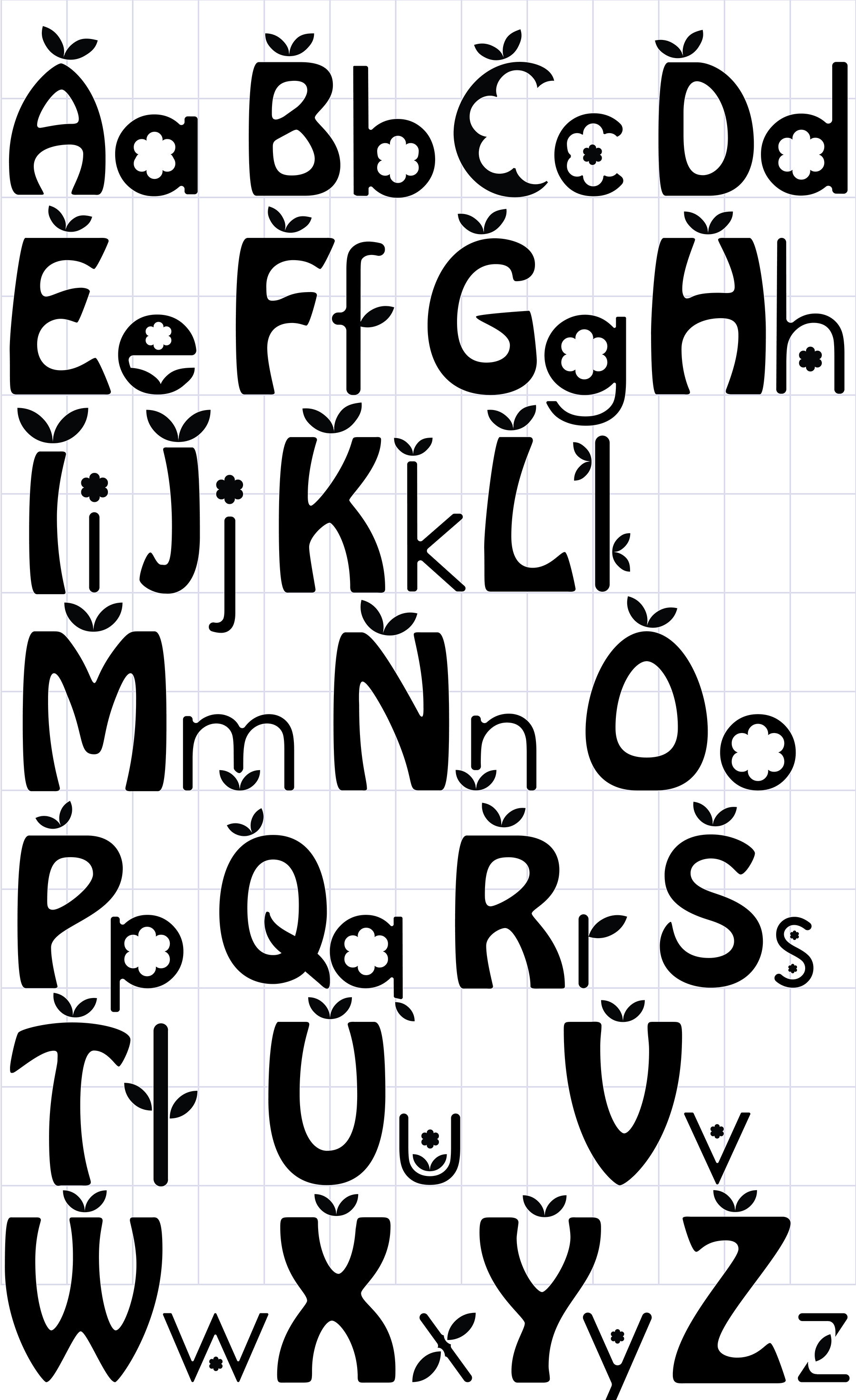
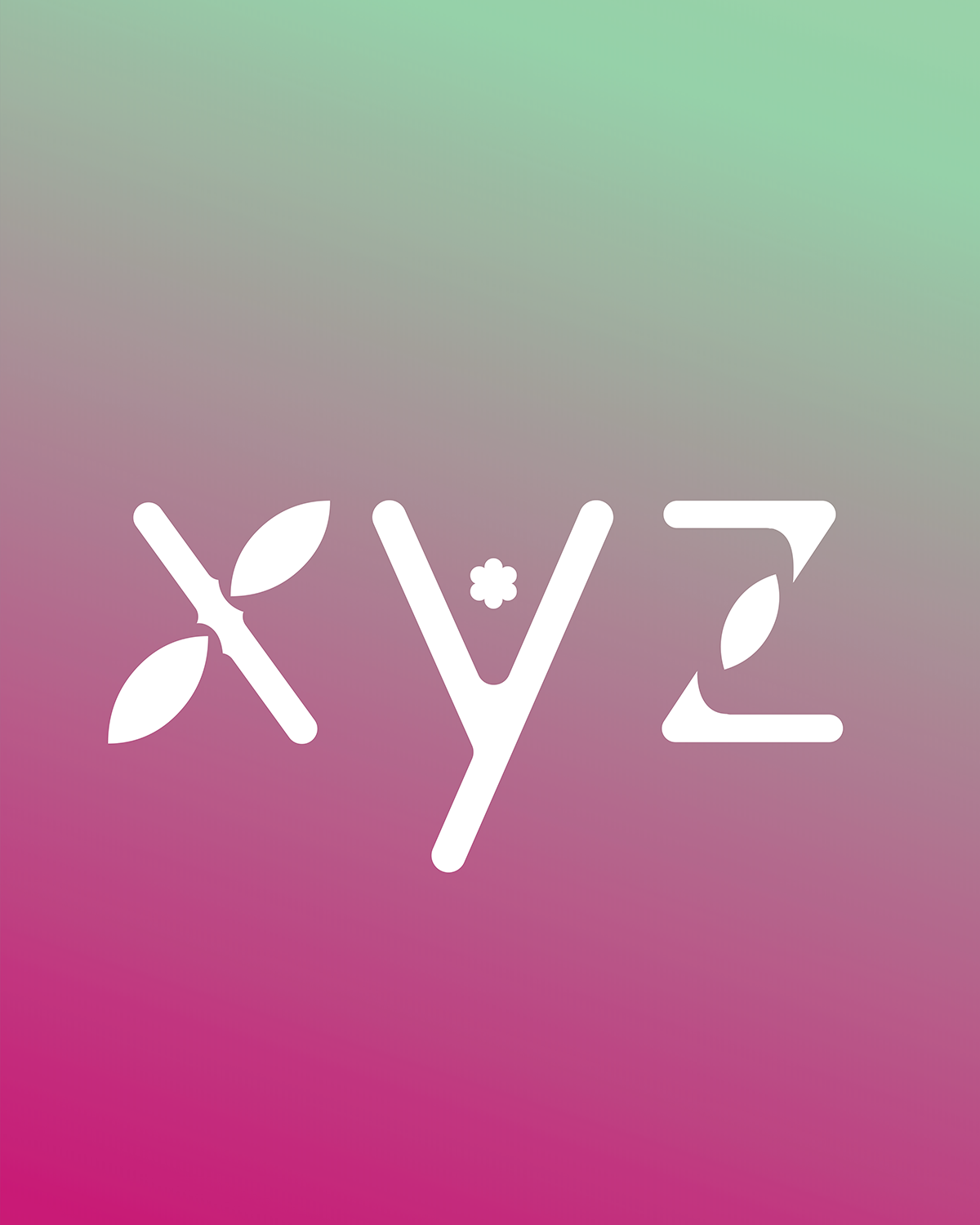

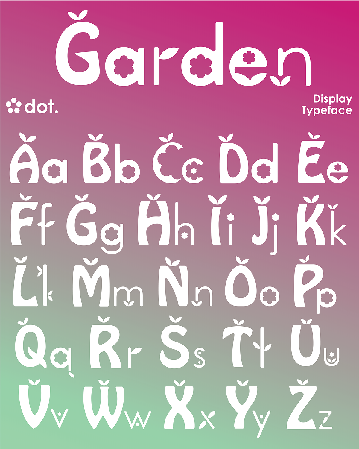
After two days of being glued to my screen, my creation has come to life. Because I did no prior planning other than my sketch and just let my creativity take me letter by letter, I ended up with some pretty interesting results. My favorite letter has to be U, I’m in awe of how I nested everything into the shape and how it looks like a logo. By the time I got to X, Y, and Z, I was feeling quite adventurous and I just let my imagination and my eraser tool go wild.
I definitely want to do something like this again, probably with a little more guidelines instead of me going crazy on Adobe Illustrator. But I’m proud of myself for coming up with an idea and sticking with it, even when I feared my computer was going to crash. My point is, if you have an idea that seems crazy, try it at the very least. It’s so common now for people to rely on generative ai to create something instead of doing some extra work to create in an ethical way. I know drawing isn’t my strong suit, so I love to lean into typography and dissect whatever free assets I can get my hands on to make something. Remixing and sampling is one of the ways art stays alive and keeps reinventing itself.
So make something, it doesn’t have to be making a whole typeface unless that’s really what you want to do. It doesn’t have to be the next Picasso, honestly it doesn’t have to be good. But creating is one of the most human things we can do, and it makes us better. So I leave you with this: take time to create.