Last semester, I experimented with incorporating screen printing into paintings. I found that the final product can be very complex, and the work I’ve made so far using this technique felt very personal to me. Although I’m sure other people have used halftone screen printing on stretched canvas before, it’s something I plan on further integrating into my own art style.
So, I decided to start a new project using the same process of creating an abstracted color field and overlaying a halftone print on top. This time, I’ve decided to plan the next steps digitally using Procreate rather than working directly on the canvas.
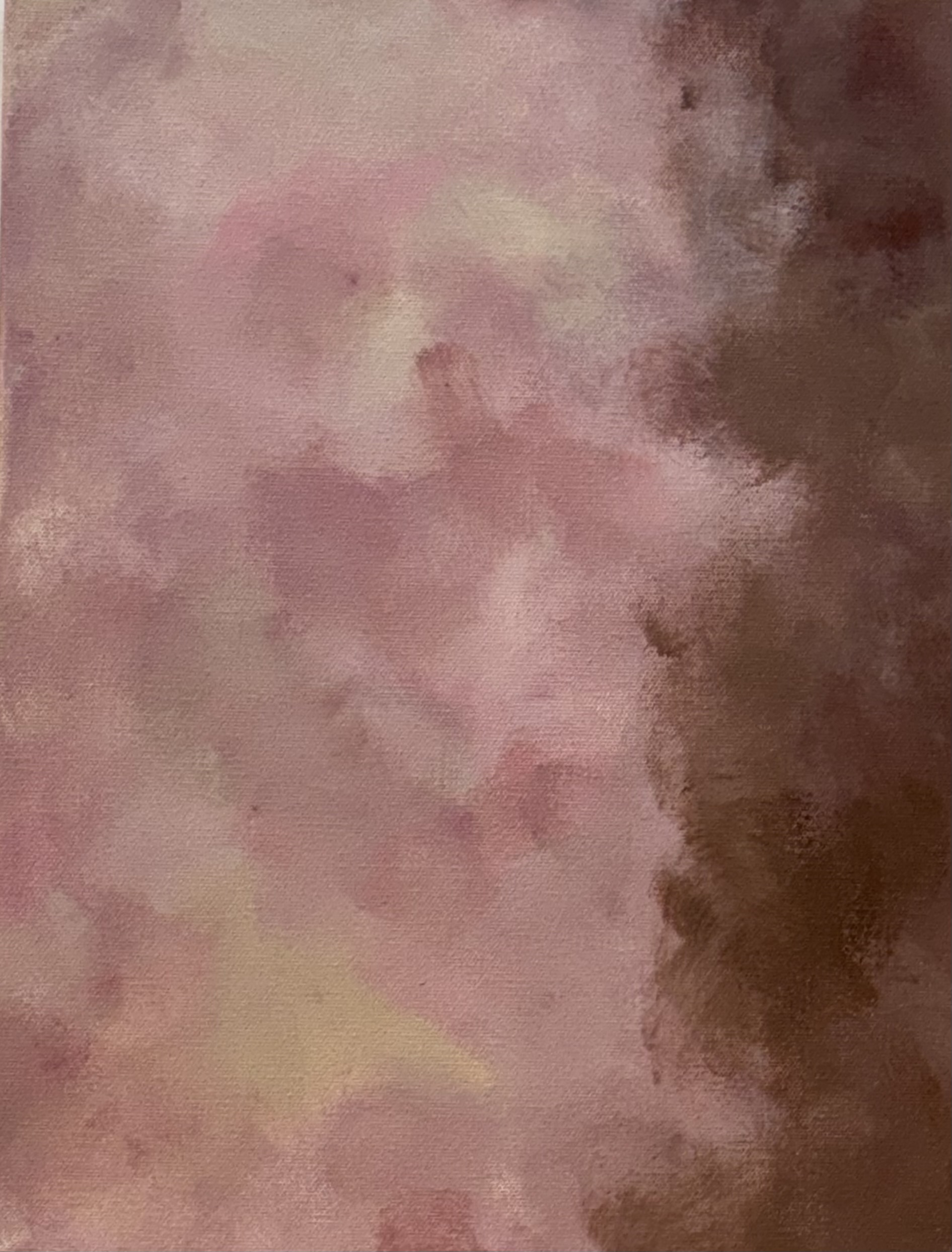


In the above paintings, I normally would have immediately started the next step that I think I should be doing, which would have been going in with the halftone print. However, I instead took these photos of the artworks into Procreate to see if there would be anything for me to add beforehand. I ended up realizing that I wanted to lighten up some areas and add more variation across all three works. Additionally, I was able to map out the ink color I would be using for each variation (see below)! Curious, which of these three is your favorite?


