I’m out here figuratively drawing with my left hand and sculpting with my right… so let’s talk about it!
It seems like every time I try to raise my head above the waters of my assignments, I get a little breath and I’m sucked right back under… I’m hopeful the eye of the storm will reach me soon, and I’ll have a brief moment of respite before diving back in again.
In all this hubbub of assignments, I’m always multitasking. I’ve usually been working on 6 projects simultaneously, or 3 one day, and then 3 more the next. Since I have classes that are both 2D and 3D based, I’m constantly switching “modes” and hopping from one medium to the next.
I’m going to go through three pieces I made and where they stand on the continuum from 2D to 3D
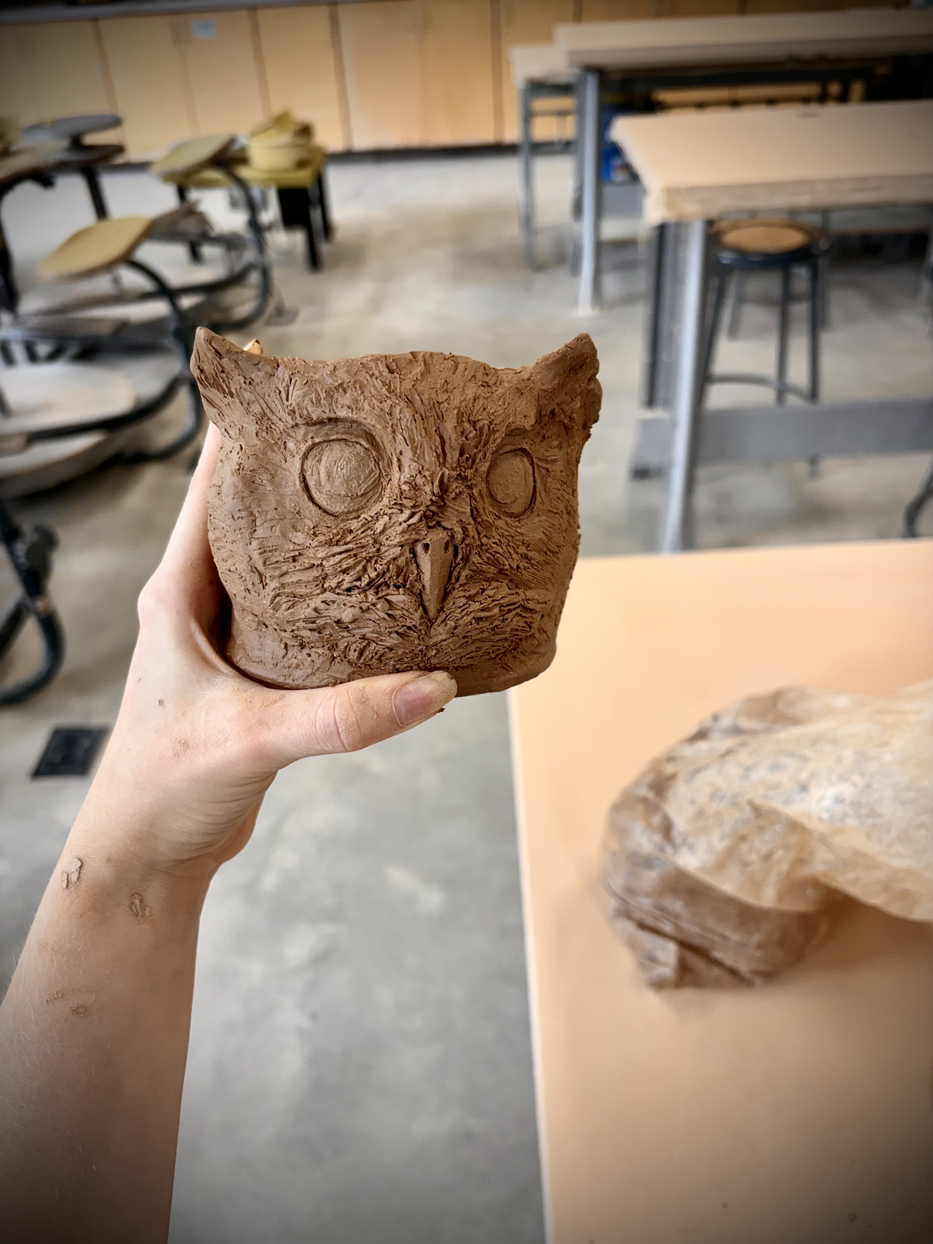
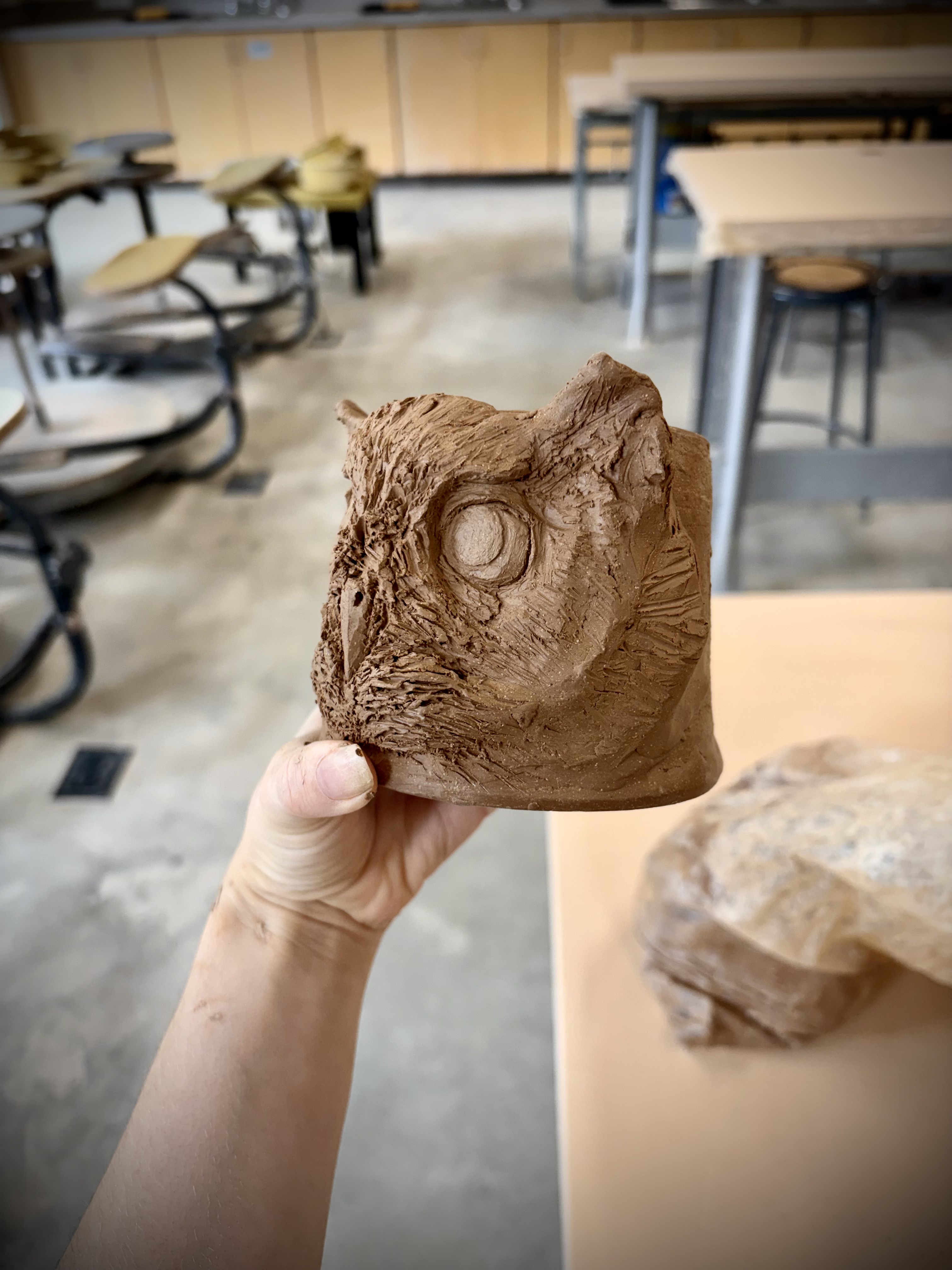
The first piece is wholly 3D. Since I had to practice on the wheel, I kept one of the cylinders to sculpt something fun on top. My grandma wanted an owl pot, so I figured this would be a perfect opportunity. Considering it only took one class to sculpt, I think it turned out pretty nice. I based it on a screech owl, since I heard one by surprise recently, and it was super cool.
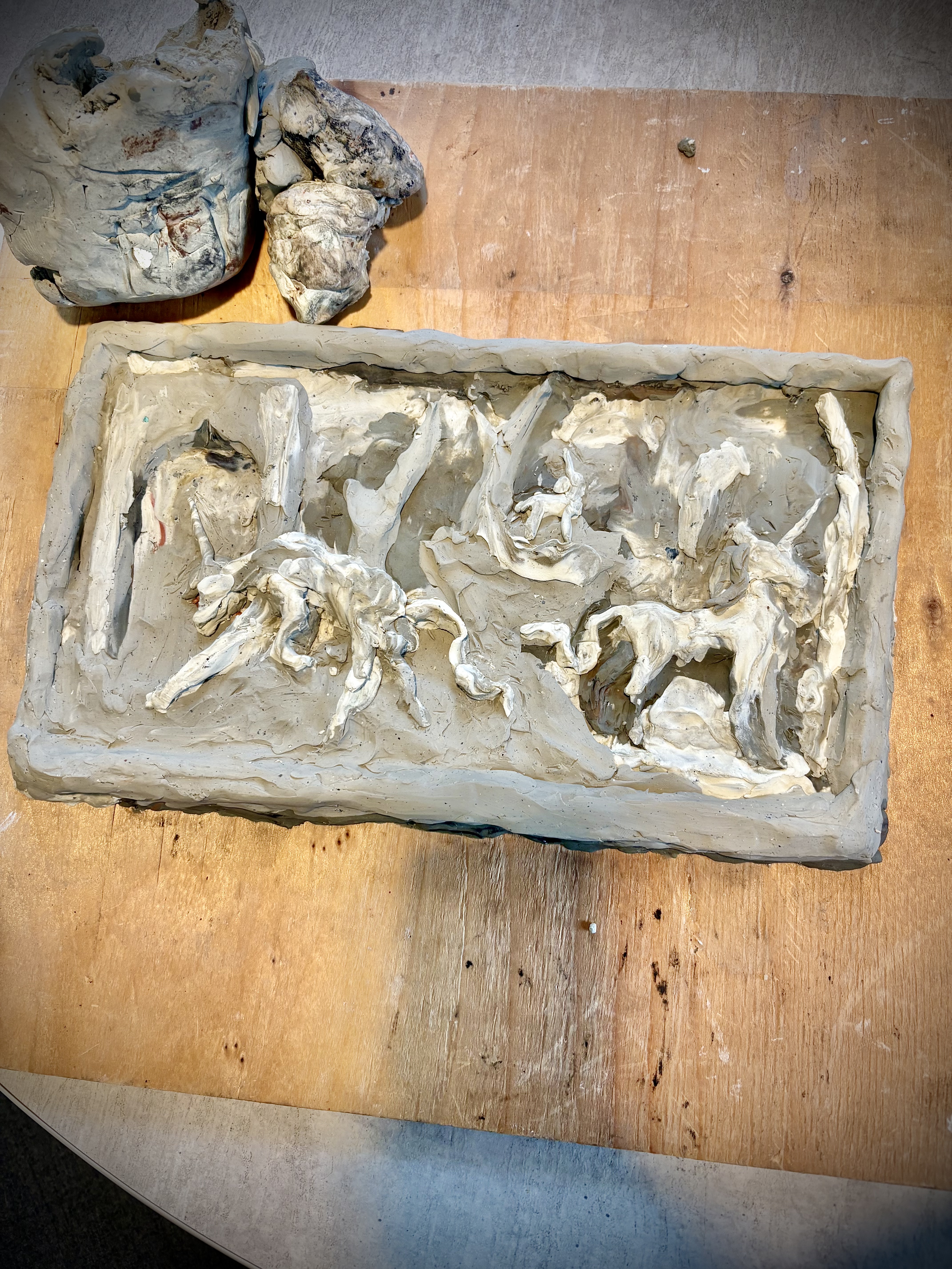
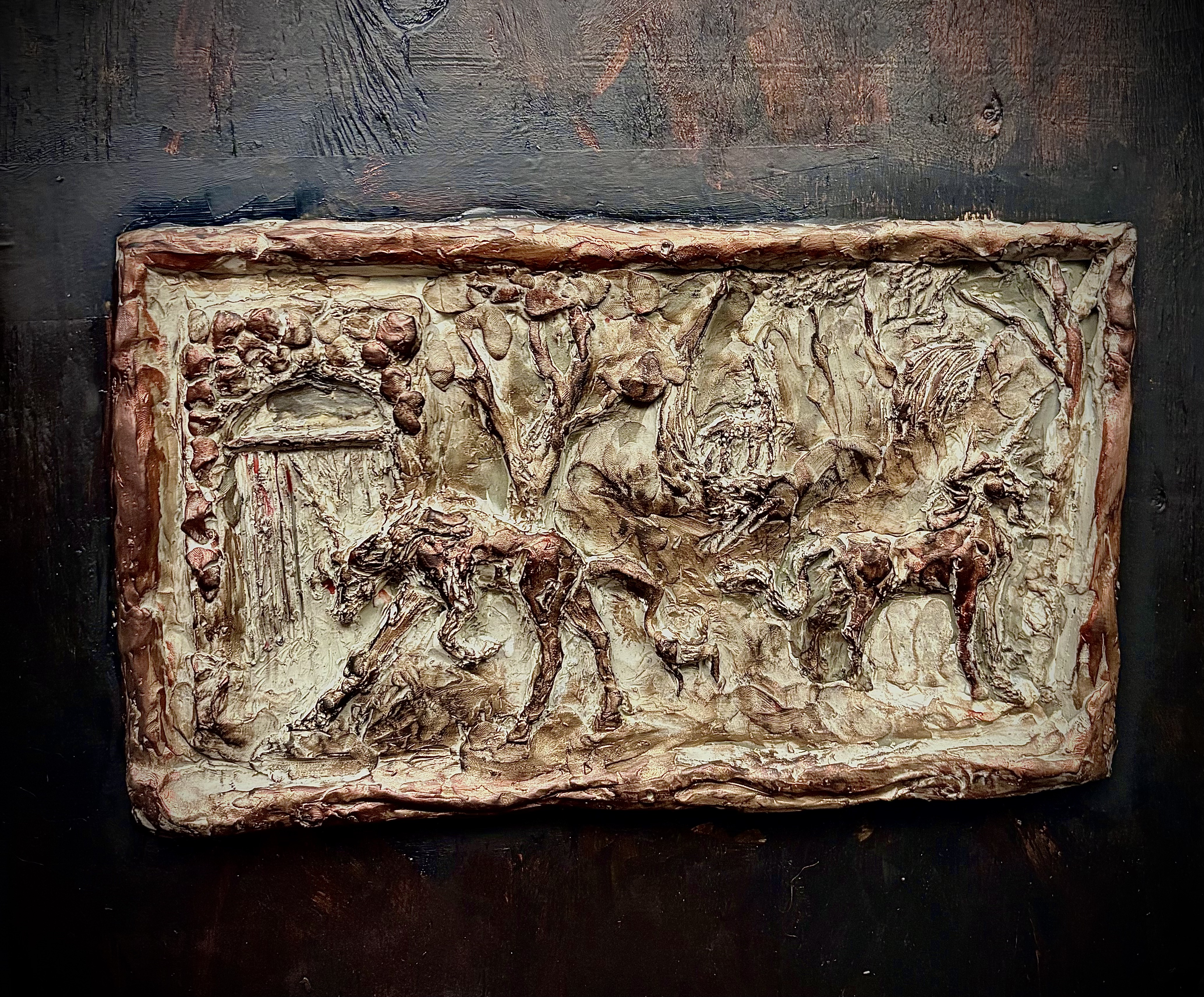
This piece is like a union of 2D and 3D. It’s on a flat surface, but the figures jump out at you! This is called a relief, and I’m pleased with how it’s coming along so far. The piece isn’t done. It’s more like a proof of concept. I sculpted it out of oil-based clay. Soon we’ll make a plaster mold of it, cast it in bronze, and then I can file it down and detail it further. Right now, the piece almost has a sketchy feel, despite being made of clay. I love keeping rough sketches and edges in my 2D art, so this implements that in the 3D space. I’d also never worked with oil based clay before, so this piece taught me a lot.
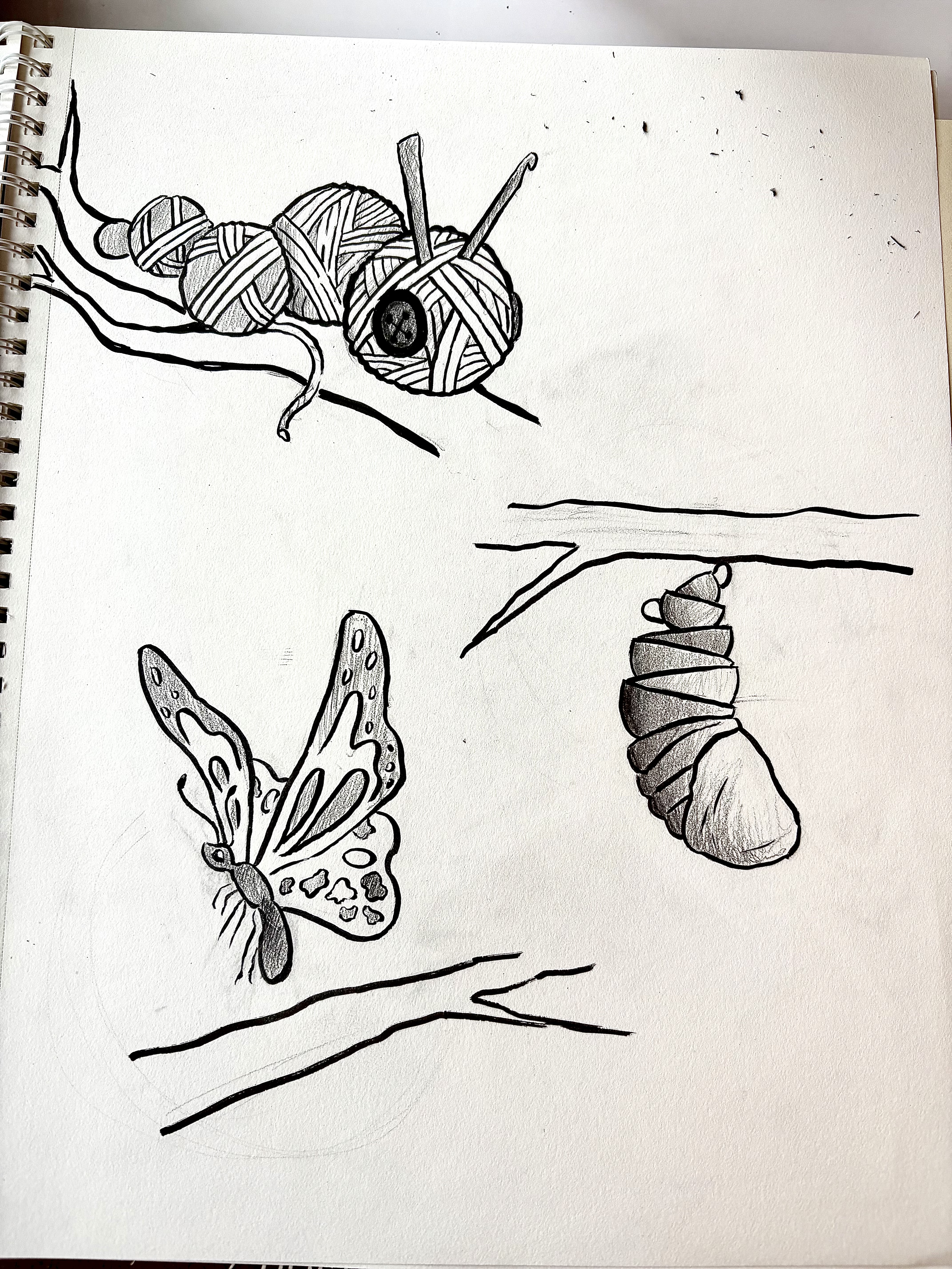
Here’s a 2D work I made for Conceptual Design class… it’s been a bit since I’ve shared anything 2 dimensional here! The official project was to unify two objects to create a third meaning. I wanted to make something useful for the project, so I decided to make logos for each major medium I work with. I already had the caterpillar concept in rough form, so I finalized it. I figured, since he’s a caterpillar, why don’t I try to make the other two a chrysalis and a butterfly? I am happy with them, but the butterfly and chrysalis were a bit less developed, so it was a lot harder to identify what they represent. The chrysalis is a stack of bowls and cups, and the butterfly’s bottom wing is an artist’s palette. I think I would keep the logos black and white, or basically colored, and then color the parts with the medium. Color can hide mistakes in logo design… but I do think the logos are fun sooooo…
So, overall, despite my stressing and multitasking, the stuff I’m doing is turning out decently and I’m happy with the amount of art I’m putting out. I’ll have plenty for the portfolio review at the end of the year. I’ll be happy with most of it as well! I hope by the end of the year I’ll feel the same. More to come!