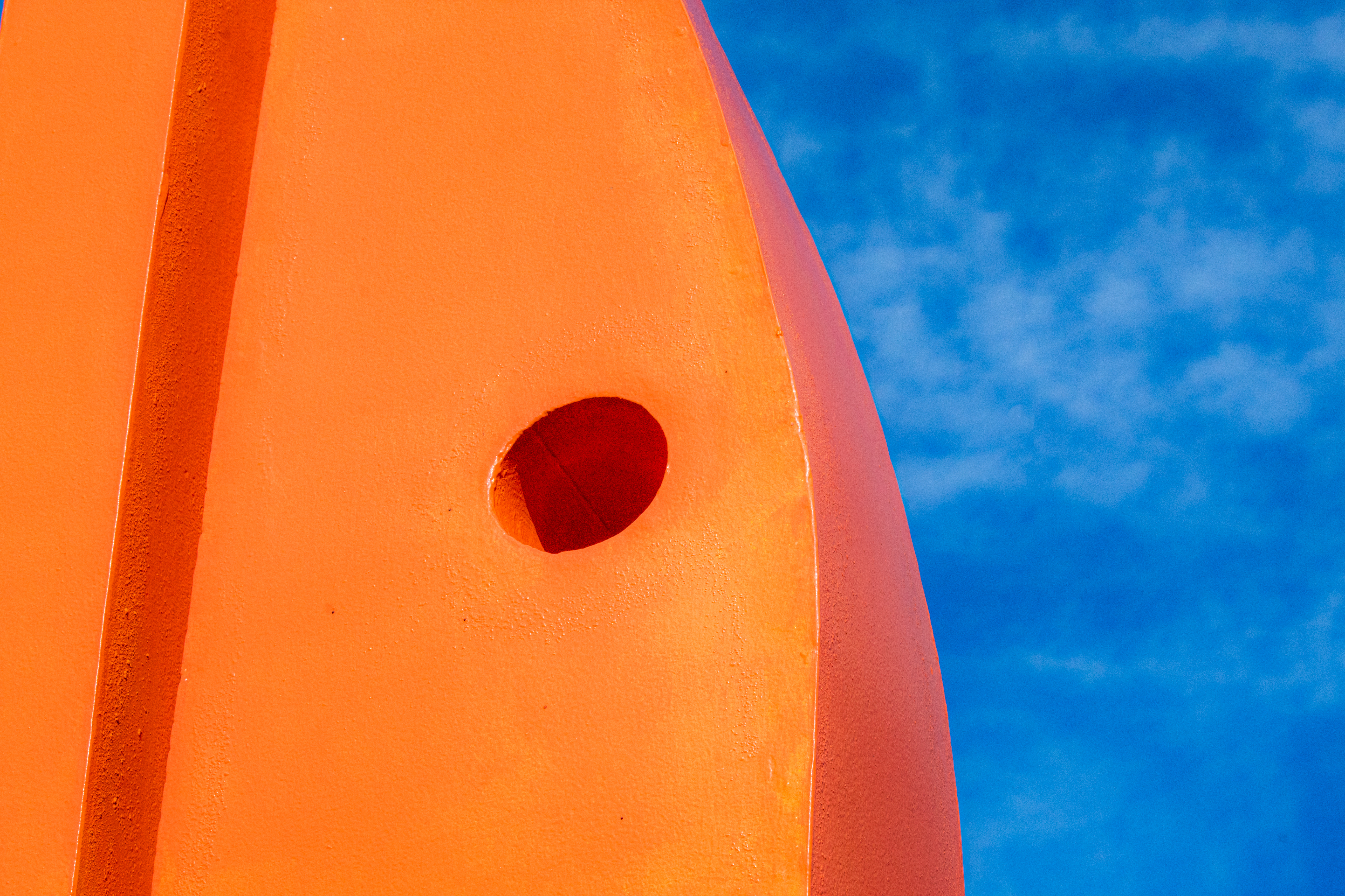
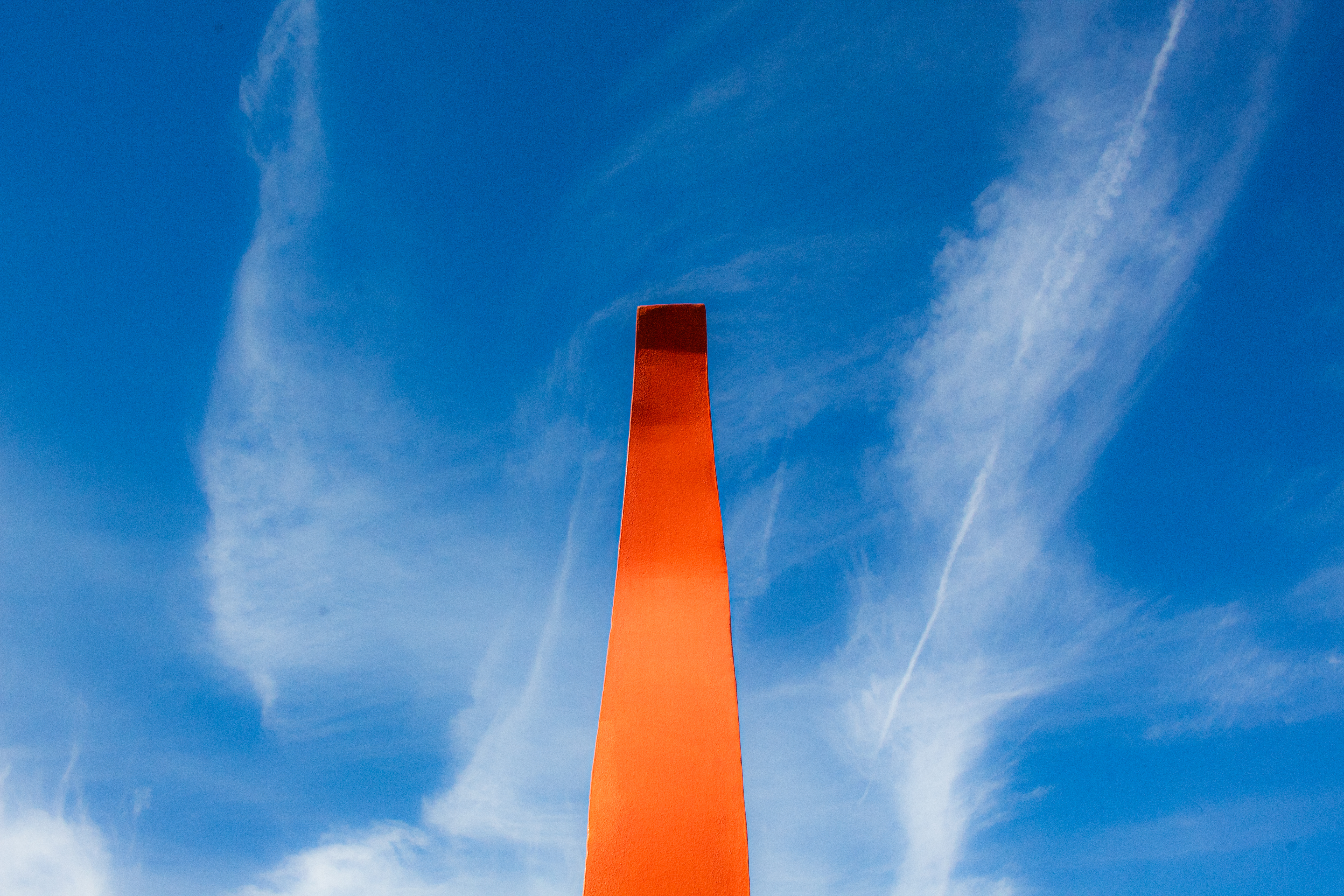
For our second project in the color photography class I am currently taking, we are focusing on color contrast and color harmony. This requires getting familiar with the color wheel and its uses in photography, and learning what color schemes are most appealing and when they are appealing. This can include, analogous, complementary, triad, split complementary, and tetradic.

So far I have a few photos that I took during class last week that I plan on using, and will continue looking for the other color schemes and harmonies. So far I’ve focused on blue/orange and blue/yellow, being complementary and tetratic (partial) respectively. The blue/yellow ones are by far my favorite and I’ll definitely be adding them into my wallpaper rotation! And yes those are my shoes, I laid down in the mud for this photo but it was well worth it. Never be afraid to look dumb while getting a shot!


My next blog will be a recap of the shutterbugs annual show: Color Struck, which opens the 11th with its opening reception on the 13th from 6-8pm. My fellow shutterbugs and I have put a lot of effort into making our show a big success this year so if you read this before the show closes on the 24th be sure to swing by the Kresge gallery in Insalaco and check it out!