Hello lovelies! This week’s post is inspired by a little road trip I took on Saturday to IKEA. With our 2019 Senior Show around the corner, I had to make a trip up to IKEA to buy some frames. Our local IKEA is only about an hour and a half away. On the road trip, I noticed how colors can help viewers recognize a brand instantly. For example, the green Starbucks uses or the vivid pink and orange combination that you see with Dunkin’. For Ikea it is this blue and yellow, although a popular color combination, the hues of the color allow it to stand out from the crowd. When you are designing a brand, it is often recommended that you should always create the basic logo in black and white first, and then you add color because once you add color, you can create a whole new feeling attached to the brand.
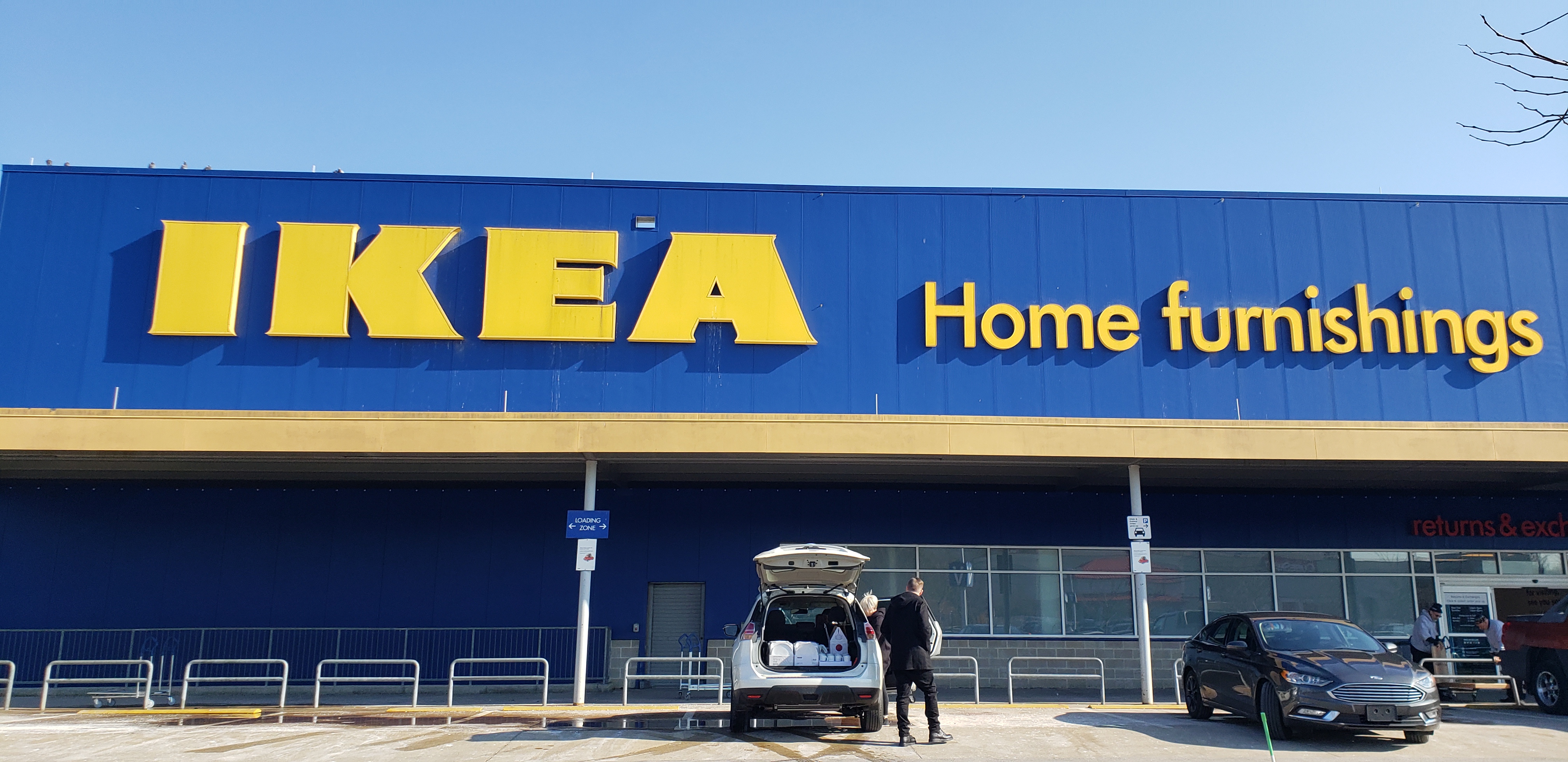
With all of this in mind, I simply had to investigate the meaning behind the colors that are used in branding. The blue IKEA used conveys the idea that they are secure, strong, trustworthy and caring. Those adjectives are everything you can hope for and more when it comes to furniture and home goods! Now the yellow has a different tone in general. The color yellow usually evokes the feeling of logical, forward thinking, and confident. IKEA is originated from Sweden, where their designs are very clean, and modern. When you visit the warehouse, it is very clean and organized according to room. Ikea is logical by the way they have you walk through the store on a set path ensuring you see all of their products before you finally reach the exit, which means an increase of sales.
Next time you are out in the world, see if you can match a brand’s colors to their personality. You may be surprised by what you find!