Thinking Really Hard About Simple Things
I have a love/hate (maybe “hate” is too strong… perhaps a “love/struggle” relationship is more appropriate) with my Conceptual Design Thinking class this semester. I find myself spending less time performing actual labor for the art in this class and more time gestating on ideas before executing. Like any art, the projects are typically filled with experimentation, trial and error, and plenty of frustration behind a seemingly simple piece, however, I am typically left with something that I am very satisfied with. Usually, it is a simple, strong design lacking in any frills or unnecessary additions.
Typically the assignments in this class involve a week of thinking and thumbnail drawing. Thumbnail drawings have become a mainstay habit when making art now, often times I find myself drawing on surfaces to capture an image before it fades away, or perhaps if I’m driving I will make a voice recording so I can describe the image in detail. Either way, usually these ideas are ALWAYS useful in translating into a finished piece, whether or not I decide to go with that specific idea. It’s not uncommon for certain elements of one idea to permeate into another if I decide to to go a different direction. This week, I wanted to talk about how this project transformed from the seed of an idea into a finished product.

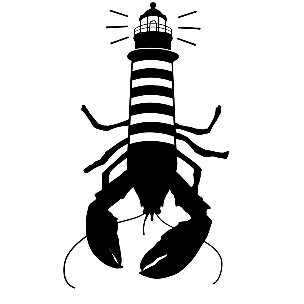
The goal of this particular project was to combine two symbols in a seamless way that would make up a new, original image. The symbols could be opposites, related, or juxtaposed in some way… as long as the two symbols make up a third image organically. Being from Maine, I think I am unconsciously drawn to imagery related to my home state. Even more so than that, I find both lobsters and lighthouses to be objects of fascination for me, lobsters because of the uniqueness of their life cycle and lighthouses because… well they are moody and eerie.
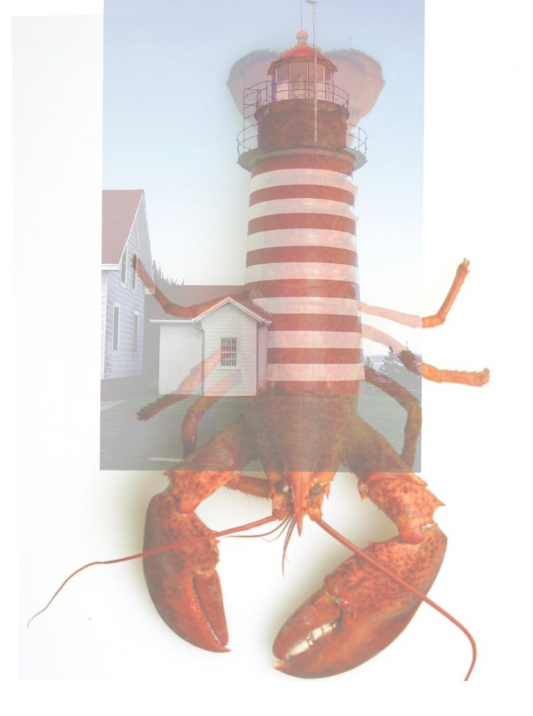
This particular piece came after looking at photos of West Quoddy Head Light superimposed over a lobster. For me, the stripes of West Quoddy Head gave the piece a more organic feel that is truer to the aesthetic of a lobster’s tail. In order to find a way to combine the symbols (and to save time) I played around and made a template in photoshop using actual images of a lighthouse on top of a lobster. After lowering the opacity, I traced an image over it (like I said… not enough time to draw everything by hand for each project) and warped/edited it to make it more proportional. Below you’ll find an example of the template I made.

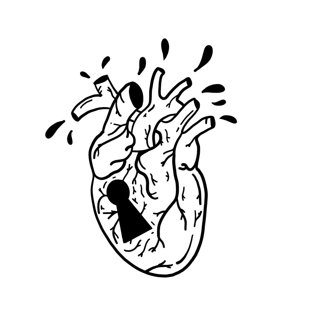
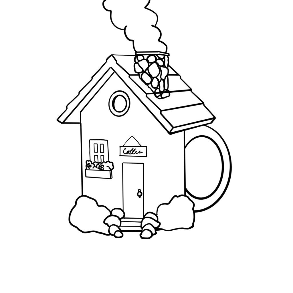
For most of the final pieces for this class, there are art least two others that “didn’t make the cut” so to speak. So the project isn’t limited to making one image, in fact typically twelve thumbnail drawings precede the final three solutions we come up with, eventually narrowing it down to one for the critiques. I thought it would be fun to include the ones that were left out as final pieces. Below you’ll find my combined symbol pieces for a “coffee house” and the phrase “key to my heart.”

