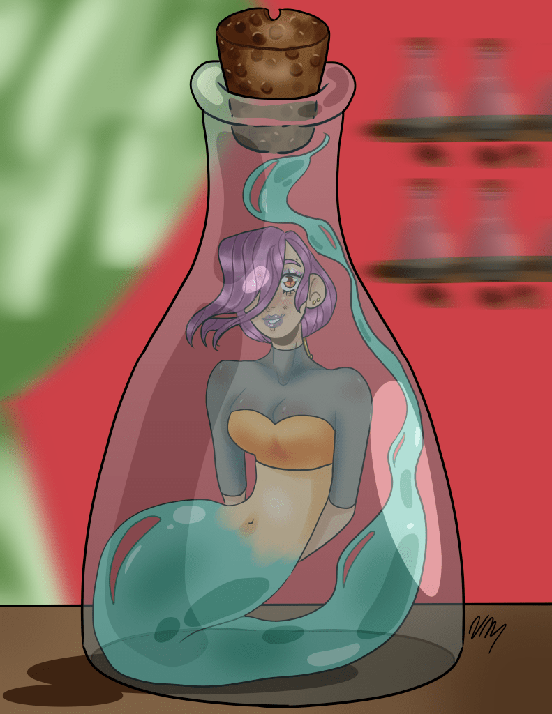
Let’s talk about drawing backgrounds, also known as my worst nightmare. While that is dramatic, and I’m nothing if not dramatic, that statement has definitely held true for the longest time. Even when I was in high school, I never truly loved backgrounds and I only ever enjoyed designing characters- I thought, why draw backgrounds if I don’t enjoy it? When I would draw backgrounds, I always drew the characters first, which made it increasingly hard to draw the environment around them; my go-to was to draw a basic background and blur it so that it looked as though I put effort into it. And even in the image below, I used the wrong kind of blur, because the background looks like it is moving, which was not the intent.

I’ve definitely grown since then, even though I still haven’t practiced as much as I probably should have over the years. I’m currently in a Digital Design class, and one of the assignments was to draw backgrounds for our characters and story that we created. At first, I was nervous as I always had a hard time making my backgrounds look cohesive with my characters- I’ve never really had a set drawing style that I was okay with until last semester, and I never ventured into drawing backgrounds with it. I read a tip online a few years back that suggested drawing the background first, so that when the characters were ultimately drawn, their interactions with/within the environment would look more natural. I had tried that suggestion before, but it was back when I wasn’t the best at anatomy- I struggled with placing my characters in the environment as a result.
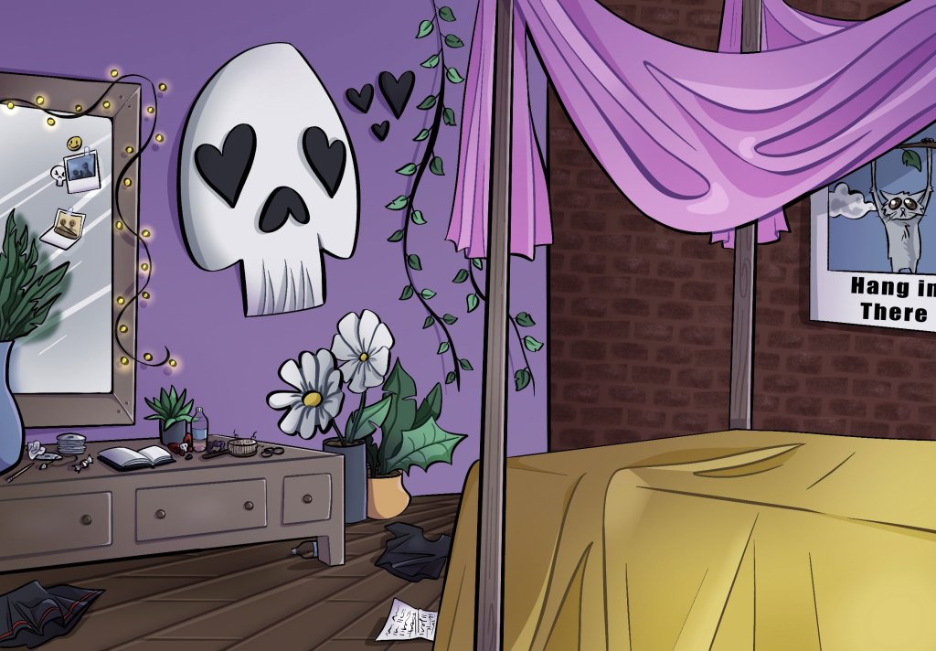
Now, I’m getting a lot better at anatomy as well as perspective due to my classes here at Marywood, and so it was surprisingly easy to sketch out my initial environment once I started! I drew out and colored the first background by itself, because it was a more intimate and contained environment. I knew in the long run, it would be easier to make edits had I separated the characters from the background. I also knew the characters would block details of the room, and I wanted there to be a version of the room where they were still visible.


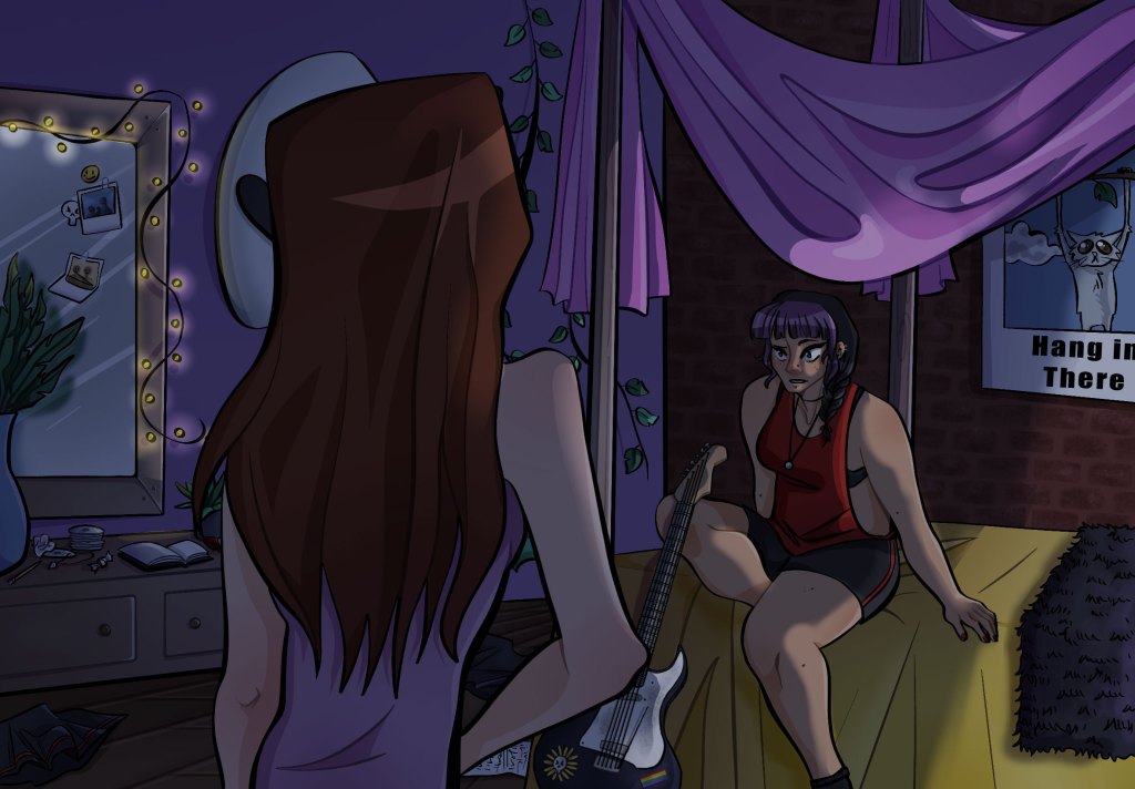
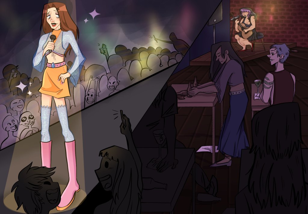
For my second environment, it was more central around the characters than it was the environment itself. Thus, I included the line art for the characters and the environment on the same layer. It was easier to show depth that way, and allowed for me to really focus on how the environment accentuated the characters and their actions.

I would say the hardest part about this project was the expression of depth within my environments. The class did in-person demos to draw landscapes and utilize aerial perspective, and that definitely helped me in the long run, especially for the right panel of my second environment.