‘m sure you are familiar with famous mascots. Whether it be, The colorful, friendly Toucan Sam, the death-staring mask of Michael Myers, or the muscular Maxis Marywood University Pacer. Icons are what shape the identity of something and it is crucial that they are carefully designed with that in mind.
Key Components of Icons:
- Simple design (not to complicated)
- Harmonious and recognizable colors
- Fits the desired theme
- Potentially relatable
- Original
Simple Design:
The icon should be simplistic in nature. Something that can be replicated easily for marketing purposes. Something complex will be difficult for the audience to recognize.
Harmonious and Recognizable Colors:
The color palette should be aesthetically pleasing. Complementary colors, analogous colors, or themed color are recommended.
Fits The Desired Theme:
Obviously, the Icon should be in theme with what it is representing.
Potentially Relatable:
It’s a bonus if the audience can relate physically or emotionally to the icon. This builds a bond between the icon and person.
Original:
Unique icons stand out among the crowd.
Exploring an Icon:
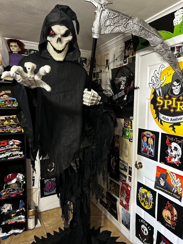
Jack The Reaper From Spirit Halloween:
- Simple reaper design.
- Contrasting black & white colors.
- Fits the Halloween aesthetic.
- Original Character
WRAP-UP:
Overall, I find it fun to explore what goes into designing the perfect “iconic” icon.
- Stay Spooky, Santo 🎃
Original photo of my Jack The Reaper animatronic.