I’ve always tended to have difficulty designing logos, it can be hard for me to settle on a design and find the right balance to it. Recently though I’ve had the opportunity to practice coming up with several, so for this week I’d like to walk you guys through what I’ve come up with.
A strong logo is like the face of a brand, it has to carry a lot of meaning in a small, simple, and clean design. Some of the qualities that I like to keep in mind when designing a logo are:
- Simplicity: Clean uncluttered logos are easier to recognize and remember.
- Memorability: A logo should stick in peoples minds after just a quick glance.
- Versatility: It should look good whether its on a billboard, business card, or phone screen. Meaning it should work in black and white, color and in different sizes.
- Timelessness: A successful logo should age well, they don’t rely to heavily on trends that could feel dated in a few years.
- Relevance: A good logo reflects the brand’s personality and values.
- Scaleability: The details of a good logo shouldn’t get lost when the logo is tiny or stretched too big.
- Distinctiveness: It should stand out from competitors in the same industry and not reel like a generic template.
So in the past month or so I’ve designed three main logos for my classes, and I’ve done a fun exercise for design logos as well. To start, in my Web Design and Interactive Media class with Professor Sue Jenkins we were tasked with coming up with a logo for a site that we would be mocking up. The site would be a San Fransisco Travel website that would provide information about events and places to go for people interested in visiting the city. I came up with four options for the logo, two of them were focused around the classic golden gate bridge imagery and the other two were playing around with the shape of a cable car. In the end I really did love all of the designs but the ones with the bridge had a bit more impact than the cable car ideas. There designs just had more impact because of how I balanced the positive and negative space in each of them. And between the two bridge logos I appreciated the one with the curved border more, but I was concerned about how it would scale. So I ended up rearranging the type so that it would be easier to read on a smaller scale.
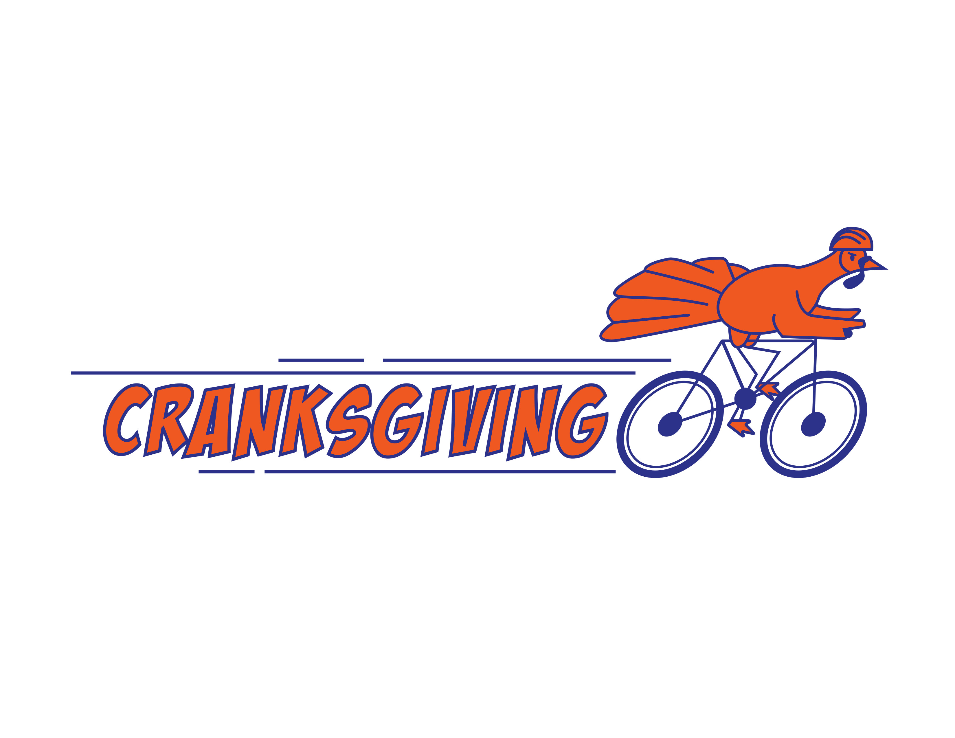
Also in my Web Design and Interactive Media class we were asked to design a logo for the Anthracite Bicycle Coalition of Northeastern PA. They participate in a nationwide event called Cranksgiving which is an annual bicycle food drive and party. Volunteers visit stores and buy food for a local food pantry, all by bike, and then return to the host pantry with all the purchases for a celebration party at the end of the ride. And they were looking for a logo/mascot design to use for the event. I ended up drawing a Turkey riding a bicycle to lay into the themes of the event. I wanted there to be a lot of movement and speed in the logo, so I angled the tired of the bike to make it look like it was moving forward, and added action lines. I chose the colors orange and blue to call back to the Anthracite Bicycle Coalition’s actual brand colors. My biggest concern with this logo is probably that its super linear and horizontal. Meaning that it would be more difficult to arrange on a broad spectrum of items. So if I were to do it again, I think I would take more time to flesh out how I could combat that issue.
The third Logo I designed was for my Communication & Conceptual Design class with Professor Kevin O’Neil. For this project we were tasked with coming up with a logo design for a non-profit organization of our choice, we should pick from an already existing non-profit, or come up with our own. I ended up coming up with a company who collects used craft supplies and takes donations and then holds crafting events for kids at schools, hospitals, etc. The aim would be to provide these kids with an opportunity to be creative with supplies that they might not have access to. I struggles for a while coming up with the design for this logo. But I eventually landed on merging the name of the organization “Donate & Doodle” with a pencil. In the end I was pretty happy with the design, I chose a fun playful font to reflect the company, and wanted to use pastel primary colors to allude to the connection with kids.
Lastly as a bonus, I did a quick exercise in my Communication & Conceptual Design class, we were given three different companies to design logos for, and only had 30 minutes each to come up with and digitize them. The experience was stressful in the moment, but overall fun. These logos are far from perfect but they were a great start and the exercise was a fun way to practice being creative. The first one was for a television company named curious pictures, I thought it would be cool to make the shape of a television using the letters C & P, and incorporating the ? symbol too. Unfortunately I leaned a bit too much into making it look like. TV and lost the letter forms, but I think it was a strong beginning of a concept. The next one was for a airline company, but specifically for the electric trains that take travelers between the different airspaces. I definitely struggled with this one the most, I thought it would be fun to make a train out of the cloud path that an airplane leaves behind, but couldn’t quite figure out how to best translate that physically. With more time I probably could figure it out but for now I got the idea in the screen. The last one was a logo for a fun family diner, this one I liked designing the most (you can tell cause there’s a colored version) I modeled it after retro diner signs and had fun adding in little details to build character into the logo.
Overall, I’ve been having a lot of fun coming up with all of these logos. I had some successes, and some failures these last few weeks, but it’s been amazing to practice making them. And logos are something that I’m sure I will keep needing to make in the future. But the more I practice the better and quicker I am at making them!
Thanks for reading!
Emma <3