Color is often regarded as a major tool for conveying emotion. We are predisposed to certain feelings in due part to the colors we observe. In graphic design, an advertisement that uses a lot of muted blues might feel calming, while an advertisement using lime green might feel more energetic. In business designs, we can see the same phenomenon. An office building tends to take on more neutral colors that convey a sense of seriousness, while a McDonald’s is purposely bright enough to catch the attention of a highway passerby. Even in our everyday fashion choices, color has an important role. Someone who is attending a funeral would typically wear black or muted tones to match the solemnity of the occasion. Meanwhile, someone attending a Fourth of July barbecue or garden tea party might choose something with more vibrancy and life.
In the art world, color’s importance has been the topic of much debate for years. One such debate was over the favor of Sir Peter Paul Rubens’ work, or Nicolas Poussin’s creations. There are a lot of intricacies to the debate, but it boils down to the difference in their art styles. Rubens (right) was an artist who painted with more expression and emphasized/exaggerated color. Poussin (left), on the other hand, focused more on composition and line.


Personally, I almost always prefer Rubens’ work over that of Poussin. Ruben’s art always feels so much more emotive, so much more impactful. Rubens’ works always have this sense of being caught in a moment; they are a glimpse of a larger story. I have always admired how powerful a message they have conveyed through this expressiveness. Strangely enough, I believe that I am more like Poussin in my approach to art. I focus a lot on trying to balance a good composition, and have not paid as much attention to color as my main tool. I also feel that my art could be less rigid, and more expressive.
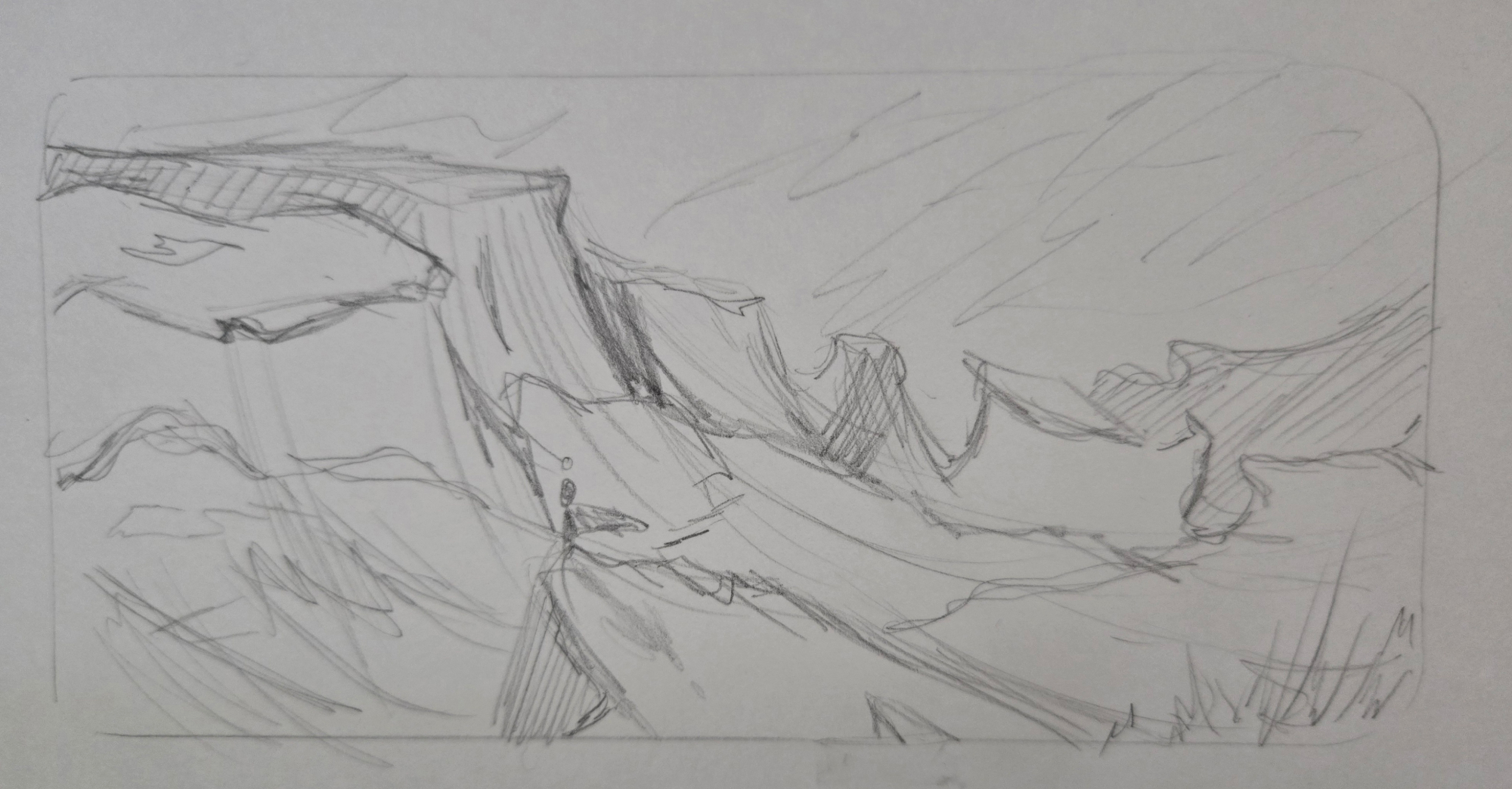
With this in mind, I set out on a short exercise to try and hone my eye for color and emotion. To do this, I chose a reference photo and sketched three identical sketches. (Okay, fine, they are not perfectly identical — I’m only human!!) The reference photo I chose is from Pixabay by FrankyFromGermany, and it is linked at the end of this post.
Using alcohol markers, my approach was to be loose with my shading. Rather than focus on the details and life-like accuracy, I was gestural with my brush (pen?) strokes and layered colors over one another. I also chose a different approach for each version’s colors. For the first version, I combined both emotion and reference colors. I wanted to give this piece a joyful feel, and chose bright greens and yellows in accordance to this. At the same time, I wanted to make this one most closely resemble the colors in the original reference photo. For the second version, I chose an emotion only, and chose colors to match. I wanted to convey the feeling of hope, so I used the idea of sunrises/daybreak to guide my color choices. A combination of pinks and teals together would garner this emotion. For the third and final version, I chose the color palette first, and then observed what emotion came from it. I chose a split complementary color palette of yellow-orange, blue, and purple, since I don’t often work in these colors. In the end, I feel like this piece communicated a spooky, cautious feeling.
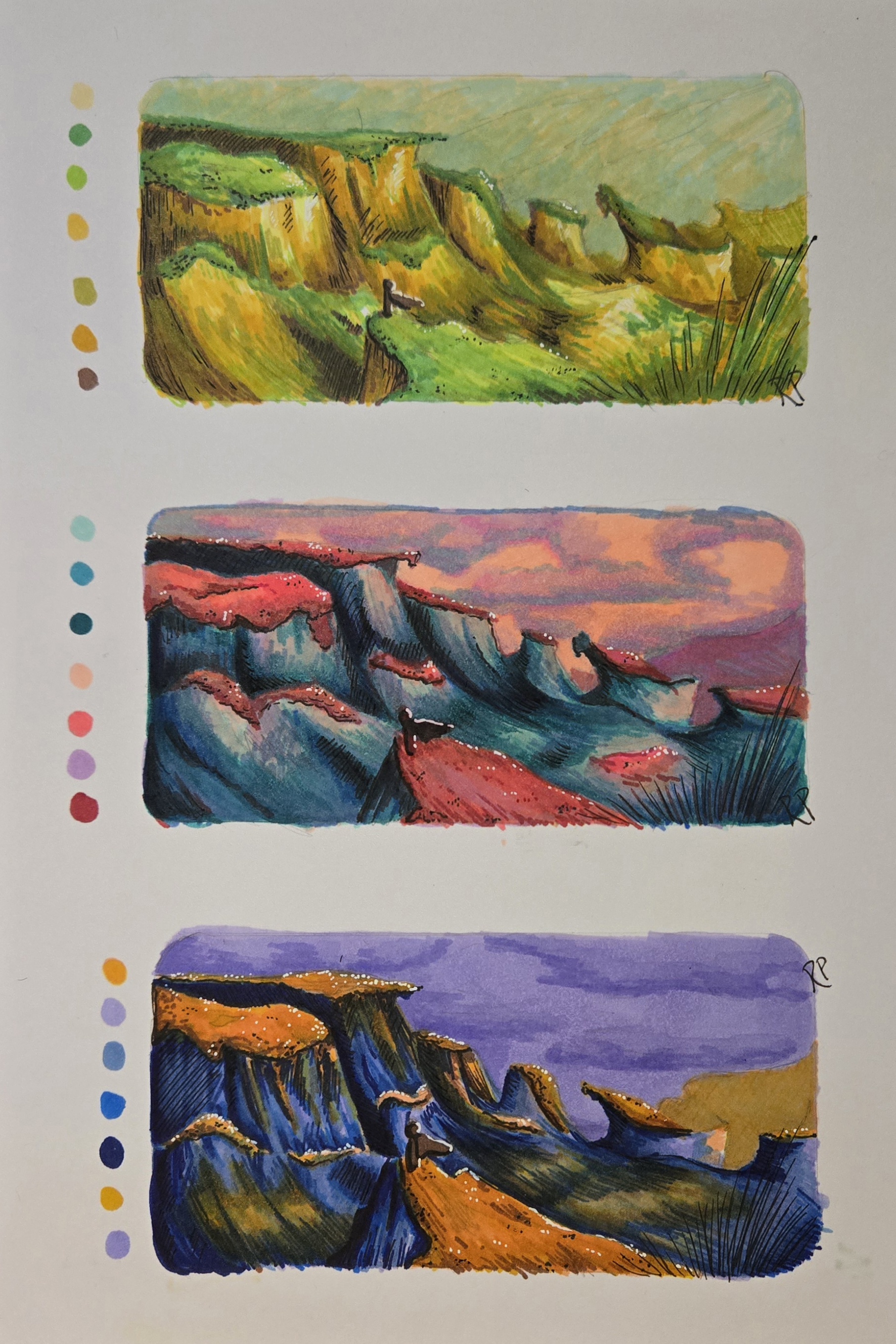
Overall, I think I did achieve my goal of being more expressive with my work. Each piece does feel different than the other, despite the similar subject matter. My pieces do not look like Rubens’ masterpieces, but his emphasis on color and fluidity applied to my own art style has an interesting effect. I would argue that I could use some more practice with alcohol markers, and probably should have tried this with a medium I am more experienced in. Color theory and the way colors interact is definitely powerful though, and I am excited to have spent more time thinking about the Poussin vs. Rubens debate! Where do you stand, and would you be willing to try out the other’s technique? There’s only one way to find out!!
Works Cited:
FrankyFromGermany, Mountains, Cliffs, Landscape. 2014. Pixabay. https://pixabay.com/photos/mountains-cliffs-landscape-540116/ .
McDonald, John. “Who did it better, Poussin or Rubens? A great art argument.” The Sydney Morning Herald, 19 Aug. 2021, https://www.smh.com.au/culture/art-and-design/who-did-it-better-poussin-or-rubens-a-great-art-argument-20210816-p58j74.html .
Poussin, Nicolas. The Assumption of the Virgin. 1630/1632. National Gallery of Art. https://www.nga.gov/artworks/46470-assumption-virgin .
Rubens, Sir Peter Paul. The Meeting of David and Abigail. 1630. National Gallery of Art. https://www.nga.gov/artworks/99280-meeting-david-and-abigail .