 essica Hische has, in my opinion, the best job ever. I fell in love with her work long before I knew her name (as is often the case with designers), and after covering her in my visual communication class I can confidently say that I hope to model my career after her in several ways.
Born in 1984, Hische spent most of her childhood in Hazleton, Pennsylvania. She attended the Tyler School of Art at Temple University in Philadelphia and continued to work in the city after graduation. Her journey with lettering started in college, where she couldn’t afford the fonts she wanted for projects, so she made her own. Or — she clarifies in her website’s FAQ — she didn’t make her own fonts but rather created unique letterforms for specific words. “I noticed that the more I “drew fonts” for my own projects (the more I lettered titles and logotypes and headlines for fake magazines) the more my work started to stand out from my classmates. Everything felt more personal and more cohesive. Plus I loved to do it!” Hische writes.
The first project that really put Hische on the map was her Daily Drop Cap project, where she posted one hand-lettered drop cap every day, slowly working her way through the alphabet. These drop caps (one of which you can see at the beginning of this article!) began to draw attention. The more lettering work Hische did, the more requests for lettering work she received. In 2012 she was recognized as one of Forbes 30 under 30 in Art and Style. Her portfolio now includes work for Adobe, Etsy, Pinterest, director Wes Anderson, and (my favorite) Barnes and Noble.
A quick aside about me: I absolutely judge books by their covers. A well-designed cover is far more likely to get me to pick up a book and see what’s inside. There are books I have bought solely because I fell in love with the cover! It’s a space for a designer to flex their chops, it’s the first marketing or advertisement for the book that most people will see, and there’s a world of visual shorthand that can tell the viewer about the content within.
Jessica Hische’s covers for the Barnes and Noble “Signature Editions” absolutely blew me away.
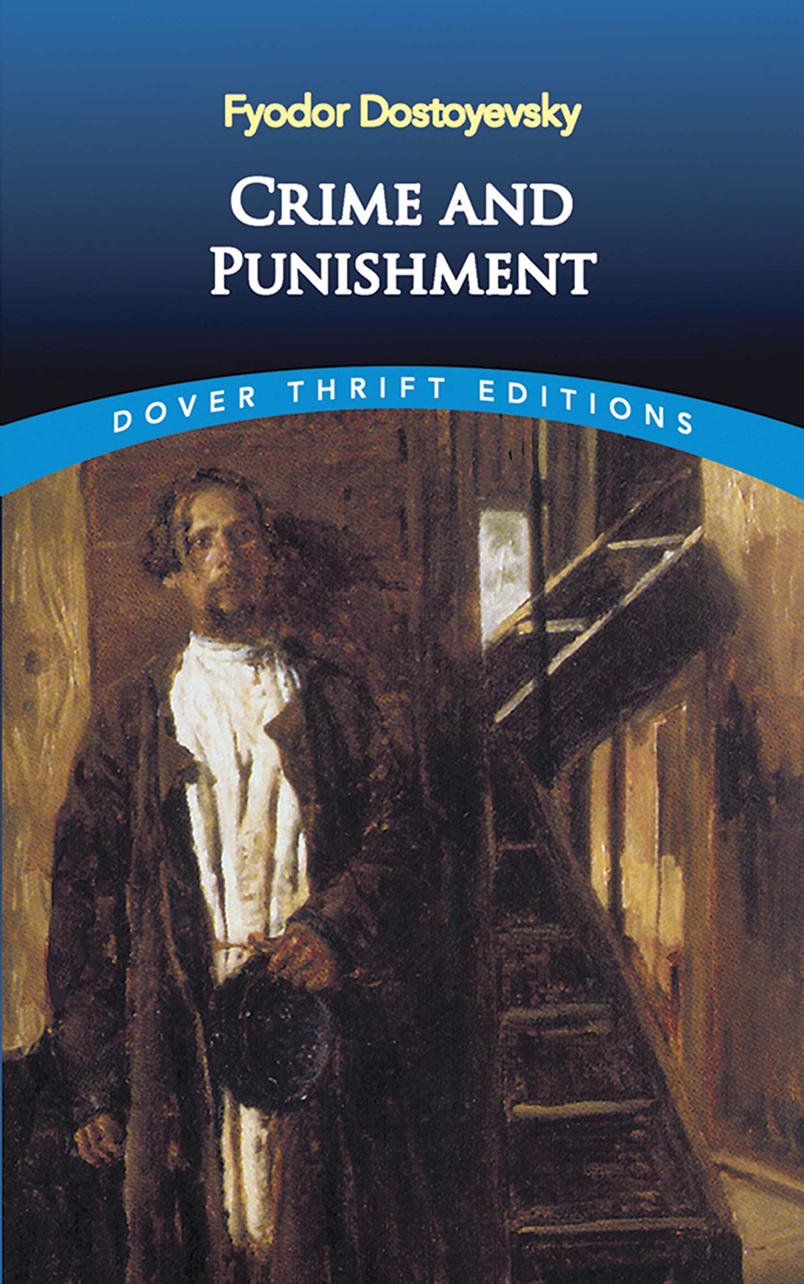
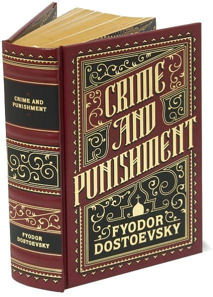
Compare the Dover Thrift cover of Dostoyevsky’s Crime and Punishment to Hische’s work and consider which you’d be drawn to in a bookstore.
This series of Barnes and Noble Classics covers provides a gorgeous case study of Hische’s work. Using limited color palettes, Hische captures the essence of each story with her covers. The lettering is unique and eye-catching, and every cover has plenty of decoration without taking away from the important information (the title and author). Using the lines of filigree or decoration on each cover, the viewer’s eye is guided to the text and held there. Take the cover for Little Women, for example.
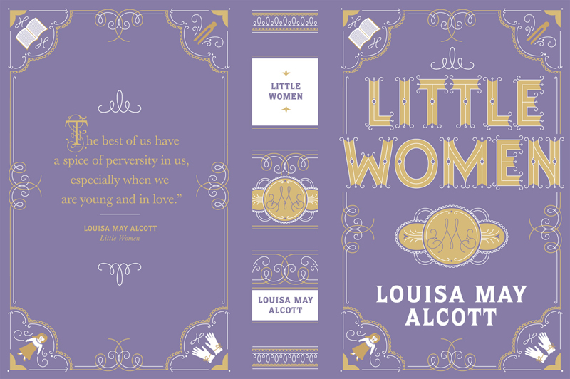
Notice how the open-ended gold lines of the filigree on the left and right sides point up towards the title and down towards the author’s name. The illustrations in each cover are separated from the main body of the cover by a scallop design that continues pushing the eye back to the title. And inside the lettering for the title, Hische included small circular openings that allow the lavender color of the background to interrupt the gold. Because it’s surrounded by a light gold, the purple within the text appears darker than the color around the letters, so it holds the eye and the attention of the viewer. Every part of this cover not only encapsulates the story of Little Women but is carefully calculated to draw the viewer in.
Hische is a brilliant designer whose bubbly personality is reflected in the passion she pours into each project. I loved the Barnes and Noble classics covers long before I knew who she was, but now I know of her I hope to emulate her in both her love of and skill for design. And, if I’m able to design some book covers along the way, all the better.
More about Jessica Hische
All Classics cover designs
Hische’s website
Daily Drop Cap
Ways We Work interview with Hische