I like to think that I am good at a lot of things; I can make a mean chicken parm, and manage to turn all of my assignments on time after endlessly procrastinating until I get that spark of inspiration. If there is one thing I have learned since studying graphic design, it is that I am not good at measurements. There is something about ppi and bleeds that I simply can not understand, and do not even get me started on document measurements and printing. No matter how much I try I can not wrap my mind around the translation from digital to physical, which is something that made this project in my conceptual design class harder than it needed to be. I needed to create a book cover for a biography of someone so famous that can be recognized from simple iconography, so I decided on the iconic Andy Warhol.
I know you are probably wondering why I began this post explaining how useless I am with measurements, and that is because my professor had us all set up the document for this project in InDesign where we had to add bleeds and guide lines to separate the cover, back cover, spine, and inner flaps. I essentially had to be walked through the setup process but nonetheless, I am happy I managed to do it correctly. But besides that, I also wanted to write about the book cover design itself because I had a ton of fun with it.
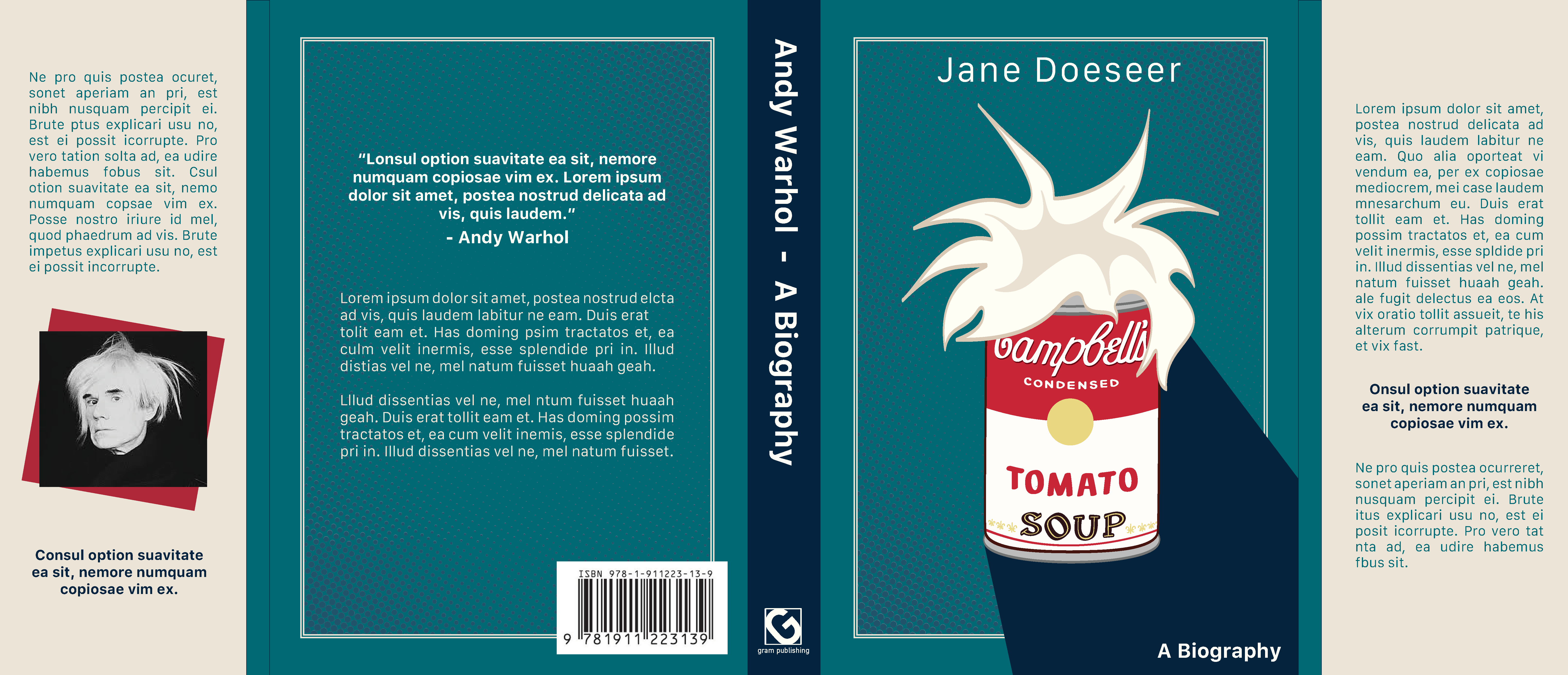
For the iconography on the book jacket design, I decided to use the infamous Campbell soup can, adorned with a tuft of Andy’s signature hairstyle. I thought it was such a silly but accurate way to portray Andy Warhol in a simple graphic. The soup can took me much longer than it should have as I could not find the exact font for the Campbell’s logo, so I decided to just hand letter it myself. I then moved on to the rest of the book cover which I kept relatively simple with a calming color palette and a subtle halftone to incorporate some of Andy’s pop style. I really liked how this project came out and learned a few things, which is always good!! 🙂