Last semester, I had a two-part project in one of my design studios with Professor Steven Brower. Picking Shakespeare plays and quotes, we had to design posters for our chosen play. The first half of this project was to hand craft a poster, however big we wanted as long as it pertained to Shakespeare and as long as we didn’t use our computers. The second part was to make an additional poster using graphic design programs.
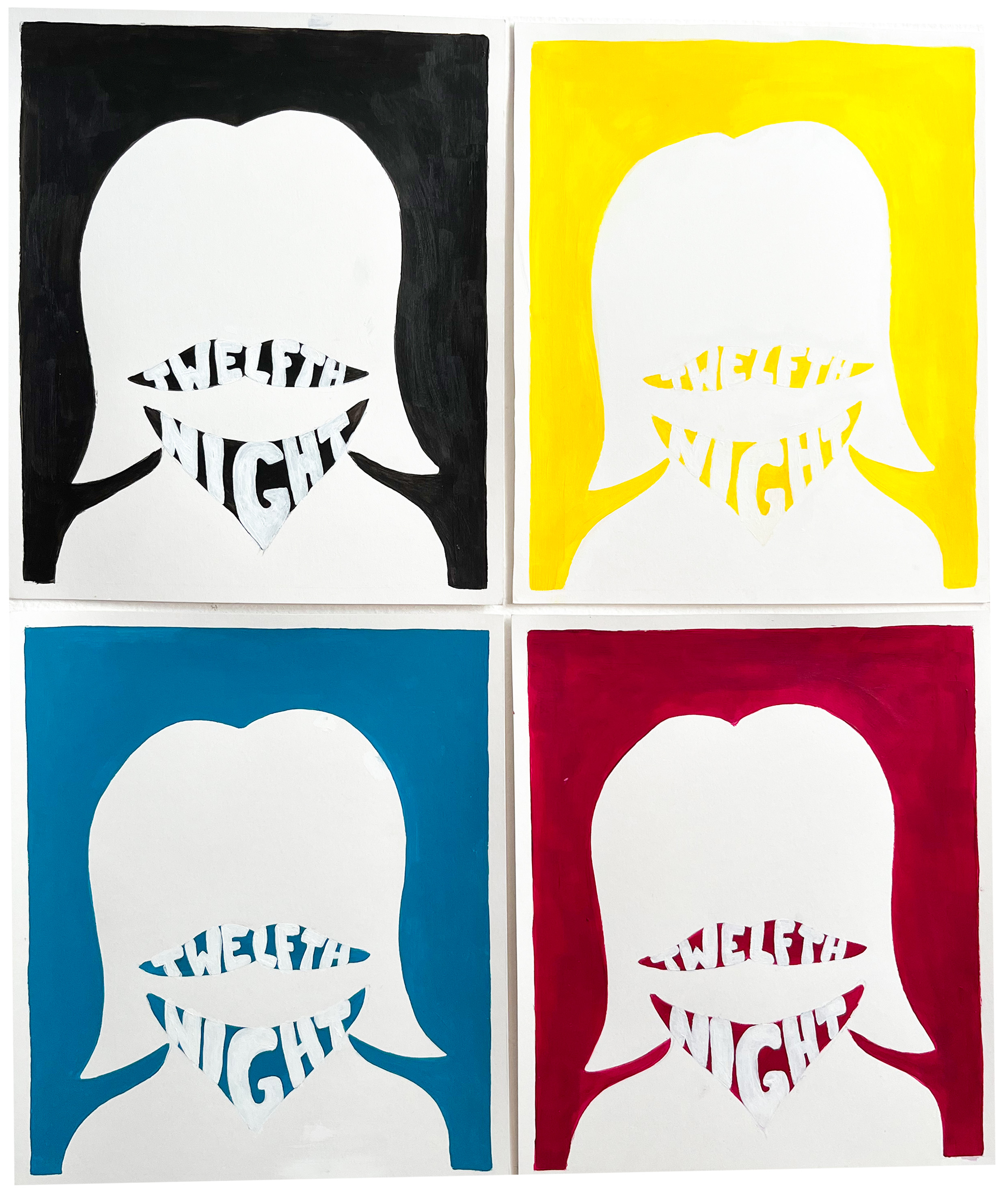
I enjoyed this idea of crafting with my hands once again, since they’ve been typing away in the Adobe Suites for the last few years and I miss my roots of painting and drawing. So I grabbed some new paints and dusted off my brushes and started thinking which Shakespeare play/movie I wanted to do, and eventually I landed on the Twelfth Night. If you haven’t read the play or watched the modern spin off “She’s the Man,” (highly recommend; Amanda Bynes stars in it) the play is a romantic comedy with mistaken identities and Viola, who goes undercover as her twin brother in order to be a servant to Duke Orsino.
With this idea of masking identity I thought it would be cool if I was able to paint a poster that looked like it was designed on the computer, and then designed a poster that would look like it was painted in order to fit the theme of the Shakespeare play. Instantly the gears started turning as I noticed that some of the new paints I bought were of cyan magenta and yellow tones, more on the vibrant side of the color wheel. What’s more graphic design-ier than a CMYK color palette?!
Next, I created four small poster sketches of a feminine outline and a mustache and all four painted in a different color, Andy Warhol style.
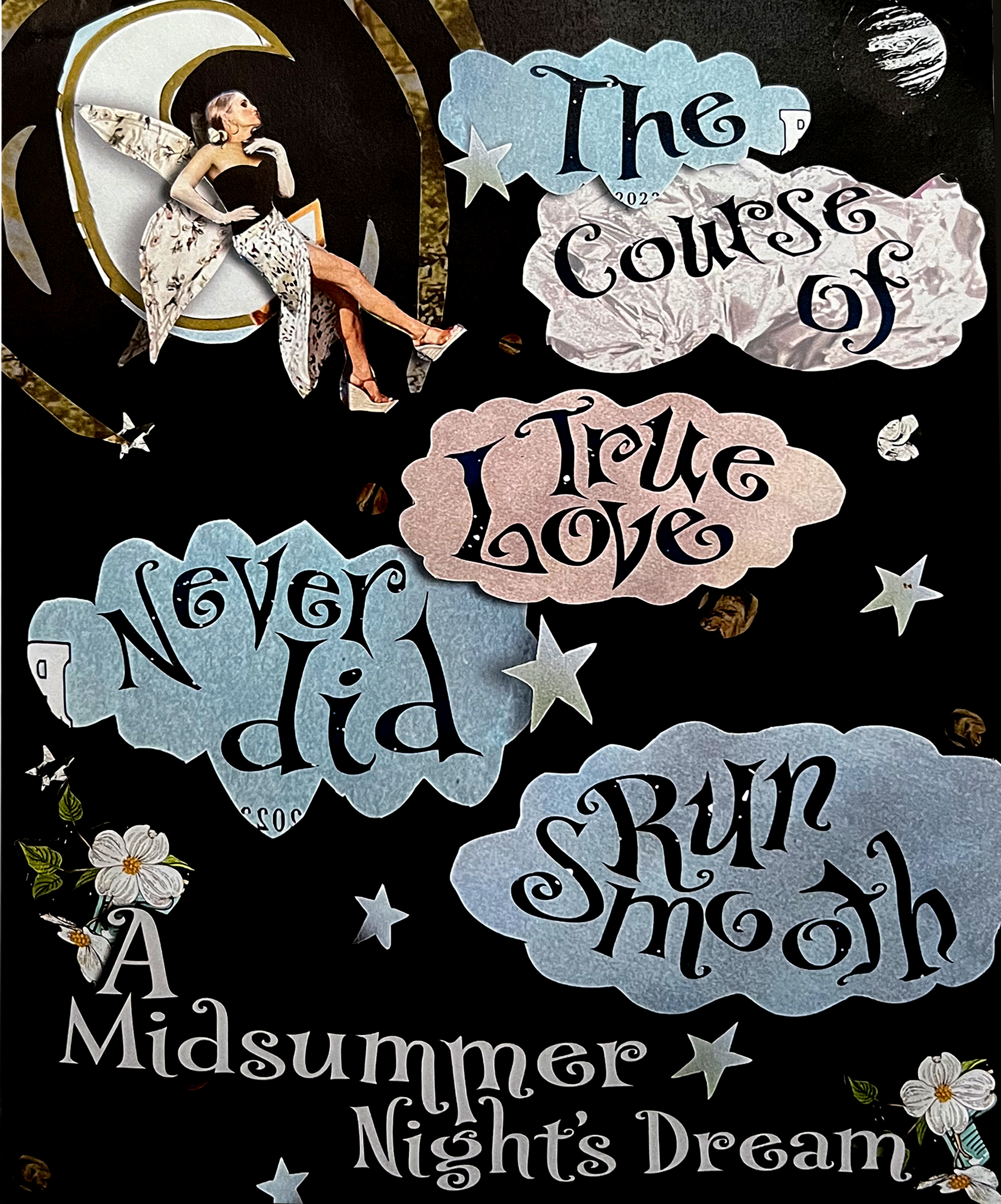
When moving on to the second part of this project, I considered using illustrator to draw something up, but frankly I was quite intimidated by the program and I didn’t know how to make it look realistic and handmade. I also wanted to stick to the theme of false, mistaken and undercover identity and I couldn’t get the idea of a ransom magazine note out of my head so I decided to use old magazines to cut out patterns and elements to alter and assemble in Photoshop to make a poster. It was in Photoshop that I added and skewed text to make it feel more handmade.
Although this project was more of an exercise, I was proud of expressing my creativity in the ways that I did. As a designer, I have gotten into the habit of trying to please others with my design, and with painting and drawing I gave myself that full creative freedom once again.