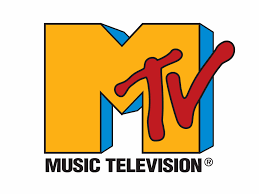
MTV may feel like a relic of the past now, but their logo still remains one of the most recognizable aspects of their brand… and may potentially be the only thing recognizable about the channel’s early years nowadays. However, the point remains that it’s design was a pure reflection of the more broadcast-able, visual-oriented and mass consumable direction that music was aimed towards, with Nirvana steering the ship with the 1991 premier of the music video for Smells Like Teen Spirit on the network. As my first official post as the blogger for Graphic Design instead of On-Campus Art News, I thought it would be fitting and fun to combine my enjoyment of history and music with the topic of Graphic Design!
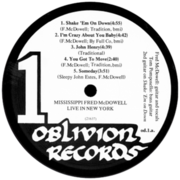
The MTV logo was the spawn of a New York graphic design collective known as Manhattan Design, which would exist from 1979 until 1991. Not only would they perform work for Viacom on the logo, but they also designed the “Moon Man” award that MTV would give out at the annual Video Music Awards. Manhattan Design began when three friends, Pat Gorman, Frank Olinksky, and Patti Rogoff, partnered together, renting out a tiny room in the back of a tai chi studio. In 1980, MTV creative director Fred Siebert would approach the studio about creating the logo due to his long standing relationship with Olinksky who worked to design a number of album covers from Siebert’s label, Oblivion Records.
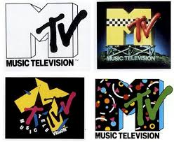
The large blocky “M” was drawn by Rogoff and the “TV” was spray painted by Olinksky. In 2008, the logo would be squashed down vertically, leaving it looking slightly wider, yet still maintaining a similar shape and feel to the original. This would officially become MTVs most recent logo in 2010. Creative branding and artistry would come together to form a unique take on the MTV logo, one that would change the way logos and channel-wide branding would be used moving forward. Instead of having a static image and color pallete, MTV allowed their logo to change various aspects about it’s visual aesthetic, as long as it kept the shapes of the design consistent with the original version of the logo which was yellow, blue and red.
Here are concept sketches of the logo done by Manhattan design in 1980 as well. I find the one in the bottom left to be particularly interesting.
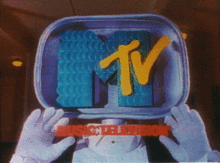
The dynamic nature of the MTV logo would lend itself to some incredibly creative versions of the original design and occasionally these channel IDs would feature artists. Henry Selick, the director and animator of The Nightmare Before Christmas designed this one during the 1980’s. The other one was from a ID that depicted the “M” in the MTV logo as the eaten apple from the story of Adam and Eve, with the snake representing the “TV.”

Heck, there’s even one for all you art history fans out there. I got a major kick out of this one, and I hope you enjoy it as much as I did.