This semester is my third semester at Marywood, and now that I feel more comfortable and confident in my art skills and being on campus in general, I think that my creativity is at an all time high. I don’t think I’ve been this productive art wise since I was thirteen, and it’s a really great feeling that I’ve sorely missed.
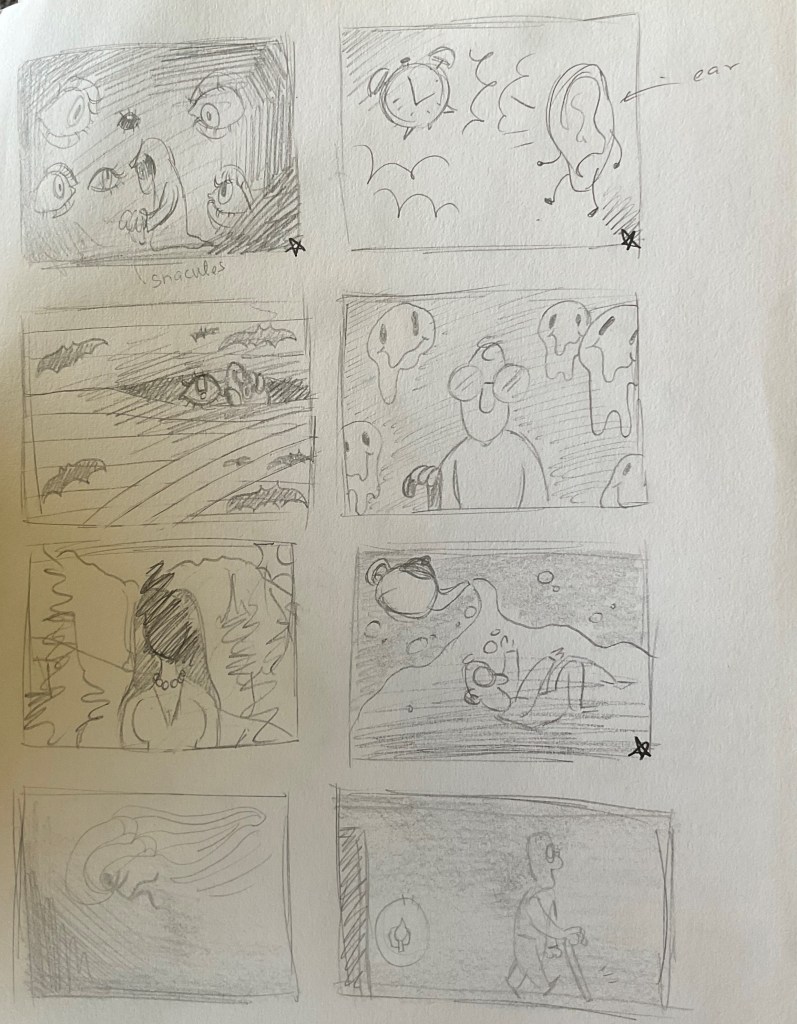
I am in a General Illustration class this semester, and at first I felt intimidated by the syllabus (although that is my natural inclination when I read any syllabus), but after one assignment, I began looking forward to this class more than I had been before. The first graded project for the class was to do an illustration for an op-ed piece for a newspaper. For context, because prior to this I’ve only ever read the Funnies in the paper, an op-ed is a work that is featured in the newspaper that does not reflect the opinions of the paper- as in, anyone can write an op-ed about anything and have it published in that section. My class was given a few articles to read from, and from there, we were to choose an article and draw up twelve thumbnail sketches for the professor to review. I chose an article on blindness, because the way in which it was written struck a chord with me (and I felt very inspired to create thumbnails for it after reading it).

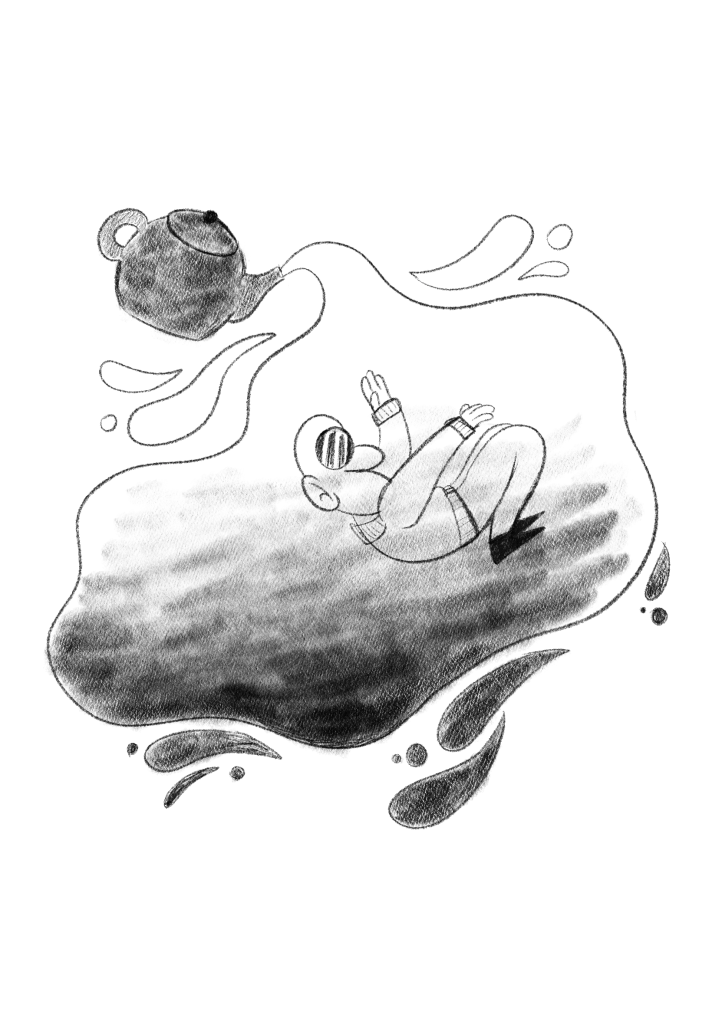
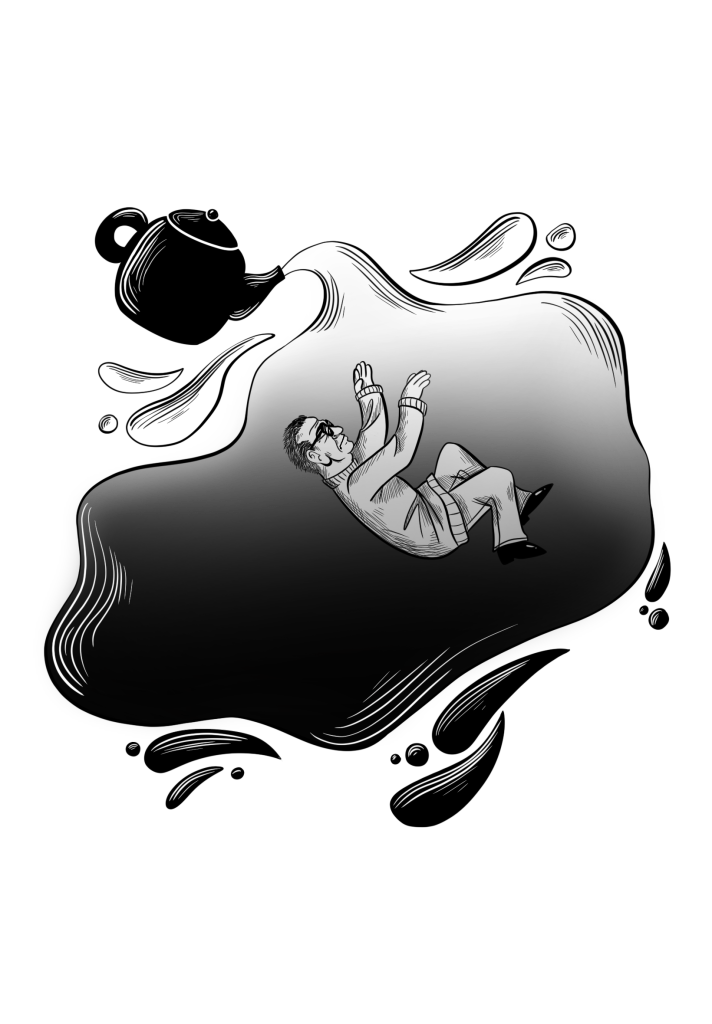
I had three thumbnail sketches to elaborate on further (they are starred in the above image), and to make it easier for myself, I took a picture of them on my iPad so that I could draw over them more easily. They were due in the next class that week, and there was a group critique to discuss how to improve the sketches for the final version. In the sketch below, I was told that the man was too cartoonish for such a serious article, and so when I took my sketch back into Procreate, I made sure to change that.

I ended up using lines in the final composition in order to add more of a dynamic feel to it as it felt too stagnant and boring without them. But other than adding the lines and making the man more realistic, the idea generally stayed the same. During class critiques, I was told that the shade in front of the man blocks him from feeling like the center of the work- that he felt hidden and should stand out more. So the final version I’m showing here is the picture that I edited after that class’ critique.
