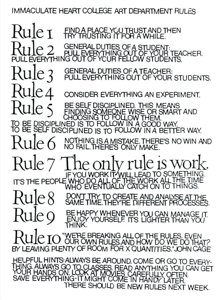
These last two weeks, my classmates and I have been working on our own screen printed poster that is inspired by the famous artist and designer, Sister Corita Kent. “Also known as Sister Mary Corita, [she] was an artist with an innovative approach to design and education. By the 1960s, her vibrant serigraphs were drawing international acclaim. Kent’s work reflected her concerns about poverty, racism, and war, and her messages of peace and social justice continue to resonate with audiences today.” (https://www.corita.org/about/corita)
Each of us were tasked to create a poster that reflected her artistic style, which ranged from abstract expressionist to pop art as the decades went on. In that poster would contain one rule from her list of 10 rules, a set of guidelines for students and artists that she created to encourage creativity, experimentation, and self-discipline. We basically had any creative freedom we wanted, could arrange the text in any way shape or form, and many of us chose to stick with the bright colors that she constantly used in her work.
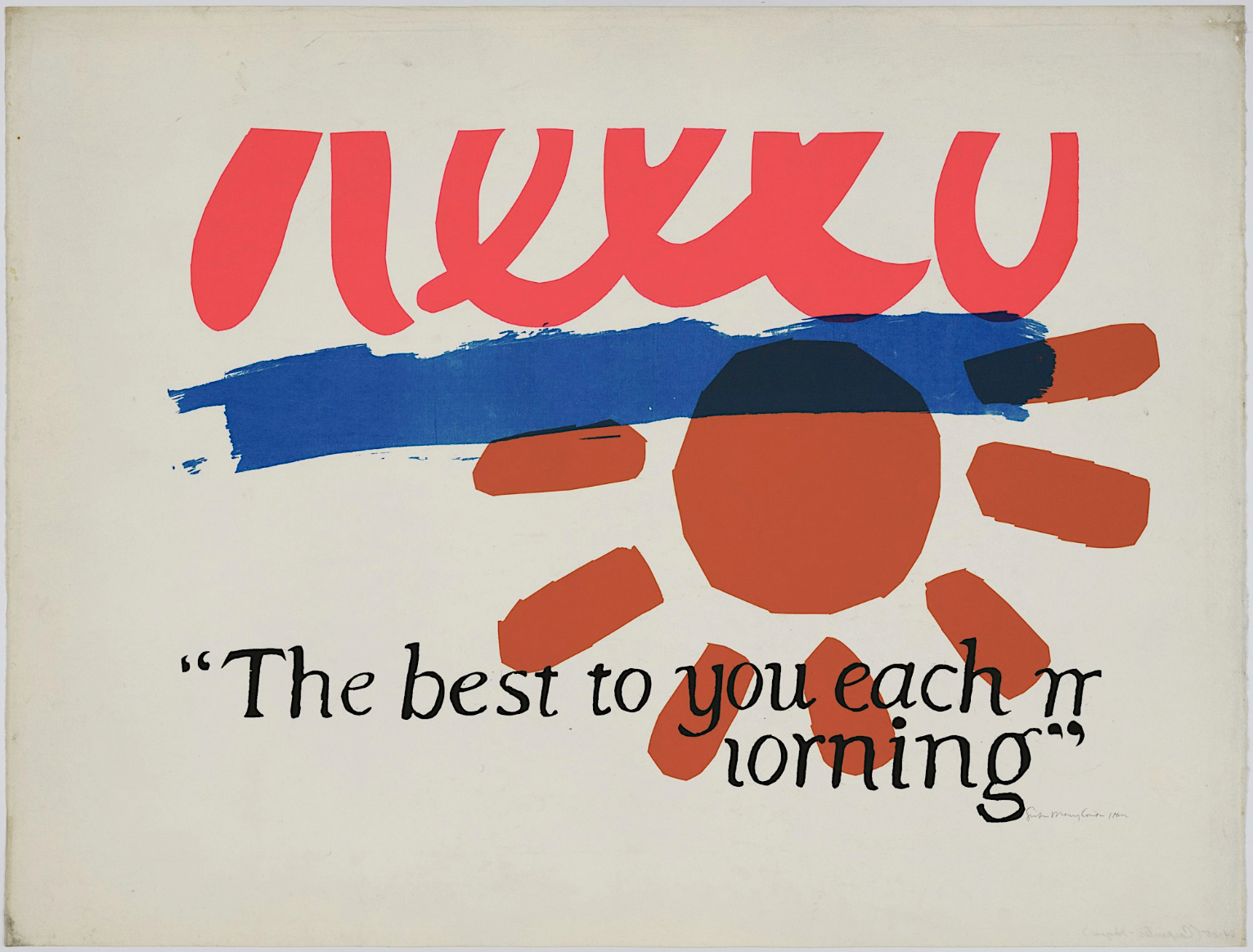
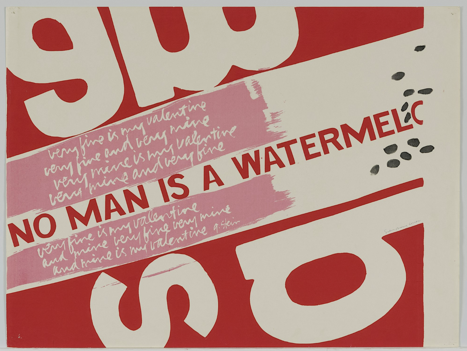
These are some of her amazing works that I was taking inspiration from:
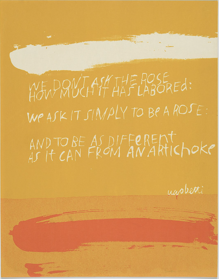
For my design, I chose number rule #9: “Be happy whenever you can manage it. Enjoy yourself. It’s lighter than you think.” I really like this rule because it is more general and can be applied to anyone’s life, and I think it is a great message because we all could be a little happier in this world. This is what my finished poster looks like:
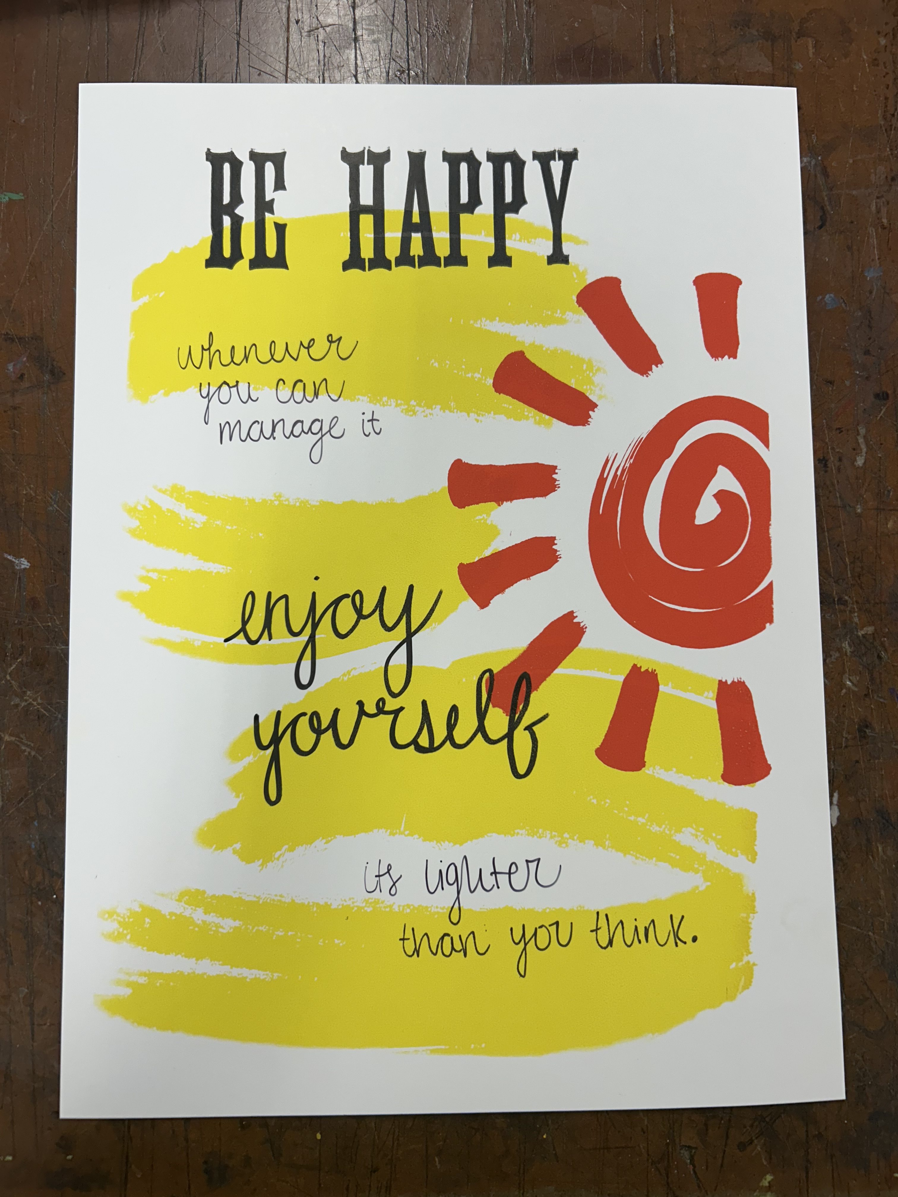
As for the process, I needed several layers for this poster and ended up doing 4 different layers. First I started with the background by creating those big brush-like strokes on a page in Illustrator and printing them out black on transparency paper so I could use photo emulsion to get that onto my screen. I started with that on the paper and printed it a vibrant yellow color. I found that Kent used lots of organic shapes and rough brushstrokes like these. I also did photo emulsion with the big sun figure as well, and that was the second step to print that on top of my yellow background. Kent tended to use a lot of bright colors, which is why I wanted to use colors like yellow and orange, also because I thought they went well with the message of being happy. Then I used a different technique for the “be happy” letters on top, I used old wood block type and used the letterpress to print that onto my poster. That is another one of my favorite ways of printmaking, it’s not what we focus on in this class but we were allowed to use any technique we wanted to. Lastly, I hand wrote the rest of the quote onto the poster, because I noticed when researching Kent’s work that she also incorporates a lot of hand writing into her works. I thought it gave it a more personal feel and I really enjoy how this came out. Learning about Kent was really inspirational and her work is really unique, so being able to create something inspired by her was a lot of fun, and my classmates made such cool posters as well!
Hope everyone is having a great week, thanks for reading!
Ella