For my final project for my intro to graphic design class, we were tasked with creating a travel poster for a destination, city, or country. After some deliberation, I ended up choosing to make one for South Korea. For some background, I am of Korean descent, both my mom and dad were born in South Korea but moved here when they were in elementary school. I was born in Ellicott City, Maryland and unfortunately I have never visited Korea. There’s a language barrier between me and my grandparents as well, so I never really was able to ask them about their life there. My parents told me stories of course, but they don’t have too many memories to share as they were both so young when they moved. So most of my impression of South Korea is biased on what I’ve seen through the internet and social media.
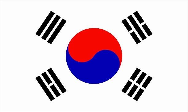
Water: Top right of flag
Fire: Bottom left of flag
Earth: Bottom Right of flag
For this project I wasn’t quite sure where to start, so I decided to approach it by learning about some of Korea’s symbols, to start was of their flag. Their national colors are white, black, red, and blue. Each color has a specific meaning behind it: White represents peace and purity, Red and blue are used to form a Yin and Yang symbol in the center of the flag. Red symbolizing yang a positive, active, masculine energy, and blue symbolizing yin, a negative, passive, feminine energy. Together they represent the harmonious balance and interconnectedness of opposing forces. Black is used to makes up four trigrams, each composed of three broken or unbroken lines. Each represent the four universal elements and the four cardinal directions.
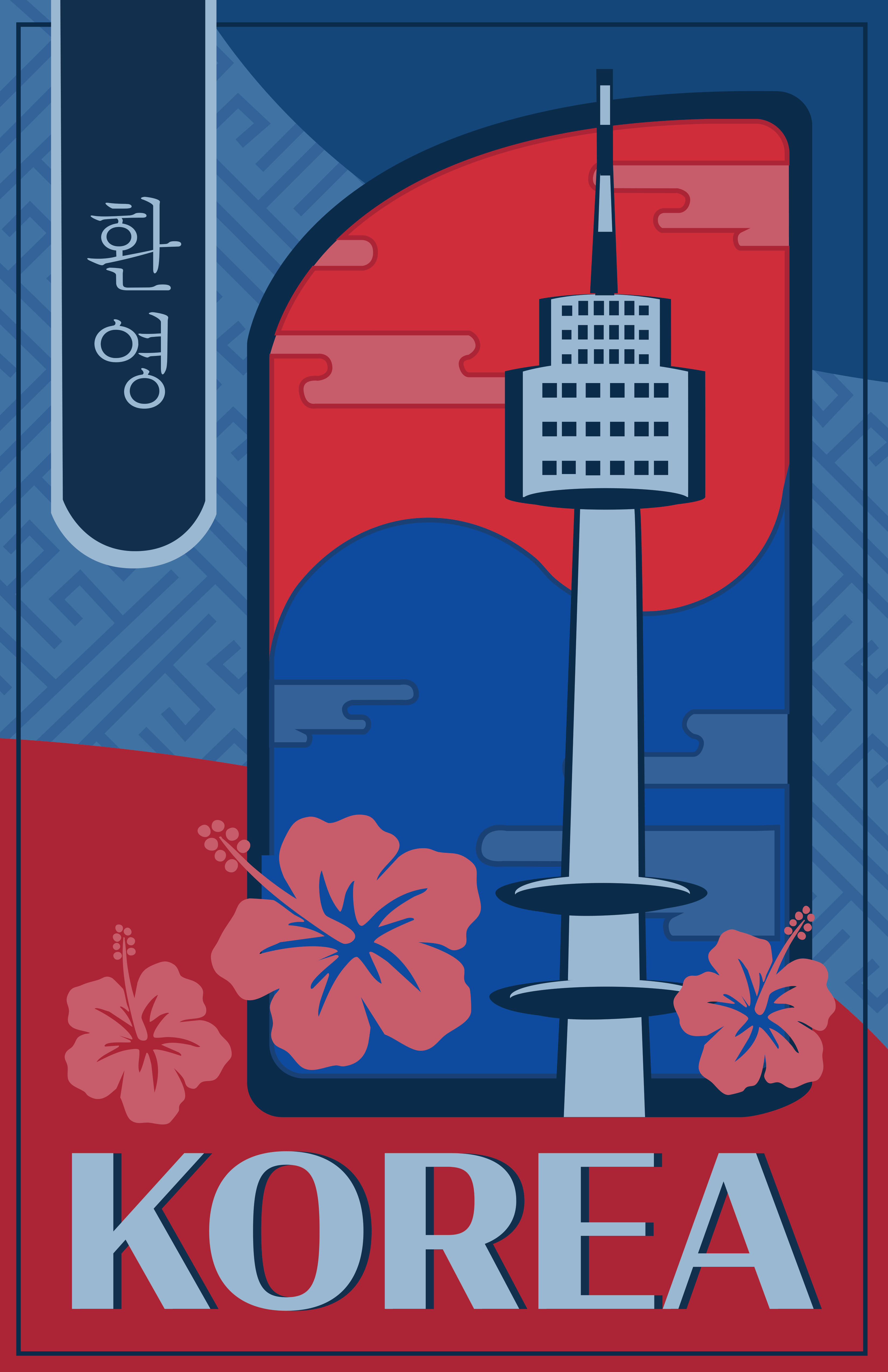
I loved the amount of symbolism and thought that went behind the design of the flag. There was so much effort and intention behind every single detail of the design which is something I wanted to try and emulate in my own poster. I started with creating a graphic representing one of Koreas most famous landmarks, Soul Tower. Soul Tower was South Korea’s first general radio wave tower used for TV and radio broadcasting. The tower is also associated with the “love locks” tradition, where couples attach padlocks to the fences as a symbol of enduring love. I also knew I wanted to incorporate the yin and yang symbol and chose to overlay some cloud shapes that were inspired by traditional Korean art to add depth and interest to the otherwise more flat colors. I incorporated Korea’s national flower the Hibiscus Syriacus, signifying the resilience, endurance, and spirit of the Korean people. Next, the background was feeling a bit flat so I took inspiration from some traditional patterning found on Hanboks, Korea’s traditional clothing, and incorporated it into the background to add depth and texture. Lastly, I wanted to incorporate some of Korea’s lettering so I created a banner at the top left of the piece, with the word “Hello!” in Korean. This last addition I felt really completed the work and helped the final poster hold a pleasing balance.
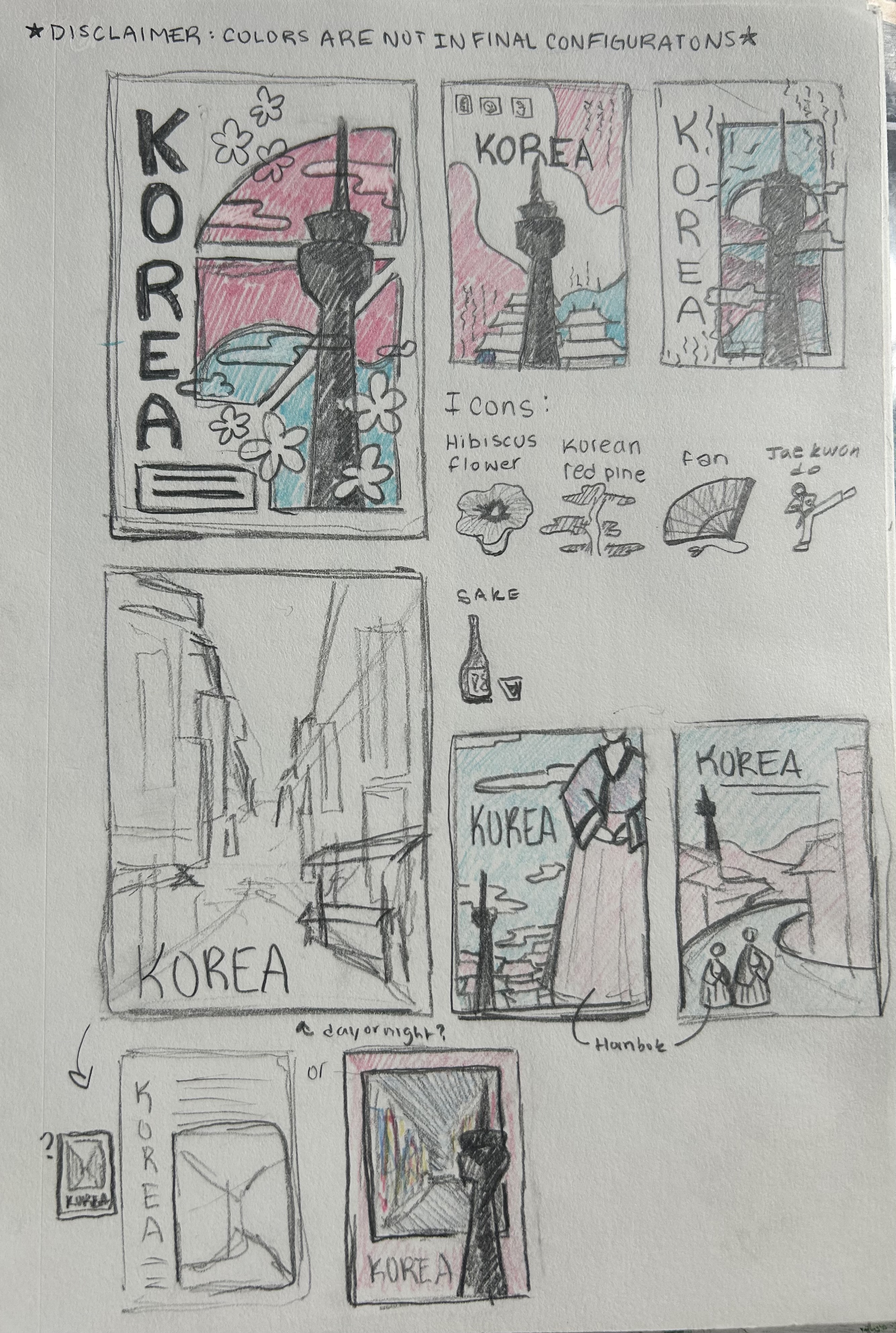
Overall I really loved this project, I really enjoyed exploring Korea’s culture and learning the meaning behind their symbols. In the end, I had collected too many symbols to use as you can see in my thumbnails and had difficulty on settling on a design. I wanted to make sure that the poster didn’t have too many components so not to risk it being too busy and overwhelming. I wanted the poster to feel peaceful, harmonious, and balanced just like the principals that the Korean flag represented. So I was selective but purposeful with each symbol that I ended up incorporating. I’m really thankful for the opportunity to learn a bit more about my culture through this project. I learned a lot more about how important symbolism can be in design and can be used to amplify the tone or messaging of your piece.
Thanks for reading!
Emma <3