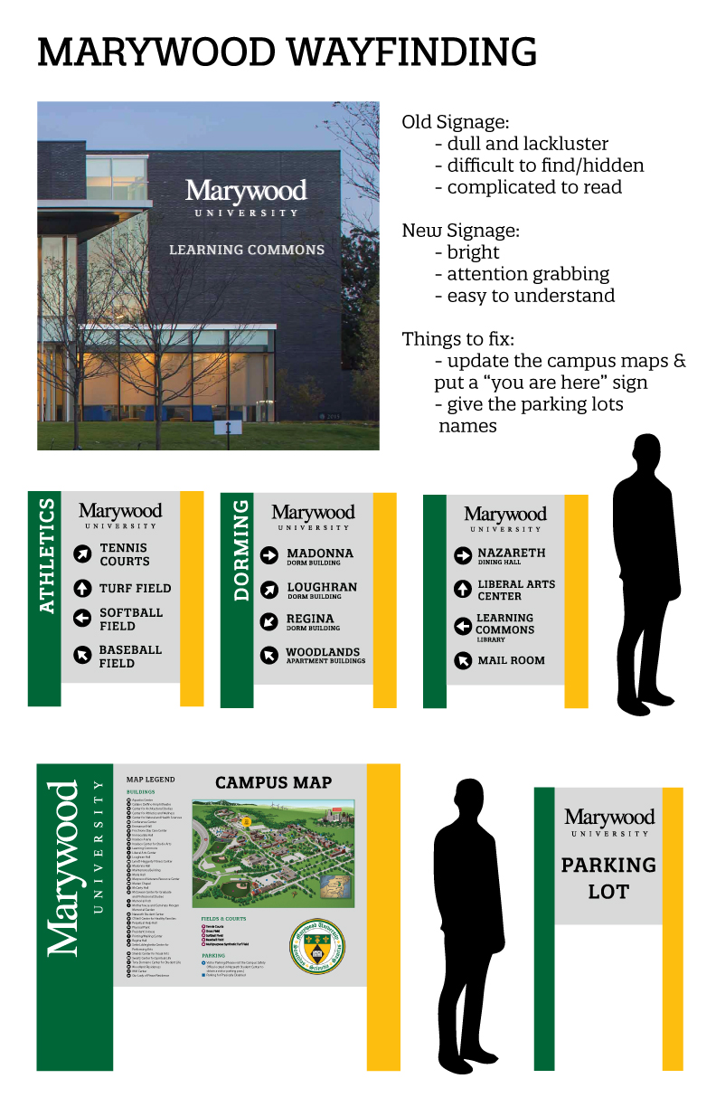
This week, my Typography class took on a new project that was a big switch up from the past projects we’ve done. We were asked to go around our campus here at Marywood, and take a look at the different signs and labels on all of the buildings. I noticed a lot of issues with the current ones we had on campus, and luckily then for this project we were asked to improve and redesign them in a mockup.
Considering this was nothing like our last project, I was kind of skeptical about it not being as fun, but it turned out to be really interesting instead. I liked making a mockup and having to go outside of my comfort zone in order to design some new signs for my campus. It was also really neat seeing all the different ideas my classmates came up with. Not a single person’s looked alike, so if these were actually to get presented somewhere, there would be a big variety to choose from.
Before this project, I never really thought about the work that goes into making the signs for a university’s campus—or any business for that matter, and now after completing this project it just solidifies my ongoing thought that graphic design really is everywhere without even realizing it!