Hope everyone is having a great summer so far! This week I’d like to talk through my thoughts and process while making my final project for my Motions Graphics class. For this last project we were tasked with creating an opening credits scene inspired by graphic designer Saul Bass’s work.
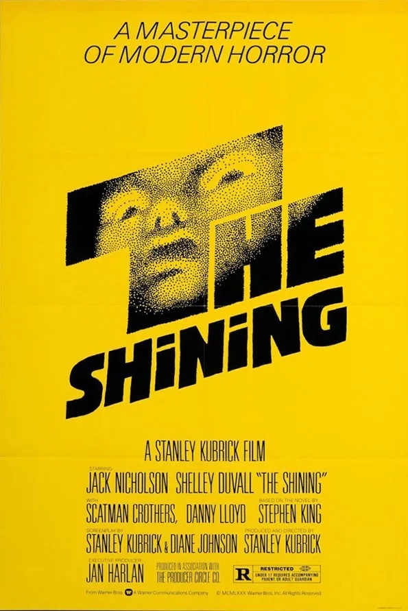
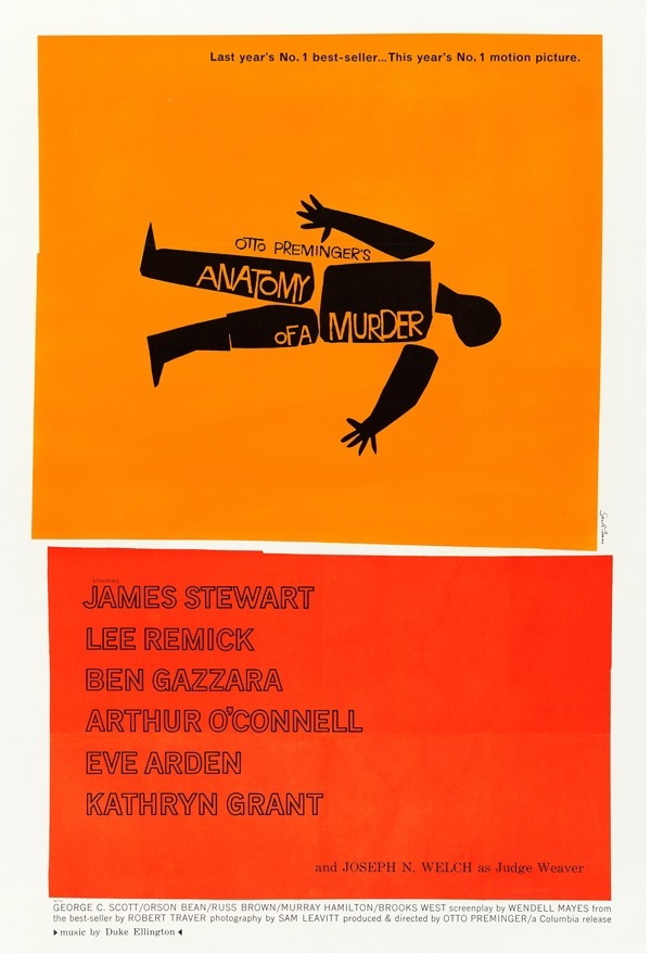
Saul Bass was an American graphic designer best known for his motion picture title sequences, film posters, and corporate logos. He designed posters for movies like The Shining and Autonomy of a Murder. He was known for his minimalist style, use of geometric shapes and bold colors. Personally I loved the way that he approached his works, his style opens up an opportunity to create emphasis on symbolism. When planning for my own work that emulated his style I had to put a lot of thought and consideration into the colors and symbols I used. I ended up choosing knives out as my movie because of the fantastic visuals and symbols that are incorporated in that movie.
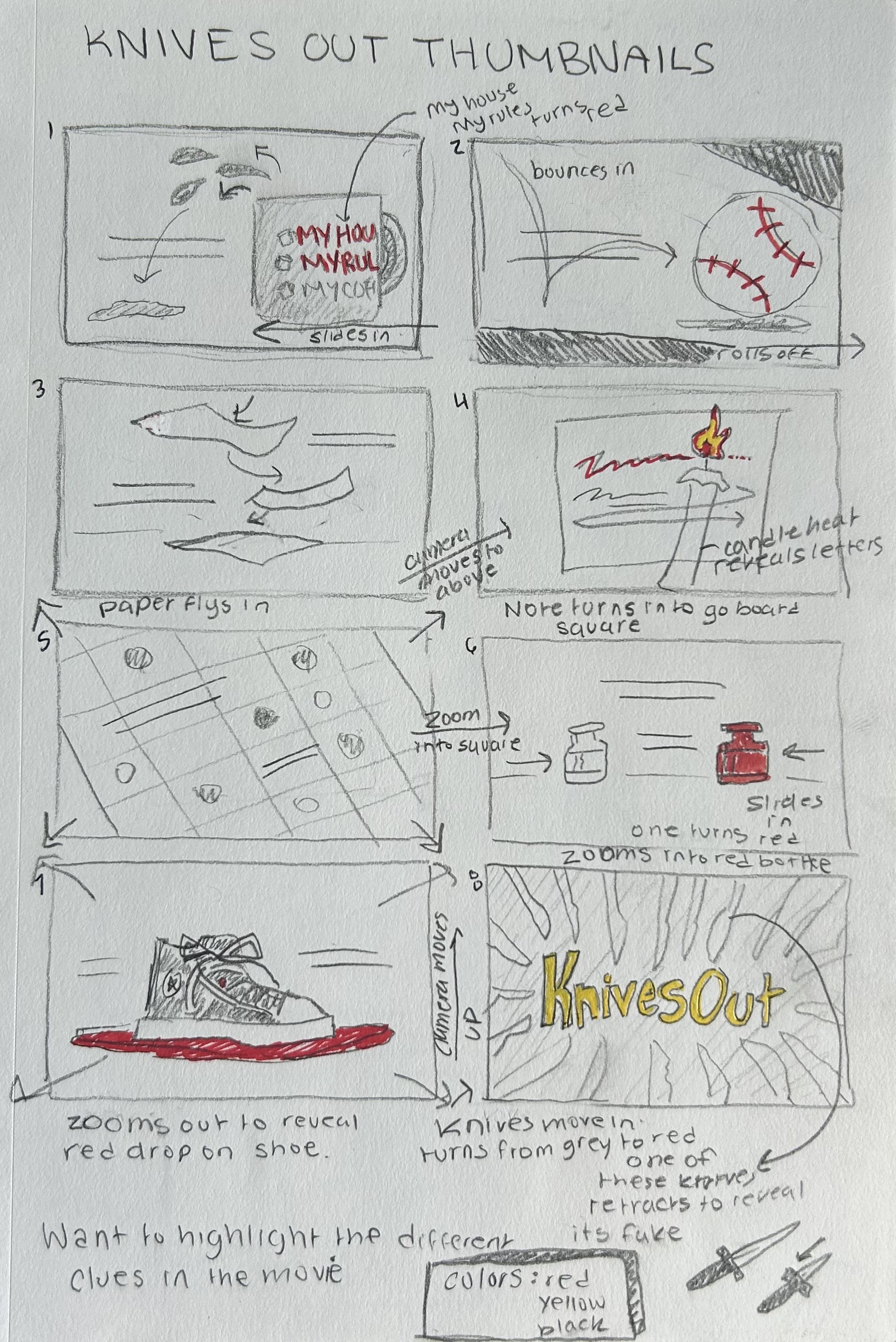
During my brainstorming process I as I picked symbols I tried to find ways to complement the ideas behind the imagery with animation. Like with the medicine bottles one turns red to allude to how one of the bottles is deadly in the show. Or with the “My House, My Rules, My Coffee” cup the lettering for “My House, My Rules” turns red in reference to the scene in the end of the movie where Marta drinks from the cup covering the covering the words “My Coffee” with her hands. Leaving only the other words to symbolize to how she now has ownership over the home and the fortune. Additionally I really loved trying to think of unique ways to transition between each symbol, it was one of my favorite parts of the whole process and I think it was worth the work. I also tried my best to match the movements with the music, I felt that by doing so it added another element of immersion for the viewer. My favorite detail though out the whole piece was in the end where the title comes out, one of the knives that comes in to frame in the top right corner retracts a little on the impact because its fake. Which is a reference to the end of the movie, which I don’t want to spoil. If I were to go back and do some more edits I think I would make the movement a bit more obvious, I initially wanted it to be really subtle, but after feedback most people didn’t notice the detail until I pointed it out to them. Even then some struggled to see it, so I’ll definitely need to go back and adjust it.
Overall I really enjoyed this project, it was a lot of work but it’s become one of the favorites things I’ve made this year. And thought its not perfect, I’ll definitely be going back and refining it further, I’m really proud of it. I barley had any experience with motion graphics before this class and I’m really happy with my progress. I’d definitely like to incorporate these skills in future works.
Thank you for reading!!
Emma <3