Welcome to another segment of, The Work In Progress. Mixing two of my favorite techniques together, drypoint and painting, became an interesting process for me as I will discuss through my “Monoprint.”
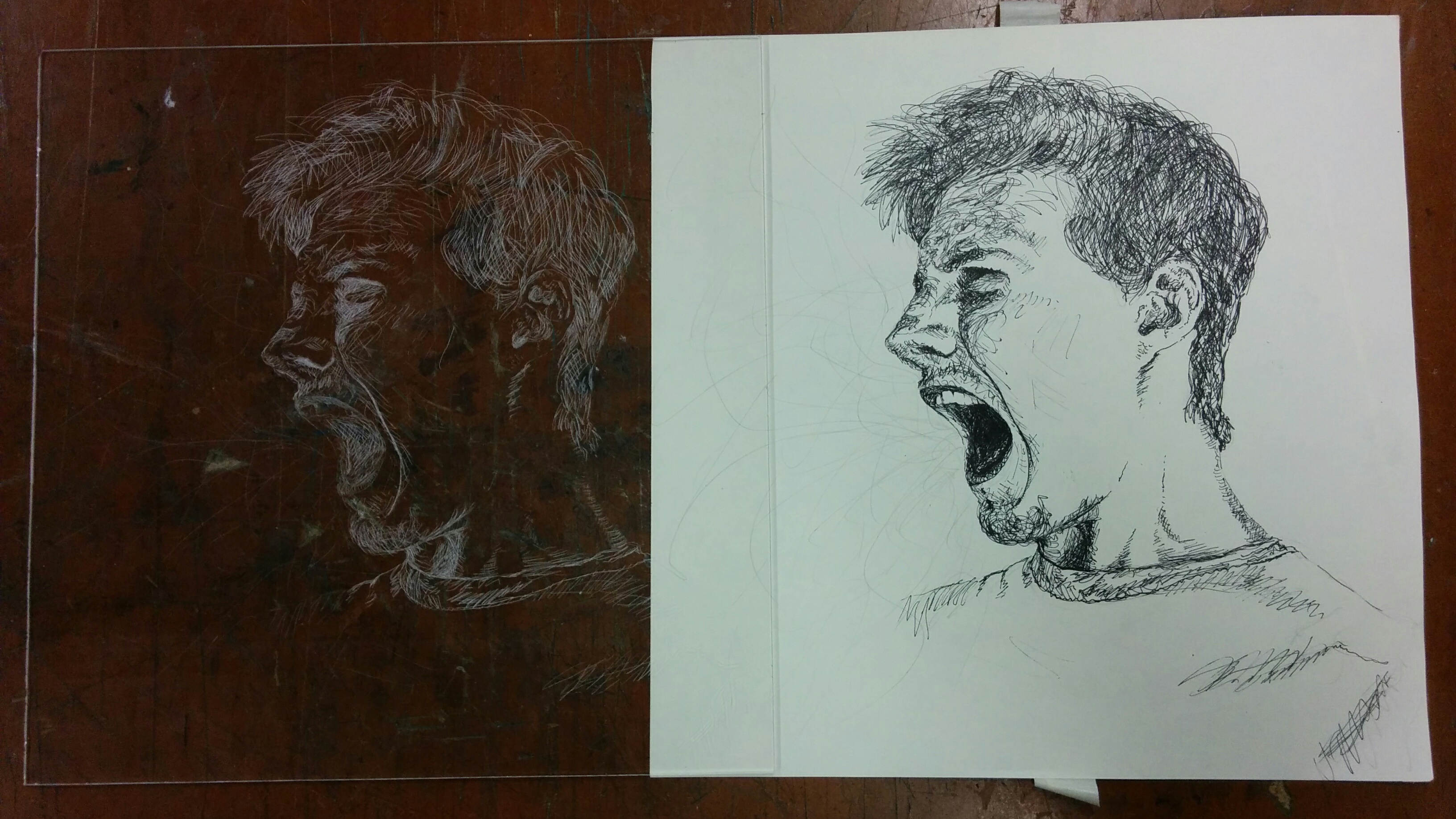
After finding my motivation, I decided that one of the best fits for a painterly effect would be of me screaming. This would allow for an outburst of emotion along with the loose brush strokes that would complement it. The paint would also be useful to showcase my art style with paint splatters and hard strokes. The drypoint print would be helpful in giving the form of the face more structure. In contrast to my other drypoints, I quickly engraved this one to adhere to the quality of the paint. Also, it didn’t seem necessary to crosshatch too much because I would inevitably paint over it, especially for darker parts like the mouth and hair.
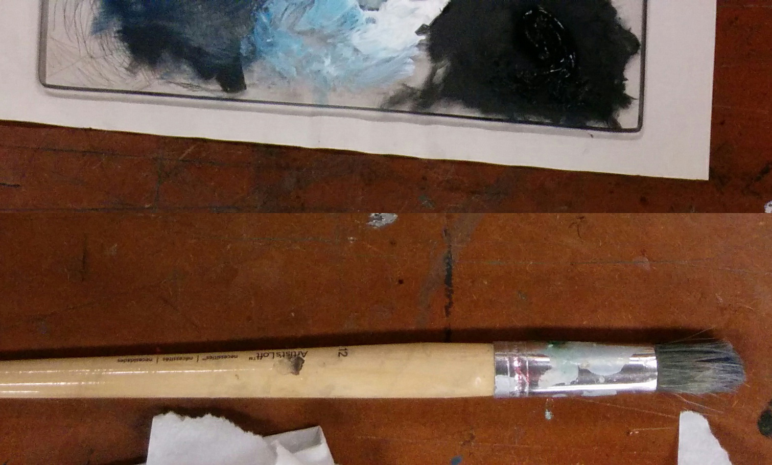
Once I applied the ink into the matrix using the typical drypoint process, I started to paint on the plate. Be careful not to paint over the burr too much or else the ink will smear over on the plate which can cause a grainy drypoint image, a musty proof, and unintentional changes to the hue of your paint. Unless you plan to have an image with that effect, I would work around the engravings, or at least go softly over them. I used a specific kind of paint used for monotypes and monoprints alike. This paint is designed to release off of the plate while printing by using a binder that does not incorporate acrylic-resin. I can have different textures and use different techniques which can’t be produced by just painting directly onto the paper. With the technical information aside, my skills in painting fit well with this medium as I casually used different sized brushes to stylize my plate.
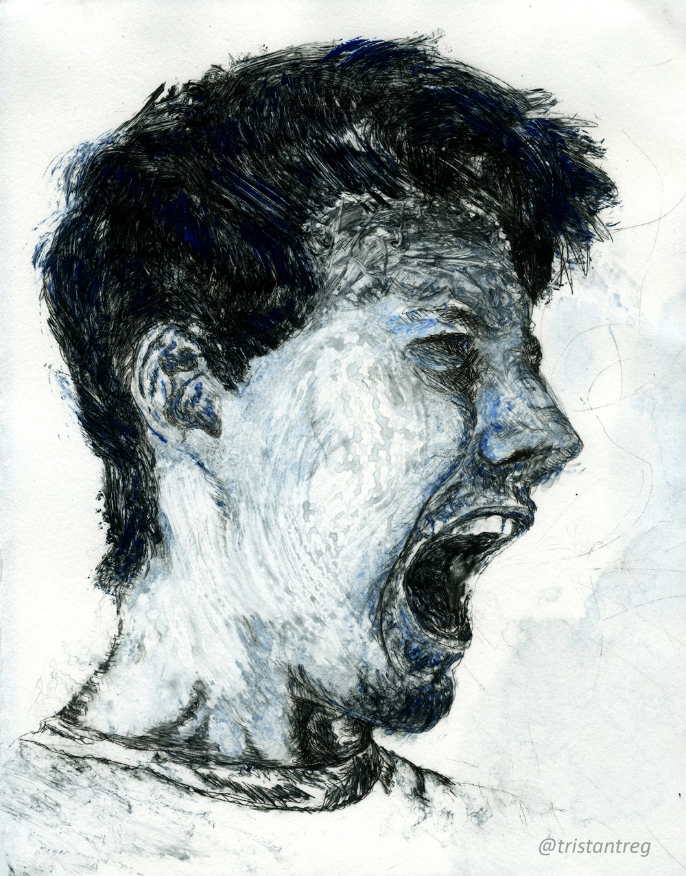
While I was painting, several parts started to dry out. This was normal, because after printing the matrix on a damp paper it turned out great. The textures I received made the process all worth while. The highlights of blue standout at the right moments to give an otherwise bland image a pop. The subtleties of the water marks along the cheeks and in the background are more important than what it may seem. The lack of ink in parts of the burr, like the background and along the shirt make the face even more of a focal point. The movements of the stokes fit perfectly with the emotion and the styles of the form (for example, in the hair, the nose, and the cheek).
My love for watercolor and ink really do shine from this, along with the emotion that is portrayed from the proof. Whether the feeling you get is sorrow or anger, the power a simple monoprint can have is impressive.
Please leave a comment below if you have any critiques or comments, or simply just LIKE and SHARE!