I feel as though I tend to talk about my Digital Design class often, but I really do love the assignments and the artworks that I end up creating in this class. I also like that the projects all relate to one another, because we are in essence creating a television series/comic series/video game with these ideas. In the beginning of the semester, the class was instructed to think of an idea that we would want to further polish for the entirety of the semester. From there, we created characters, backgrounds, and now, title art for our ideas.
For my title art, I was clueless- I had no idea what I was going to do because I am terrible with making up titles and names. It feels like such a big commitment that I can rarely decide on. I am also more self-conscious about my writing because it has always been more personal, and I suppose that timid-ness has translated over into even the little things like thinking up a tagline for my concept in class. Because I was so directionless, I did the best thing possible and just got to sketching out any and all ideas that I had. I didn’t commit to a specific title, either. I allowed it to shift and change as I had different ideas, because I knew that I would only hold myself back if I forced myself to stick to one title/idea while I was drawing. Below are all of the sketches I came up with, alongside some of the very embarrassing taglines that I’d rather never look at again (so naturally, I’d put it on this blog post).
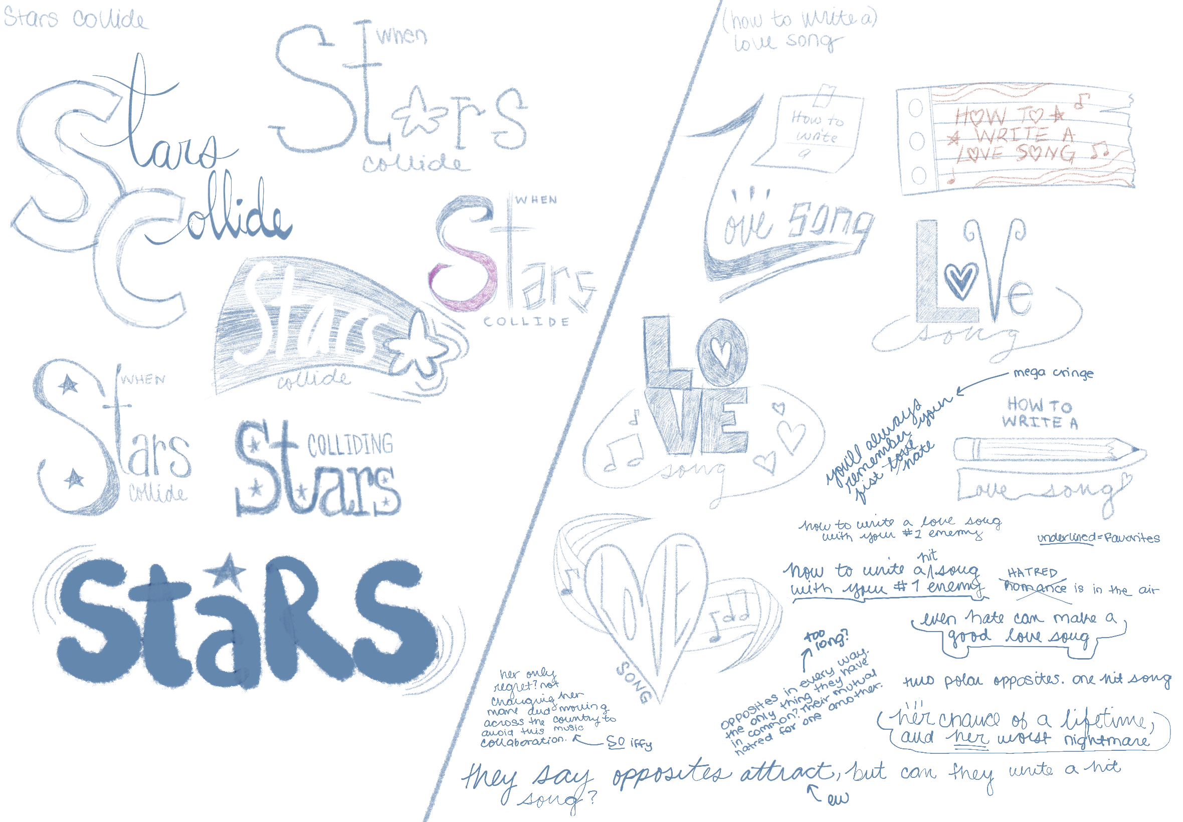
The following image is the sketches that I submitted for critique. I was so unsure about what ones I really wanted to go with, because I knew the story and was biased towards certain sketches, but was unsure how they’d be received. As a solution to that problem, I sent all of my sketches to friends and family and asked them which ones they liked. I am so thankful to have friends and family that are willing to offer critiques, because their input is truly valuable to me as an artist. It gives me insight into how my work might be perceived by those that aren’t being educated in art, and they always seem to notice things or have suggestions that I might never have thought of. So I took their thoughts into consideration when I was compiling the sketches for critique. My thought was that I wanted to go with sketches that were well received by people that I asked, because I intend for the format of my idea to be that of a television series, so the opinions of those that would be interested in watching it were very important for me to consider.
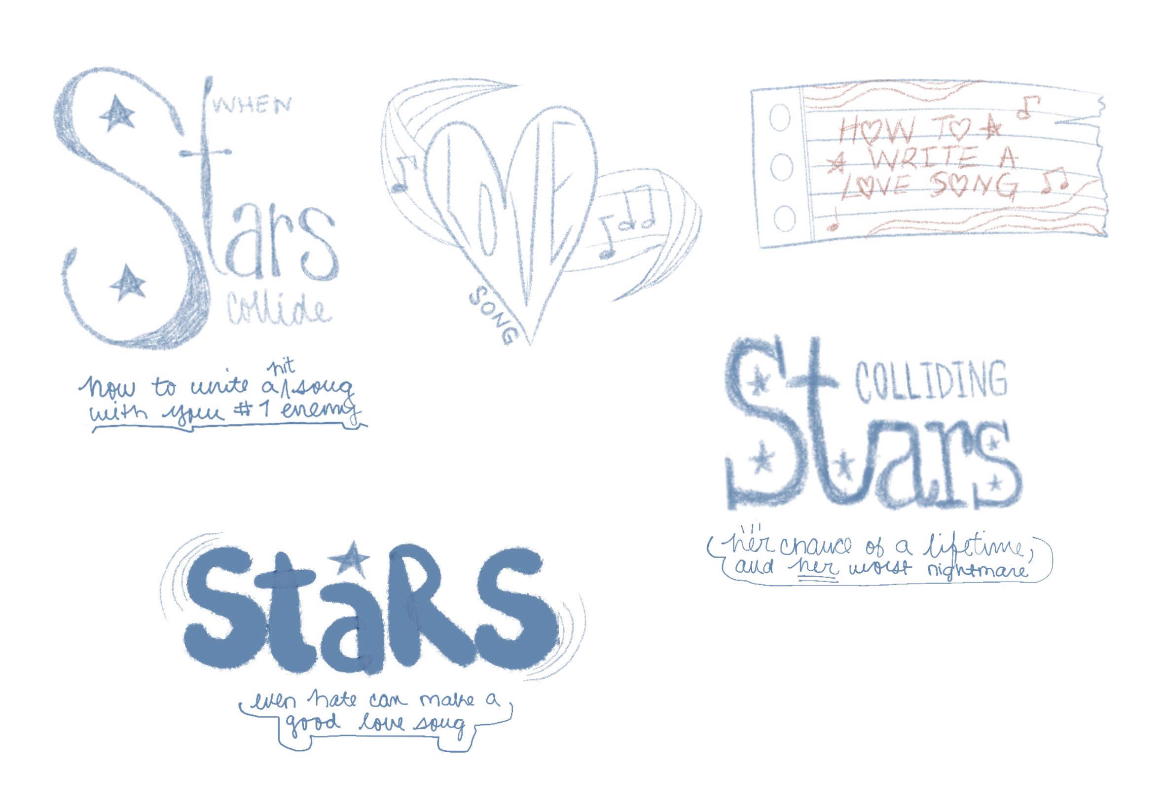
After the class’ critique of my sketches, I took what was said about what did and didn’t work and furnished them into more ‘final’ ideas. I was still incredibly indecisive at that point, and I thought that because I always have make things harder for myself than they need to be, I would render three or four different ideas. Thankfully, they were all relatively simple to do and so I didn’t have to worry about it taking away too much of my time.
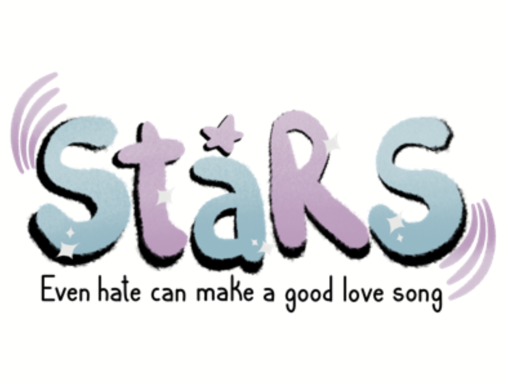
I was still working on finalizing some ideas when my professor came around for an individual critique, and together we decided which one worked best. I changed it around a little bit more after that, and then it was complete! I didn’t really go into this particular design with any intentions, I just wanted something that looked like it belonged with the rest of my work. I added visual elements that looked good, and it worked in my favor. There are curved slashes around both of the “S” in the title art, and I was told by many people that it looked like soundwaves (as my idea revolves around music), and while unintentional, it worked out for the best. I’m pretty happy with how the title art worked out overall, and I feel more confident in my hand-lettering abilities, too.