Let’s talk about travel posters! I struggle a lot in my Graphic Design class, because I am not that good at graphic design. I love to illustrate, but when it comes to choosing fonts, altering fonts, or creating logos, it never turns out well even though I try my best. That’s why, when it was announced to the class that we were going to be working on designing a travel poster for our next assignment, I was very excited! Especially because the professor mentioned that we could illustrate it if we wanted to. This assignment was way different than creating a logo for a made-up brand, and while it felt nice to be challenged with that assignment, I was ecstatic that I would be able to illustrate something for this class.
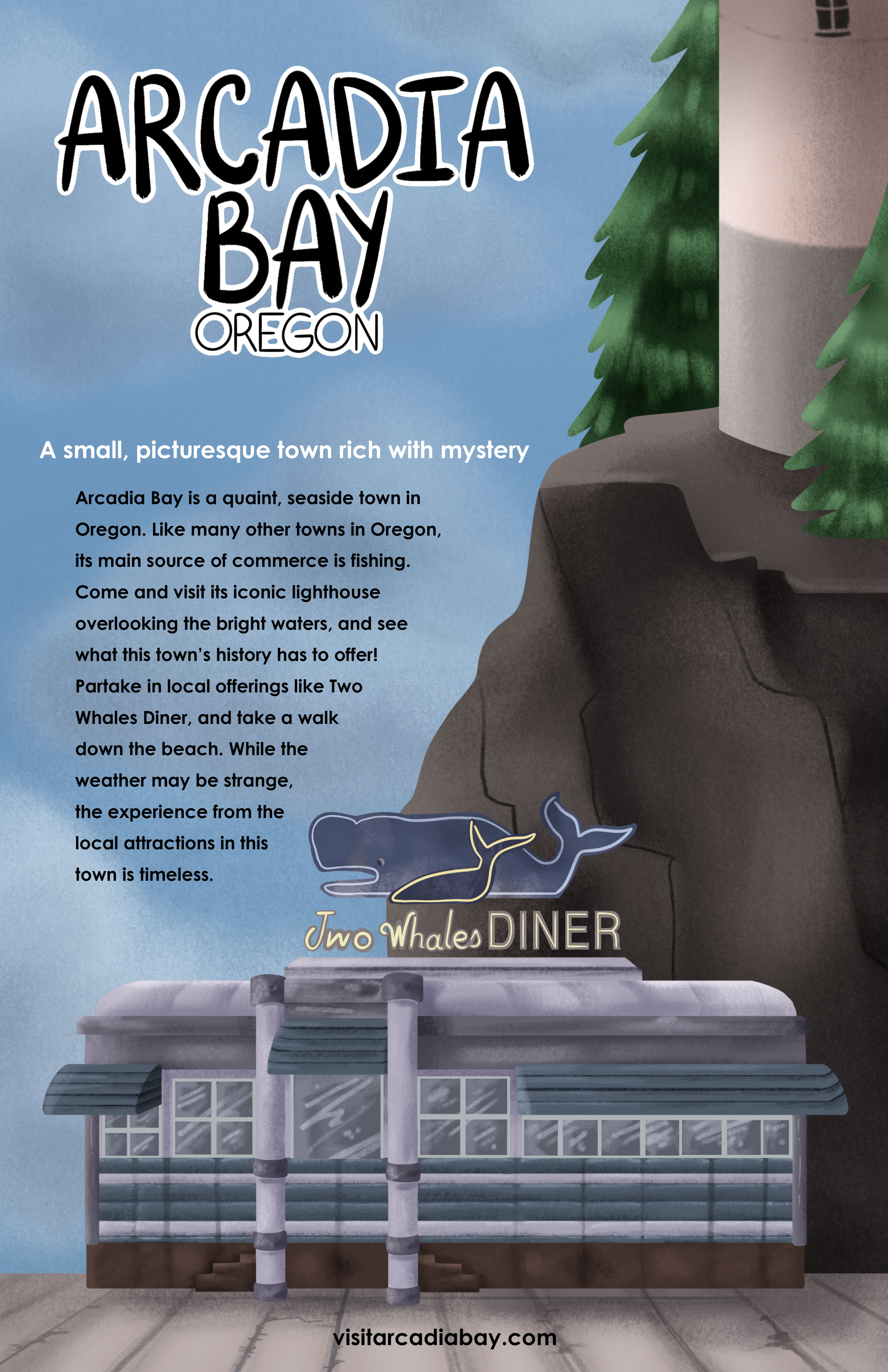
For the travel posters, we were allowed to choose a place that was real or fictional. I didn’t feel inspired by any real locations, and so I wracked my brain for a fictional one that I would enjoy working on. I ended up choosing Arcadia Bay, Oregon, from the videogame Life is Strange. Sure, I could have just created a travel poster for the town that Arcadia Bay was inspired by, but I thought that doing the videogame town would be fun, and also a bit of a challenge as it isn’t the first place one would think to go when making vacation plans.
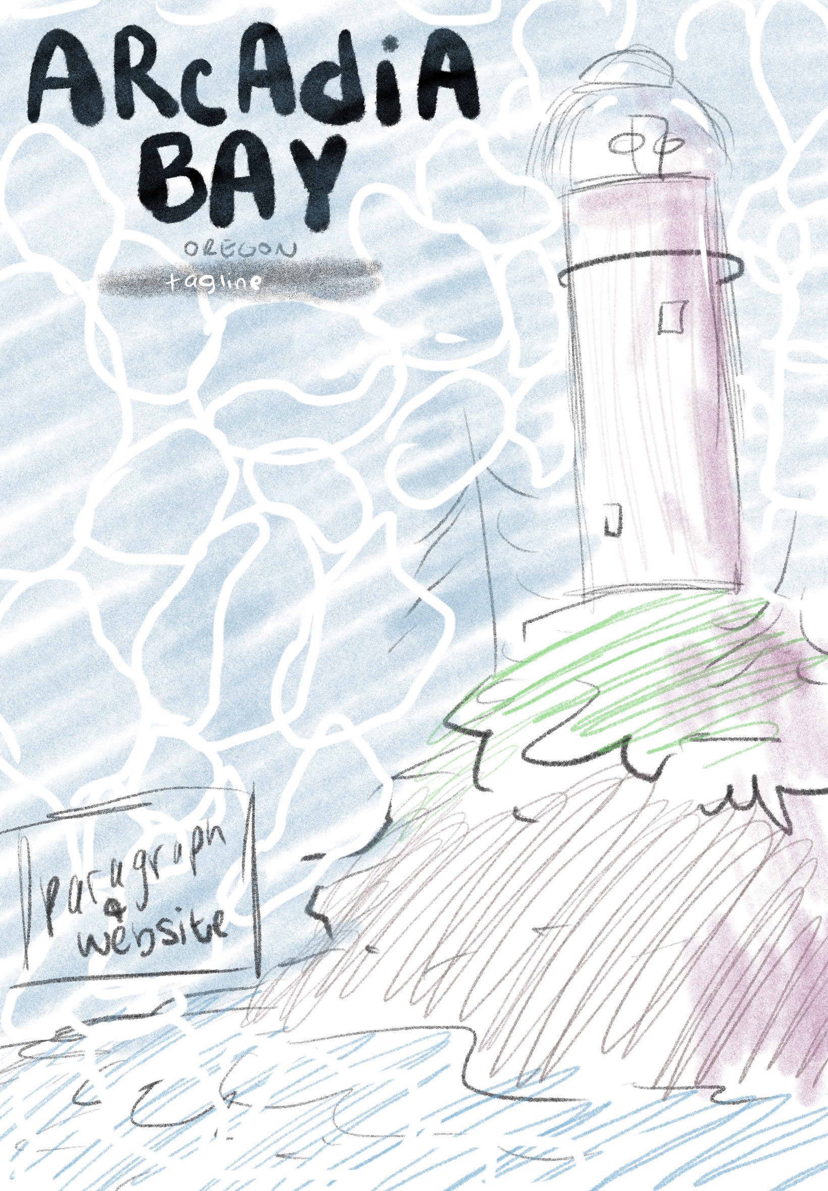
I started with numerous rough sketches, deciding on the general placement of text and images. I knew that I wanted to include the lighthouse into the travel poster because it is a landmark for the town, and it is also pretty important to the game.

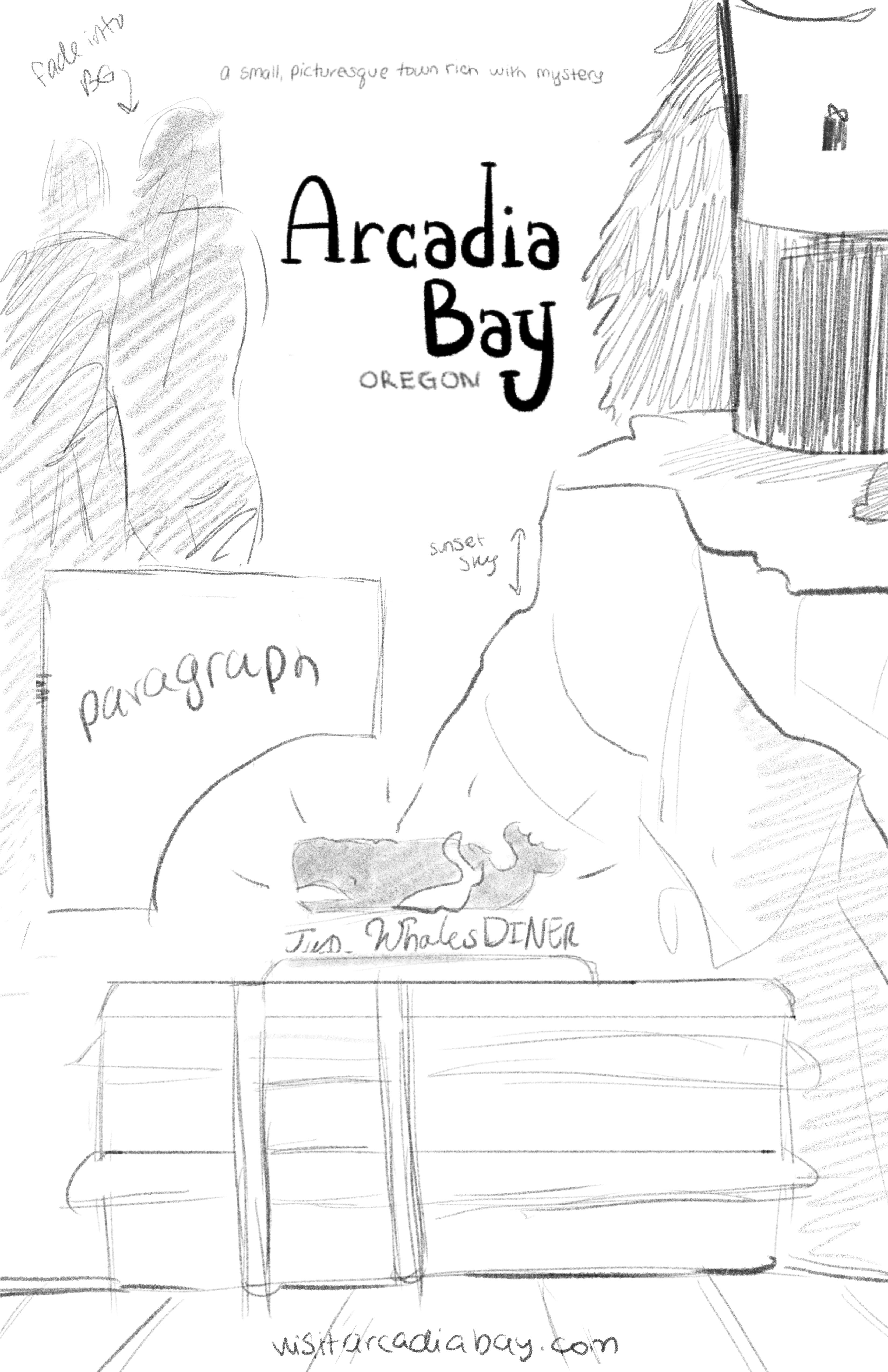
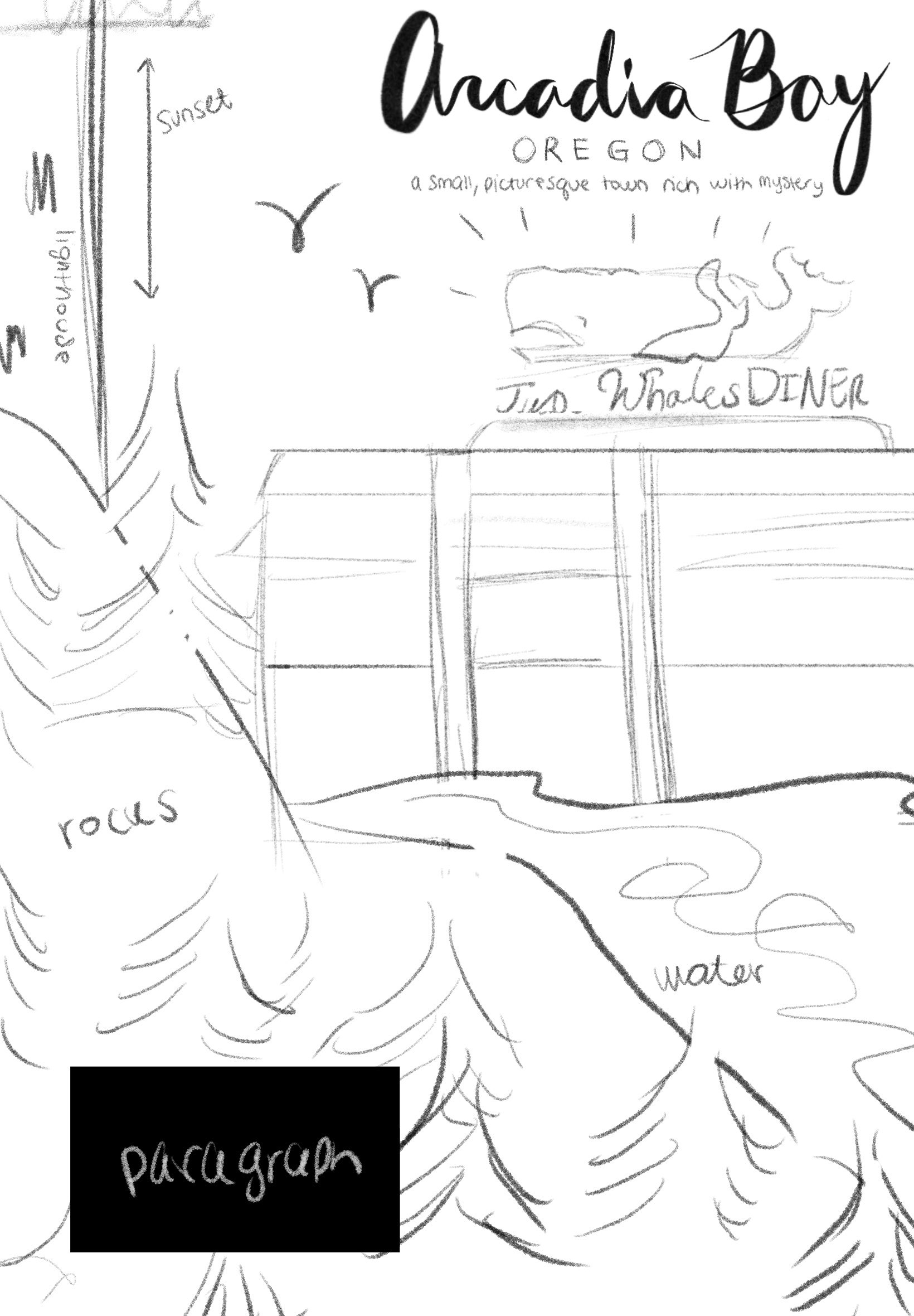
After I decided on the concept I liked best from my thumbnails, I started a more finished sketch of what I really wanted my poster to look like. I knew that I wanted to go for a more lineless style, inspired by the travel posters from the early 1900s. Life is Strange also has a more painterly style to both its characters and the photographs/images, so I wanted there to be dimension to the images in my poster as a nod to that. After I decided on the art style I wanted my poster to be in, I got to work drawing everything- that was the easy part, but also the most time consuming.
All of the drawing was done in Procreate, so after I finished the drawing, I saved it as a Photoshop file, uploaded it to my Google Drive, and then took it into Photoshop to work on the text. I hand-lettered Arcadia Bay, Oregon in Procreate, but all of the other text was done in Photoshop. It took a little guidance from my professor to place the text in the best spot possible, but overall I am really happy with how the poster came out!