It is already week five of the fall semester, which truthfully is still hard to wrap my mind around as I am sitting here wondering how it has gone by so quickly. Being preoccupied with of assignments can truly make time fly, and although it can be stressful it is nice to be challenged and flex my creative muscles. One of my favorite things I have worked on this semester so far was assigned to me from my Communication and Conceptual Design class. This assignment tasked me with creating a poster for an international design competition called “TypoDay” that is centered around typography and a theme. This year’s theme was, “Typography and Storytelling” so I decided to try and tell a story through type with an illustration composed of letters.
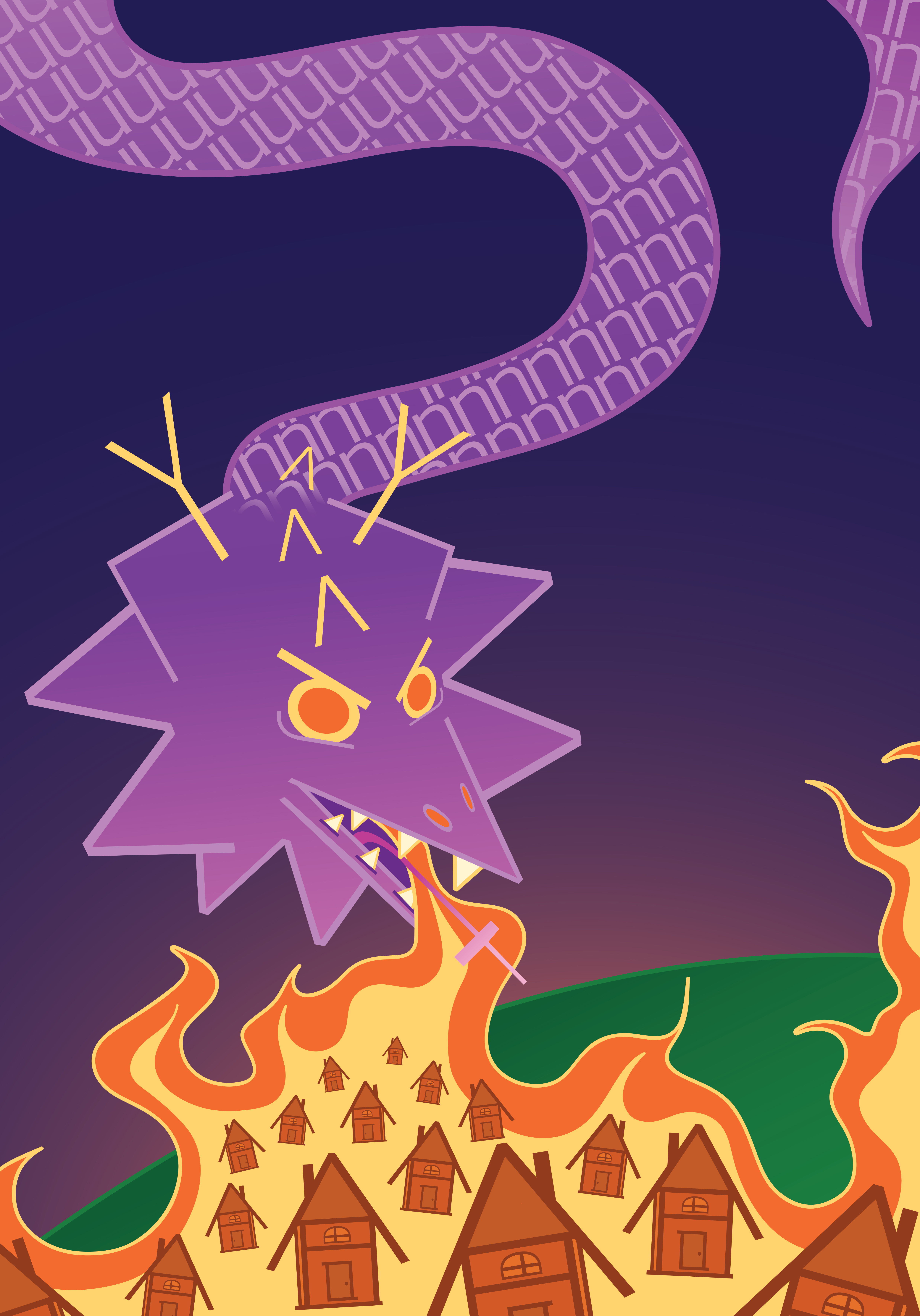
I knew I wanted to lean into that storytelling aspect with a mythical feel so I to decided to make a dragon, which many may agree is a very mythical creature. I felt a fierce dragon pictured with fire spewing out of its mouth would be cool to create but I was unsure as to what the dragon should be burning. However, during a class critique it was suggested that it be a little village made out of letters feeling the dragon’s wrath. I thought that was such a good idea and led me to my final design for the assignment. It was fun trying to figure out which letters would be best for each part of the dragon’s body and the little houses, and I would just keep scrolling through my Adobe fonts until I found one that worked best. I did make the mistake of building the entire poster in RGB mode, which was no good since the competition required CYMK if it was chosen to be printed. It was no big deal though as I just made sure to convert to CMYK, and then I adjusted the colors and saturation to make the colors vibrant. I am super happy with the final poster and enjoyed the process of creating it.