Brochures are a way to provide a compact and organized way to present information. They are often used in marketing and promotional efforts in order to showcase products, services, or events in a visually appearing and easily digestible format.
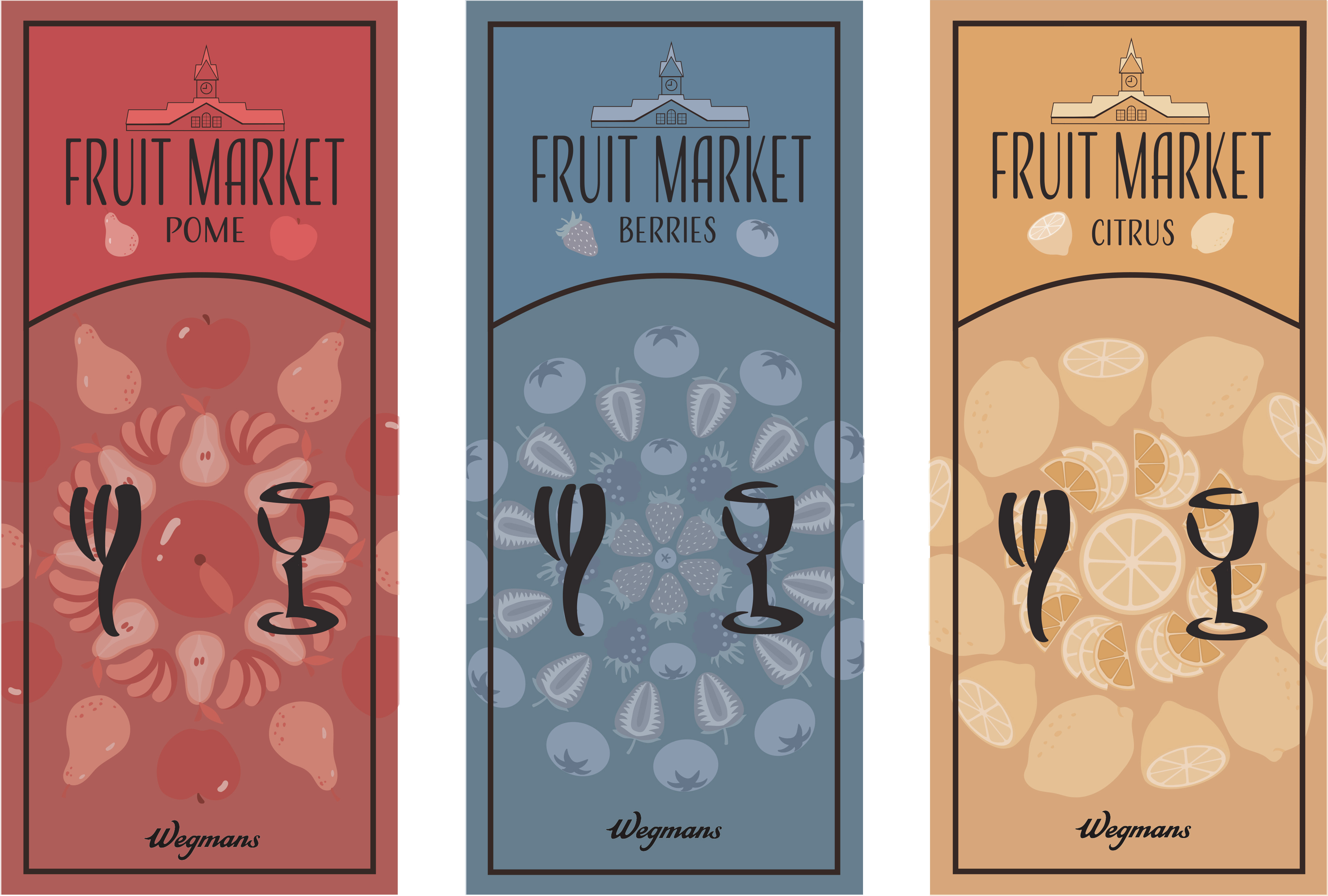
Recently in my Introduction to Graphic Design class we were tasked with creating three cohesive brochure cover designs for a supermarket brand. To start I definitely knew that I wanted to model my designs after Wegman’s, I liked their modern, sleek interior design. But had a lot of difficulty deciding on three categories to base the brochures after. There were so many options and it was a bit overwhelming to try to pick the perfect ones, but eventually I decided on three fruit categories: pome fruits, berries, and citrus fruits. For my final design I knew I wanted to create a circular patterned design with the fruits from each category. But I struggled with determining the best way to format the design, that was until I went back and did some more research on Wegmans. I ended up taking a lot of inspiration from their logo. Their logo is a graphic that consists of a fork, a plate and a goblet. I used the fork and goblet but left out the plate and replaced it with the center of my circular fruit pattern. Additionally to that, I took inspiration from the Wegman’s brand clock tower architecture that is found at most of their locations. I made a smaller version of it and placed it along the top as a label. This helped reinforce cohesiveness of the three brochures while also incorporating a bit of the history and character that Wegman’s has.
Overall I really loved this project and I’m proud of the end result. It was a great experience and I loved taking time to explore more aspects of Wegman’s in order to incorporate into my design. I liked the character it brought to it, and will definitely do it more in the future!
I hope everyone had a wonderful spring break! Thank you for reading!
Emma <3