In this entry, I want to go over my projects I’ve worked on this week (as is customary). There’s, admittedly, less sculpture work at the moment because I am not currently in a sculpture class, but this week I plan on resuming work on the stained glass heron project that I hinted at last semester, so stay tuned for my progress on that!
In the meantime, I’ll go through each of my classes I’ve made projects for these first few weeks. I’m excited to be back, although the workload is already getting a little hectic.
2D Animation
In 2D so far, we’ve had a self portrait assignment as well as a brief animation showcasing a principle of animation. For the self portrait assignment, we had to create a self portrait based on the style of an animation that inspired us. The animation I chose is a movie called “Wolfwalkers.” It’s a very cool take on the concept of werewolves and the character designs are masterful. To take a look at the reference material, take a look at google image search. They’re very lovely!
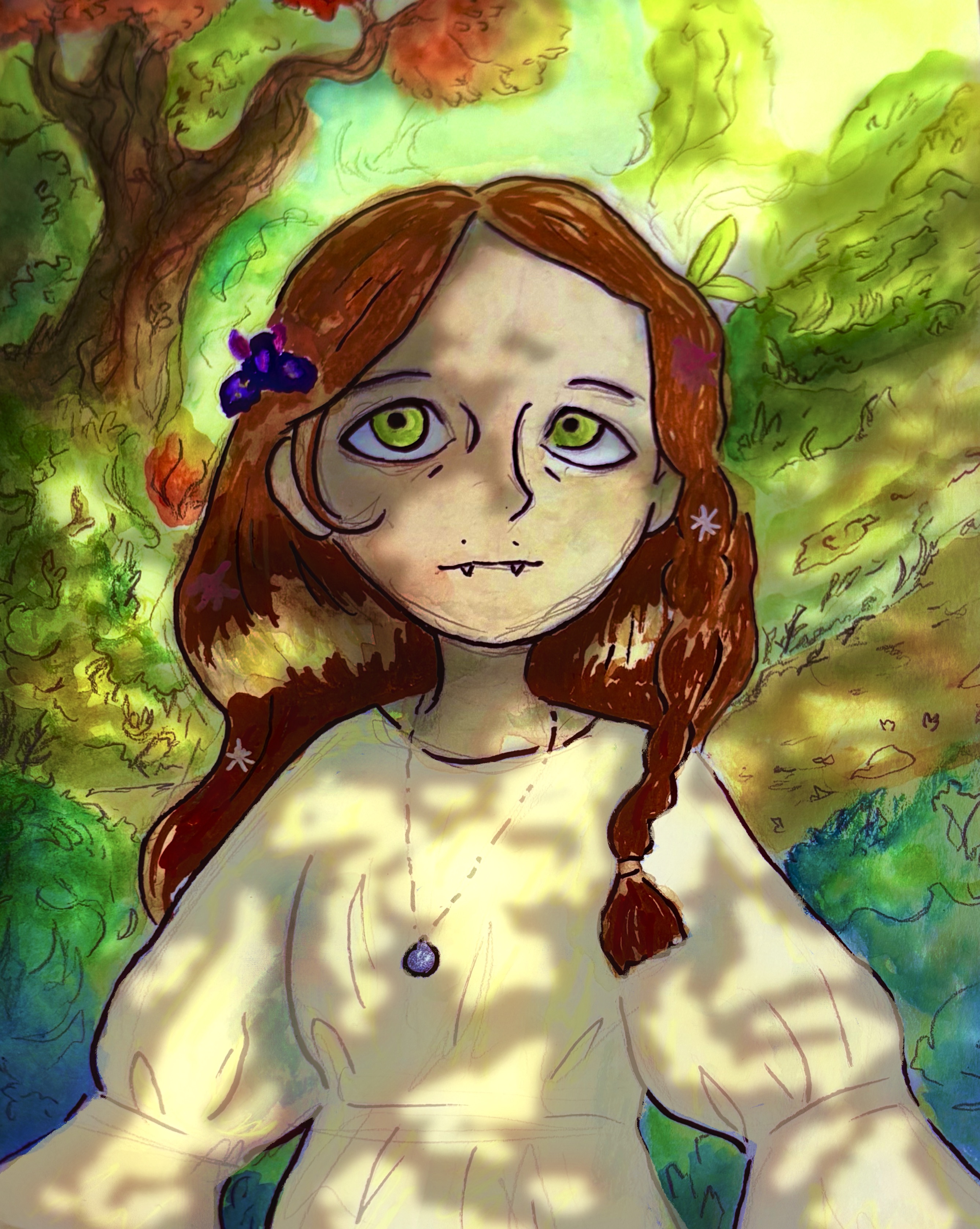
This is what I came up with! I’m not super happy with its resemblance to me, but the style is very basic-shapes based. I made sure to include my fun hair halo and my little teeth piercings, as well as the necklace I wear most days. I added an iris in my hair because they’re my favorite flower. I started off with watercolors, but I quickly found that I couldn’t achieve the deep color I wanted. I went in with paint pens and then took the image into procreate to add the lighting effects I desired. I think it turned out a lot better after making those changes.
The second project for 2D animation was an animation showcasing a principle of animation. There are 12 principles of animation, and there were 12 people in the class! I got “appeal” which is essentially giving your character an appealing design, whilst making sure it is easily animatable. It is also ensuring that the moves a character makes are appealing and fun to watch.
I’m hopeful I was able to accomplish this, although for the final portfolio, I want to make the end portion where the jester returns to the stock, hands-down position faster and remove the speed lines, but I’m still very happy with it! My apologies if it appears very very crunchy. Seems like it just wants to be low quality on here.
Communication & Conceptual Design
In this class, we’ve had one major project so far, with a long running project underway. This is another main project I’ve been pouring my efforts into. Below is the beginning sketch.

We had to make a poster for the local Dunmore High School theatre. The play they’re showing is “Anastasia.” I wanted to incorporate a combination of art nouveau and art deco because of the time period it takes place in. Art nouveau is right at the tail end of the time period, but I liked the way it complemented the princess themes of the movie. I attempted a constructivist inspired poster since Anastasia is Russian and and it’s also close to that time period, but I don’t work as well with basic shapes. It essentially looked like a paper cutout.
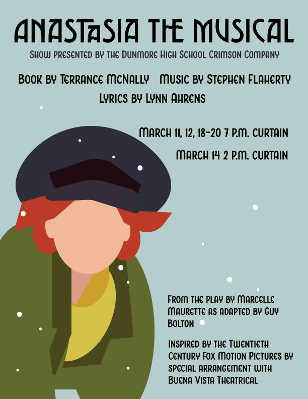
So I went with my initial sketch instead. I had to shorten the arm to be more anatomically accurate.
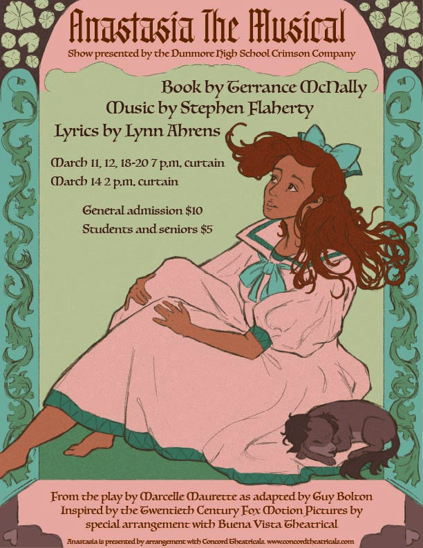
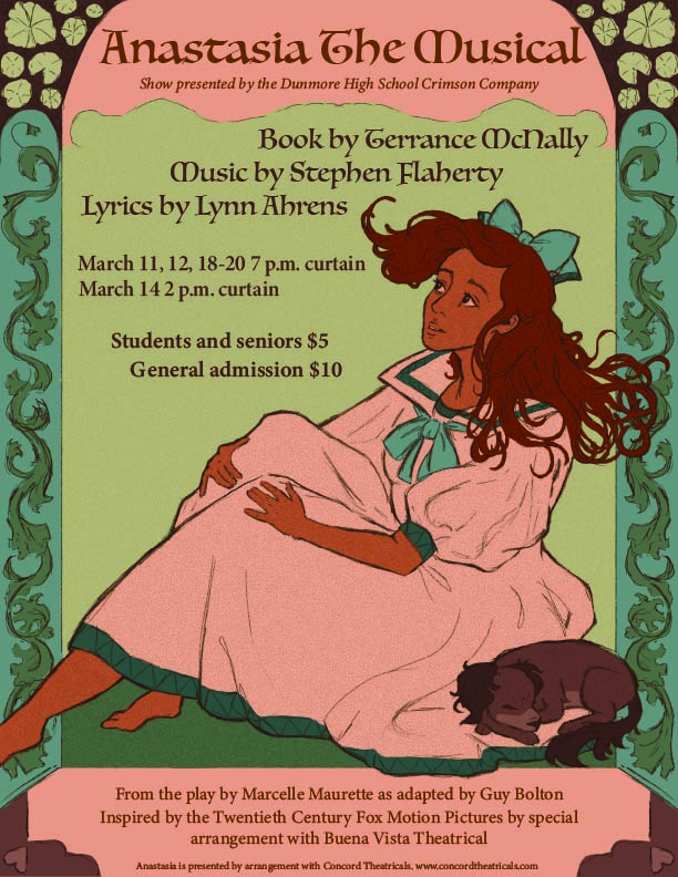
The arm is still a bit long, but I was able to shorten it to a less unsettling amount. The image on the left is my original version and the image on the right is with feedback given. The class wasn’t a fan of the original type and suggested using the body type as the title. It is a bit small in that variation with the space I have there. I admittedly still like the original better, but majority rules on that one.
Book Illustration
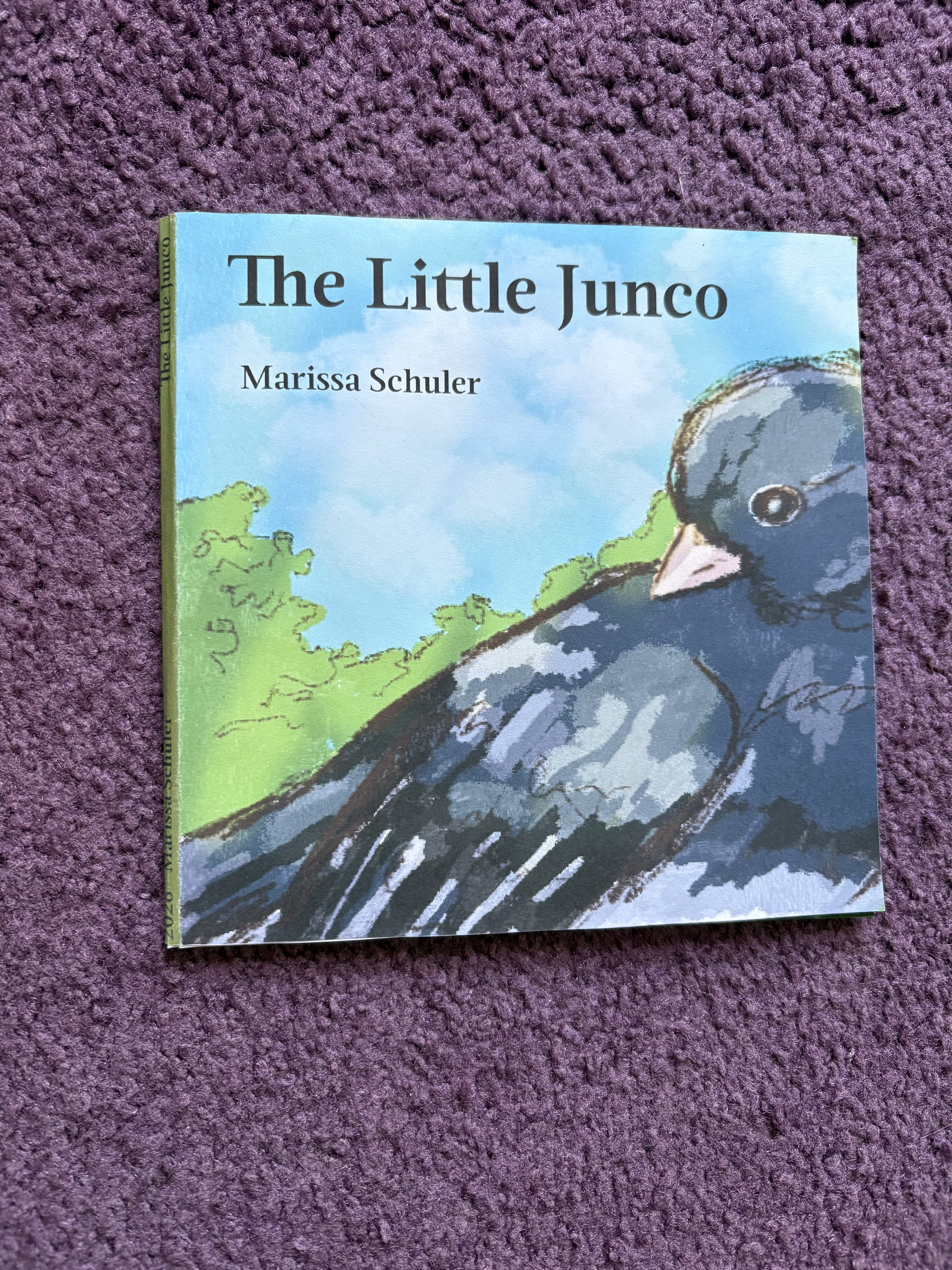
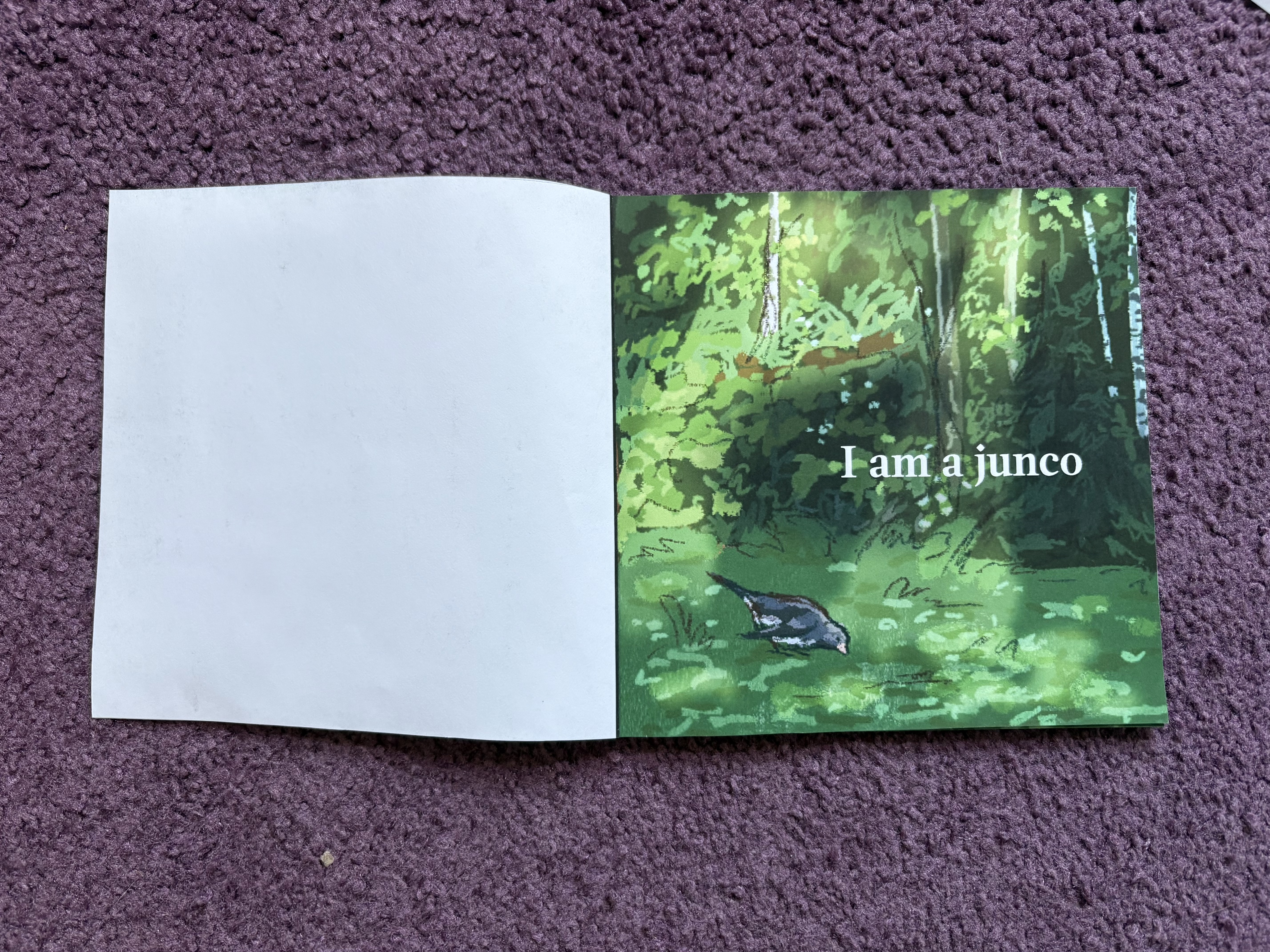
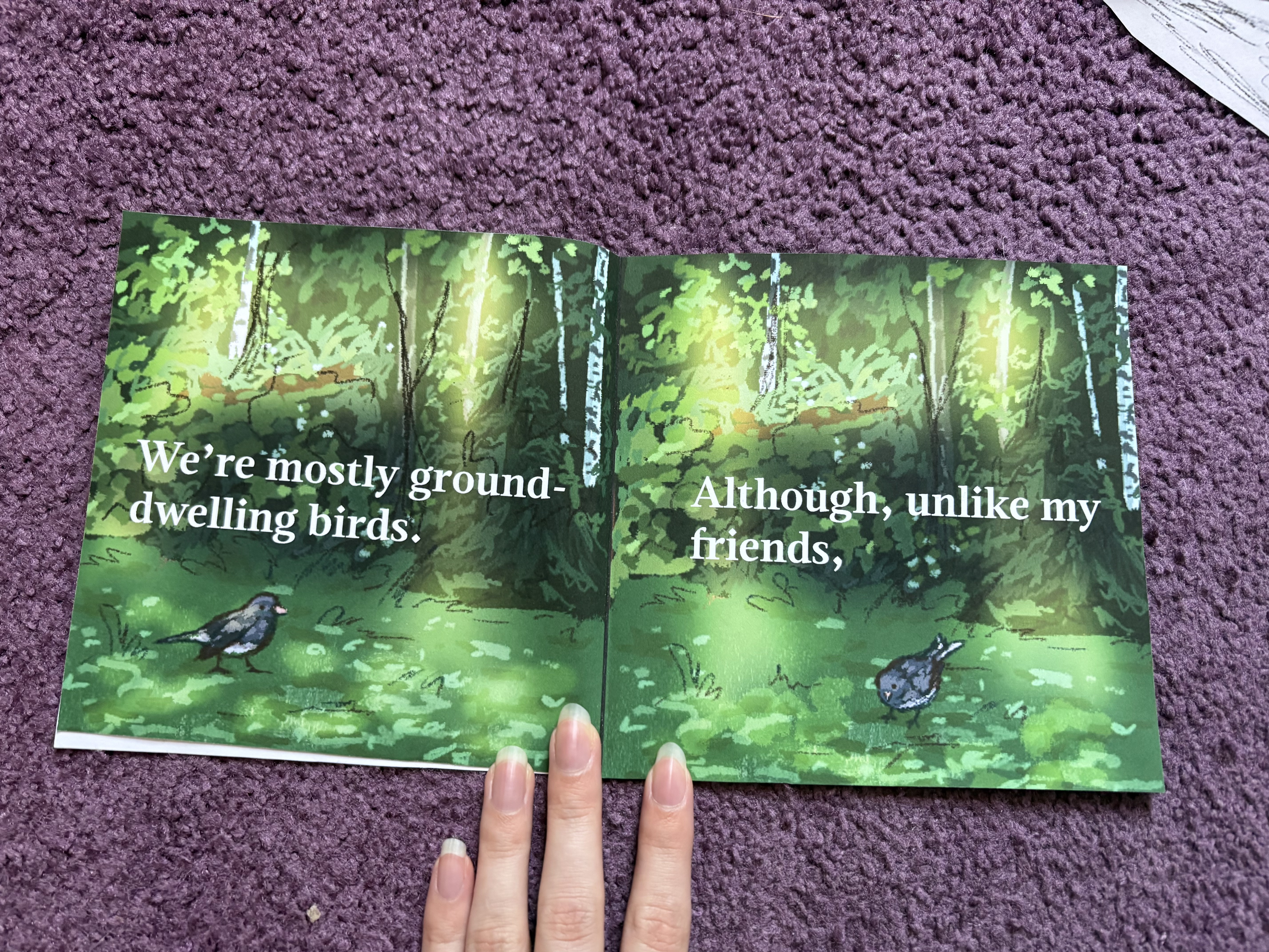
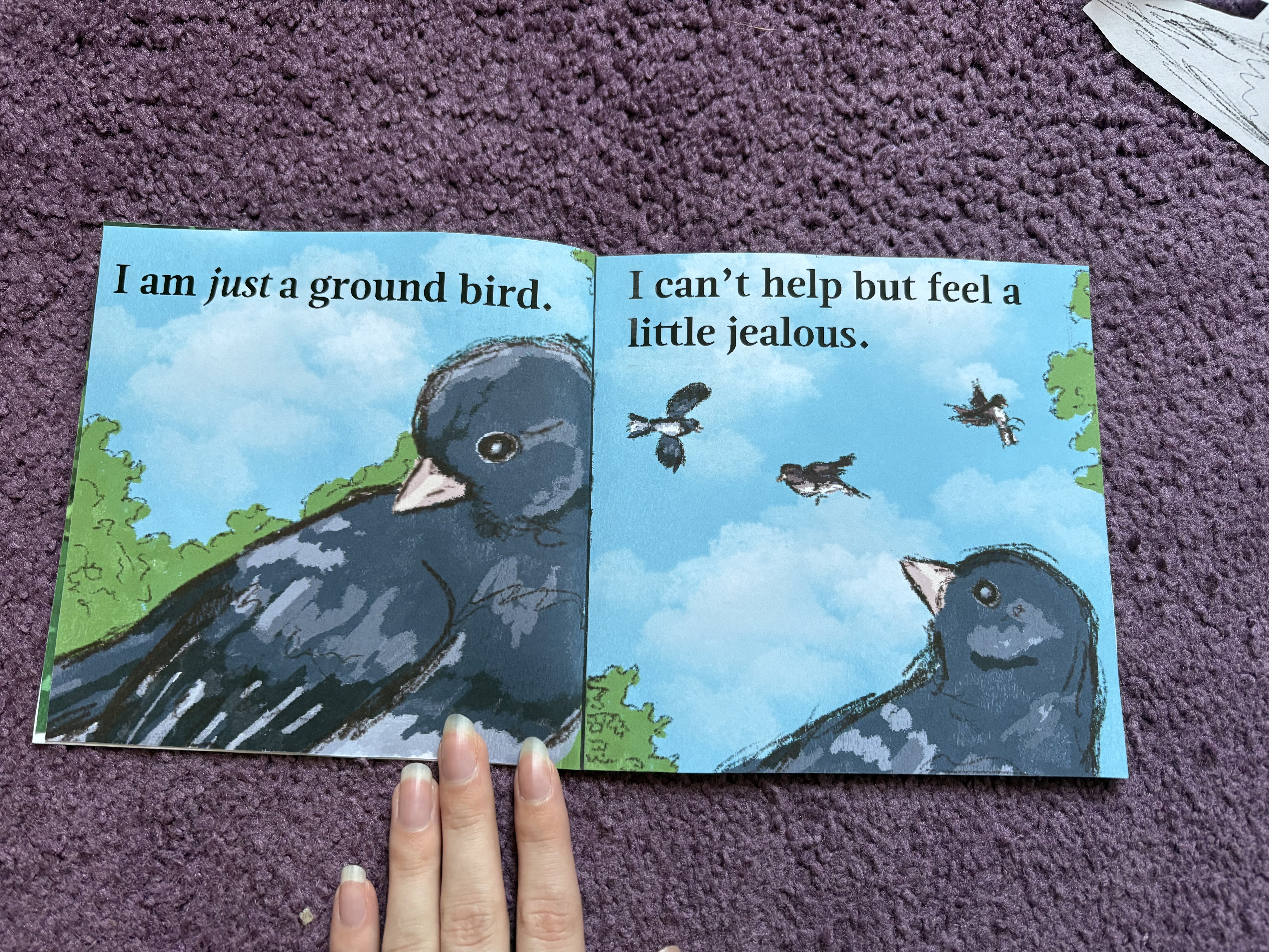
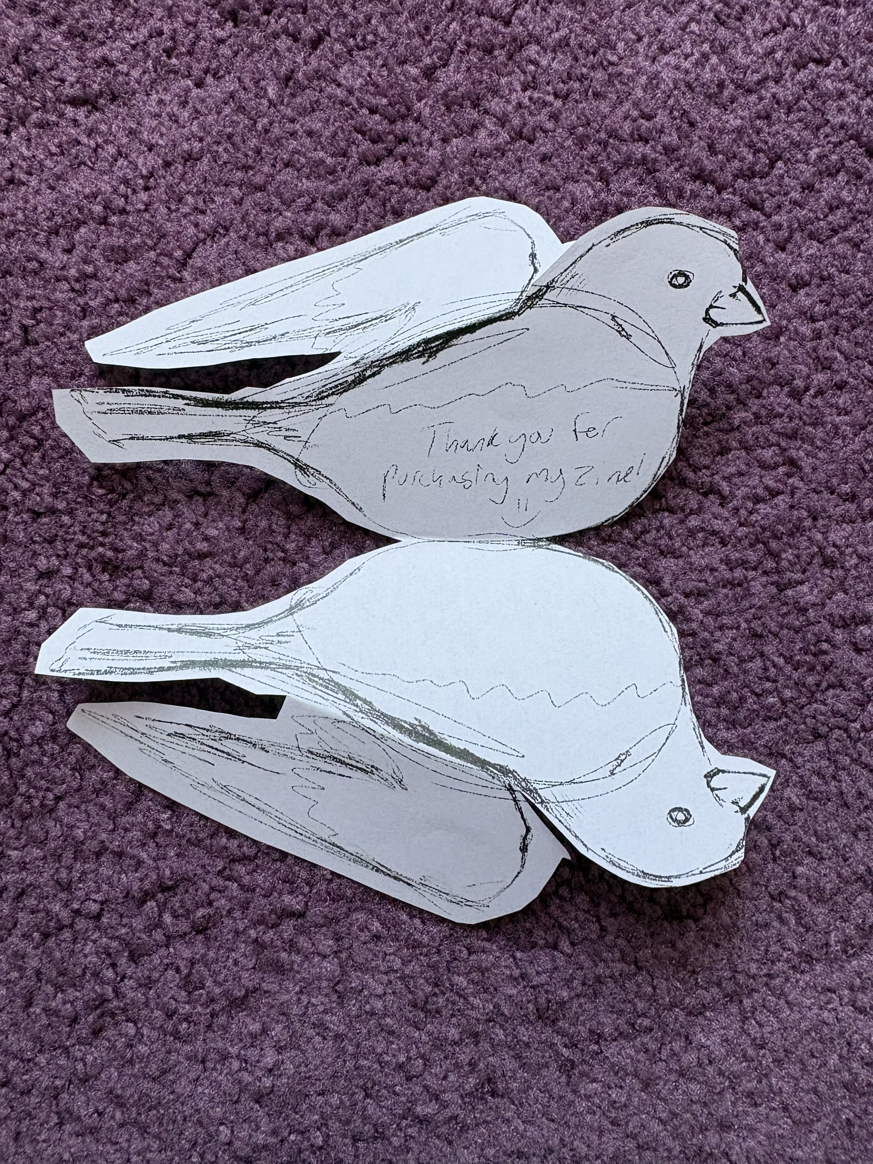
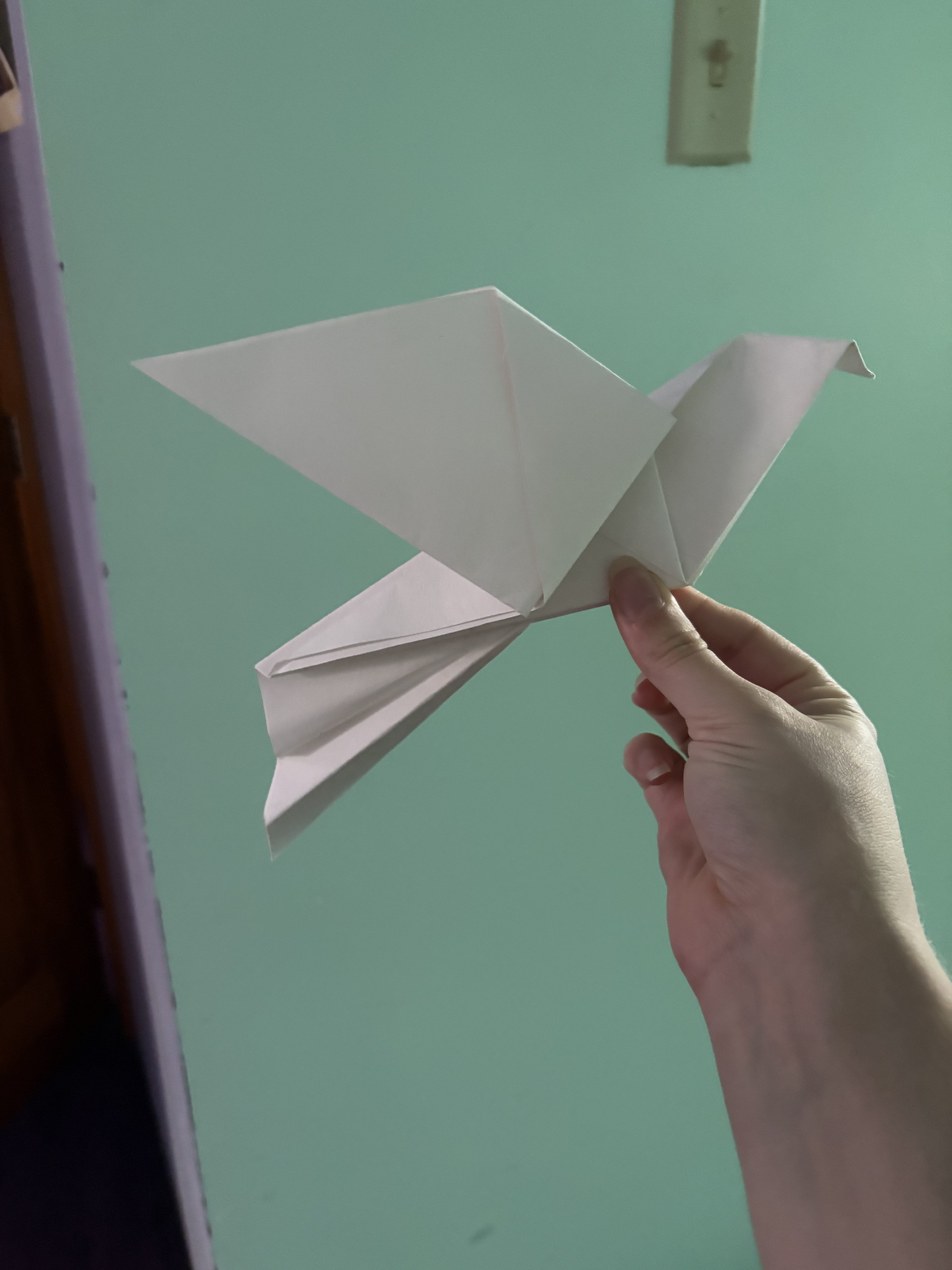
In book illustration, we were tasked with creating a zine. This is a folded paper book that can be made simply instead of with a careful binding process. My zine ended up being more of a picture book than a zine. I chose the version that can be folded together and have an additional cover piece pasted on the outside. I also had to make a few promo pieces in rough format to be mailed with the zine if someone were to purchase it. I made a few stickers, a fold-out thank you card, and an origami bird, which is the only sculptural element that made it into the blog today. I’m very happy with the art in my zine and otherwise, although some pages still need some lighting added, but I mainly still have to work to make the story more clear. Feel free to take a look at the images below of my book and tell me in the comments what you think the story is. I desperately need feedback to see if the story makes sense. I really want it to be clear the way it is, but I fear it is at risk of misunderstanding. So, if you’ve made it this far in, please tell me in the comments what you think occurred in the story! I appreciate it greatly.


Thus concludes my work thus far! It’s been a lot to do, but I’m happy with how everything has gone, all things considered. I’m excited to get back to this stained glass heron project and I’m excited to update as it goes.
More to come!
~ Marissa