My General Illustration class is one that I think will really prepare me for different things that I may encounter throughout my career as an Illustrator. We have done such a wonderful variety of projects, such as creating comics, designing posters for black and white movies to appeal to a more modern audience, and most recently, designing elements of an amusement park!
I found that it was both fun and difficult to work on this project. Towards the beginning, I had a burst of inspiration that made it easy to choose a theme for my park (rainbow assorted fruit), however, my inspiration almost immediately dispersed once I had to create a sketch for the map. I felt really bored by the colorful and literally rainbow design I chose because I had a hard time visualizing in my head what I wanted the map to look like. Although the assignment was to also design a billboard and ticket, as well as create a three-dimensional structure, I really want to focus on the map because I struggled with it the most and spent the longest creating it (I spent over twelve hours working on the map alone).
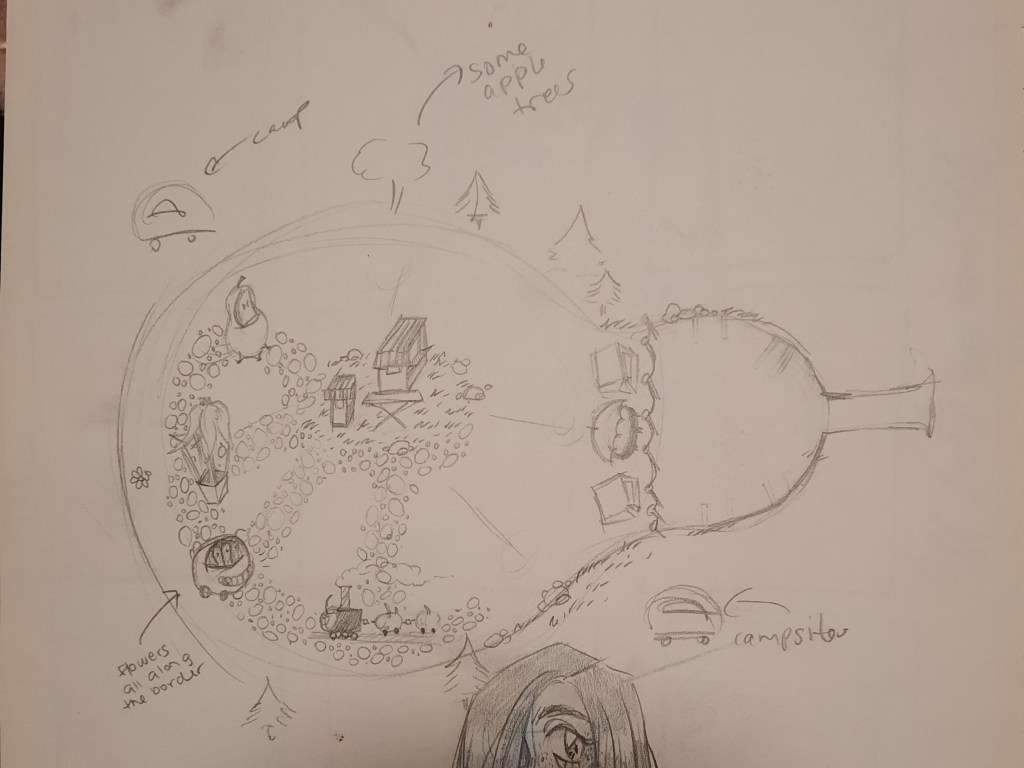
Once I sketched the map and showed it to my professor, I hated the sketch so much that I wasn’t even sure that I wanted to commit to the fruit theme even though that was what I had been approved to do. Of course, I probably could have asked to change my theme because it was early in the process, but I didn’t feel as if I had time to think of a new theme as well as redesign a new map so I stuck with it. I knew that I wanted the layout of the park to be in the shape of a fruit, but I seriously struggled with thinking of what that fruit would be.

I changed my tactic and worked on sketches for the billboard and ticket so that I could take some time away from the map, because trying to sketch it digitally was only frustrating me. During a break in my Figure Drawing I class, I had my traditional sketchpad out to sift through contending fruits that would serve as an adequate layout for my map until I stumbled across the perfect one- a pear. Once I allowed myself to draw fruits and explore the ways in which I could rotate them, I settled with a horizontal pear.

By then, I had spent longer than I should have just generally hating on my initial sketches, and so it was crunch time. It took about a week to digitally render the entire map. I hated the initial design so much and I had viewed so many examples of maps that I was intent on it being perfect, or at least as perfect as I could have made it within my time constraints. I really did want a more fantastical look, and it was not looking good. So I took my time and tried to build the map up layer by layer.
I started with the general shape of the sideways pear, and I kept with the green colors by adding in trees and campsites. I felt inspired by the wood-sy feel of an amusement park that I’ve been to before- Knoebels. It was once I started drawing the actual structures that I felt as if things were coming together. I think that the pear was the perfect shape because not only was the green a nod to the color of the fruit, it also represented grass and allowed for the overall map to have a ‘natural’ feel to it.
I made a decision halfway through drawing and coloring the rides to add a white border around the attractions that were going to be listed in the key that I needed to include, and I think that helped them to stand out without them feeling out of place on the map.
The key itself was going to have fully rendered fruit as a border, but I was running out of time for the project, and I honestly think that my sketches beneath the key that I wrote look better. Sometimes having bad time management is a good thing, because otherwise, I would have likely spent time coloring the fruit only to dislike it. Using my sketches as an accent worked perfectly because the map feels balanced, instead of busy.
I can say that I am super proud of how this map came out. I really like the overall feel to it, and although I wish I had time to do at least one more ride per section (I had so many fruit ride ideas!!), I think that it came out good. I generally feel more confident about the works in which I felt inspired during the process, and once I got over my initial hurdle of the basic design for the map, I can say with confidence that that sentiment holds true for this project.
