Hi guys! This week I want to talk about an artist called Andrea Schiavone. He was a painter and etcher from the Renaissance time. He was born in 1510 and died in 1563. He self taught himself to print by studying the works of Parmigianino, another prolific artist from the time. He was born in Dalmatian, which was under Venetian control. Around the age of 30, he was well established as an artist.
His work was highly influenced by significant artists in Venice, such as Titian, Tintoretto, and Bassano. Therefore, much of his paintings has a tendency to overemphasis when it comes to color, as many Venice artists did at the time. These artists, Titian, Tintoretto, Bassano, and Schiavone, most likely preferred the use of color as good art tool rather than the use of design; this simple means that color was an essential component of the artwork as a whole, and that the design wasn’t as important as the color scheme. Schiavone also tended to incorporate a Renaissance technique of the time called Mannerism into his works. This technique took art design to another level. Rather than creating simple figures among a background, artists experienced with representation. This means that figures weren’t exactly proportionalized, space was denied, and many elements of the art piece were exaggerated.
Here are some examples of his artworks:

Conversion of Saul, 1540-5
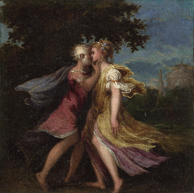
Image from National Gallery of London – Jupiter Seducing Callisto, 1550
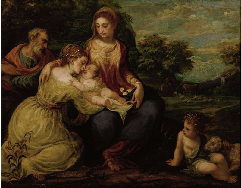
Holy Family with St. Catherine, 1552
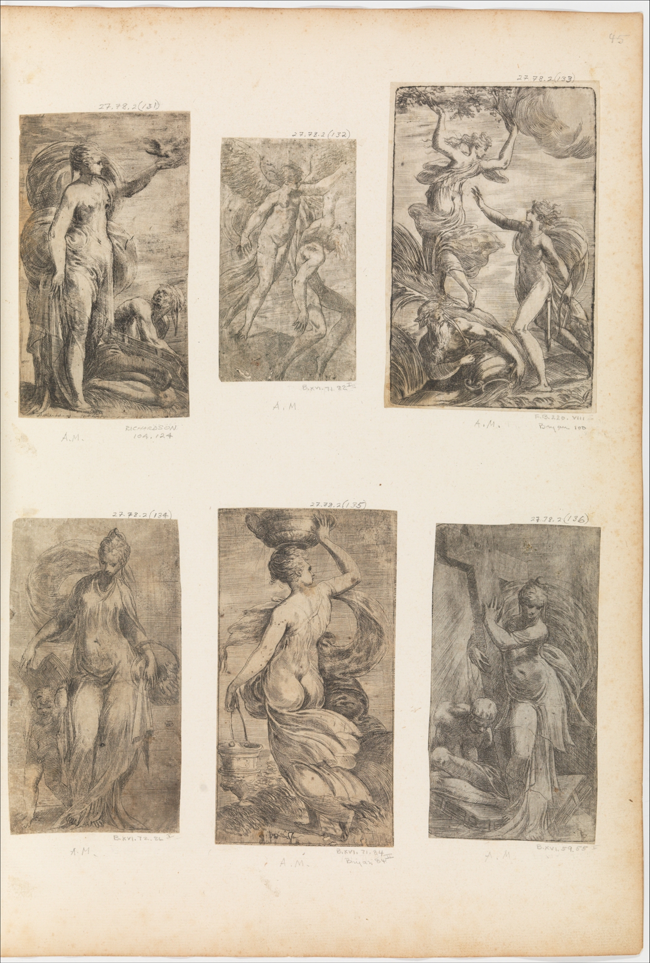
Image from MET – Virtue Triumphant over Vice, 1536–38
I kept these artworks large so that you guys can see the detail! But I just wanted to show off his use of color in his paintings. It’s clear to see that he experimented with his colors. Each painting has a different variety of emotion, which ranges from intensity to calmness. The Conversion of Saul has intense blues, yellow, pinks, and white that allow the viewer to know this is an intense moment between Christ and Saint Paul, since it led to his conversion. The Jupiter Seducing Callisto has a variety of light blues and pinks that express love and likeness between the figures. Finally, the Holy Family with St. Catherine seems to have a yellow overtone, which presents a calm and relaxing setting among the family.
Additionally, I wanted to point out the immense skill Schiavone had in printmaking. For these six etches in the Virtue Triumphant over Vice, he had to create every single detail into the plate to get this detail; and he successfully did so. He also added elements of mannerism into the prints of the Virtue Triumphant over Vice. You can see that the bodies of the Virtues are elongated and exaggerated, which is an element of the art movement.

