As my last post for this blog, I wanted to switch things up a bit and talk about my final Graphic Design assignment. I am really proud of the progress I’ve made in Graphic Design (and with Photoshop and Illustrator in general), and so I think this will be a nice way to conclude my time here on the blog.
For the first half of this project, we were given a creative brief written by a classmate of ours. The class played a pretty fun White Elephant-esque game to decide who got who’s creative brief and foundation, which was definitely a highlight of the project. The foundation that I ended up receiving was the ALS Foundation. From there, we were instructed to view the creative brief and draft up logo sketches. We were tasked with redesigning not only the logo but the brand of our respective foundations/nonprofits as well.
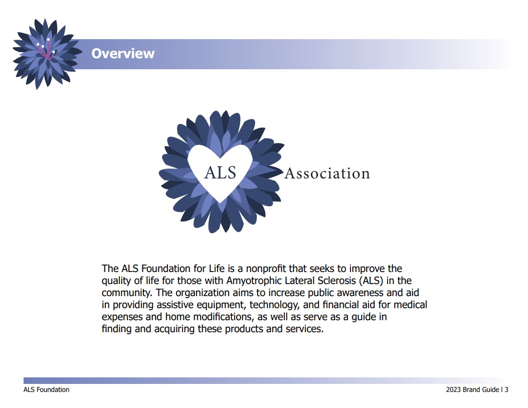
I sketched about 12 ideas for the reimagined logo, and after critiques from my professor and peers, I soon had a finalized logo that could be the start to establishing my brand guide. The logo ended up being a variation of a blue cornflower, because that is the symbol for patients with ALS. I wanted the brand guide to feel cohesive and intentional towards the logo, and so it was really interesting to play around with different fonts in order to give the brand the feeling that my peer wanted for the foundation.

For one of the earlier pages of the brand guide, we had to explain what the foundation was about, and in the example brand guide, the professor also showed the main logo above the foundation descriptor.
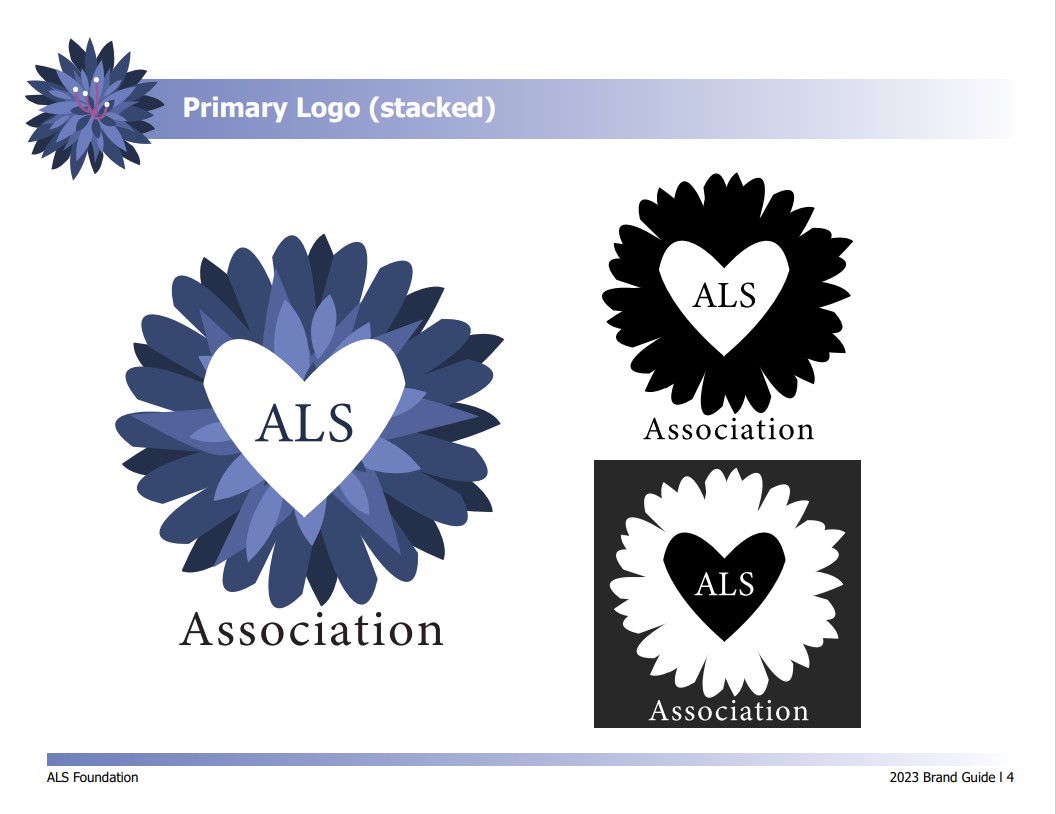
For the logo, we were also told to create a black and white version of it, so that if the brand had to print the logo in black if the situation called for it, they could.
A lot of the hard work for this brand guide came from struggling with the interface of InDesign, because I am very new to that program. It was fairly easy to navigate because I took notes in class and my instructor recorded the lesson that day, but it still took quite some time to get a hang of exactly what I was doing. However, it was really cool to see my end result, especially because my peers and I turned our brand guides in as an interactive PDF. Therefore, the table of contents was functional, and if you clicked on a topic, it would take you right to that page.
After taking my Intro to Graphic Design class, I can say with certainty that I am an Illustration major for a reason. However, I really enjoyed my time in that class, and I learned a lot and really improved my design skills. It was a great experience overall, and if I could take that class over again, I really would. The curriculum was diverse enough that the semester was interesting, and yet it all had real-world applications. I definitely won’t be forgetting that class any time soon, and I feel much more confident about my design skills than I did at the beginning of the semester.
CONGRATULATIONS ON MAKING DEANS LIST. YOU R THE BEST