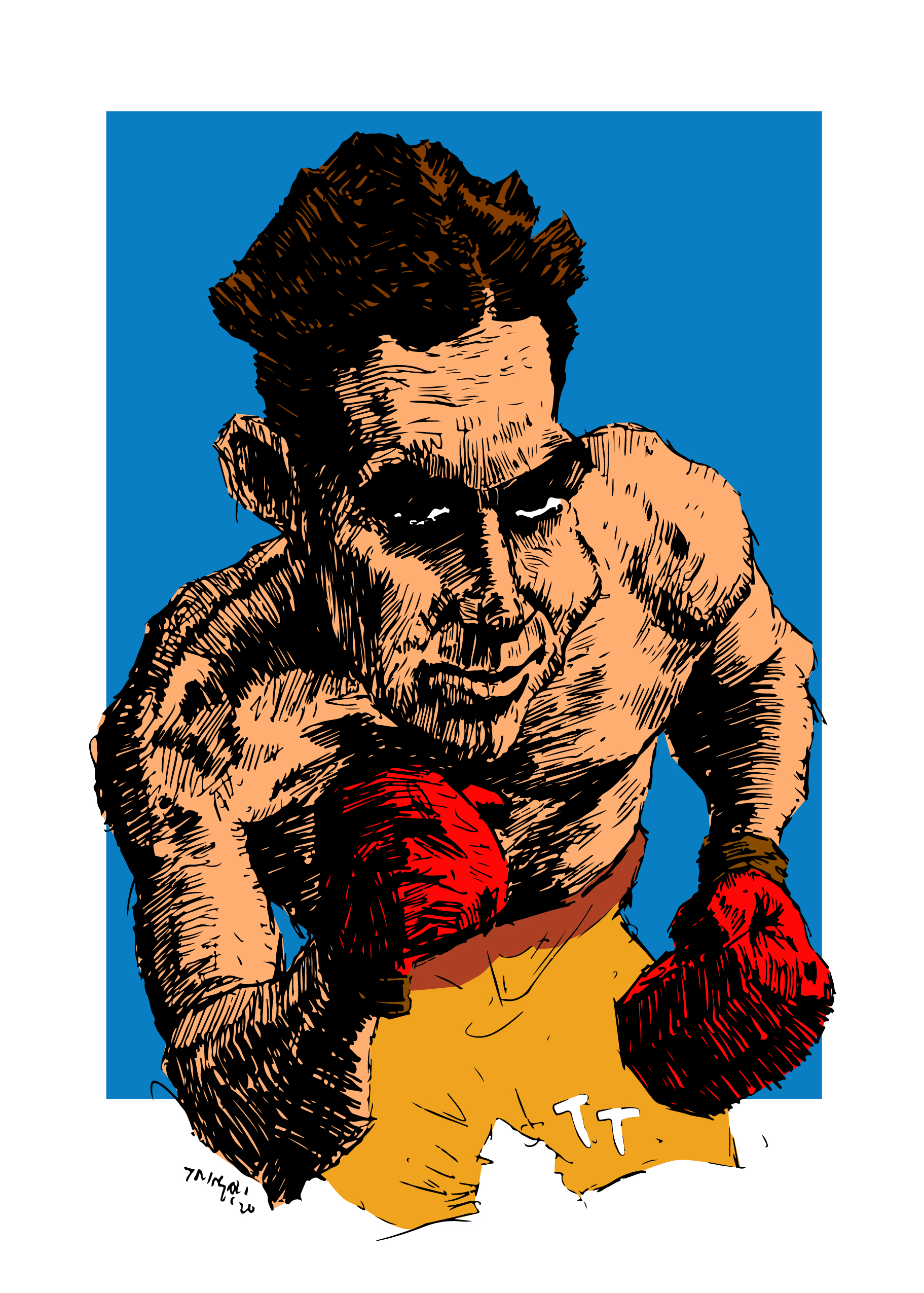
Looking through my recent caricatures, I decided to digitally colorize them. Starting off as a ballpoint pen and transferring it into Adobe Illustrator, I was able to not only sharpen, but keep the “pen-line” quality of the illustrations. I had to simplify the line work enough to still lighten the shadows, but just enough to not lose the highlights.


The most enjoyable part of this process was the adding of color. I could choose whatever I wanted to bring the people to life. The colors are so saturated, that they pop out of the screen. I had to figure out the best colors to go together as well, due to the bold background that would glow around the figure. I also offset the background to make the person almost standing in front of it, instead of inside of it. Especially in “STEEL”; slight variations of the primary colors red, yellow, and blue were all utilized, creating a harmony within the piece.

I am very satisfied with the results and will eventually revitalize my other caricatures down the road. I think for next week, I will create something different, straying away from the caricatures for a bit.