Hi all! This week, I shot one of my favorite photoshoots I have ever done. I am beyond proud, and happy with how these photos turned out. For my Color Photography class, we had to take 3 photos that showed color contrast, and 3 photos that showed color harmony. For the contrast photos, I knew I wanted to do blue and orange. I love the way those colors contrast with each other, and I think it’s really pleasing.
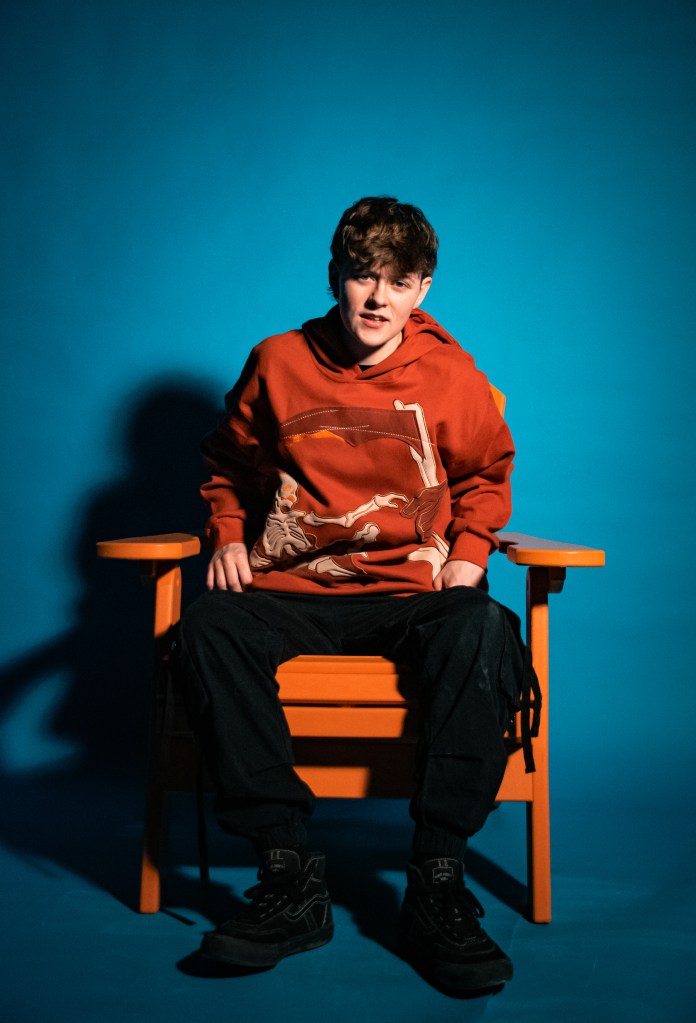
These are the 3 I ended up choosing for the project – the first one is my favorite. The harsh shadow casted on her face and onto the background is such a cool element and I’m glad I was able to capture that.
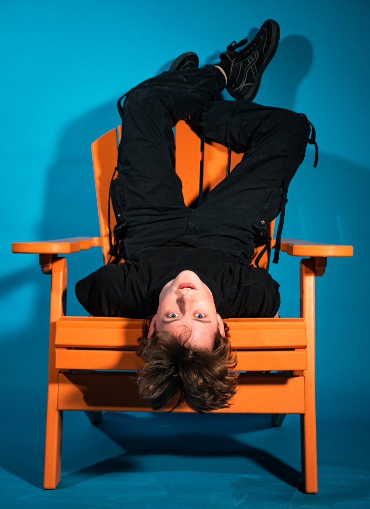
The second photo is what I thought was going to be my favorite shot of the shoot. When preparing for this shoot, thinking of poses, etc. I imagined this shot of her hanging off the chair in some type of unconventional way would have been my favorite. While it’s still good, I wish I would’ve captured it with a different angle rather than head on. I still really enjoy this shot though! Don’t get me wrong.
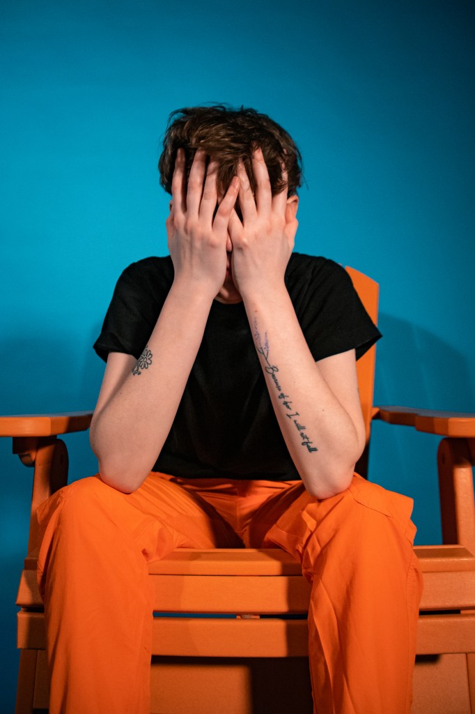
Finally – the third photo! This was a completely candid shot. One of my biggest flaw when it comes to taking pictures of my friends is not directing them well, lol. I love candid shots, I always feel that they’re the most authentic. She was getting frustrated that I wasn’t telling her what to do but it’s okay! Because we ended up with this beautiful shot!
I loved this project! It made me step out of my comfort zone a little bit, because I never would have paired these colors together in a photoshoot.
Thanks for reading, hopefully soon I will have some graphic design content for you all. 🙂