The past week I’ve been juggling major assignments (shocker) and i’ve been going hard trying to get them all done (and look good, of course) I’d love to share what I’ve been up to!
Sculpture Progress
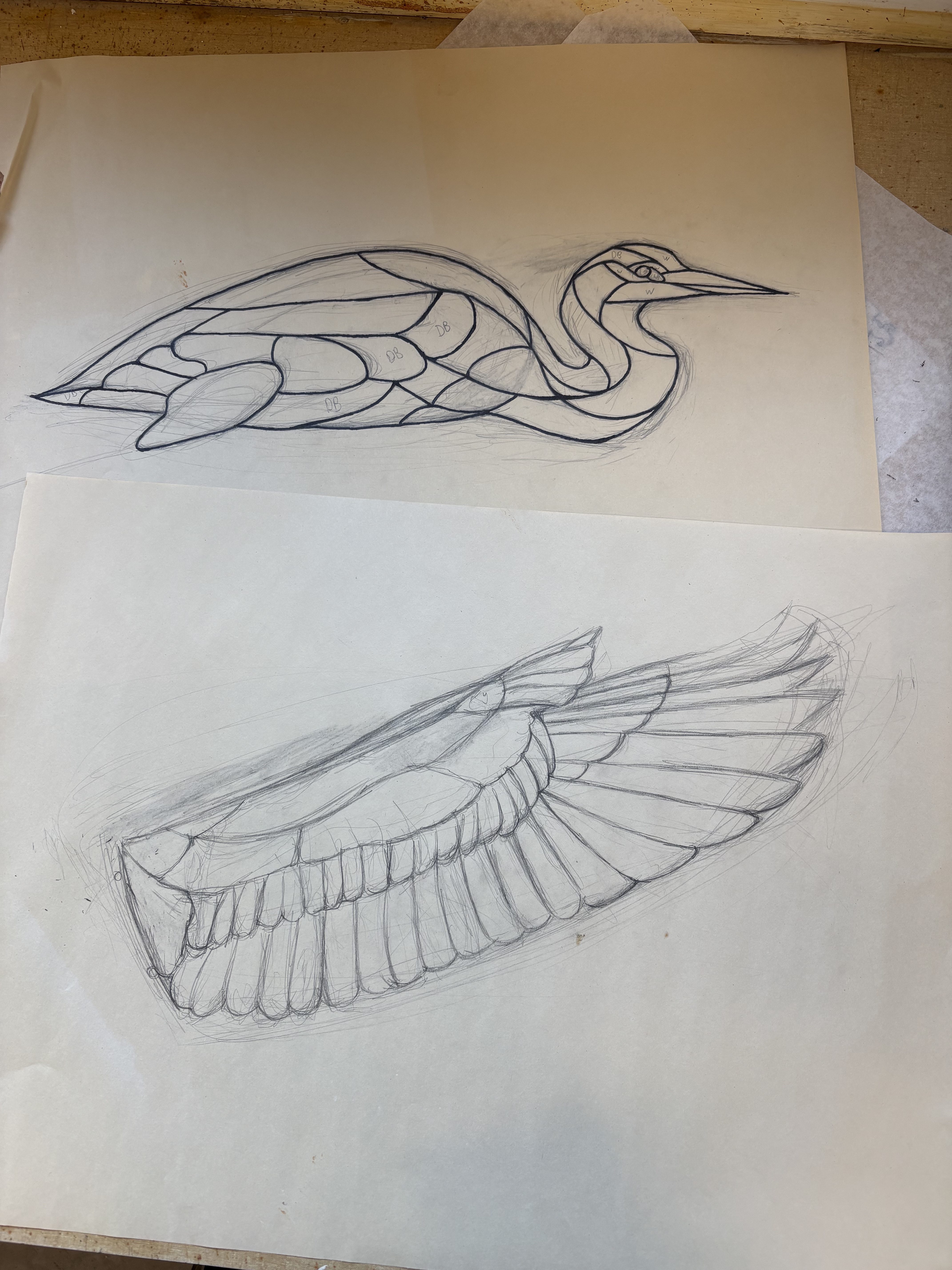
I’ve been continuing to work on the heron piece I mentioned in the last blog. I had to look back over my original sketch from last semester and change things up a bit. Below are the original sketches of the heron and wing.


I have never done stained glass in my life, so the process of designing the pattern is slow. I currently have no intuition of what is going to be easy or hard to cut out in stained glass. Well, not from experience anyway. I looked up many things along this process. I had no idea if I was supposed to cut the black line out entirely, or just cut in the middle. It turns out, you remove the entire black of the sharpie line to account for the space the tape will take up. I watched a few videos and took some notes. I then tried cutting some test glass with the advice from those videos. It took some trial and error to get an idea of the pressure I need to have and starting from the edge of the glass.
I watched a few videos and took some notes. I then tried cutting some test glass with the advice from those videos. It took some trial and error to get an idea of the pressure I need to have and the difficulty of starting from the edge of the glass. So far, I have some tips to share as well as facts I learned. Although they are from an amateur, they could be of some help. First off, I learned that you start from the edge of the glass facing you and cut away. I assumed I would be doing the opposite, so that’s quite interesting. You score from one edge over to the other and do not go back over your score line.
Another thing is that you should start with your most difficult cut. I had no intuition for what was easy or hard at first, but I’ve gathered that concave cuts are the hardest and usually require a few passes to ensure they do not break. Curved cuts are second hardest, and straight cuts are the easiest. I also gathered that planning for mistakes is critical. I’ve seen some artists that draw onto their glass with sharpie and then cut it out, but most cut out and paste a pattern onto the glass. I will likely cut and paste the pattern as well, since, if I make a mistake with the sharpie method, I cannot just move my outline. With the pasting method, I can just move my pattern a bit and continue as normal. I still am very in the dark now, but I’ll let you know more as I learn more.
Back to my pattern, I successfully lined out the wing as well in between practicing glass cutting.

This really does give a good idea of what it will look like with the lead lines and excites me greatly! However, it does not give a good idea of what it will look like in color. To get an idea of that, I labeled each piece with two letters representing the color of glass I want to use. Below is each color with its corresponding label:
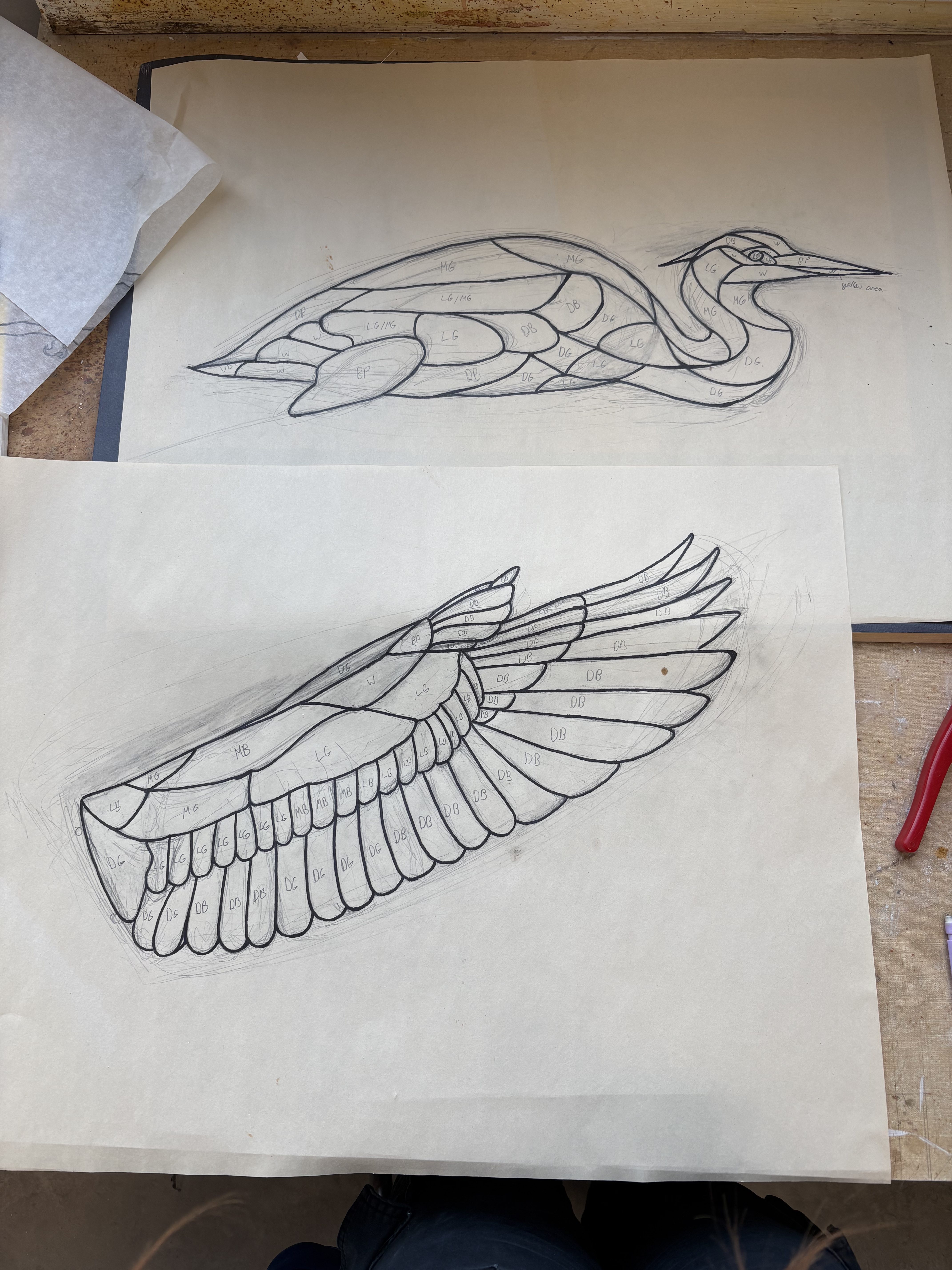

I do also plan on numbering the pieces on the wing. The body pieces are pretty distinct, but the feathers are very similar and it could get confusing once I’ve generated a pile of them. That’s all for progress on the heron for this week. I’ll update with even more progress next time!
Character Design
In character design, we’ve been doing lots of exercises to develop our skills in designing characters. I think I’m slowly getting better at not falling into the same style every time. This week, we did caricatures. We had to choose three people off of EarthsWorld, a photography website with lots of references of super interesting people. I’ll show the three caricatures along with links to the corresponding image.
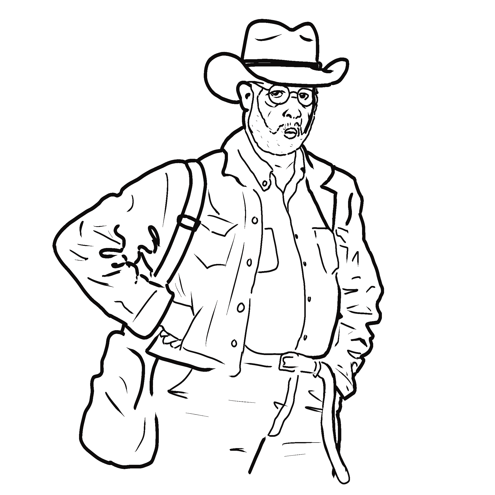
Something about the way this guy’s lips were puckered along with the stance was really delightful. I like the way it turned out, although I probably could have exaggerated his features more.

I wanted to try this one with a larger brush size to stop myself from going too heavily into the details. The contrast of his sullen expression with the American Gothic aliens shirt is truly something.

The main thing that stood out to me about this guy was his nonchalantness when wearing two baseball caps at once. This is a truly amazing feat and I am proud of him. His shirt is… something else. He also had a really interesting nose.
History of Visual Communications
We’ve begun to have many an assignment in this class! I’ve been having fun with them, but the volume of assignments we only have two days to work on has been beating me down. I always want to put my best into them, but there’s only so much you can do in such a limited timeframe. Either way, our first assignment that I’ll talk about is the medieval memeuscript… yes, you read that right.
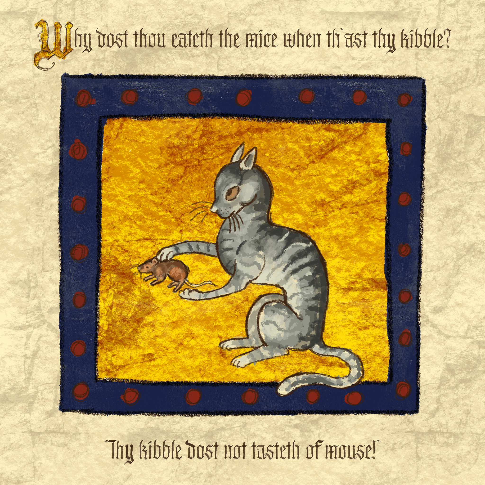
The goal was to create a meme in the style of a medieval manuscript. I wanted to make something they might’ve found funny in that time. Subsequently, it’s not that funny. It sort of reads like a mug design from the 70s that is meant to be funny, and probably was at the time, but isn’t remotely funny now. However, I do enjoy the cat illustration. I wanted to make a cat in the style of the notoriously badly drawn cats in the medieval bestiaries and the like.
The next assignment was a victorian style type poster. I went with a more gothic design. We were to have the image be mainly type with one or two illustrated elements. I decided to make a poster for the KPS (Keystone Paranormal Society) Halloween party at the end of October. It’s still a ways away yet, but it’s always better to be early than late.
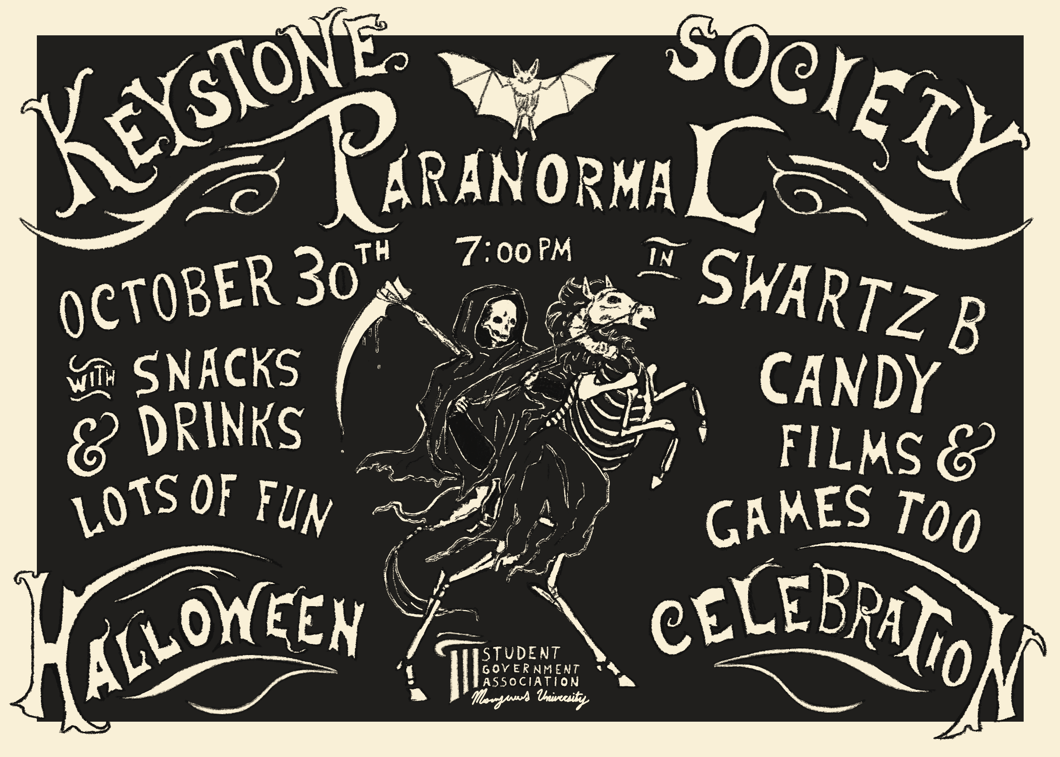
This is one that I took way too long on and put way too much effort into for a small project. However, I’m proud of it, so it’s no real loss aside from my sunk time, which I think it was well worth. Now it can be hung up soon to advertise the Halloween party! I anticipate using the reaper design at the bottom for a sweatshirt merch run as well, so keep your eyes peeled if you want to wear that design!
The next project was an art nouveau composition showcasing a single word and nature-inspired imagery. I have the piece mostly done, but I’m going perhaps a bit overboard on the border and background. I’ll show my lineart/sketch and then the color so far.
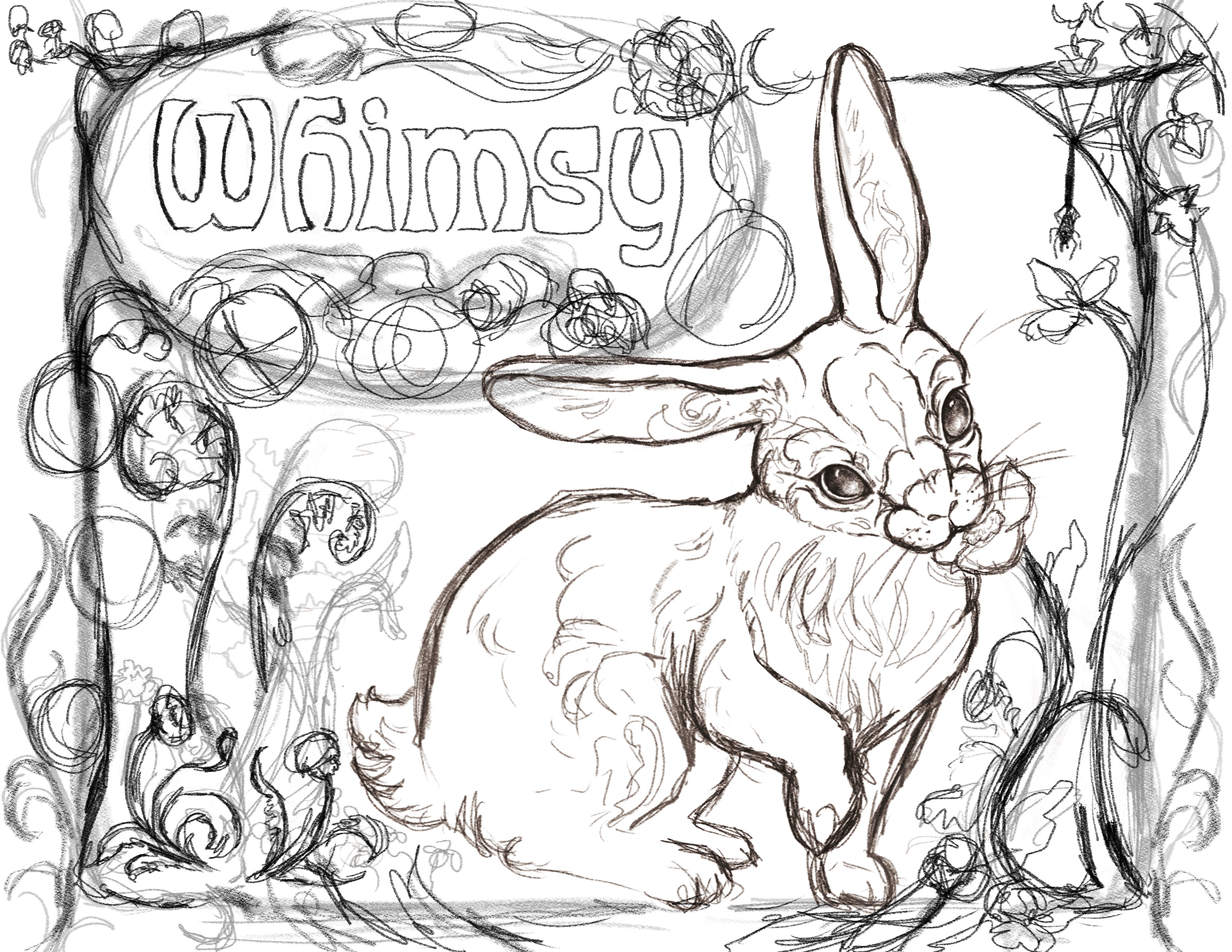

I’d love to color the plants, but I need to not implode, so I may just get them to a finished lineart stage and then color them in after the fact. If there’s anything I need to learn to do, it’s accept the deadline I have and work to a standard that can be completed within that time. I’m super happy with how it is so far though. I poured most of my time into the face of the bunny, but that’s just how it goes sometimes.
2D Animation
My next 2D animation project is done as well! We had to create a rotoscoped short film. Mine feels like more of a video than a “film” but I thought it was pretty fun… pun intended 🙂
Many apologies if it’s a bit fuzzy. The videos tend to get a bit crunchy on here, but you get the idea. It’s my cat! Like everything else here, I definitely underestimated how long this was going to take. Rotoscoping is always a commitment, but it’s always a delight when it’s done.
Communication & Conceptual Design
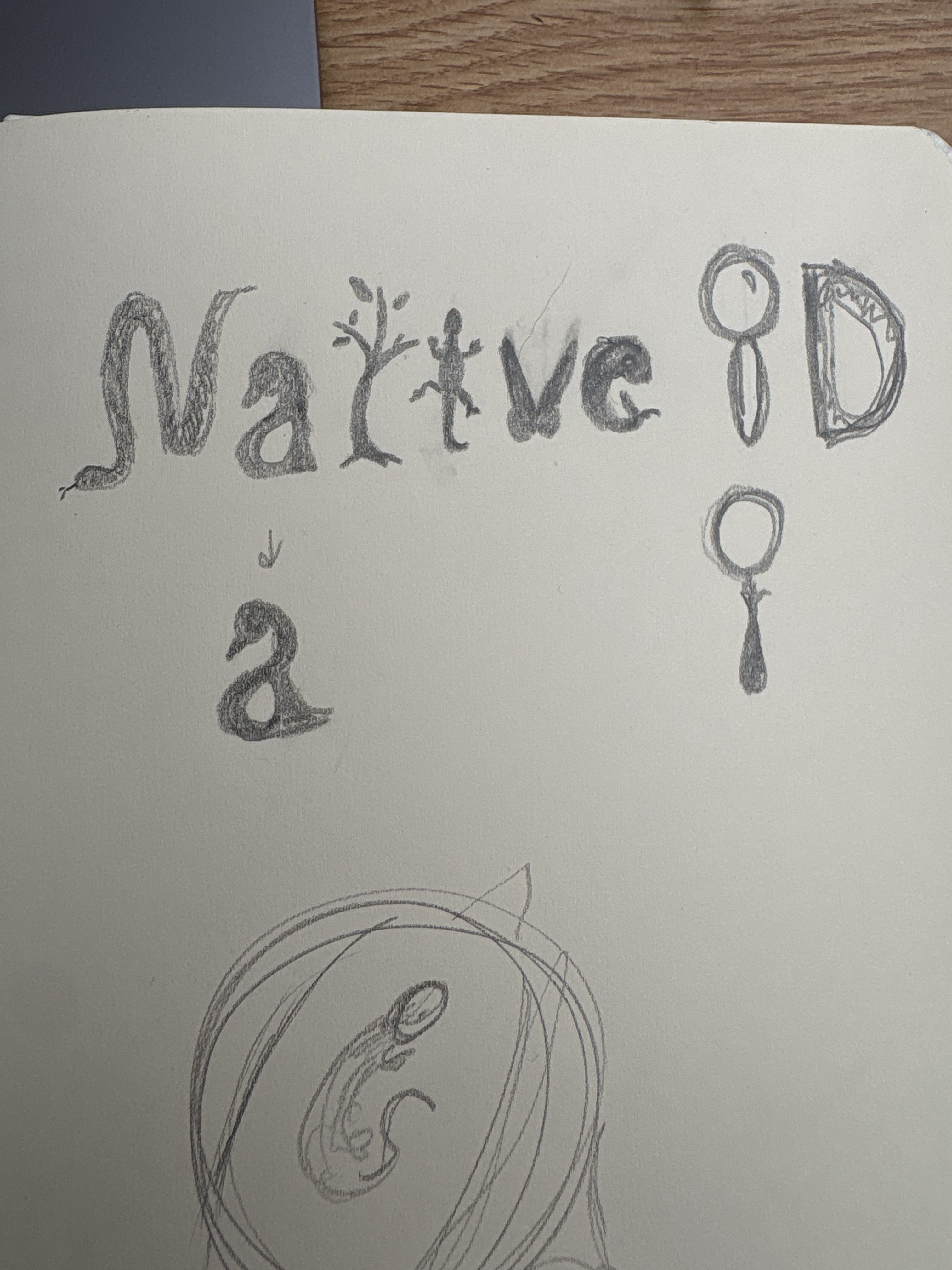
This class is mainly graphic design based. We had to come up with an idea for a nonprofit and create a logo for it. My idea for the nonprofit would be an animal and plant identifier where you can take pictures of any plant or animal and be shown many options of what the creature is. Many of the services that exist only show one or two possible species, which is no help as I’d like to compare many different ones to see what it actually is. Once you’d take a picture and identified what it was, my nonprofit would give the option to add your image to a database to track native species to the US. I wanted to make a logo that encompasses all the creatures that can be identified with my service, if it were to exist. Below is my rough sketch after a few iterations.
From there, I took that into procreate and refined it into a complete sketch:

As you can see, I made the “D” into a ladybug and added a rabbit to represent mammals, but the D was a bit unclear and the salamander needed work, so I came up with this as the end result:
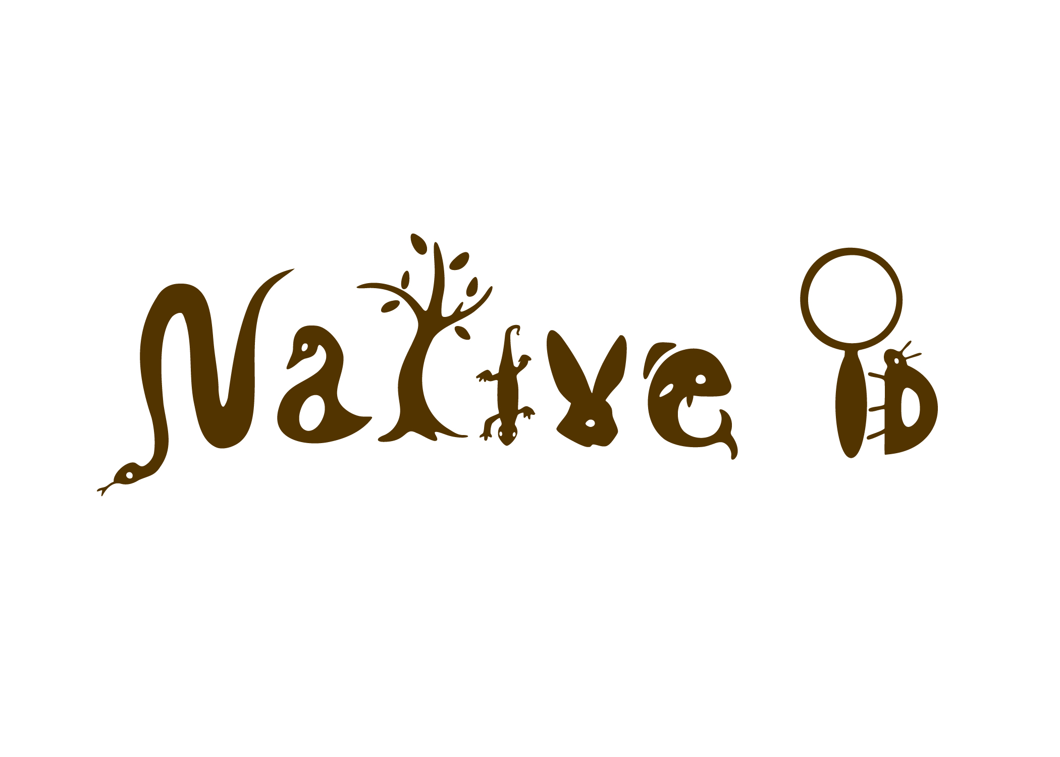
To add more unity, I gave the characters a bit more of a cohesive baseline. It’s difficult because they aren’t very standard letterforms. I also made the salamander thicker, made him upside down, and curled his tail to simulate a dotted “i.” I may make him thicker for my final portfolio since I received feedback that he’s still a bit thin. I’m pretty satisfied with it, though. I’m really glad it ended up readable in the end.
We then had to make an app icon for the nonprofit. I started off with a rough design of a magnifying glass and a leaf:

It was a basic idea so the gradients would’ve needed work, but everyone felt that it wasn’t cohesive with my original logo, so I took the “ID” from the original logo and added it to an app icon, creating this:
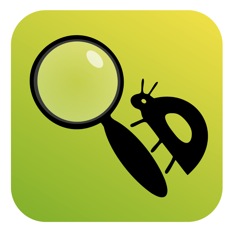
This was before I had changed to the brown color. It was suggested that I add a leaf texture to the background to get that magnification aspect that I liked from the original.
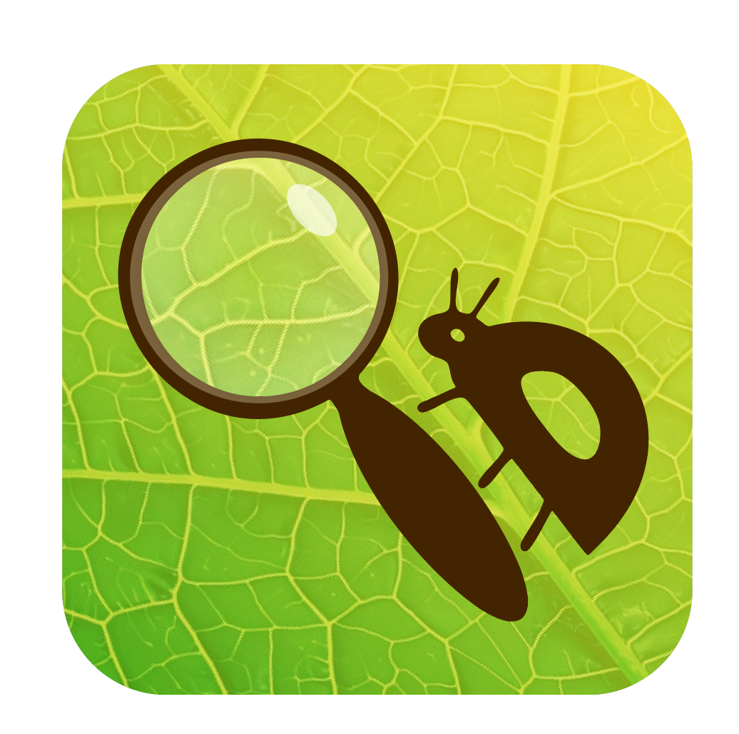
Now I think it looks real fun with the leaf pattern. I’ve been encouraged to make the leaf even more magnified, so I’ll likely do that for my final portfolio as well. The next assignment will be making business cards, envelopes and a letterhead for the company. Not really my forte, but I’m excited nonetheless!
So, that was a long winded version of all the things I’ve been up to. Needless to say, I need a break. Really, I need to give myself a break and do at least one or two simple things for upcoming assignments. It’s my senior year and I’m still learning to manage things. Ah well.
More to come!
~Marissa Schuler https://www.instagram.com/three_separate_teaz/