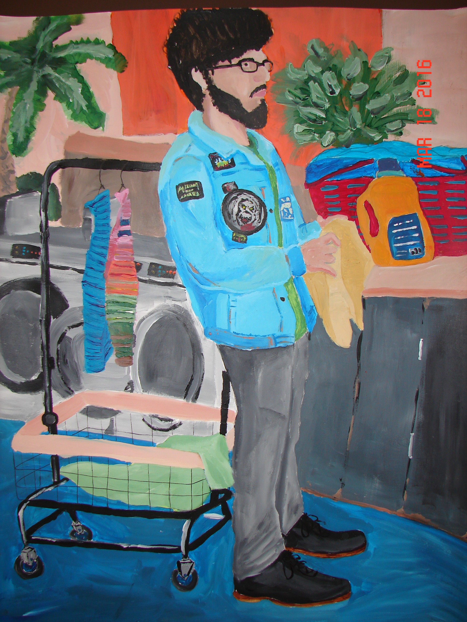
A few weeks back I talked about an issue I was having with managing my sense of depth in a finished piece. I also gave a bit of a preview to the piece I was experimenting with. I’m happy to say that I’ve finished one of the paintings, and with a bit of help I’ve found that the most effective way to manage the depth between my middle-ground and background is through contrasting colors. The blues of the jacket and the oranges surrounding the figure have done an effective job of pushing the jacket forward and the rest back. This painting came together great and I’m interested to see what else this revelation holds for future projects.