In my experience as a designer, logos are super fun to make and usually can be completed with a quick turnaround. In the past, my experience with logo design typically centered around mock up businesses and fake companies for class projects and personal study. Logos, in my opinion, are the first step in creating a brand identity and face for a company or organization. I’ve also learned that it doesn’t have to be a company to need a logo, it can be a sports team, a fundraiser or even an event or party.
While I was super excited for the semester to end, I knew it wasn’t going to be the last of design or graphics I’d see for the year. Things definitely slowed down as projects reached their final due dates and classes ended one by one but I had a few of my own personal commissions I had lined up for winter break. First on the list: Engineered Electric Inc needed a logo.
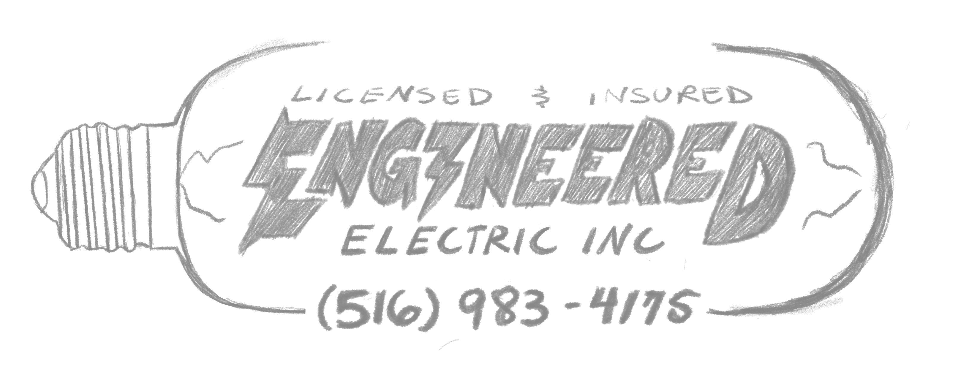
Local to Long Island and Queens in New York, Engineered Electric Inc is a company started by a young electrician named Bryan. He reached out to me via Instagram (which if you don’t have design accounts on social media, do it now) wanting a logo made so he can order business cards and give his new company some sort of brand. With an idea already in his mind, he sent me this sketch he came up with.
In my years of education, I immediately had a few things that I liked about his design and a few things I definitely needed to change. I liked the idea of a light bulb and having it be a logo that would glow and tying that into the company name. I wanted to change the shape of the bulb because I felt that it closed the logo off and confined the text and space within, and I wanted it to be a bit more inviting. Additionally, the first thing a viewer is drawn to would be the filament (the thing in the middle of the light bulb, one of the things I learned designing this logo) and not the name of the company. With the hierarchy being slightly off, I wanted to switch that up as well. Talking with Bryan, he was open to working with me to create other variations of his sketch so I began drawing and exploring other solutions for his logo.

I wanted to create variety for him to see; different text styles, layouts and overall esthetic. The first one is strictly a typeface logo, the second row is a variation similar to his own sketch with the company name acting as the filament, and the third row is his sketch text but with a different layout and lightbulb. After chatting with Bryan again, he really liked the text of the first one and the layout of the second one and with that being established, the final sketch was born.
Next step in the production process was bringing it into the computer for rendering. During this stage, small changes will be altered to the design, given you never actually know how it will look with color and layout in the programs. Additionally, the more you study your design the more little things you’ll notice and may want to change, think of it as a refinement process of your sketch. Which I did indeed, I decided to change the lightning bolt attached to the “E” and I also changed small details within the lightbulb base to the left of the design for a more simple, readable design that could print nicely given screen print, embroider, or just at a smaller scale. These are important to think about when designing a logo, what is the logos purpose and how is it going to be utilized?
Another thing I have to think about at this stage is color. What colors am I going to use? What colors carry the brand across? Make it stand out? How many colors? Monochromatic? Complimenting colors? Am I going to use black and white in the design? This is why many designers like myself will tell you they might struggle with colors. I decided that I was going to use bright, almost neon colors to create a vibrant yet cool feeling. A monochromatic look goes better with a sharp, thick logo like this, so I rendered the design each in the specific color palette.
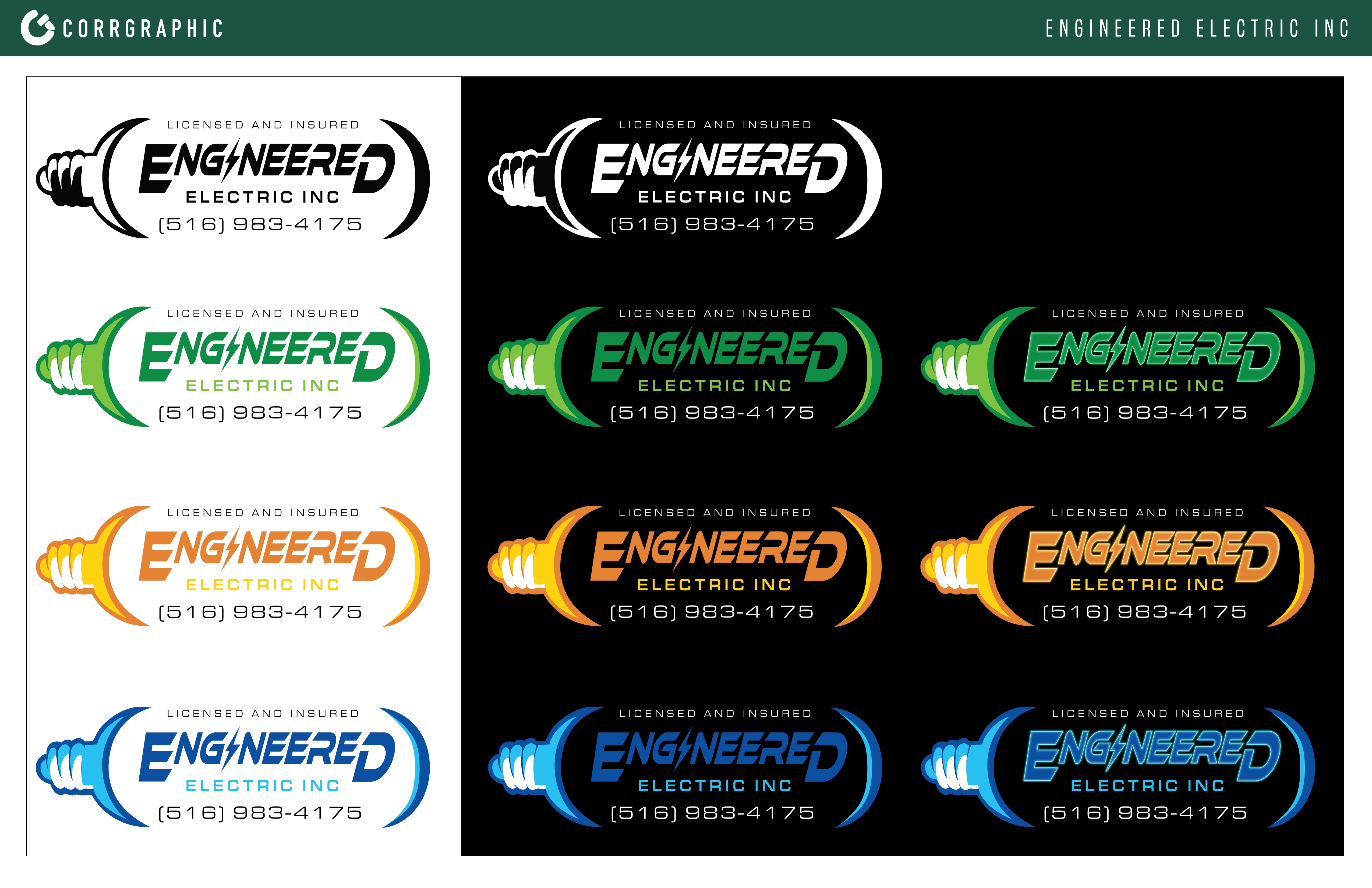
Finally, in my original meeting with Bryan, he expressed that it would look cool if it looks like the lightbulb was turned on. With that, I wanted to add an illuminating or glowing effect in addition to the flat logos, that way Bryan could have the option to use either depending on logo function.
Overall, it was such a pleasure to work with Engineered Electric and mold our ideas together through the creative process. It makes me excited for my career as a designer as I continue to make connections and expand my knowledge about the world and design.