I can’t believe that I just finished up my sophomore year of college. It’s crazy how time flies, but this school year was definitely one to remember. It was so much more than I could have hoped for, and even in my last week of classes I ended up learning some new things about graphic design.
My final for my Computer Graphics II class consisted of a pizza party along with a critique of our homage websites. For our final project, we had to make a website paying tribute to a graphic designer we admired, and we had to do it using HTML & CSS coding. After getting super frustrated with coding and having to restart my project about three times, I started to get the hang of it and this project actually became really interesting for me. I chose Alex Trochut, a graphic designer from Brooklyn, for my project and reading about his accomplishments really opened up my eyes to a part of graphic design I had no idea about.
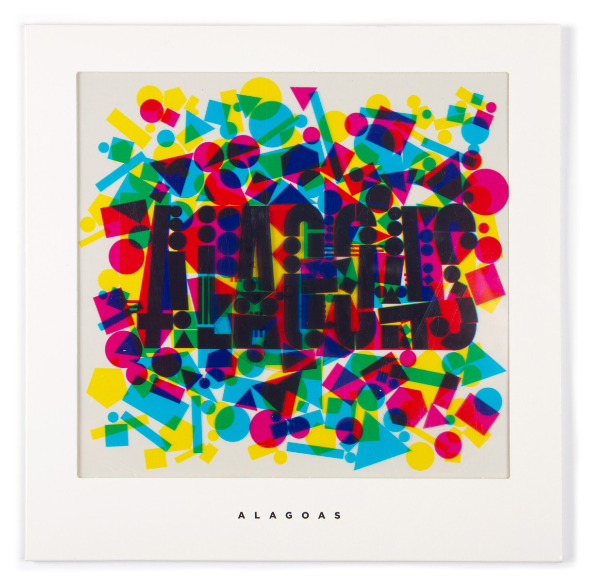
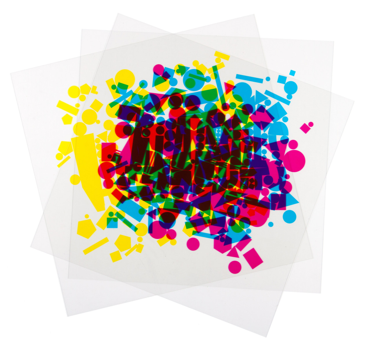
In 2016 he was nominated for a Grammy for Best Recording Package. He, a graphic designer, won a Grammy. I couldn’t even fathom it, it blew my mind. It’s definitely a long shot but there’s a chance, that could be me one day. Just knowing that it’s a possibility is such a cool feeling. I had no idea that was even a category and I think it’s awesome that the designer of the album gets such high credit for their incredible work. Alex Trochut’s design was for the album Alagoas, performed by Alagoas and I thought his design was amazing. His album cover consisted of three sheets of transparent paper in cyan, magenta, and yellow with abstract shapes on them, and when layered they revealed the name of the band. It is so creative and well thought out and at first glance I had no idea it was that complex. That design along with all of his other work really impressed me.
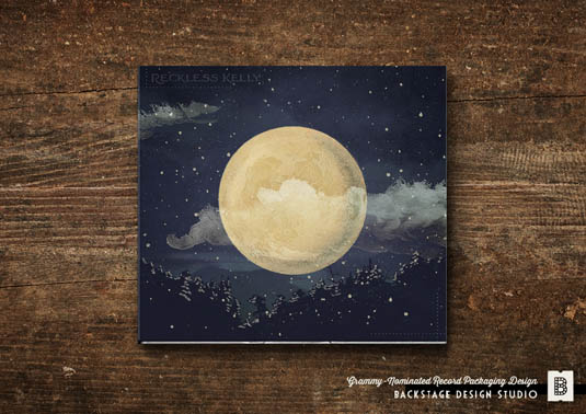
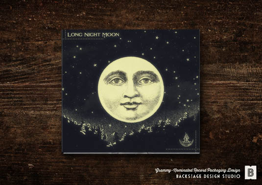
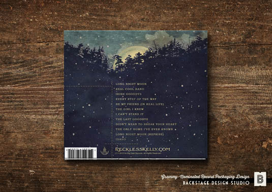
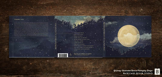
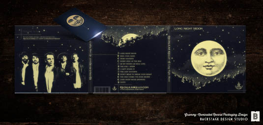
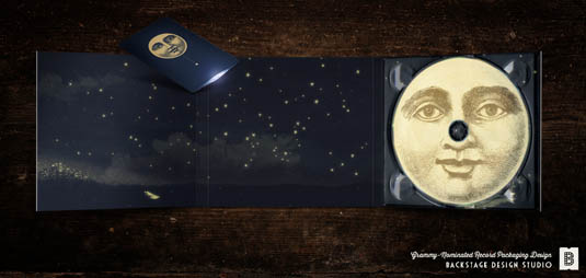
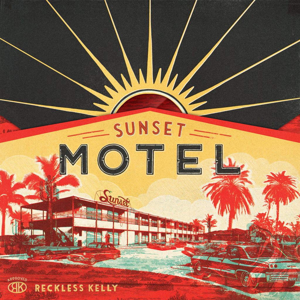
After completing my project, I got really into looking at all the other nominees and winners of past years. The winner of the Grammy this year was Jonathan Barnbrook for his album cover of David Bowie’s, Blackstar. It was so simple, yet it fit perfectly for the classic album and iconic singer, I loved it.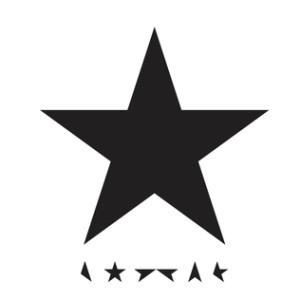 Going farther back, I noticed that two of my favorites were for the same band by the same designers. Sarah and Shauna Dodds designed the cover for the 2014 winner, Long Night Moon by the Reckless Kelly, and they were nominated again in 2017 for Reckless Kelly’s Sunset Motel album cover. Both designs were already so cool in my eyes, but then I discovered that the packaging for Long Night Moon has Glow in the Dark ink which revealed hidden images and messages. Absolutely genius.


I totally think the album cover plays an important role in conveying the overall message the singers and musicians are trying to give out. It helps draw people in to listen to their music, and they’re all just so neat to look at to get a sense of what kind of an artist that person is. I don’t think people realize how much effort is put into making an album; I’ve never even really thought about it until now. Good music is one thing, a good album cover is another, but both good music with a good album cover is just straight up magic. I can’t wait to see the nominations for next years award show.