You get a logo! And he gets a logo! Logos for everybody this January! As I near graduation, so do all of my friends and their friends and with that, many people I know are starting their own businesses and trades and working to establish themselves. My online presence on Instagram is really paying off when it comes to those in my social circle, who have me in mind when it comes to logos and branding.
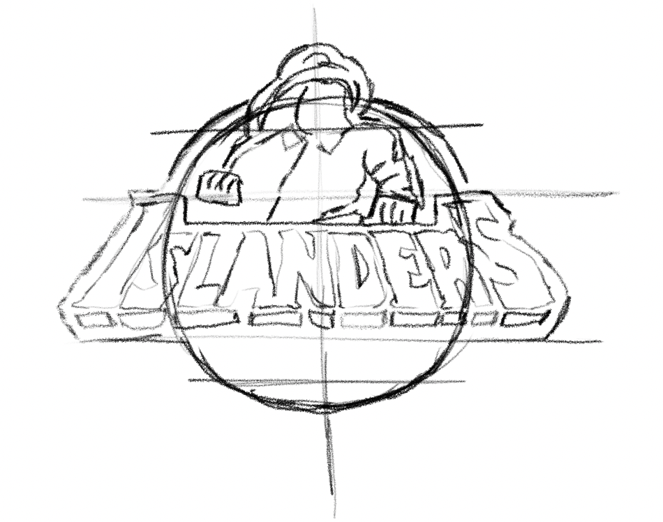
Over the weekend, my friend Curtis reached out to me for a logo for his welding business, Dutchmen Welding, local to my stomping grounds on Long Island, New York. Also native to the area, Curtis is a huge Islanders Hockey fan and was thinking about them when he came to me with his logo proposal. He wanted a logo to look like the Islanders logo but holding a welding torch instead of a hockey stick and for it to say “Dutchmen,” instead of “Islanders.”
As a designer, the last thing I want to do is copy someone else’s design for a NUMBER of reasons that I’m sure you all can come up with, especially copyright issues. So I knew how I would change it in a few ways, which you’ll see as I take you through my process.
My first step was to familiarize myself with the Islanders logo, how the type behaves and overall logo behavior to see what elements and design aesthetic to keep. In my process, I noticed that the type was at a blocky angle with a shallow perspective falling back. I took note of the angles of the main character’s posture and how the head faces one way more than the other to create dimension and a type of aggressiveness or dominance.
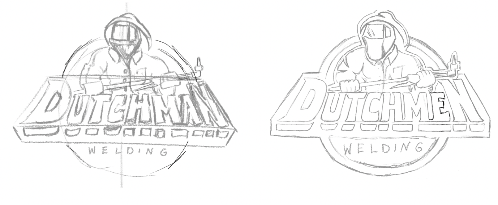
Then I started to turn it into a Dutchmen logo, changing the type, altering the posture and drawing a welding mask and torch. I also decided to change it from a circular background to angular background because I thought it would relate to welding a bit more, since Curtis works with metals and construction.
From there, I touched base with Curtis for his feedback and approval moving forward and he really liked it and to quote him, “it looks sick.” So I went ahead and finalized the sketch.
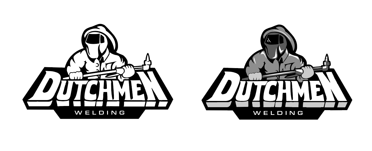
At this point, I normally take the sketch into Illustrator or Photoshop and render it off my computer, however I decided the easier way to make this logo specifically was to color block it with layers on procreate. So I broke it up into five layers, each containing a single color and the contents that hold that color. Afterwards, I took it into Illustrator and Image traced each layer and touched them up. At this point, I am still working in greyscale just so I have my values right and also because Curtis and I were not sure what color palette we wanted to use.
Once again, touching base with Curtis I wanted to finalize the design and layout part, which we both agreed, “looks sick,” so I went ahead and started playing around with colors. During this stage in designing, it was also important to ask Curtis what he wants to do with his logo so I know formatting and file details that he may need.
For example, he might need a black and white logo for printing on documents, he might need a logo as a profile picture which would be exported smaller to execute that. One day he might want t-shirts or merch that will be expensive if he has five colors in his logo, etc. In this case, Curtis told me that he mainly wants to print stickers at this point for his equipment and projects, with the deal that he would give me one once they’re done.
When thinking about the color palette, being that most of Curtis’ work and lifestyle revolves around Long Island beaches, boats and water life, I wanted to keep a cooler tone, more aquatic set of colors. I played around with some pinks, purples, oranges and blues, and we went through a series of mixing and matching colors before we decided on the top right set seen below.
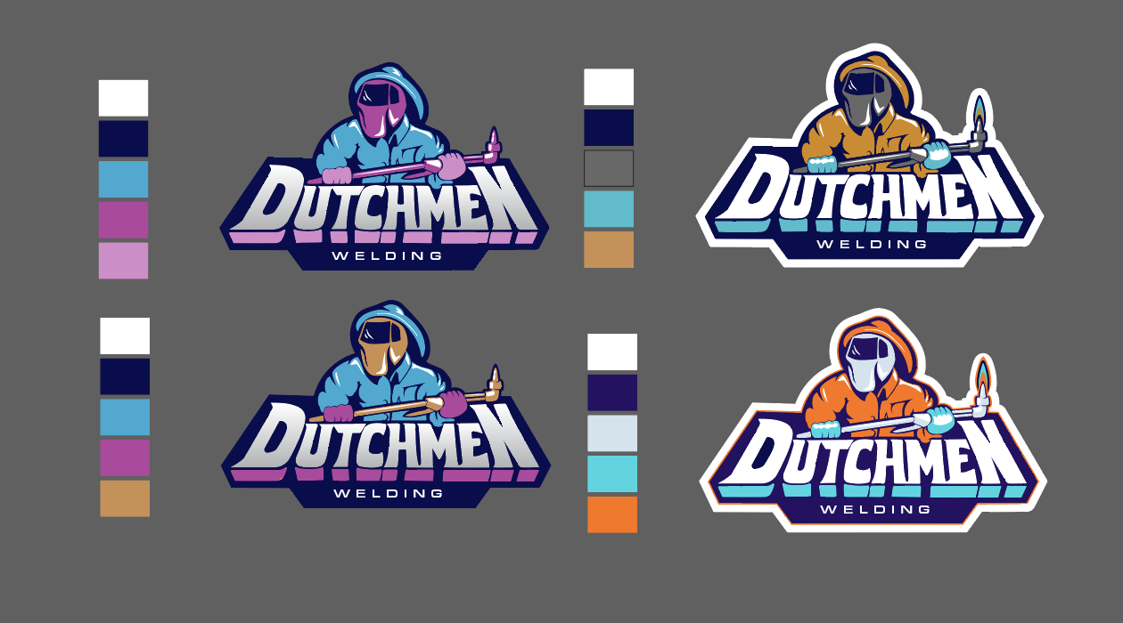
Once I got the, “that looks sick,” approval I went ahead and started packaging a logo file for him. Included in Curtis’ files were a black logo, a white logo, a colored one and one more with a thick white outline like a sticker.
Overall, I was so excited to take on this design since I am very passionate about sports design and all things related. I was also happy to jump at the opportunity to illustrate and familiarize myself further with Adobe Illustrator because frankly I never gave myself the chance to really learn the ins and outs of it.