Hello all! The end of the Spring Semester has finally arrived! I don’t know about you, but for me, it was certainly a sprint to the finish line. All of my classes had finals due at the same time, and I was running on nothing but adrenaline, drive, and the delicious sugar that comes from Nilla Wafers.
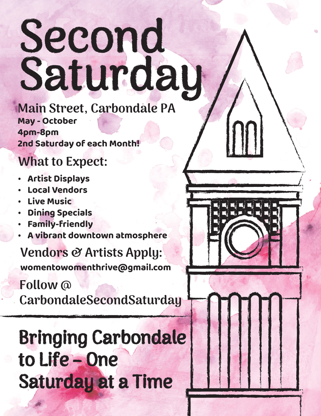
One of the projects that took up my time was a Facebook poster for Second Saturdays in Carbondale, Pennsylvania. This project was for my Introduction to Graphic Design class, and it worked with a real client: The Carbondale Chamber of Commerce and Women to Women Thrive. For this project, we were given an extensive copy to include and to run wild with what we could create.
For me personally, I was at a loss of what to create. I’d never been to Carbondale, and the Second Saturdays are so new that there was not much to go off from their past. I ended up researching major landmarks on Carbondale’s main street, which is where Second Saturday is located. I ended up finding what I believe is the Carbondale Historical Society, which seems to be this large building with a clocktower that is very iconic for the town.
In the client’s brief, it seemed that the event was going for an artsy, family-friendly vibe, so I really leaned into the art side of the theme. In Adobe Illustrator, I constructed a linework version of the clocktower, and then I changed the line work to taper and use a brush for the stroke. This created a much more sketchy image of the Carbondale Historical Society. I was so excited, I was finally on a roll, getting the work done! It was flying by . . . and then I had to figure out what to do with the background.
I was blocked by this background for several days. I had no idea what to do, and none of my ideas were working when I used the vector tools in Adobe Illustrator. I had this vision of a splotchy paint backdrop, but nothing I was doing was achieving the visuals I was looking for. Frustrated, I turned to the basics: pencil and paper. Or rather, watercolor and paper.
If I could not achieve what I wanted digitally, I definitely could achieve it on paper. I experimented with all sorts of compositions and spent all afternoon trying different ways to watercolor. I don’t usually like to use watercolor and avoid it, but for this time I tried to tackle it. I tried applying water before the paint, and I tried applying watercolor straight on the paper. Sometimes I used splatter paint techniques. In general, I just experimented with the paint to see what I could do.


I then scanned each of these images and put them as a layer behind my line work in the Adobe Illustrator file. I then checked to see which looked best. I was really stuck between the first watercolor backdrop and the fourth, but in the end, the latter won out.
From there, I applied a few layer effects to make the text more readable and called it a day.
At the end of the day, I am pretty happy with this design. I’ve never scanned in my own artwork before for a digital file, but I am really happy with the effect that doing so gave my piece. I think in the future I would upload scans with a higher resolution then the 300 dpi I had originally chosen. I also would like to experiment more to see if I can achieve an even more natural appearance with the sketchy lines of my line work. Overall, this was a lot of fun to work with and to push my limits and problem-solving skills. It certainly is not my best work, but I am still happy with the results and am excited to see how this project can become a stepping stone for better projects in the future.
Thank you so much for coming on this Graphic Design journey with me! What do you think of my solution? How would you have approached this project? I’d love to hear!
See ya in the summer!
-Rebecca Prowse