I wanted to catch everyone up on the finished pieces that I had introduced in my blogs prior.
First to be shown is the painted finishing of my Child’s Sorting Box. For a project based on creating visual metaphors, I made a plaster toy box that is meant to resemble a child’s sorting toy.
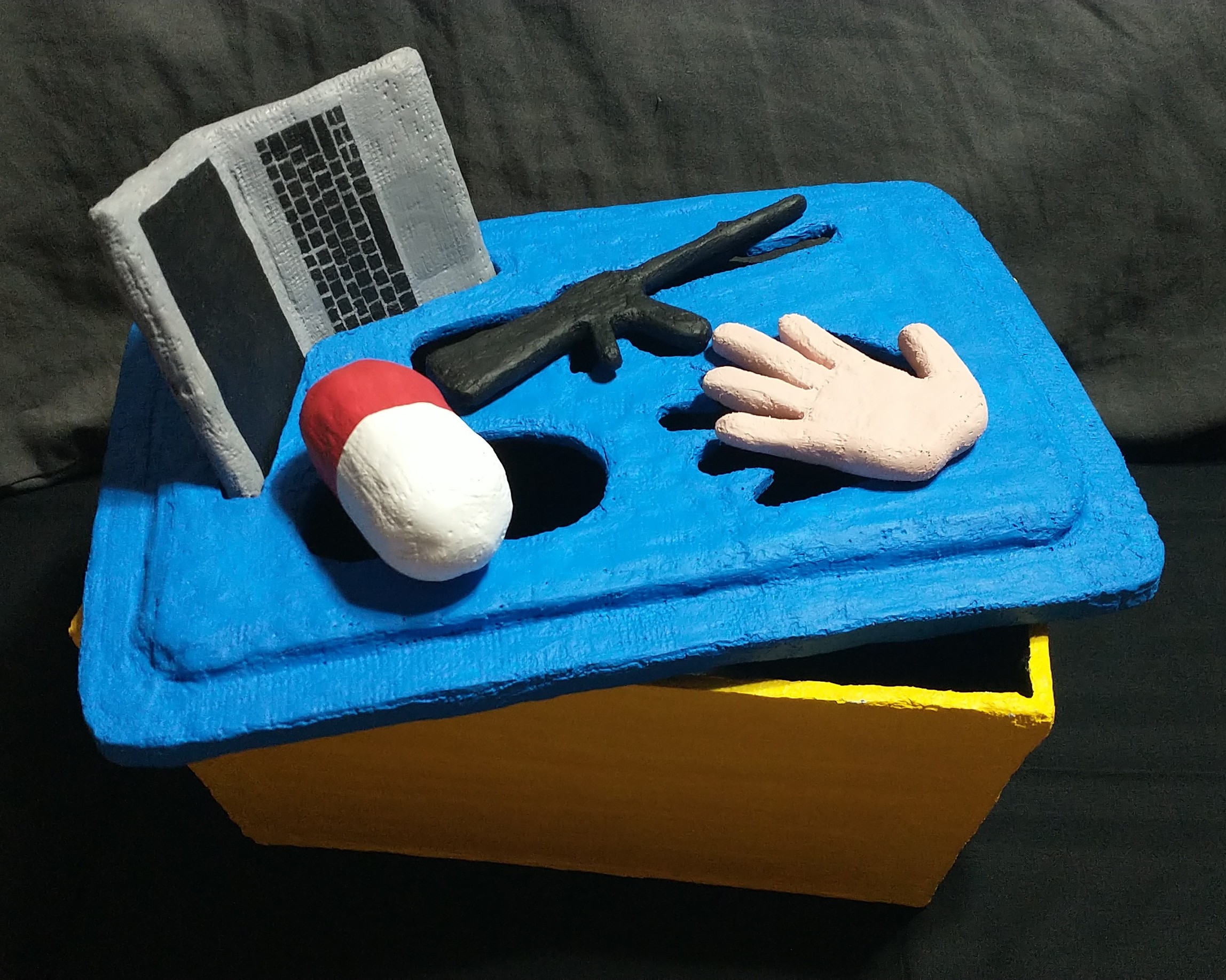
You can read the explanation of the metaphor in my original post. I made the box itself primary colors that resembles how most kids toys would be colored, which are colors most easily identifiable to them. I have plans of adding more detail to the box itself and to give it a faux-brand name. As for the inside, I painted it black to add more visual cues to the darkness of the metaphor and to how these things negatively effect the child on the inside. As for the individual pieces, I colored them accordingly to the actual objects.
For my second piece, I have the textured thumb cup I mentioned in this post that I have now named *trypophobia warning*.
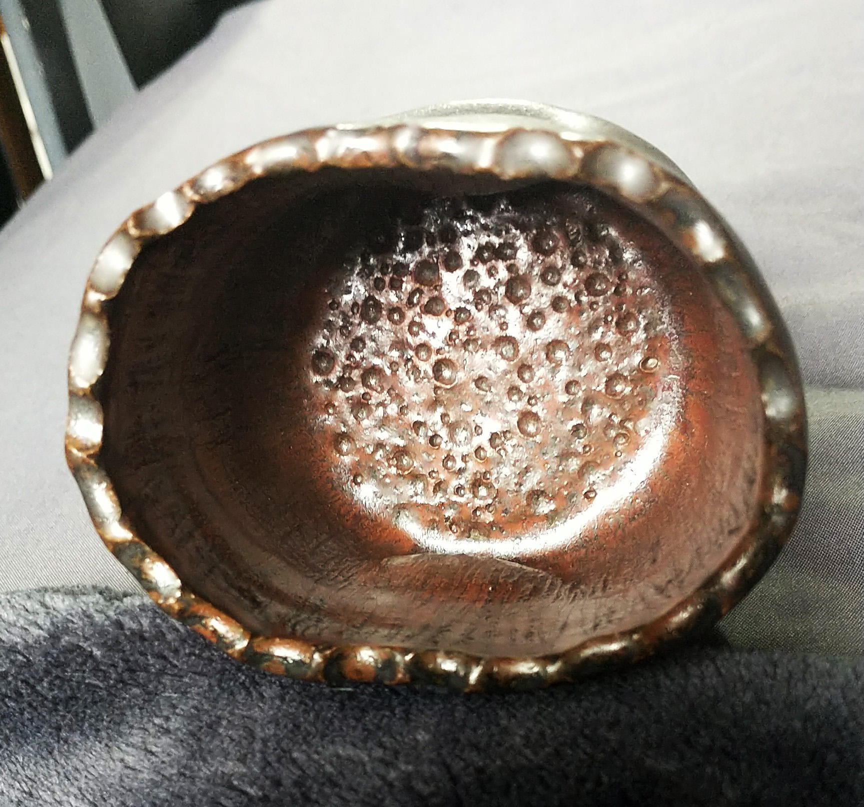
There were more scratched textures on the outside of it, but the glaze mostly filled them in, otherwise, it fired great and I love the colors.
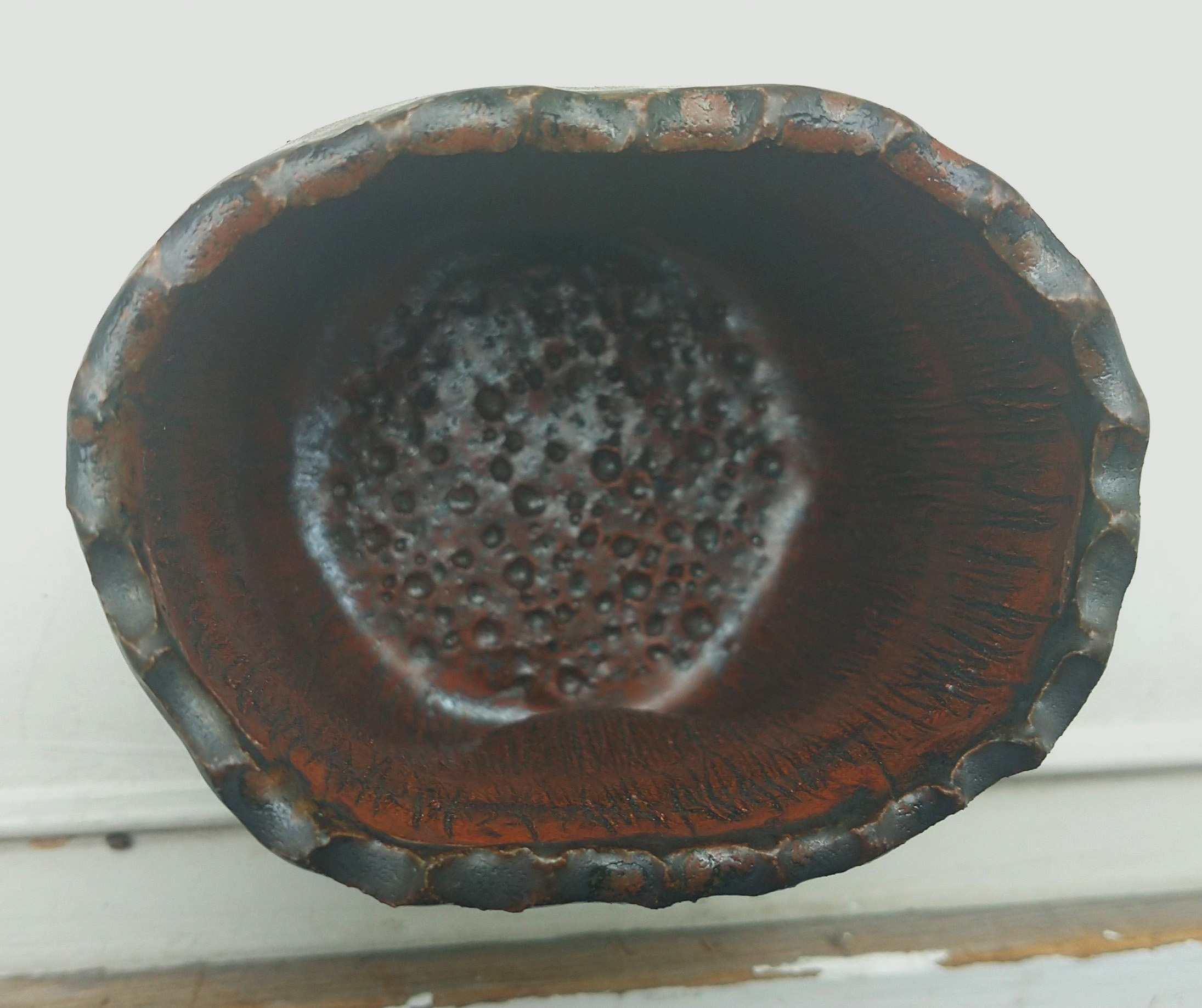
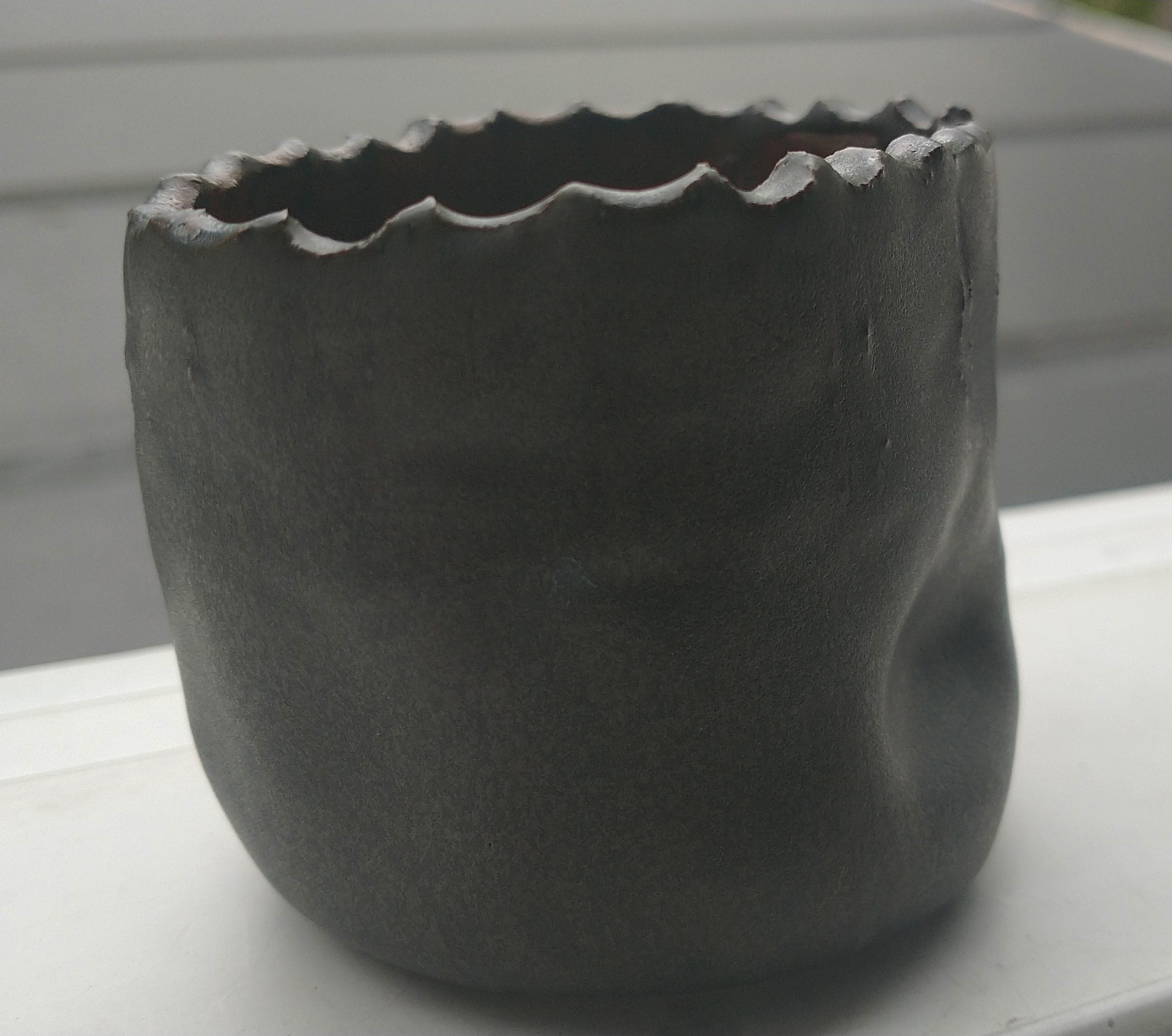
Lastly, I have the other fired piece from that post.
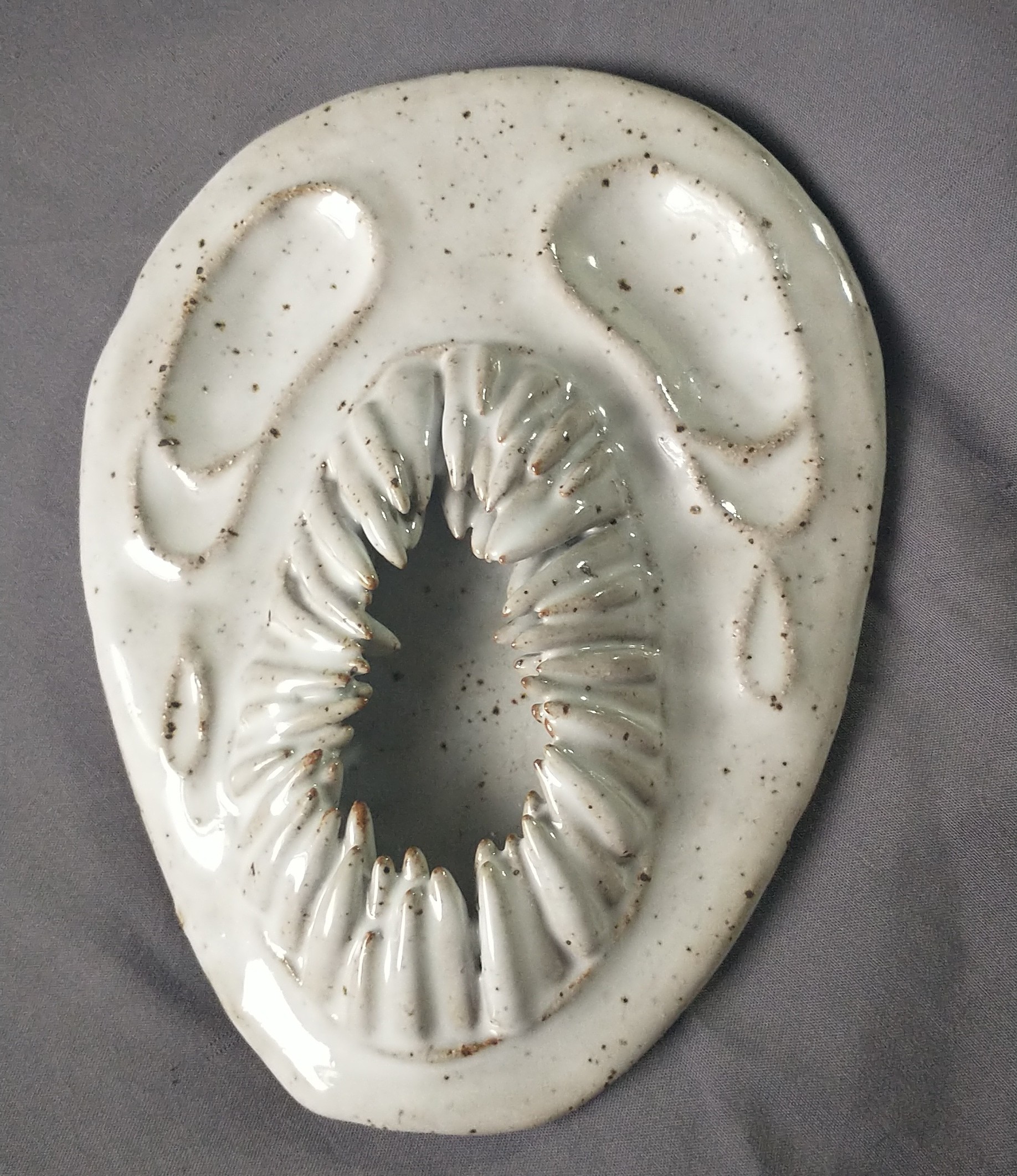
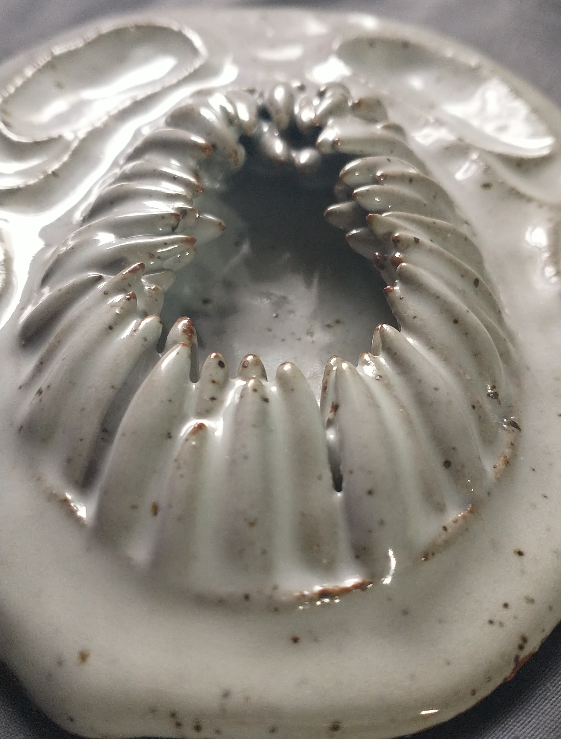
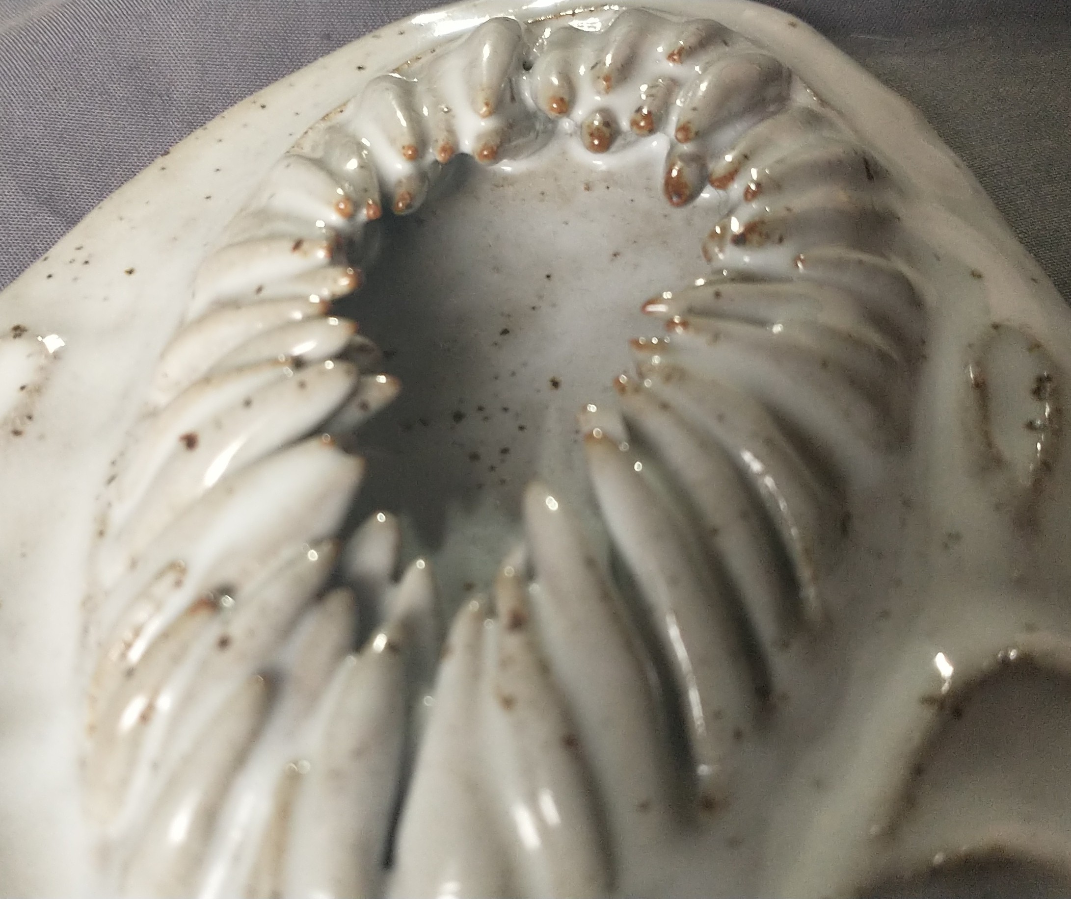
This piece is more of a rough draft. I plan to recreate it to its fullest capacity another time. I love how the teeth came out. It is especially fun to run my nails across them ;).
I’ll see you for my next post! Buh-bye