Last week this painting (shown above and below) was done for my Kitsch vs. Art assignment. Kitsch is defined as being art, objects, or design considered to be in poor taste because of excessive garishness or sentimentality, but sometimes appreciated in an ironic or knowing way. So the objective for this assignment was to have a sound understanding of what kitsch meant and apply it to something you can turn into fine art.
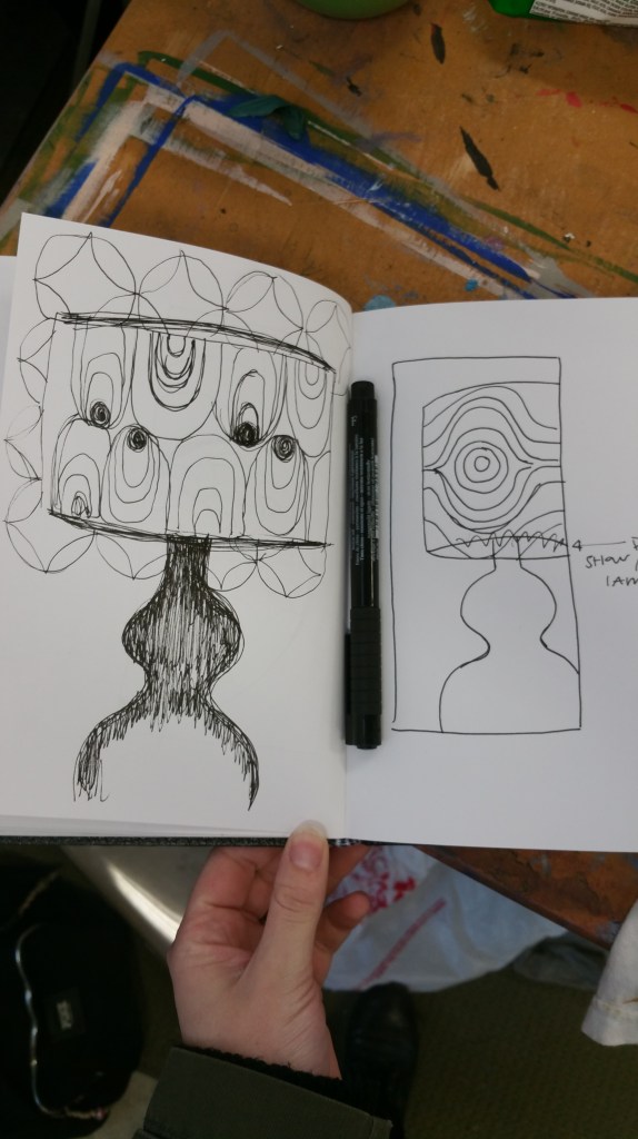
I was confused at first trying to come up with something that was considered to be kitsch until I really understood what it really meant. So I choose to focus on a decade to narrow down my options. The 70s contained lots of design patterns that usually had a distinctive color palette that represented this time period. Also wallpaper was very popular during this time. So I decided to combine these things to create something that was completely 70s kitsch. This was before I made the wallpaper orange and the lamp green.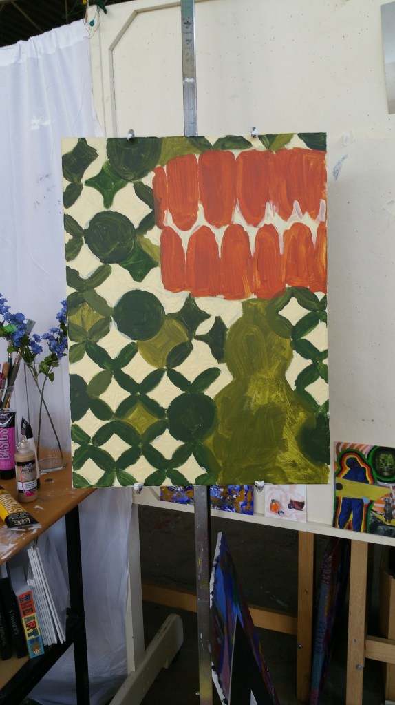
It actually looked nice when I thought it was finished. Sadly I do not have a picture of it.
I struggled with trying to figure out how to turn this into fine art so I tired to think of how I would make this something interesting that I would like. I am usually drawn to abstracted pieces and a lot of my work is abstract. This led to the idea of abstracting the lamp completely and making this a flat surface with no depiction of anything but shapes. I also think the texture of the paint adds to it being fine art. It contrasts with the 70s wallpaper patterns that were so flat, smooth and perfectly measured.
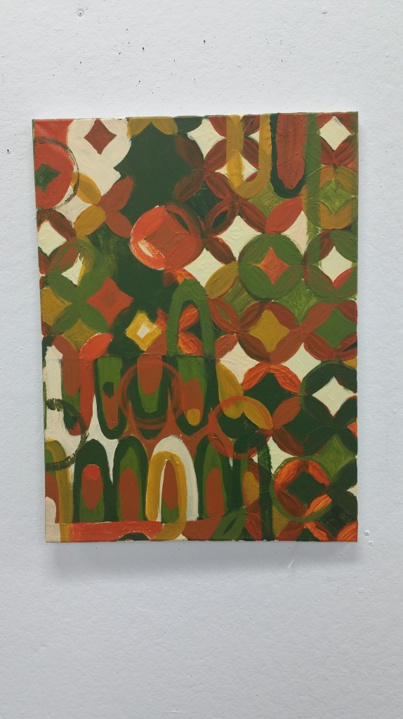
This project was interesting and I don’t love it but it was fun and I learned some new things along the way.
Sketchbook Drawing of the Week: