When developing color film, there is a technique called cross processing, where you purposely develop with chemicals made for developing a different film. This often creates vibrant and unique looking images, that are not true to the scene they captured, but rather an artistic expression and fun pop of color. When editing digital photos there is a way in to mimic this process in Photoshop, that allows for more control, while still maintaining the cross processing look.
I learned to mimic cross processing in my independent study class with professor Sue Jenkins, and the steps to do so are also listed in her book Smashing Photoshop: 100 Professional Techniques
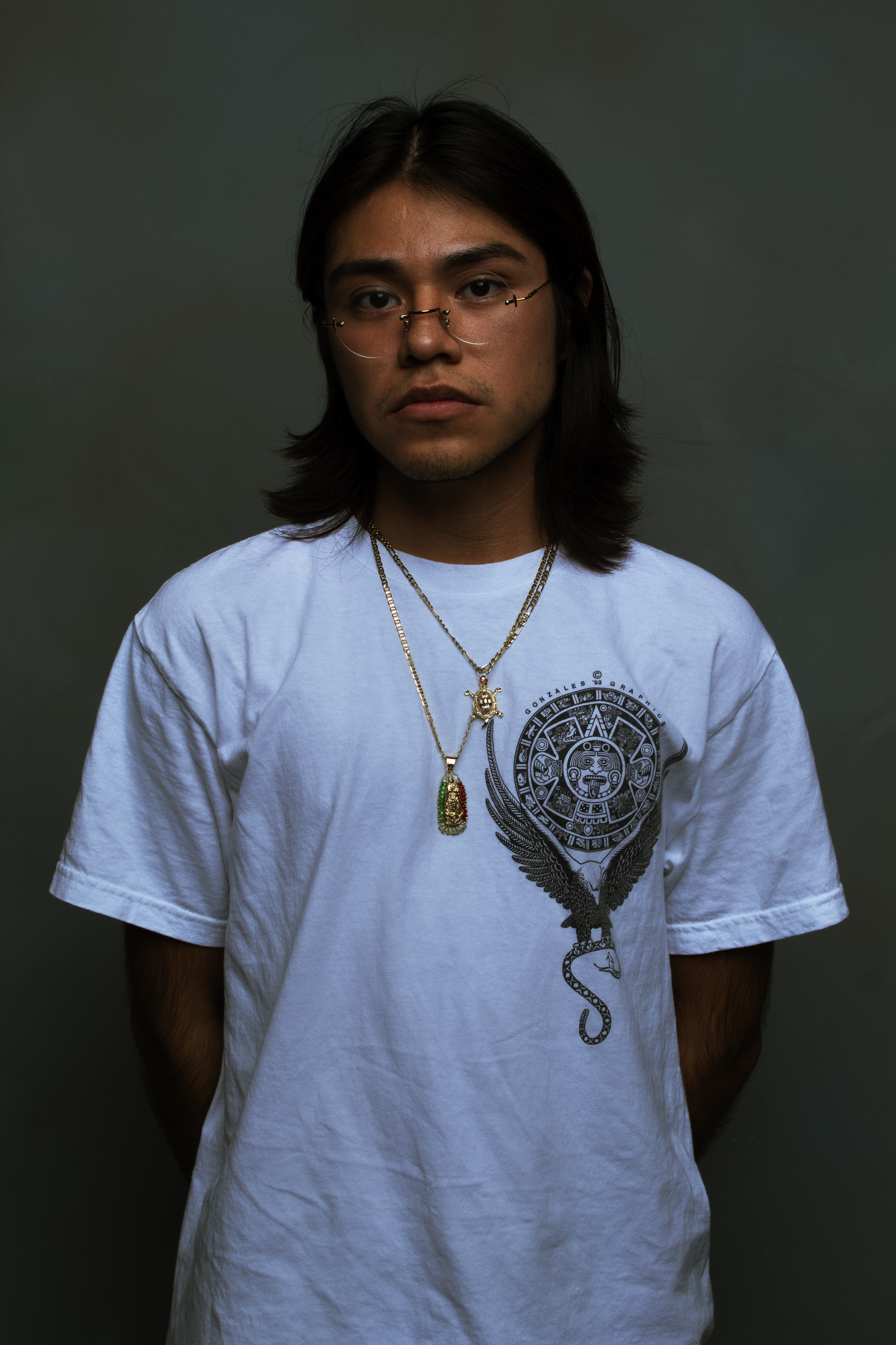
So far I’ve applied this technique to several of my photos, ranging from portrait to landscape, and hope to experiment with it more in the future. In portraits, it has interesting effects, and while it might not always look like traditional cross processing, it adds a unique vibrancy and depth of color to the subject and makes for a very interesting photo. In this particular portrait below, the cross processing changes the mood of the photo to something darker and more edgy, as well as bringing out the colors in the subject and background.

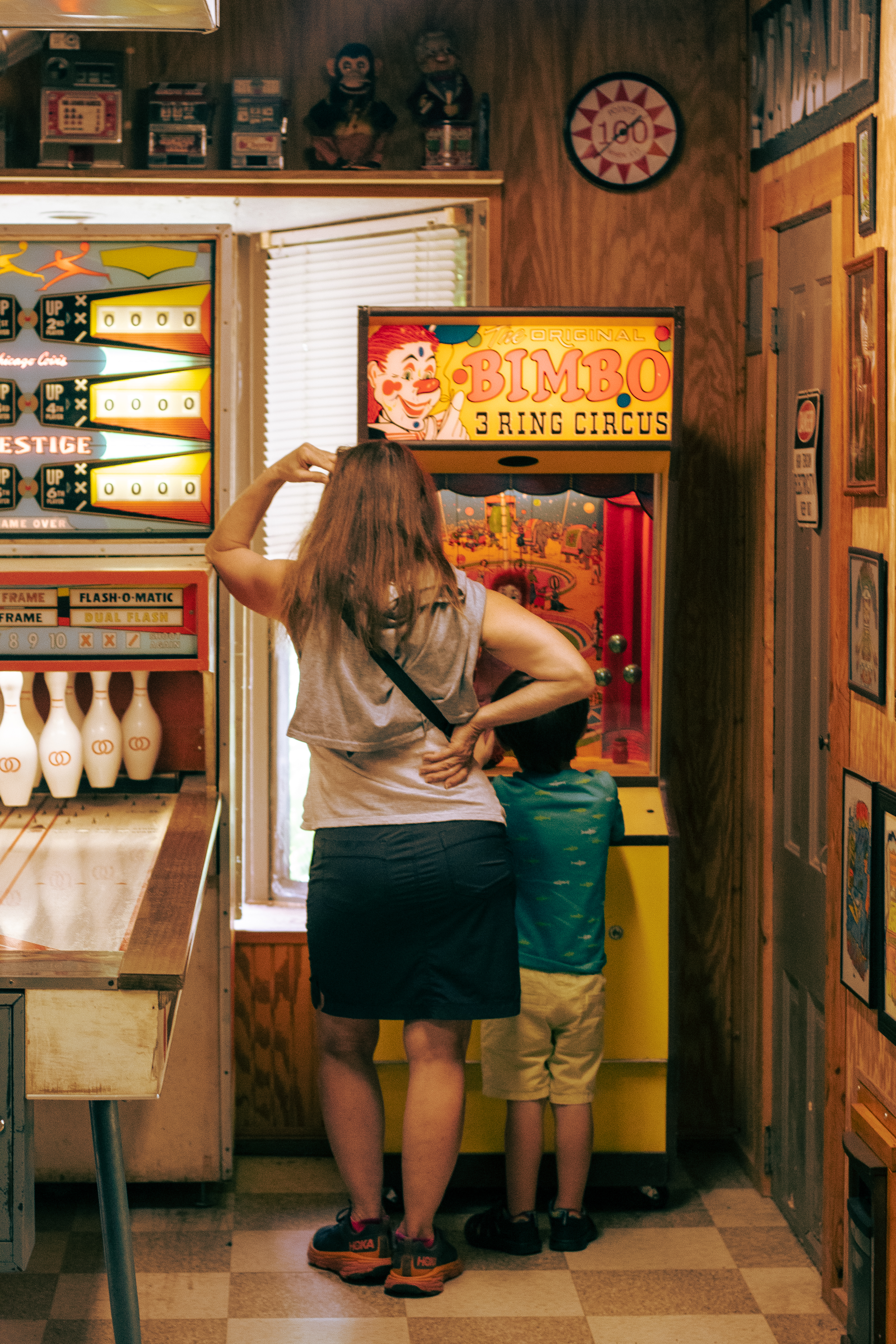
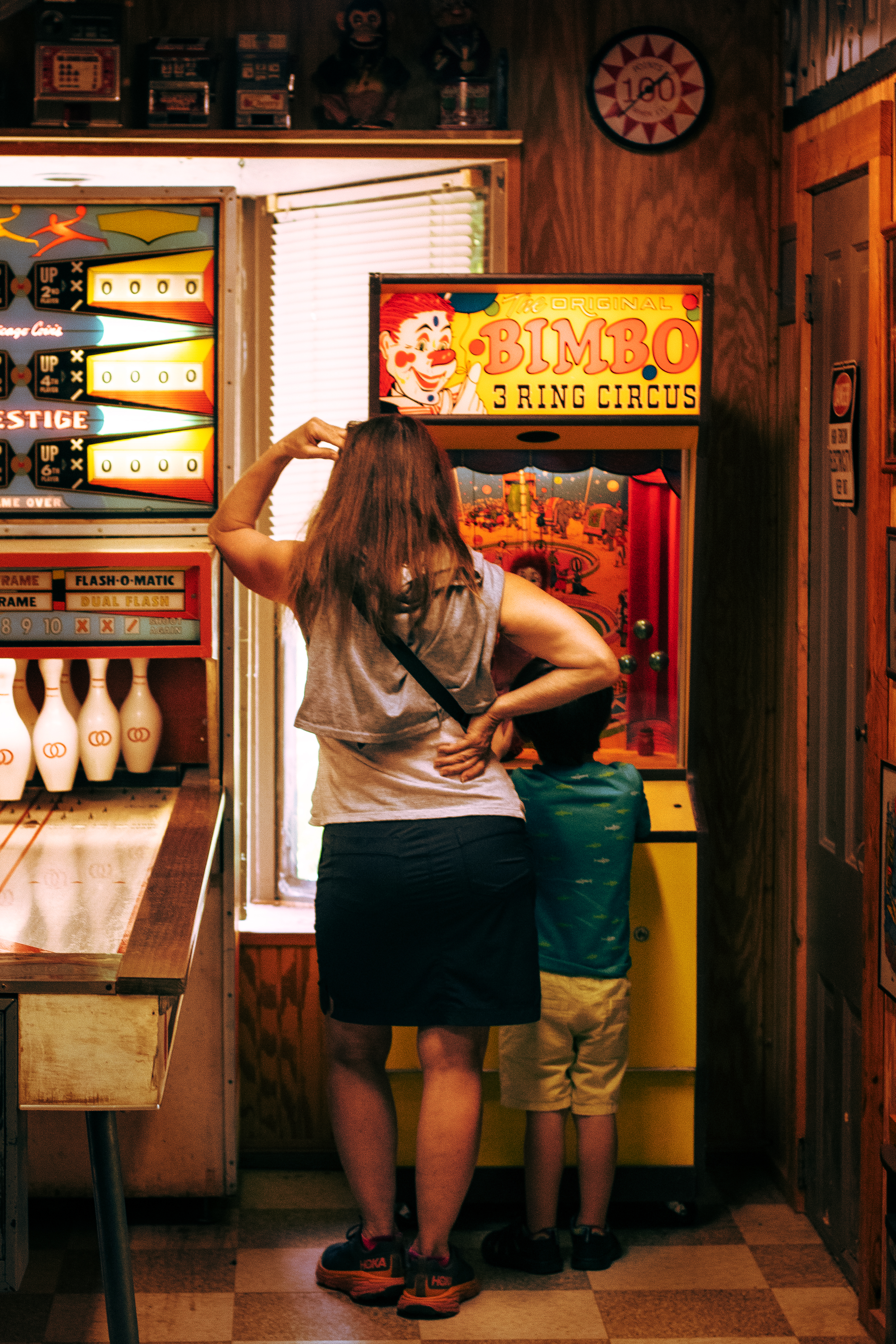
I applied this to a photo I had taken in an arcade of a woman and her child, as I thought the warm tones of the original photo would benefit from the cross processing effect. The change here is more subtle, but it adds to the cinematic feel of the photo, and contributes to the story telling element. It also highlights the bright colors of the arcade games, an important part of the story being told.
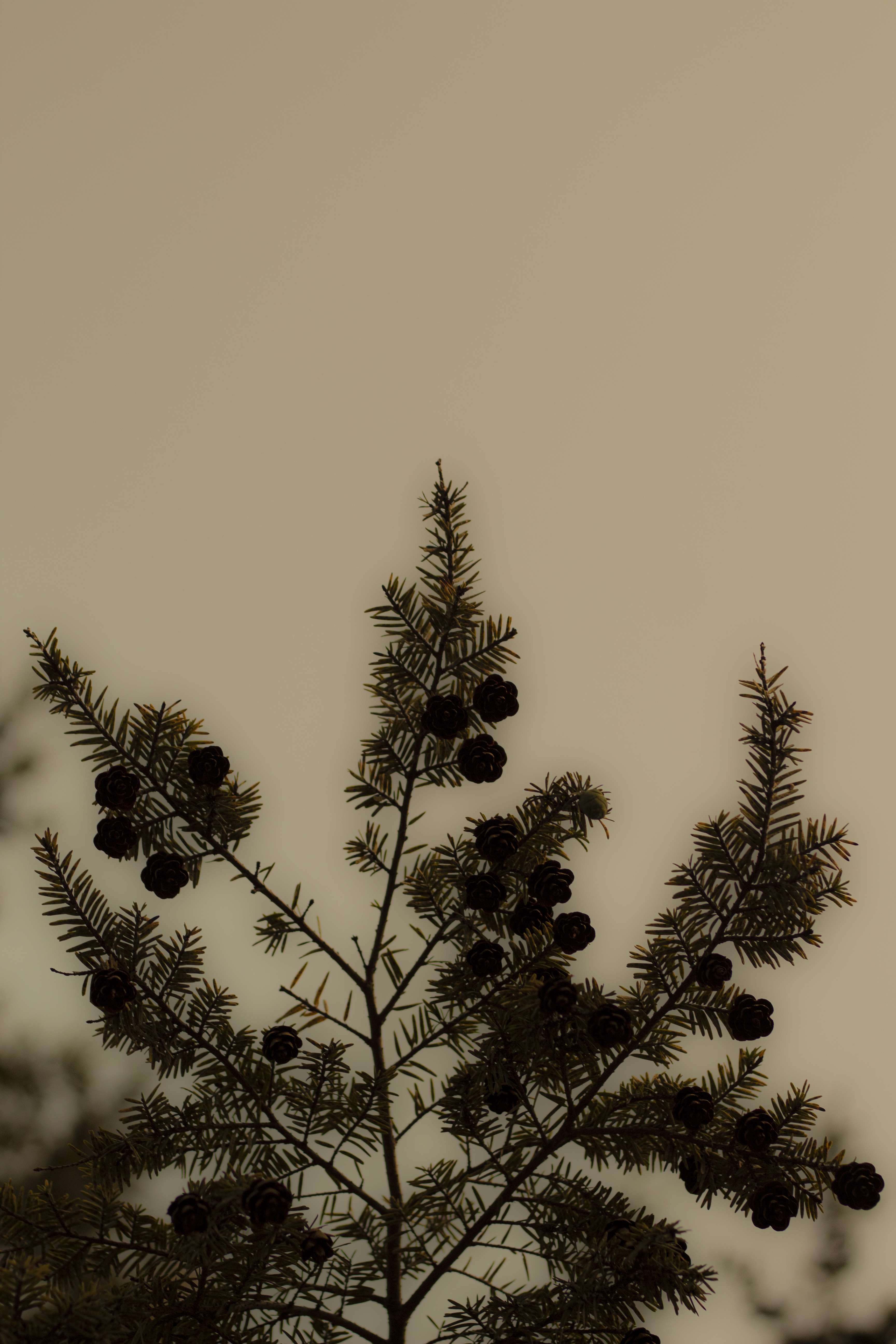
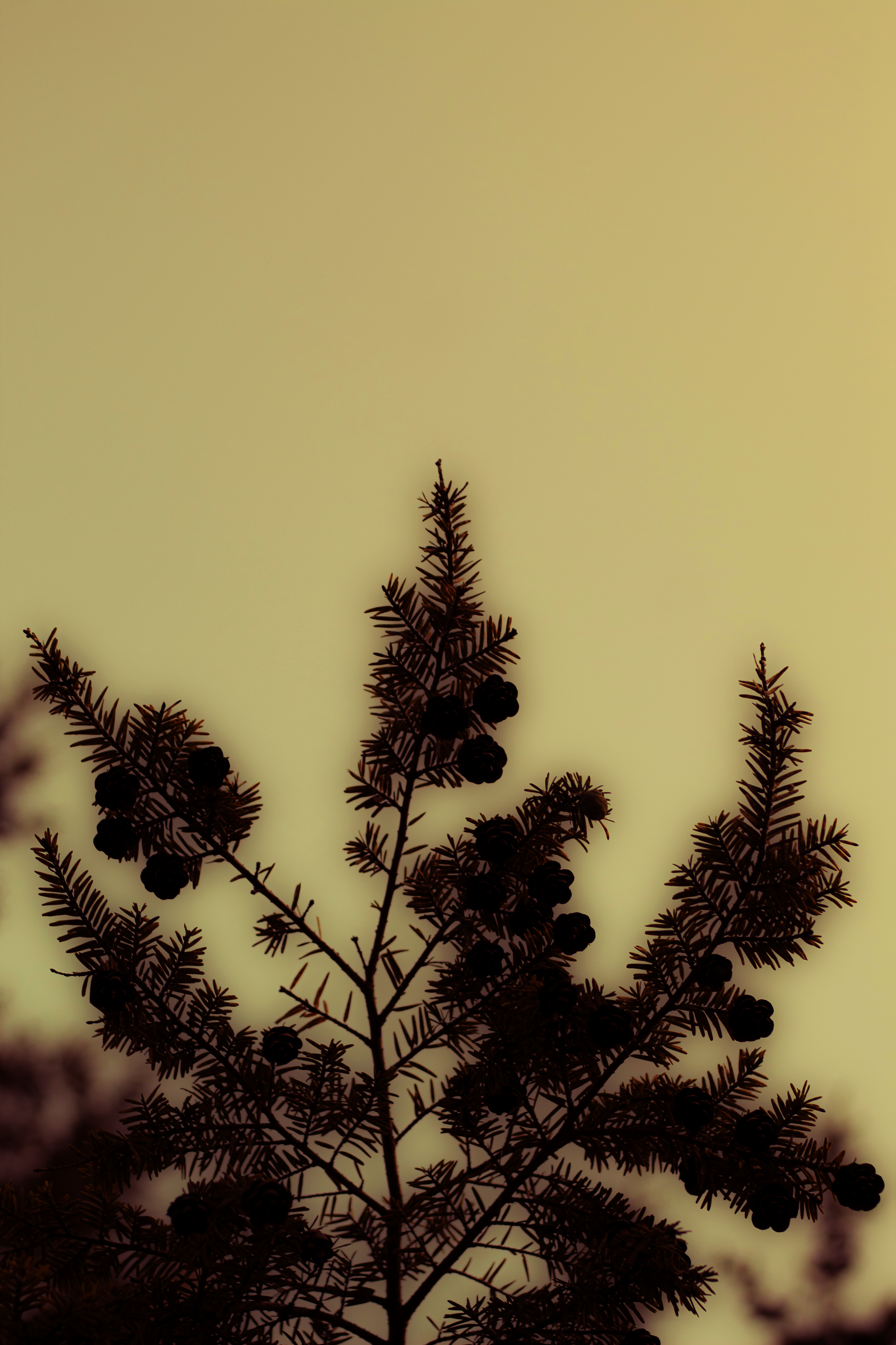
In this next image I wanted to try to push the colors further, and when choosing a photo to do so with, I thought an image that was rather simple would work best, so the colors would be a bigger focus. Here the shadows have more red and are richer, and the highlights have a yellow and in some spaces green tint to them. It evokes a very different feeling from the original, which is muted and almost black and white.
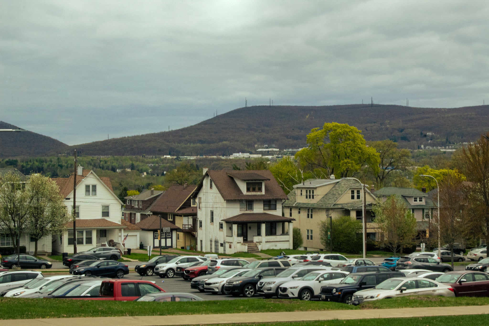
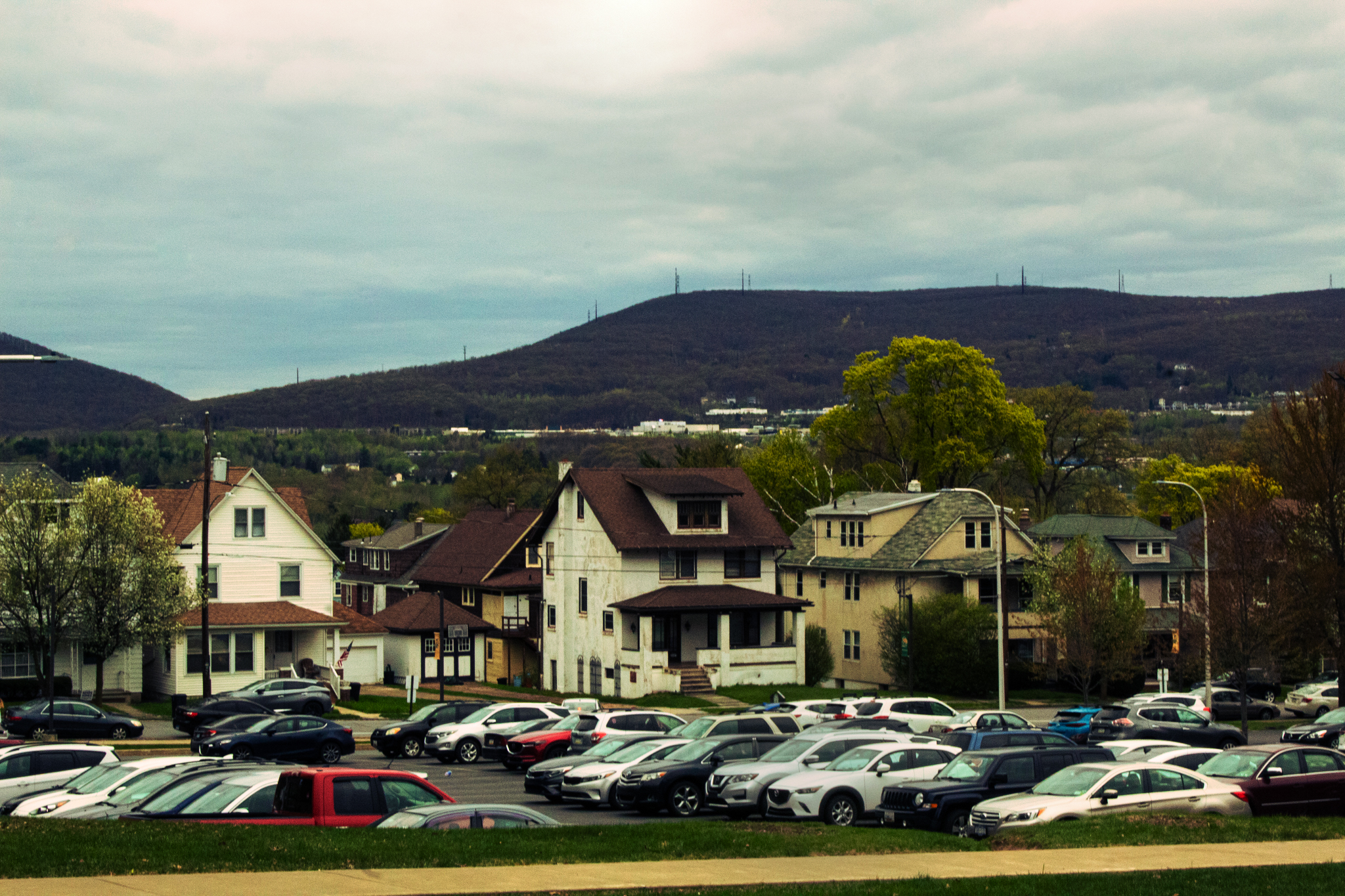
In this landscape I wanted the cross processing to really bring out the variety of colors that were present in the original. I also wanted to increase the contrast of the original, as it had been shot on a very overcast day, with even lighting and no harsh shadows. The difference is less dramatic than the previous set of photos, but still manages to greatly alter the mood of the photo.
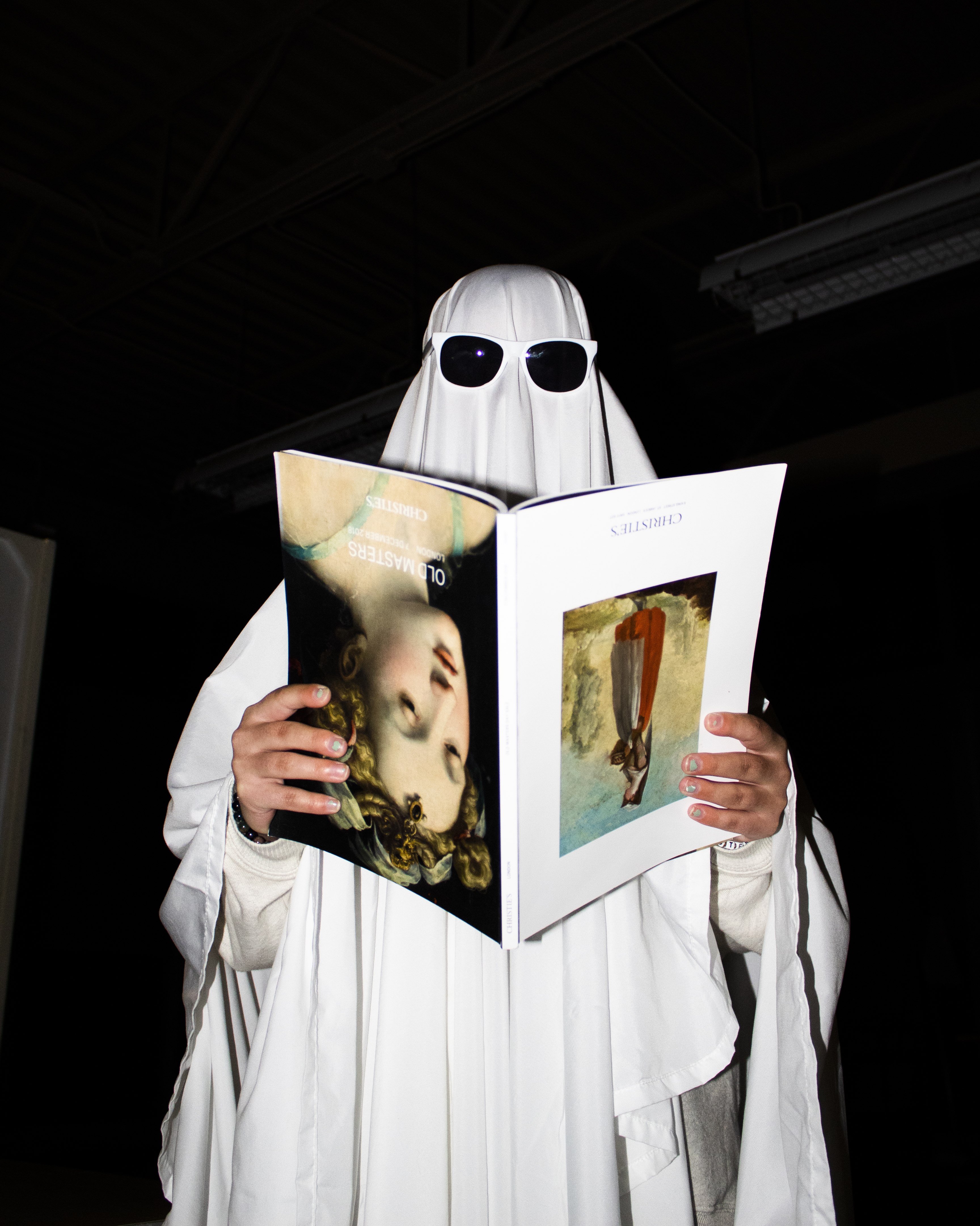
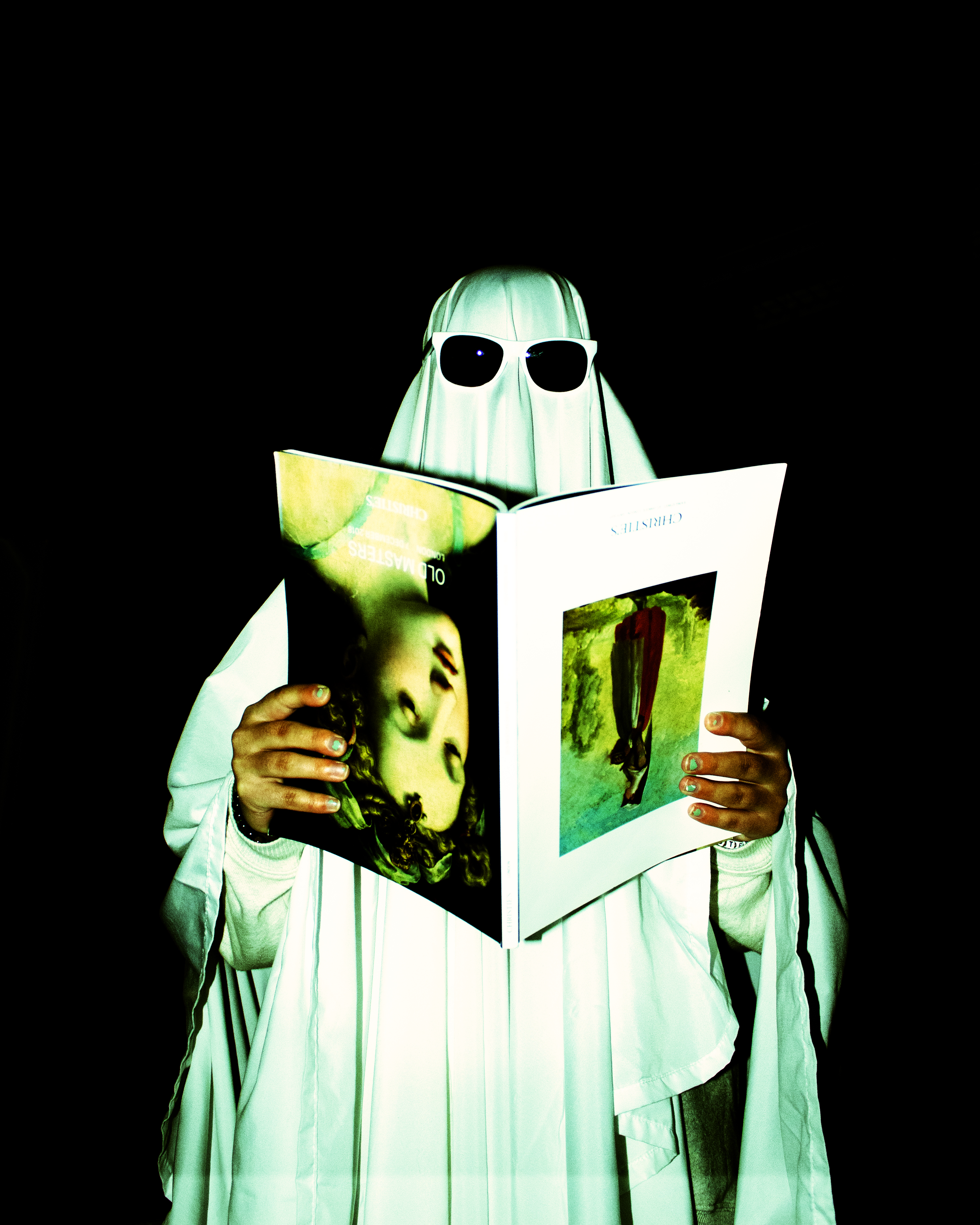
In this last set of images, I wanted to pick a photo that felt fun and silly, so I could really feel comfortable pushing the boundaries of the colors in the photo. I think it adds to the Halloween theme of the photo, and the green tint to the white sheet is very reminiscent of film for me. I love recreating the look of film, and with this technique I’ll have yet another way of doing so and having fun with the process of editing.