Hello all!
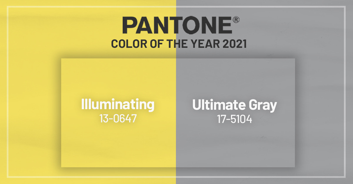
Many people look forward to a new year because of the hopefulness of fresh starts, resolutions, and leaving the bad experiences of the past year behind. I think it’s pretty safe to say that there are a couple of experiences we’d like to leave in 2020! We’re holding many hopes for 2021, such as a widely successful vaccine for COVID-19 and progress on social justice issues that have been fought for throughout many years. Embodying these themes of optimism for the future in the midst of dark times, Pantone has released that its 2021 Colors of the Year are Ultimate Gray and Illuminating.
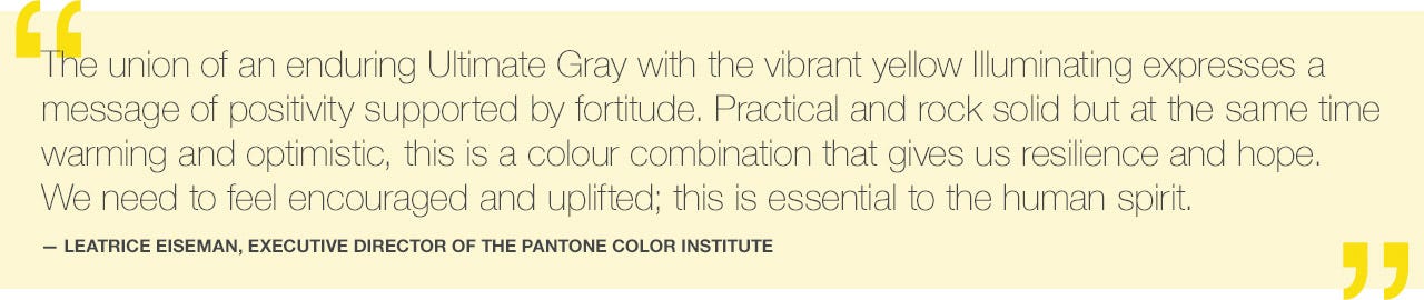
According to Pantone, this pairing is “a marriage of color conveying a message of strength and hopefulness that is both enduring and uplifting.” The gray is described by Pantone as practical, rock solid, thoughtful, strong, fortitudinous, spirited, emboldening, dependable, everlasting, assuring, steady, and resilient. The yellow is described as warming, optimistic, promising, sunny, friendly, energetic, clear, hopeful, bright, cheerful, sparkling, vivacious, and powerful. This match of colors isn’t meant to be expressing duality in the way that gray can represent bad times and yellow good times, but expressing that different values can be relied upon at the same time in order to promote innovation.
While Pantone’s color selection is supported by trend analysis in order to influence industries such as fashion, product packaging, and home, graphic and industrial design, there is no denying that not only the art world has been considered when choosing the color of the year. The normal avenues of inspiration are from the fashion and entertainment worlds, as well as art from unlikely areas such as social media. However, socioeconomic conditions, new lifestyles, new technologies, sporting events, and popular travel destinations absolutely go into the consideration for the color of the next year. (This fascinates me!! I want to meet and chat with every single person who works on gathering the data for this. If anyone has connections, hook me up!) This is only the second time that Pantone has chosen two colors for its Color of the Year, with the first being Rose Quartz and Serenity for 2016.
Without delving too deeply into color theory, it is completely understandable as to why gray and yellow have been chosen to represent strength and resilience with hope for the future. We also get some insight on the way that we view color as a society by looking at the way that people have responded to these Colors of the Year. Some reactions to this color pairing have been positive, expressing hopes and beliefs that the future will be as bright as Illuminating yellow. Other reactions have been more negative, explaining that there is too much work to be done to expect 2021 to be full of sunshine when the clock strikes midnight on January 1st. As art history is my field of study, I’d like to look to an artist and color theorist to see what his insight is on these two colors for 2021!
Wassily Kansinsky, Russian painter and Bauhaus teacher among many titles, published in 1911 Concerning the Spiritual in Art. This book was his way of expressing his views of the three types of painting, the innate spirituality of art and artists, and the ways that colors touch the soul, just to name a few. In his explanation of the synesthesia that he experienced, he describes both yellow and gray. Let’s see how they match what Pantone described the effect of these colors to be!

Kandinsky says that the opposite of blue is yellow, due to blue being the core “cool” color and yellow being the core “warm” color. Yellow being described as warm is probably due to the connection between warmth and light, as yellow is the lightest color (closest to white). This distinction between yellow and blue is interesting to note because Kandinsky would not agree with the common interpretation of Pantone’s gray and yellow being opposites. Pantone has expressed that these colors work together, but many have taken gray as representative of the dreary present and yellow the bright future. With a Kansinsky approach, these colors wouldn’t be opposite at all since blue is the opposite of yellow, not gray. He would agree with Pantone that these are colors that work off of each other. Let’s explore how Kandinsky would describe each color. Here is how he conceives of yellow:

“The first movement of yellow, that of approach to the spectator (which can be increased by an intensification of the yellow), and also the second movement, that of over-spreading the boundaries, have a material parallel in the human energy which assails every obstacle blindly, and bursts forth aimlessly in every direction.”
Here we see the link that Kandinsky makes between human energy and with yellow to be similar to the hopefulness of the yellow in Pantone’s Illuminating. Assailing every obstacle blindly could be evidence for the reaction that we are being overly optimistic about the new year, but bursting forth in every direction could prove that there is progress about to be made. (Note that I’m not saying we should look to these colors as a way of predicting the future, I’m merely making a comment on the ways that color can affect our perception of the world!)
He describes gray as such:
“The balance of these two colors [black and white], occurs by mechanical mixing, forming a gray color. It is natural that born this way paint can’t give external sound and movement. Gray is soundless and motionless, but this stillness is of a different nature than the rest green. Gray .. so there is hopeless immobility. ”
This hopeless immobility that he describes certainly lends us insight into how Kandinsky would interpret the gray in this color pairing. He likely would understand the gray not to be symbolic of strength or alluding to pebbles on a beach, but instead a commentary on the slow progress towards a future that we so desire. However, he also says this about gray:
“The darker the gray, the more overweight is suffocating hopelessness. When the paint highlights include something like the air, the possibility of breathing, and this creates a certain element of the hidden hope.”
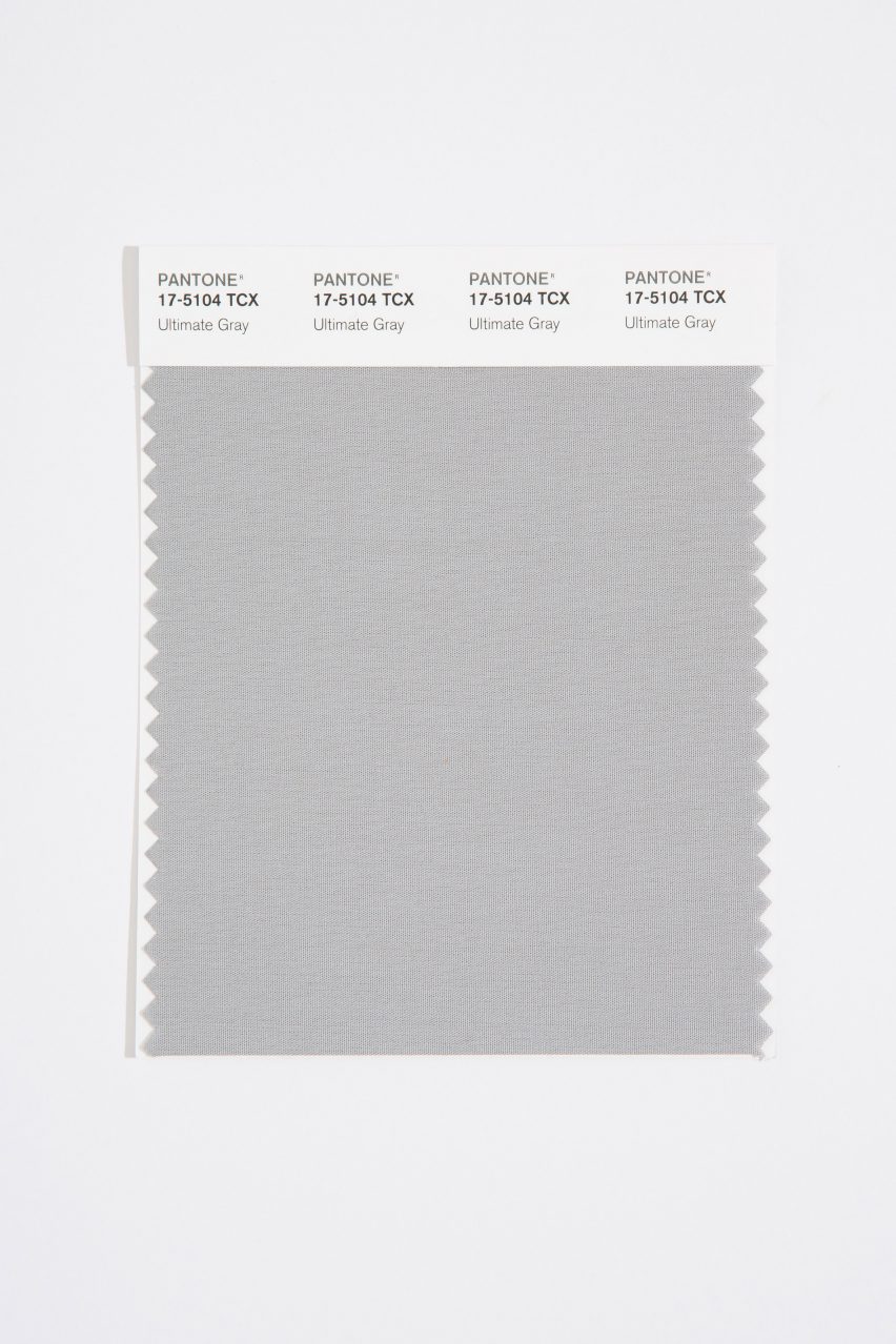
This could indicate, since Ultimate Gray is a medium shade of gray, that it has enough lightness to indicate a sense of hope. This would mean, according to Kandinsky’s interpretation of these colors, that Illuminating and Ultimate Gray combined both indicate a sense of hope, even though they are looking towards the future in opposite ways. Gray speaks to the immobility of the current reality and the importance of recognizing one’s situation, all while having a certain hope for change. Yellow speaks to the sometimes reckless abandon of hope that one can feel when looking towards the future, but also tells of the warmth and sunshine that we can feel as humans in the midst of any circumstance we’re facing.
It may just seem like a silly color pairing, but given the time that these researchers took to carefully observe design and social trends, it is actually a valuable comment on society. Thanks for joining me in this discussion! I was so intrigued by this topic and I want to know… how do you interpret the Colors of the Year? Let me know in the comments!
Have a great week!
Sources: Kandinsky Quotes 1 and 2, Pantone Sources 1 and 2
Images: Featured Image, Illuminating, Ultimate Gray, Both Colors, Wassily Kandinsky